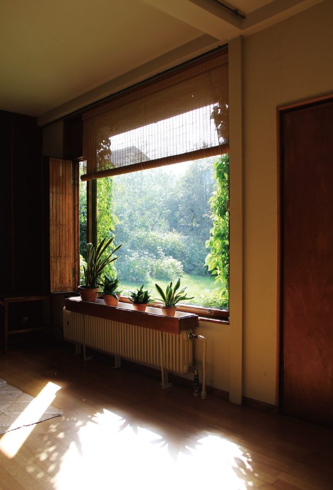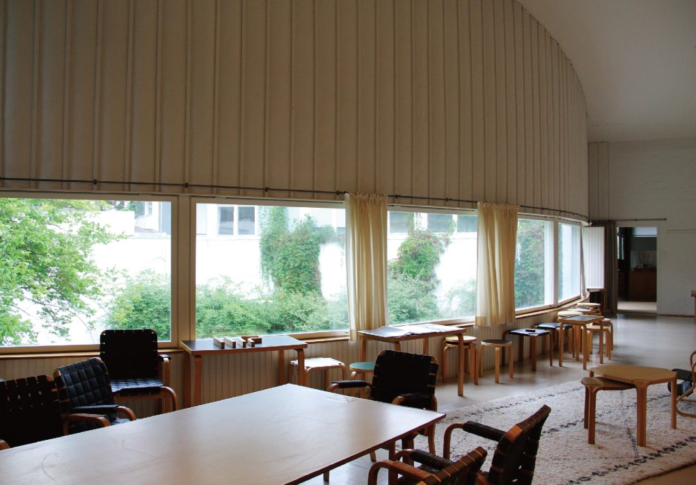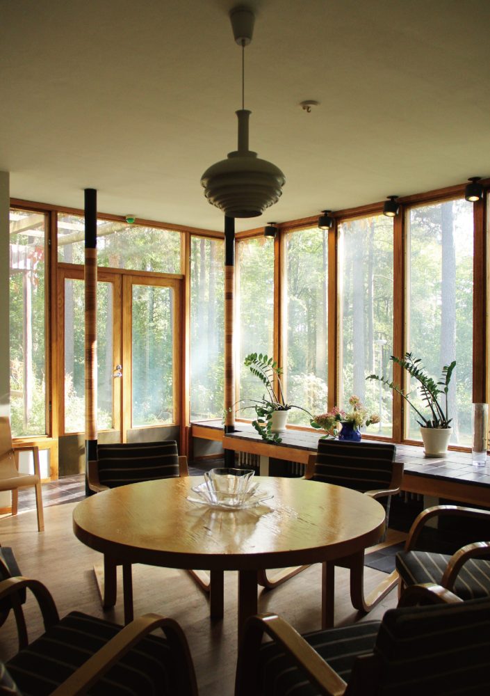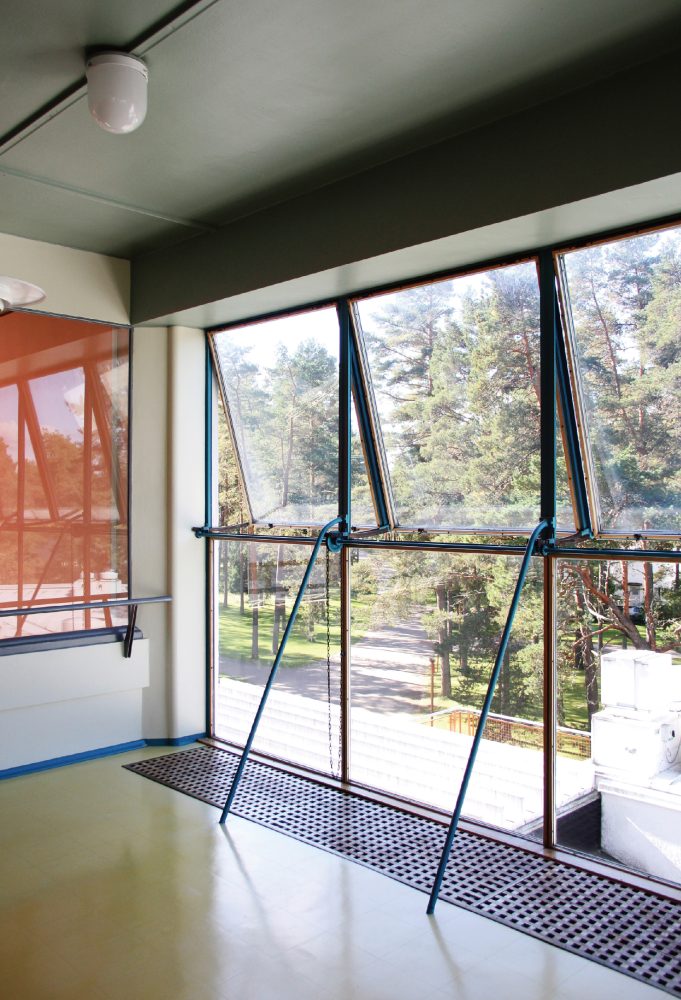
Donald Judd and Windows:
Contemplating Openings Through the Artist’s Interior Designs and Architectural Renovations
07 Feb 2024
- Keywords
- Architecture
- Art
- Design
- Essays
0. Introduction——Why Judd Now?
Donald Judd (1928–94), an icon of American Minimalism, has many admirers in the architecture world. Presumably, this is because his artwork is loaded with allusions to architecture,1 and not because he did actually envision and realize works of architecture—a fact which perhaps may not be widely known, at least not in Japan.2
And so, in this column I would like to introduce his architectural works together with their various kinds of openings. It should be noted that many of his realized architectural works are either interior design or renovation projects.3 Though I am far removed from the US where most of Judd’s architectural works are located, I would like to use this opportunity to revisit his architecture from my viewpoint here in Japan, as I believe his approaches to interiors and renovations could be highly enlightening for architects working in today’s Japanese context.
1. From Three-Dimensional Objects to Architecture
I still intend to do discrete pieces, but I get a little tired of them. . . . I got a little tired of big pieces that just sit there in an indefinite space, so I wanted to do something that dealt more with the space of the room.4
—Donald Judd
Before delving into the discussion on the architectural work of Judd the artist, I would like to briefly outline his background. Judd’s creative activities spanned a broad spectrum of genres, including criticism, visual art, architecture, furniture, and outdoor installation art, so it would be correct to say that architecture represents just one small facet of his oeuvre. For the sake of better understanding his architectural work, I think it will be worthwhile to take this tangent to retrace the path that he took before he began directing his imagination towards architecture.
Judd attended several schools during the late ’40s and ’50s, studying mainly art and philosophy. After starting on a career in art criticism in the late ’50s, the focus of his artistic work gradually shifted from two-dimensional surfaces (paintings) to three-dimensional objects. It was in the ’60s that he began setting up his works on the floor, which led him to explore their relationships to their sites. He then went on to intervene on the sites themselves through the mediums of furniture and architecture from the late ’60s.
According to Judd, it was only by happenstance that he transitioned to making three-dimensional objects.5 This chance occurrence would give rise to such iconic works as his “stacks” and “progressions”, but here I would like to look at two works that show hints of his later architectural work.
The first is untitled (DSS 76) (1965) (Fig. 1).6 One of the more low-lying of Judd’s works, it is made of perforated steel, rests directly on the floor, and has a slanted top. The perception that its slanted plane exists discretely from the horizontal and vertical planes of the floor and walls of its environment is crucial to this work. Even more important, however, is the fact that the slanted plane simultaneously appears to be disengaged from and engaged with its surroundings because of how Judd compressed its vertical dimension to minimize its presence as a free-standing object. In this respect, it can be considered an early example of a Judd work that responds to its context (albeit in a paradoxical manner).
-
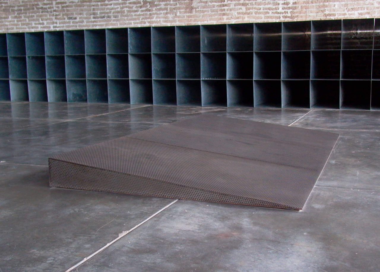
Fig. 1. Donald Judd, untitled (DSS 76), 1965, perforated 16-gauge cold-rolled steel, 20.3 × 304.8 × 167.6 cm (artwork © Judd Foundation / Artist Rights Society (ARS), New York).
© 2024 Judd Foundation / JASPER, Tokyo E5493
Looking back on the trends in Minimalism at the time, one will notice that Judd did not seem to be too interested in how his works related to their surroundings compared to his Minimalist peers. It is rather amusing to see how his works continue to sit passively in their contexts while his contemporaries were turning away from free-standing forms to instead explore works that are more dependent on their sites and situations (in a Post-Minimalist manner).7
However, there was one environmental attribute that managed to elicit a reaction from Judd: sloped ground. Untitled (DSS 241) (1971) (Fig. 2) is a work that he specifically made to be installed outdoors on a hill at the Pulitzer House in St. Louis, Missouri. It is composed of a pair of nested stainless-steel wall enclosures. The inner wall has a uniform height of 137.2 centimeters such that its top edge remains parallel to the slope of the land, while the height of the outer wall varies between 138.5 centimeters and 174 centimeters such that its top edge remains horizontal. The work can be said to be dependent on its context because the slope of the inner wall is tied to the slope of the site.8 However, there is a caveat: the outer wall is 174 centimeters tall at its highest point. A viewer standing downhill hence cannot see into its interior; all they can discern is Judd’s usual passivity towards context. The work creates an illusion of sorts, as viewers can only confirm that the inner wall responds to the topography by looking at it from uphill. While such illusionary qualities can also be found in Judd’s earlier work, the fact that the illusion is contingent on the site allows this work to be read as being more engaged with its situation and viewers.
-
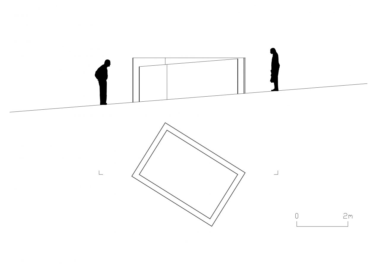
Fig. 2. Section of Donald Judd’s untitled (DSS 241) (1971, stainless steel, 174 × 247.7 × 369.6 cm). Drawn by author.
Now, what I wanted to highlight with this tangent is the fact that Judd continued to create works that exhibit a passive attitude towards their contexts even as his contemporaries were shifting to producing environmentally dependent (site-specific) work. And yet, as evinced by the quote included at the beginning of this section, he held an interest in dealing more closely with the spaces that his works occupy. Rather than pivoting to creating three-dimensional works that actively engage their environments, however, what he did next was to adopt an approach of intervening directly, but still passively, on spaces and sites while meticulously suppressing the generation of unnecessary meaning.
Another point that should be noted is that the Judd works just discussed, with their perforated and tubular forms, have a quality of inviting viewers to “peer in”. This is an attribute that can also be found in other three-dimensional works by Judd, and it calls to mind a key quality of that architectural element we know as the window.
2. In an Interior Design: Carefully Reading the Existing Conditions
There is no neutral space, since space is made, indifferently or intentionally, and since meaning is made, ignorantly or knowledgeably. This is the beginning of my concern for the surroundings of my work.9
—Donald Judd
In November of 1968, Judd set up his home and studio at 101 Spring Street, a five-story cast iron building in New York’s SoHo district.10 Based on the history of the neighborhood and the building type of the Nicholas Whyte-designed structure dating from 1870, Judd deduced that the building must have originally been used for producing textile products in the upper stories and selling them below. He gives a simple explanation of how he approached the refurbishment of the building and what he sought to achieve:
I thought the building should be repaired and basically not changed. It is a 19th century building. It was pretty certain that each floor had been open, since there were no sign of original walls. . . .
The given circumstances were very simple: the floors must be open; the right angle of windows on each floor must not be interrupted; and any changes must be compatible. My requirements were that the building be useful for living and working and more importantly, more definitely, be a space in which to install work of mine and of others. . . . I spent a great deal of time placing the art and a great deal designing the renovation in accordance. Everything from the first was intended to be thoroughly considered and to be permanent, as, despite several, it still is.11
Judd brings up two important elements of his approach to designing spaces in this excerpt: permanent installation and the concurrence of living and exhibiting. The idea of permanent installation became one of the motivations for his later relocation to Marfa, Texas, and it also can be considered a key informing factor of his architectural work. He explains why permanent installation is so important to him as follows:
The installation of my work . . . is contemporary with its creation. The work is not disembodied spatially, socially, temporally, as in most museums. The space surrounding my work is crucial to it: as much thought has gone into the installation as into a piece itself. The installations in New York and Marfa are a standard for the installation of my work elsewhere. My work . . . is often exhibited badly and always for short periods. Somewhere there has to be a place where the installation is well done and permanent. . . . My installations and architecture are very much in defense of my work. Visual, spatial art cannot be reduced to performance.12
Judd also consistently applied the idea of permanent installation in his interiors. That is, he defined the spaces clearly while being careful not to do too much or add unnecessary meaning.
I found that if I had placed a work on a wall or on the ground, I wondered where it was. I found that if I placed a work on a wall in relation to a corner or to both corners, or similarly on the floor, or outdoors near a change in the surface of the ground, that by adjusting the distance the space in between became much more clear than before, definite, like the work. If the space in one or two directions can become clear, it’s logical to desire the space in all directions to become clear.13
In order to create clearly defined spaces at 101 Spring Street, Judd installed the artwork in the living spaces while intervening directly on the spaces at the same time. Particularly notable of these architectural interventions is the way he dealt with the three different planes of the floors, walls, and ceilings in the three spaces from the third to fifth stories. Programmatically, the third story is the studio, the fourth story is the living room, and the fifth story is a bedroom. The third and fifth stories have oak floors, and their walls and ceilings are finished with plaster. The third story does not have skirting along its walls, so the floor, walls, and ceiling are defined as distinct planes. In contrast, the fifth story has 20-centimeter-high skirting boards made with the same oak used on the floor, creating the illusion that the whole floor is slightly depressed. This detail has the effect of delineating the fifth story into two tiers, with a living zone occupying the bottom 20 centimeters of the space and an exhibition zone occupying the rest of the space above it. On the fourth story, the ceiling and floor have been defined as analogous parallel planes by being finished with the same material. To further clarify these characteristics of the floors, walls, and ceilings, Judd purged the spaces of all other superfluous elements. Specifically, he took out the heaters on the fourth story, embedded the lighting fixtures directly into the ceiling on the third and fourth stories, and did away with lighting appliances altogether on the fifth story, save for a bedside lamp (Fig. 3).
-
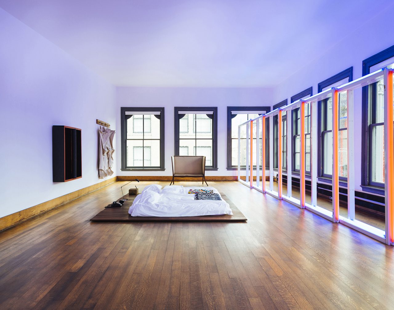
Fig. 3. Interior view of the fifth story of Donald Judd’s 101 Spring St. (artwork © Judd Foundation / Artist Rights Society (ARS), New York).
© 2024 Judd Foundation / JASPER, Tokyo E5493
The problem of how to treat the front, side, top, and bottom surfaces was of critical importance to Judd when he created his three-dimensional works. His various operations on the box forms of his floor works with recessed tops, his tubular works made of stainless steel and plexiglass, or his stacked works with their differently treated sides, tops, and bottoms, all serve to articulate the construction of the boxes and give clarity to the works.14 His operations on the floors, walls, and ceilings at 101 Spring Street also give clarity to the spaces, and in this respect, the project can be placed in the same lineage as those works.
Similarly to how Judd created the aforementioned hillside work, untitled (DSS 241), in a way that set him apart from other Minimalists of the time, he realized an interesting interior design project with 101 Spring Street in that he managed to make spaces that stand on their own without relying on the building’s context by carefully reading the existing conditions and keeping the production of extraneous meaning to a minimum.
Purging the spaces of superfluous elements resulted in the windows becoming the most prominent of the preexisting elements. In addition to articulating these large windows as features that enable the spaces to be lived in without the use of lighting fixtures, Judd also reemphasized their proportions by matching the dimensions of the second-floor dining table to them.15 This detail is again illustrative of his characteristic way of passively engaging the site.
3. In a Renovation: Arranging Openings Using Reasonable Asymmetry
A good reason [for using asymmetry] in both art and architecture is the configuration of the land that the structures are on. Existing buildings are a reason. . . . In architecture all aspects have to be considered in regard to symmetry. To me, just realigning the doors and windows, if possible, of old buildings so as to be opposite one another or on an axis, is a great improvement. Other than function, there’s no reason why doors and windows should be haphazard.16—Donald Judd
After spending the 1960s in New York, Judd moved to Marfa in the ’70s. All the architectural works he realized, except for 101 Spring Street and several later works in Switzerland and Cologne, are sited in Marfa. Here, I would like to introduce La Mansana de Chinati (Fig. 4), which was the next architectural project he worked on after 101 Spring Street and one that he continued to develop over the course of many years.
-
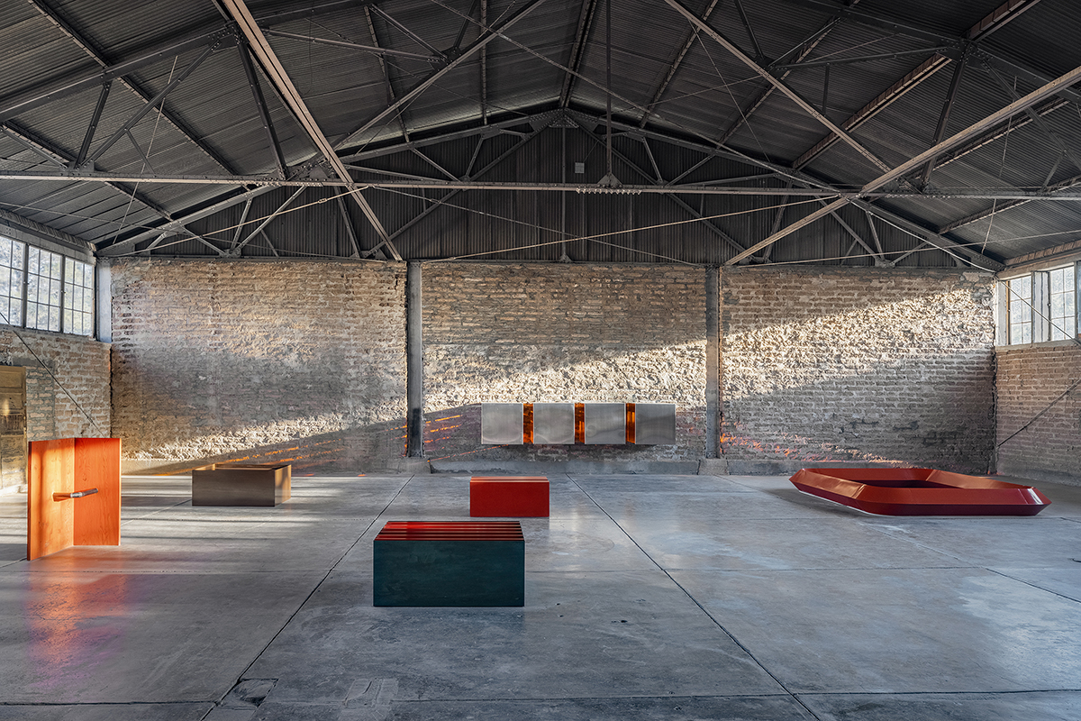
Fig. 4. Interior view of the south room of Donald Judd’s, La Mansana de Chinati West Building (artwork © Judd Foundation / Artist Rights Society (ARS), New York).
© 2024 Judd Foundation / JASPER, Tokyo E5493
Judd discovered Marfa while traveling through the American Southwest and Mexico in search of a place to set up his home and his work. His relationship with La Mansana de Chinati—also referred to as “the block”—began in ’71, when he rented one of two former Fort Russell hangars on the property to store some of his large-scale works. He began implementing architectural interventions to the site after purchasing the two hangars in ’73, and then the rest of the city block, which includes a two-story building, in ’74. Unlike at 101 Spring Street, where Judd only needed to deal with the interiors, here he had to consider not only the interiors but also the exteriors and the relationships between the various structures.
Let us first look at the composition of La Mansana de Chinati as a whole (Fig. 5). The East Building (Fig. 5-a), West Building (Fig. 5-b), and Two-Story Building (Fig. 5-c) are the three existing buildings. After purchasing the buildings, Judd built an outer wall (Fig. 5-d) along the property line to cordon off the site. The East Building and West Building are positioned in the southern half of the site, and the first story of each consists of a north room and south room with a middle room between them. The north half of the site forms an open yard that Judd added small structures to over time, including a bathhouse, office, and storage building, and various yard elements such as a dog house, chicken house, greenhouse, garden, pergola, and pool. Lastly, Judd also built a U-shaped inner wall (Fig. 5-e), which stands between the East Building and West Building and forms a concentric relationship with the outer wall.
-
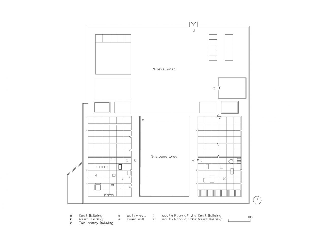
Fig. 5. Plan showing the main openings of Donald Judd’s La Mansana de Chinati. Drawn by author.
a: East Building
b: West Building
c: Two-Story Building
d: outer wall
e: inner wall
1: permanent installation in the south room of the East Building
2: permanent installation in the south room of the West Building (dashed line indicates doorway position shown on 1984 plan)
Like with the interior design project discussed in Section 2, Judd clarified the spaces at La Mansana de Chinati while respecting the existing conditions. Illustrative of this are the outer and inner walls, which are made of adobe and stand at a height of 9 feet (2.75 meters) to match the materiality and height of the existing buildings’ walls. But what stands out to me as being an important key to this renovation project is Judd’s idea of “reasonable asymmetry”. He uses this term when reflecting on the making of the hillside work, untitled (DSS 241) (Fig. 2), from earlier:
In 1970, . . . I worked out a large piece for the land of Joseph Pulitzer in St. Louis. It’s a rectangle of two concentric walls of stainless steel, the outer one level and the inner one parallel to the slope of the land. Since this is related to the land on which it is placed it is a reasonable asymmetry.17
As discussed, untitled (DSS 241) can be seen both as maintaining a passive stance towards its context and as being site specific because it is adapted to the sloped ground. If Judd considers this feature to be a “reasonable asymmetry”, then I believe similar asymmetries can also be identified in his renovation work. I would like to examine instances where they occur at La Mansana de Chinati by focusing on two aspects of the project.
First, let us consider the doorway openings of the East Building and West Building, some of which are positioned off-axis. The East Building has a large revolving door at the entrance of its north room that is aligned with the centerline of the building and with the openings leading into the middle room and south room (Fig. 5-1), so it establishes symmetry in a literal sense. However, the exterior entrance to its south room is located not on this axis but on the west wall, and it is aligned not with the center of the room but with the stairs leading to the second story of the middle room. One should be able to describe this as a reasonable asymmetry because Judd, while carefully reading the existing conditions just as he did at 101 Spring Street, chose to relate the opening to the stairs by giving priority to the clarity of the space over its symmetry.
The reasonable asymmetries occur in a more complex manner in the West Building, where only the middle room (library) has a centered entrance that establishes symmetry. There is also one particularly noteworthy feature that you may notice if you visit the site: the south room (Fig. 5-2) entrance is not centered on the room as shown on the plan drawing from 1984, but is positioned further south.18 What could be the reason for this? If Judd changed the position of the entrance after ’84, the off-centered entrance could be considered another reasonable asymmetry that was informed by the way he installed his works in the room. On the other hand, if he had already finished setting up the permanent installation by ’84, this would suggest that he deliberately drew the entrance in a different position from where it is in reality. This is intriguing because it would mean he prioritized establishing a symmetry in the drawing despite setting up a reasonable asymmetry in the actual space.
Second, let us consider the largest of the architectural interventions Judd made at La Mansana de Chinati: the concentric adobe walls. The outer wall that encircles the site at the same height as the walls of the existing buildings brings coherence to the relationships both between the block and its buildings and between the various structures. However, the inner U-shaped wall that slopes in response to the site’s topography is the one that ties the architectural composition together.
Between the two large buildings on the south side is being built an inner wall that slopes slightly with the land there. The rest of the area is level, as is the outer wall. The two walls and two areas, one sloped and the other level, make a work, I suppose both art and architecture, although usually the distinction is important. . . . The discrepancy of the walls is related to the idea . . . for the piece in St. Louis [i.e., untitled (DSS 241)].19
The inner wall has the effect of articulating the topography. And interestingly, it also serves the functional purpose of facilitating the drainage of the land:
The slight slope of half of the block and the problem of drainage suggested increasing the slope which was between the large buildings and leveling the remainder beyond the buildings, including the area around the two-story building. The break between the two areas bisects the block crosswise and provides drainage. The slope dips in two directions to the north-west corner at the low retaining wall of the break.20
The point to note here is that Judd applied the same technique from his earlier hillside work to the inner wall as a way of mediating the sloped ground—the contextual feature that he had previously only addressed passively—while also integrating it into an architectural solution for resolving the site drainage problem. Lastly, I should also point out that the entrance to the block also creates a reasonable asymmetry, as it is not centered on the outer wall but is instead positioned to relate to the inner wall.
Looking at these reasonable asymmetries together bring to light another architectural solution that Judd introduced at La Mansana de Chinati: a circulation sequence. That is, the asymmetries are set up so that viewers are naturally inclined to walk straight onward from the outer wall’s entrance and follow the inner wall into the galleries, first in the East Building and then in the West Building, where Judd meticulously developed his permanent installations. Each of the galleries is accessed via the doorway openings that have been positioned asymmetrically with careful consideration to how the works would be seen.
What Judd accomplished at La Mansana de Chinati was thus twofold: he utilized the concept he had developed through his earlier work to resolve the problem of drainage and introduced a circulation sequence that related the discrete spaces and objects on the site to one another. This was how Judd’s favored technique of creating reasonable asymmetries to relate his artwork to its context evolved into a technique for rationally determining the position of new walls and openings in his renovation work.
4. In Architecture: The Windows of Minimal Architecture
We have now looked at the architectural approaches Judd applied in an interior design project and a renovation project. In New York, he took a passive spatial approach with which he articulated the existing windows, while in Marfa, he applied his concept of reasonable asymmetry to the walls and openings, developing it into an architectural technique for resolving the issues of drainage and circulation.
Based on this examination, one could perhaps characterize Judd’s architectural approaches as being about articulating window openings. In fact, his artwork also contains many elements that evoke windows, such as the notions of peering in or drawing in light. If it is permissible to describe the act of articulating thresholds with the use of walls and skirting as a technique for creating openings,21 then one could go further to argue that Judd had a fundamental interest in creating three-dimensional windows, which is a highly architectural operation. This is why I believe his work can offer great insights into how we approach the design of interiors and renovations today and, additionally, provide an entry point for rethinking the relationship between architecture and Minimalism.
NOTES
1: Rosalind Krauss, for instance, draws a parallel between the perspectival effects created by Judd’s sculptural work and colonnades of classical architecture. Rosalind Krauss, “Allusion and Illusion in Donald Judd”, in Art in America 1945–1970: Writings from the Age of Abstract Expressionism, Pop Art, and Minimalism, ed. Jed Perl (New York: Library of America, 2014), 765. Originally published in Artforum 5 (May 1966).
2: Writings on Judd’s architectural work have been published within the Japanese architecture community, such as Tetsuzo Oshima, “Minimarizumu to ābanizumu: Donald Judd in Marfa” [“Minimalism and urbanism: Donald Judd in Marfa”], SD (March 1997), 56–60, and Oshima, “Donarudo Jaddo: Kūkan to ninshiki no konshisutanshii” [“Donald Judd: Consistency of space and perception”], SD (April 1999), 89–112, but few attempts to reinterpret or reframe his architectural work seem to have been made since the 2000s. More broadly however, there has been a resurgence of research that revisits his architectural work in recent years, such as Toru Arakawa, Donald Judd: Landscape and Minimalism (Tokyo: Suiseisha, 2019), and Rebecca Siefert, Into the Light: The Art and Architecture of Lauretta Vinciarelli (London: Lund Humphries, 2021).
3: According to the chronology compiled by Urs Peter Flückiger, Judd designed a total of 35 architectural works, and 19 of his 23 realized works are renovations. Urs Peter Flückiger, Donald Judd: Architecture in Marfa, Texas (Basel: Birkhäuser, 2007), 146–148.
4: John Coplans, “An Interview with Don Judd”, in Donald Judd: Selected Works, 1960–1991Art, Saitama, and The Museum of Modern Art, Shiga (Saitama: The Museum of Modern Art, Saitama, 1999), 162. Originally published in Donald Judd and John Coplans, Don Judd (Pasadena: Pasadena Art Museum, 1971), 19–63.
5: “[O]ne of the first three-dimensional ones started off as a piece of canvas from a failed painting that I tried to turn up, but I couldn’t make the canvas turn up evenly. . . . I went from low to high relief and then to free-standing works.” Coplans, “An Interview with Don Judd”, 155.
6: As all of Judd’s works are untitled, I am referring to them using the “DSS” numbering system of his 1975 catalogue raisonné. Donald Judd: Catalogue Raisonné of Paintings, Objects and Wood-Blocks 1960–1974 (Ottawa: National Gallery of Canada, Ottawa, 1975), 91–280.
7: “In a shift from the first half of the 1960s, when the impetus to overcome pictorial illusionism to instead attain reality sparked a fascination for creating autonomous presences in the form of ʻobjects’, with focus being directed to fundamental structures (primary structures) and non-relationality (Minimal Art) as the means for achieving this, the latter half of the 1960s saw a growing awareness that the autonomy of such presences should be understood as being relative rather than absolute. . . . There came a realization that when objects bearing concepts of form collapse, they are reduced to general ʻthings’ or ʻmaterials’, and . . . things and materials exist either within some system of its mode of existence (e.g., numerical sequence, repetition, layers, etc.) or within some phase of a transformational process. . . . This hence opened up the possibility of an art in which things or raw materials are employed to express the autonomy of presence in a relative manner—by surrendering to the influence of gravity, for example—and without relying on concepts of form: an art of materiality. And so emerged the anti-form, which favors the use of soft, malleable materials such as rubber and felt, and the earthwork, which uses the accumulation, displacement, and scattering of earth and stone as its means.” Toshiaki Minemura, Chōkoku no yobigoe [The call of sculpture] (Tokyo: Suiseisha, 2005), 116–117.
8: Judd also developed other works that respond to the physical features of their sites, including on the sloped floor of New York’s Guggenheim Museum and the hilly site of Philip Johnson’s Glass House.
9: Donald Judd, “21 February 1993”, in Donald Judd Writings, ed. Flavin Judd and Caitlin Murray (New York: Judd Foundation and David Zwirner Books, 2016), 811. Originally published in Donald Judd: Large-scale Works (New York: Pace Gallery, 1993), 9–13.
10: Judd purchased the building for $68,000 in February of the same year. The SoHo neighborhood became home to many artists’ loft studios from the 1960s and art galleries during the mid-’60s to ’70s.
11: Donald Judd, “101 Spring Street”, in Donald Judd: Architektur (Münster: Westfälischer Kunstverein, 1989), 18.
12: Donald Judd, “Judd Foundation”, in Donald Judd Writings, 285. Originally published in Donald Judd: Complete Writings: 1975–1986 (Eindhoven: Van Abbemuseum, 1987), 9–10.
13: Judd, “21 February 1993”, 812.
14: “I was always interested in edges and flanges. . . . It defines what the boxes are made of by showing the thickness of the sheet metal, and thus becomes less arbitrary, more rigorous, with a more precise knowledge of the thickness of the material. So it shows, or makes, or emphasizes the edge more clearly.” Coplans, “An Interview with Don Judd”, 162.
15: Nina Murayama, Functional Art in a Dysfunctional Society: Donald Judd’s Furniture (Tokyo: Bunshindo, 2015), 78.
16: Judd, “Symmetry”, in Donald Judd: Architektur, 190–192.
17: Judd, “Marfa, Texas”, in Donald Judd Writings, 426.
18: Judd, “Marfa, Texas”, 430. Judd did not leave behind any architectural drawings that he drew himself, and the materials preserved by the Judd Foundation consist mostly of rudimentary sketches. The plan published in the catalogue Donald Judd: Arkitektur, published for the solo exhibition that he held in Münster, Germany, was produced for the purpose of the exhibition, and it is dated 1984.
19: Judd, “Marfa, Texas”, in Donald Judd Writings, 430.
20: Judd, “Mansana de Chinati”, in Donald Judd: Architektur, 50.
21: Hiroshi Hara, “Kyōkairon” [Boundary theory], in Kūkan: Kinō kara yosō e [Space: From function to modality] (Tokyo: Iwanami Shoten, 1987), 131–175.
Top image: © 2024 Judd Foundation / JASPER, Tokyo E5493
Shimpei Terada
Born 1990 in Tokyo, Japan. Studied at the ETH Zurich in 2015. Worked at Christ & Gantenbein (Basel) in 2016. Completed a master’s degree in architecture with a focus on urban history at The University of Tokyo in 2018. Previously employed at Mtka (Murayama + Kato Architecture), where he had worked on projects such as Ceiling and Ellipse (2018), FIL Fukuoka (2019), Peerless (2019), Go-Sees Aoyama (2020), Go-Sees Premier (2021), Wota Office Project (2021), and Music (2023). Currently, a co-principal of ManyConf (Many Conference). He has been developing media projects with the aim of establishing a platform for bridging architecture and its related fields. Founded W/ in 2023. He also designs and writes independently.
