Gerrit Rietveld – A sense of space
27 Mar 2023
Gerrit Rietveld (1888-1964) is perhaps Holland’s best-known architect. His Schröder House in Utrecht from 1924 has achieved iconic status. In fact, Rietveld built around 100 houses, and of these very little is known. Dutch photographer Arjan Bronkhorst (b. 1972), who established his credentials in 2013 with the bestseller Grachtenhuizen/Amsterdam Canal Houses, went in search of these unknown Rietveld houses. For his new book Wealth of Sobriety/Weelde van de eenvoud he documented 20 authentic Rietveld houses and portrayed the residents in their interior.
Gerrit Rietveld was born in 1888 as son of a furniture maker at Utrecht, The Netherlands. After working for his father, he started his own furniture workshop by 1917. By that time, he was also working as a graphic designer. He had an interest in architecture, attending part-time educational programs during his evening hours. By his design work on furniture as well as interiors, Rietveld gradually started out as an architect. His first house assignment would turn out to be his most famous one, the house for Truus Schröder at Utrecht in 1924. He would never built anything so exceptional and avant-gardistic anymore after that first project. However, he would built another 100 houses, well designed with outstanding interiors and world class furniture. Yet many of his houses are modified by consecutive owners and have lost the architect’s spirit. A few of Rietveld’s houses still exist in meticulous state today, almost all of them in The Netherlands.
-
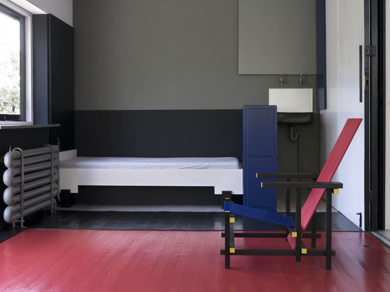
Schröder House interior, Utrecht, The Netherlands, 1924
What inspires me as a photographer about Rietveld? The clarity of his designs and the sober genius of his interiors. Let me explain. Rietveld’s houses have a light and spacious character. Lines and planes dominate his designs. It is the interplay of lines and light that fascinates me about his houses time and time again. Sobriety was a basic principle for Rietveld. This ideal of sobriety in his designs derived from a general philosophy he applied in life: ʻEverything we find useful we use immediately and I believe we exercise far too little sobriety,’ Rietveld commented in 1958.
Rietveld is probably The Netherlands’ most famous architect. Yet more than an architect, I like to think of Gerrit Rietveld as an artist. An ʻartist of space’. For Rietveld, building was about creating space. And besides his eye for space, he also had an eye for ‘non-space’. Non-space is the tangible matter, the solid boundary of a space. In his view it restricts the sense of space. Yet he needed it, without a house would collapse. As Rietveld himself remarked: ʻArchitecture is never about closure; it is a boundary of the here and there, the above and the below, the between and the around.’
-
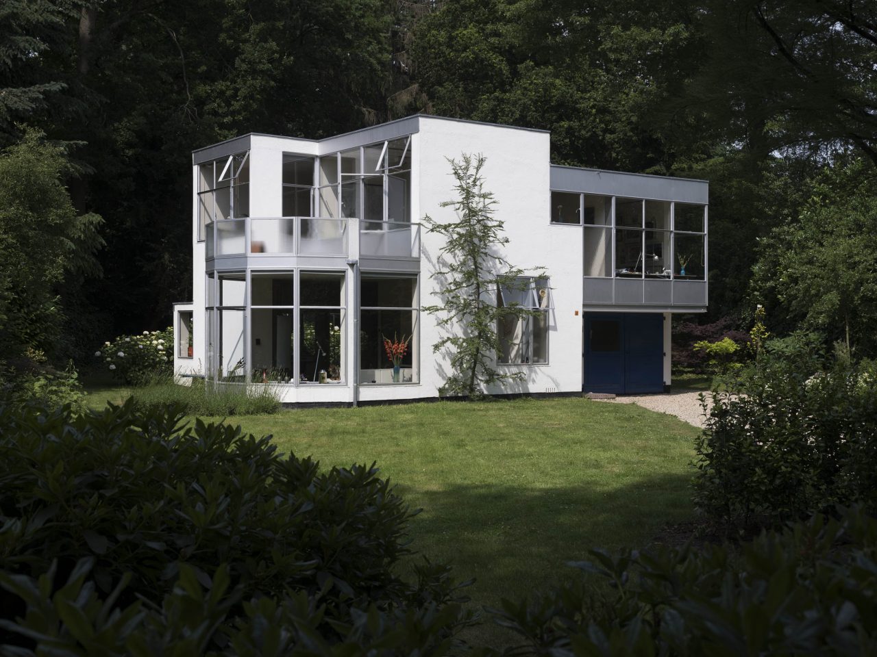
Hildebrand House, Blaricum, The Netherlands, 1935
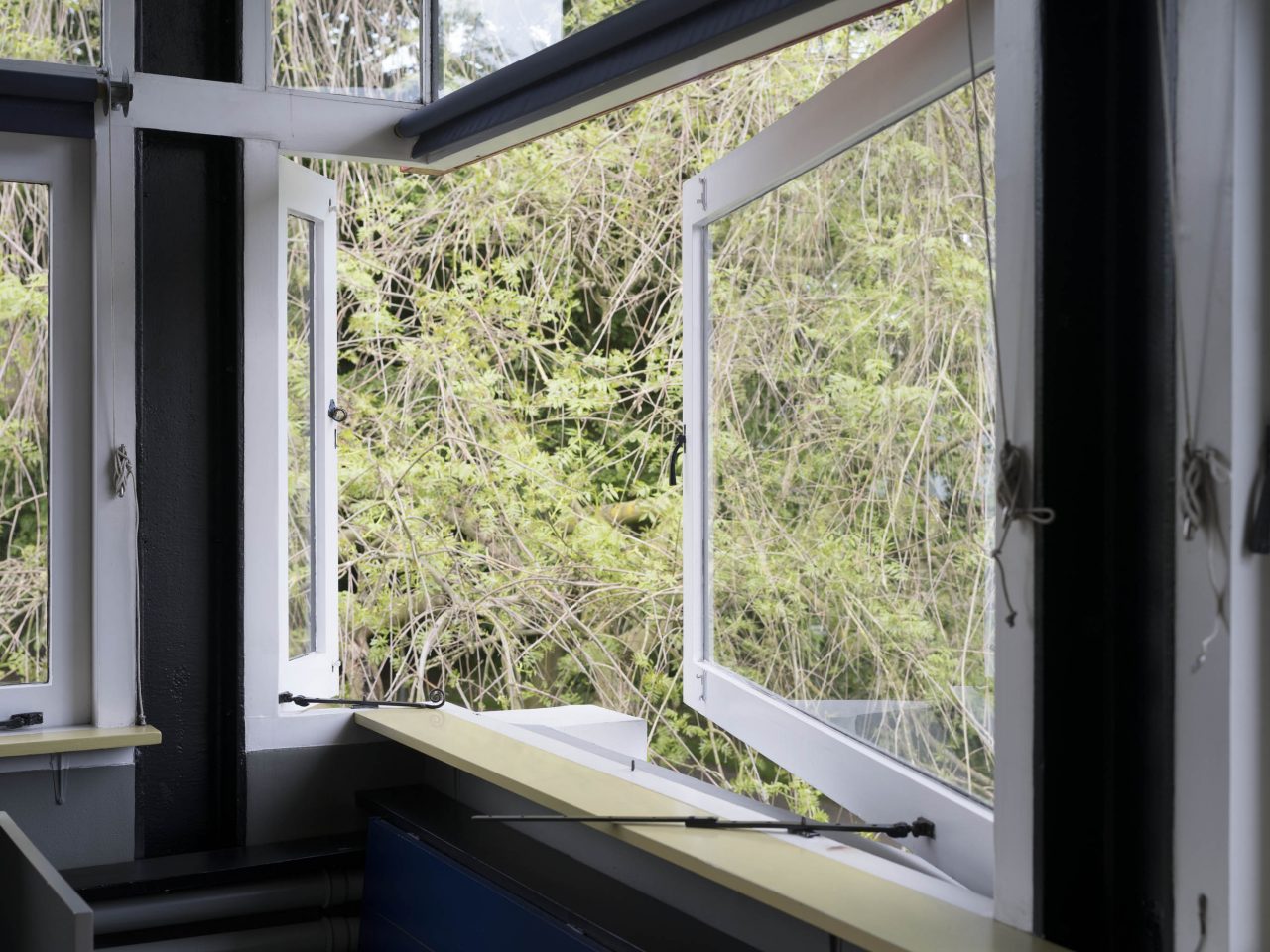
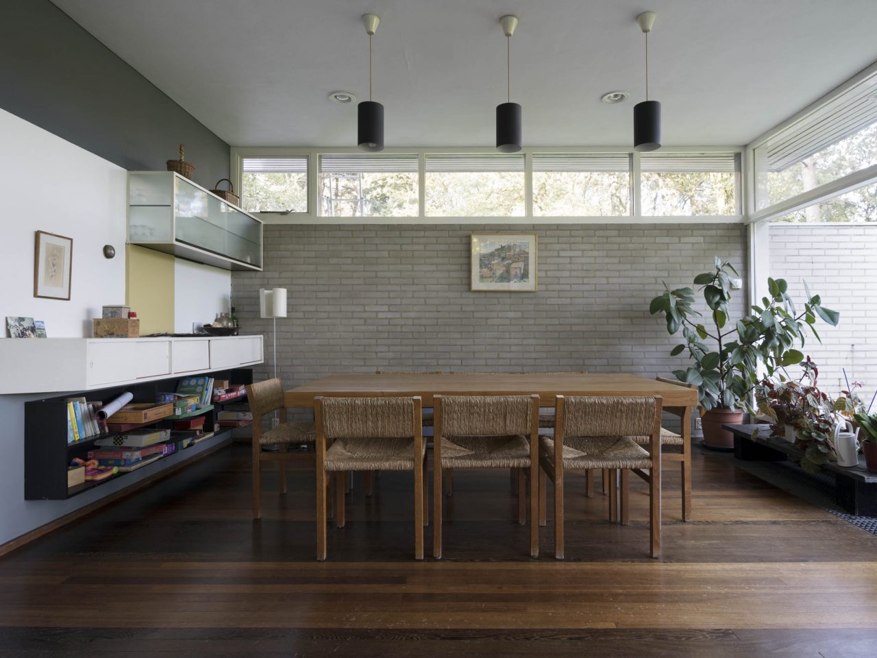
Rietveld’s houses are rather compact, meeting their client’s budget restrictions. In comparison to the villas of some of his contemporaries such as Mies van der Rohe and Le Corbusier for instance, Rietveld’s houses are frankly small. He usually began designing a house from the interior and managed to fit in all functions on a modest floorplan. By not totally enclosing houses and rooms, Rietveld conveyed a sense of space. So he bounded areas with both tangible and open planes in interior and exterior walls. He also used ʻoptical planes’. Light was a key tool, if not his principal guide. Using panoramic windows, top windows, roof lights, frosted-glass ceiling lights, open stairs and sliding doors he was able to give a house a particular sense of space. He created a fluid transition between inside and outside.
Besides light, colour was another key tool for Rietveld in creating space. Rietveld focused more on the way different colours reflect light than on the actual hue. He used light colours to bring an object closer, and dark colours to make them look more distant. In Schröder House, colours on the floor indicate how different areas are used, even when the folding walls are retracted. Colours indicating boundaries, like two-dimensional walls. By giving windows that could open a darker colour than fixed windows, he made the white window frames look from the outside as if they had the same width, creating a calm pattern.
-
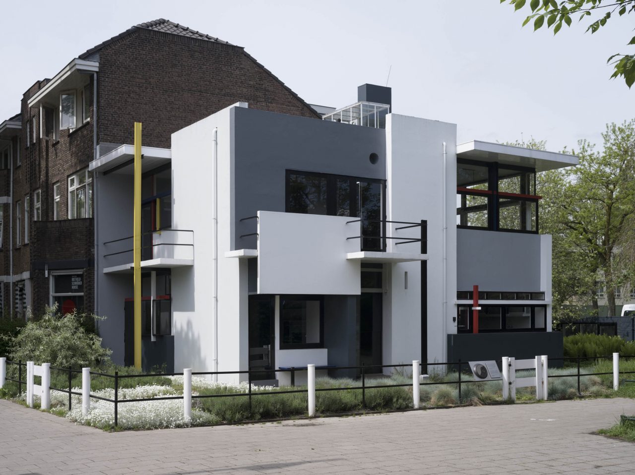
Schröder House, Utrecht, The Netherlands, 1924
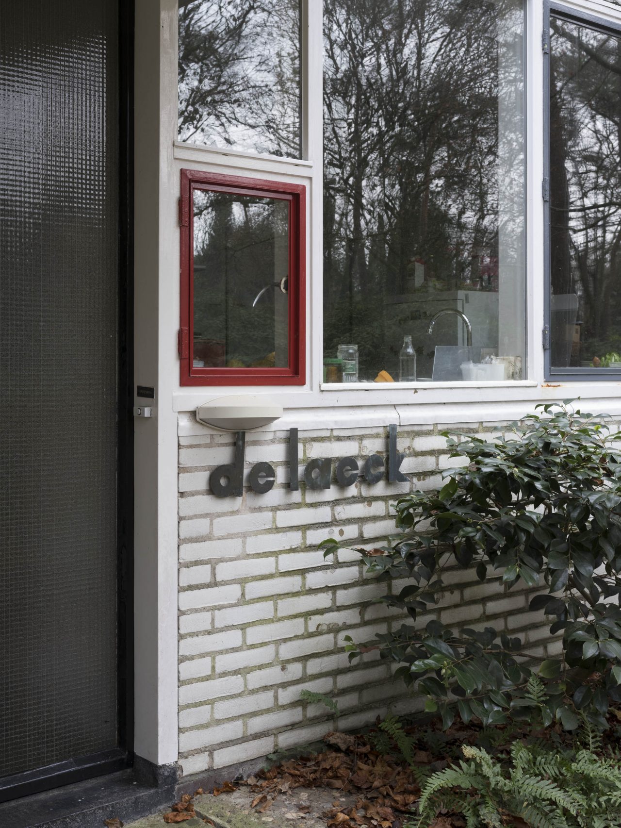
Unlike Schröder House, the colours in many of the houses that I visited for the book Wealth of Sobriety in no way resemble the bright primary colours of De Stijl (red, yellow, blue). Or at least not in juxtaposition. I often encountered surprisingly soft colours. Perhaps the years had helped the brighter colours fade a bit. The cupboards were usually painted beige, or sometimes grey. Even a soft light blue. Doors were often a soft green or a soft yellow. On iron doors, many of which divided into two, I saw red and blue in various shades, and olive green. In Hildebrand House, at Blaricum, Rietveld had given the interior doors a vertical coloured strip, with a different colour for each room. Window frames were painted silver, white, black, grey, beige, blue, yellow and red. Although rarely combined.
When implementing windows in his residential houses and apartment buildings, the direction of light and view from the window were key elements for Rietveld. A notorious story goes that Rietveld would bring an empty window frame on scouting visits to see how the view would look like from the future windows. He liked to use a lot of glass, sometimes comprising most of the facade, for example with the block of four houses at Erasmuslaan, Utrecht (1931) but also at his own apartment on top of the Vreeburg Cinema at Utrecht (1936).
-
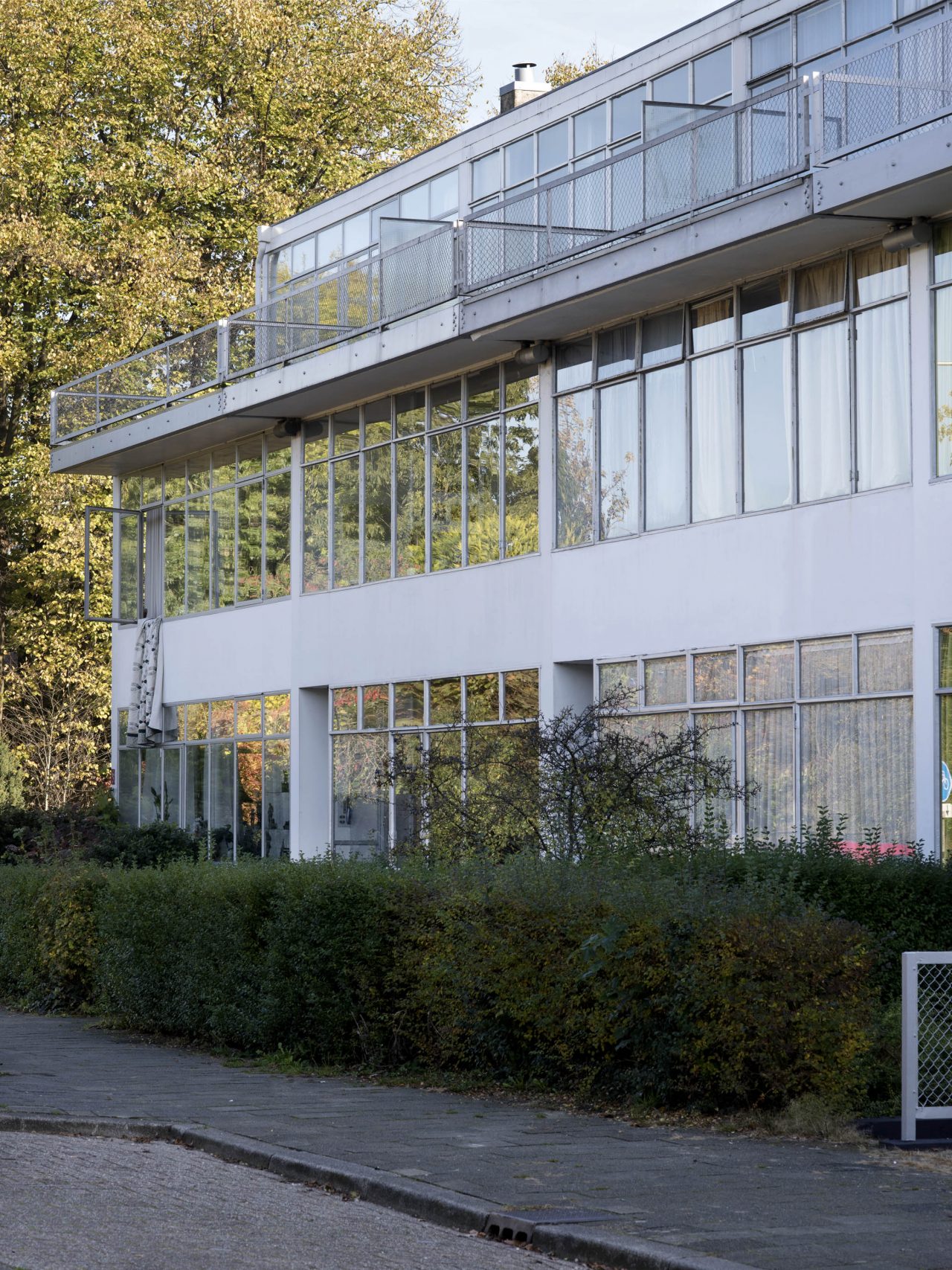
Block of four houses at Erasmuslaan, Utrecht, The Netherlands, 1931
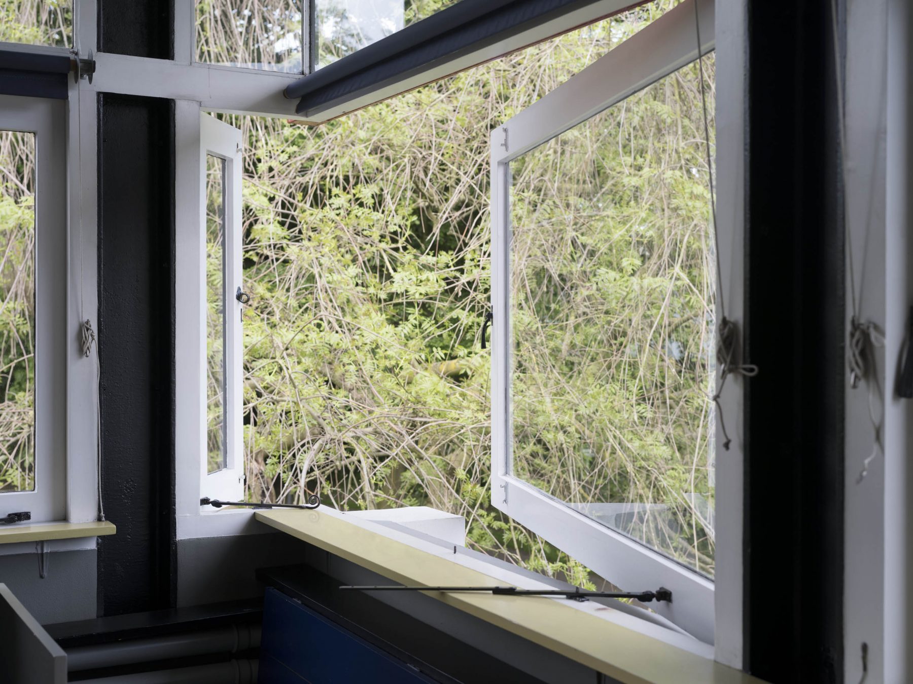
Rietveld’s windows might seem identical at first, until you look more careful. Then the details and the differences between the various planes start to appear. For example the surface composition of large lower windows and small horizontal top windows, and the use of clear glass and textured glass. As a result, a Rietveld house is immediately recognisable, and yet never the same.
When we take a closer look at the way Rietveld designed his windows, we see a wide variety throughout his residential houses oeuvre from 1924 until 1964. A further distinction can be made with the materials that he used. In his early houses in the 20’s he used wooden frames. In the 30’s and 40’s, he used primarily steel frames on his detached villa’s, according to the modernist fashion of Bauhaus in Germany and the Nieuwe Bouwen (or International Style) in The Netherlands. From the 50’s on, when he started to build single-storey bungalows with large overhang roofs, Rietveld used a mix of wooden and steel frames, for the windows as well as for the doors.
Especially Rietveld’s steel frames that he used in the 30’s and 40’s are of great beauty. These are very sleek designed and well proportioned. The steel frames were painted in appealing colors like light blue, olive green, or dark red. But most striking steel frames were the ones that were painted in a brilliant silver-grey finish. See the first photo of this article of Hildebrand House (Blaricum, 1935) or take a look at the photo of Mees House (Den Haag, 1936) below.
-
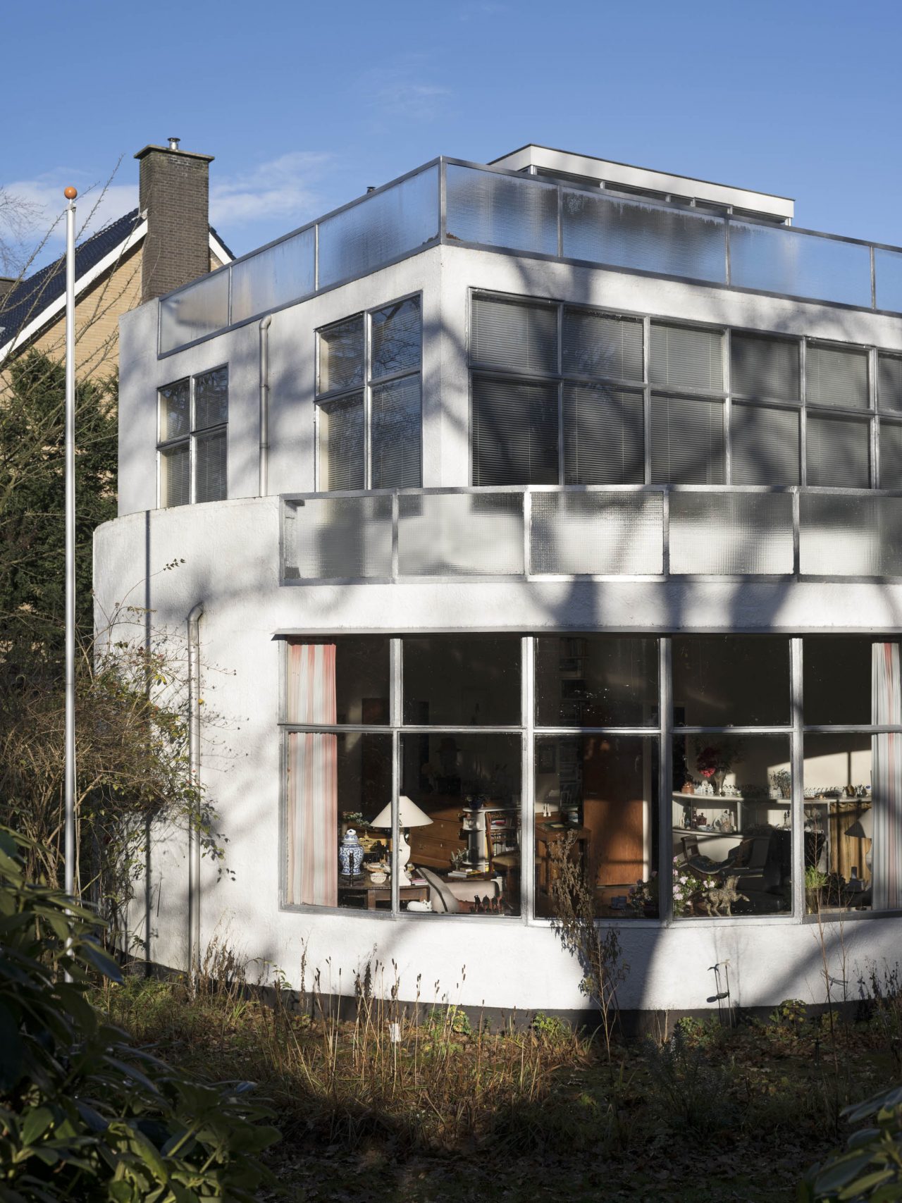
Mees House, Den Haag, The Netherlands, 1936 -
Mees House, Den Haag, The Netherlands, 1936
The most striking window design by Rietveld is undoubtedly the corner window on the first floor of Schröder House. To emphasize the feeling of being outside, while being inside the house, he omitted the corner column of this window. In this way, Truus Schröder would have an unobstructed view into the garden. Rietveld cleverly designed the corner of the living room to be able to transform from limited non-space into limitless space. After he implemented the same principle on the corner windows of the first and ground floor of Lommen House (Wassenaar, 1926) this unique window design would never be seen again in any of his houses. Regretfully, Lommen House was destroyed by a V2-missile in 1944. Rietveld did use this spacious principle on other aspects of his houses such as terrace overhang roofs.
-
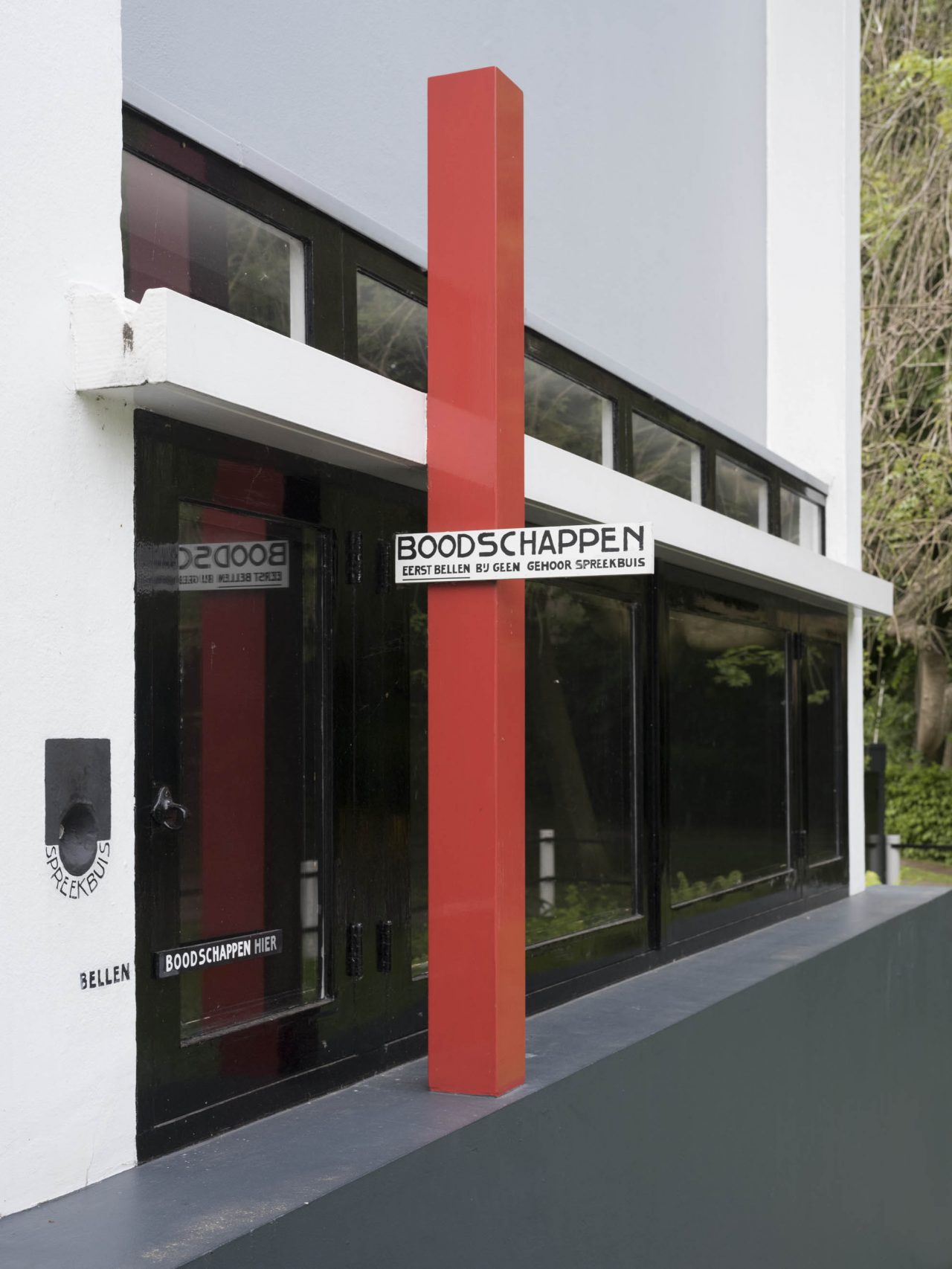
Schröder House, Utrecht, The Netherlands, 1924
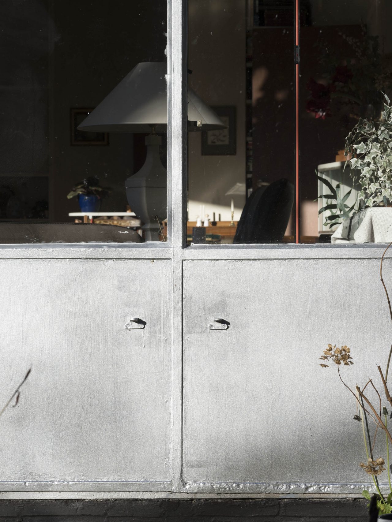
Regularly, Rietveld designed a delivery window in the kitchen wall to enable the baker and milkman to drop off their supplies directly into the kitchen. These delivery windows were painted bright red to ensure they would not be missed. Delivery windows can be found throughout Rietveld’s work, from Schröder House in 1924 until Kronenberg House in 1963. Some of his houses seem to have a delivery window but were not painted in a bright color such as Brandt Corstius Summerhouse (Petten, 1939) and Székely House (Bloemendaal, 1934). The delivery window at Schröder House was also just black, but had a separate red coloured signpost with the text ʻboodschappen’ (Dutch for groceries) that indicated clearly where the milkman could leave his merchandise. Other houses such as Slegers House (Velp, 1955) do have a red painted kitchen window while the kitchen is actually not situated at the roadside and therefore seem to ignore a proper delivery function.
-
Schröder House, Utrecht, The Netherlands, 1924 -
Kronenberg House, Wageningen, The Netherlands, 1963
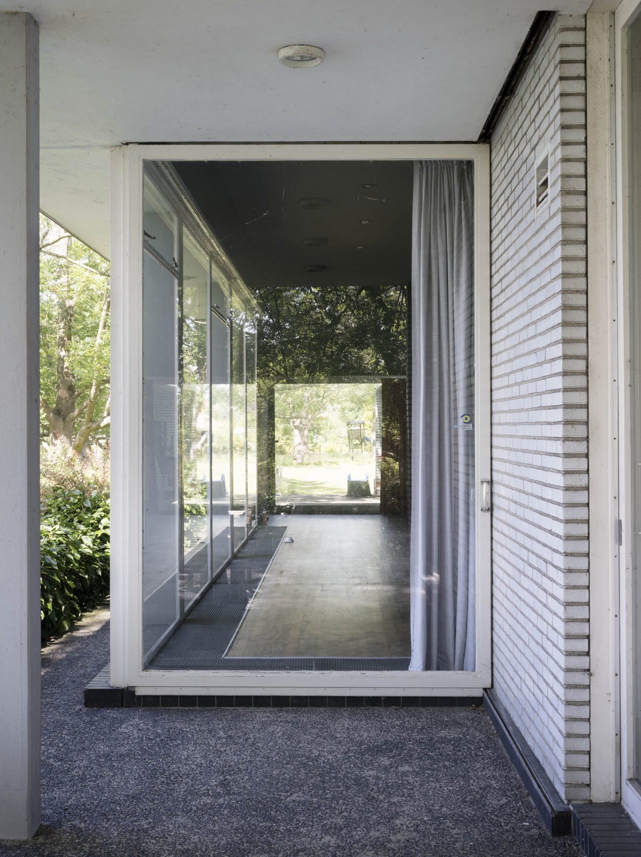
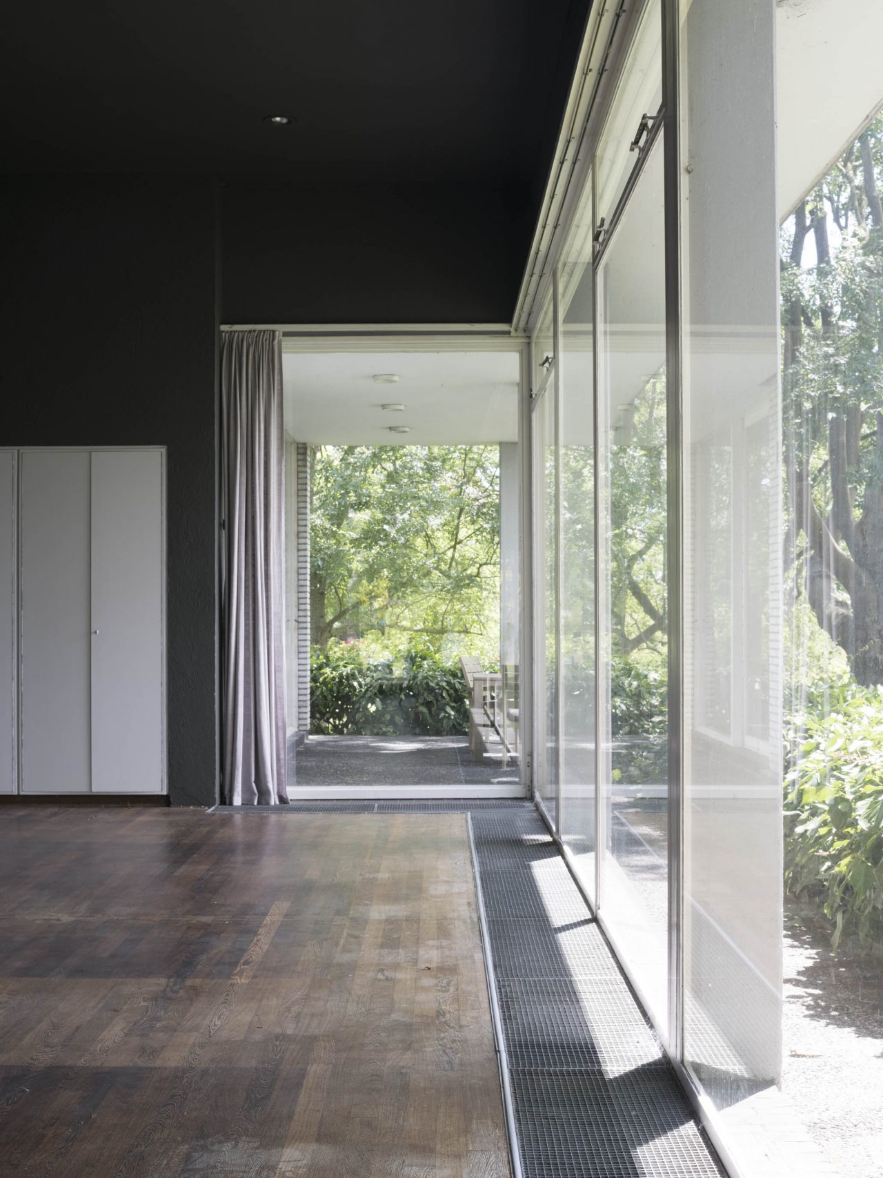
Rietveld designed large windows for his houses but rarely would they cover the whole facade from ground to ceiling in his pre-war designs. When he started to design bungalows after the war he used larger panes, sometimes covering complete walls or hallways. Throughout his work he used glass doors to give entrance to terraces or balconies. For Van den Doel House at Ilpendam (1959) he designed a very special glass door that could shift away from its frame completely using sliding rails. Fully opened it would rest alongside the exterior wall. By designing the door in this way, the interior floor would continue seamlessly on to the exterior terrace floor, attracting the outside space towards the inside space and vice versa. Rietveld was not the only architect experimenting with this construction. In 1932 for example, architects Ben Merkelbach and Charles Karsten designed two large multi-panel glass doors for the Dijkstra Summerhouse at Groet that could slide away completely from their frames, opening the two ground floor facades in the south corner.
-
Van den Doel House, Ilpendam, The Netherlands, 1959 -
Van den Doel House, Ilpendam, The Netherlands, 1959
From the 50’s on, Rietveld designed mainly bungalows, consisting of several parts with sometimes a separate bedroom wing. In many of these one-storey houses, he designed a multilevel roof in order to place horizontal strips of small skylight windows. Not only would these high placed windows bring extra light into the interior but also would it enhance the spacious feeling. As a bonus, the exterior would look much more attractive. This type of roof design is very prominent with Van Daalen House at Bergeijk (1960).
-
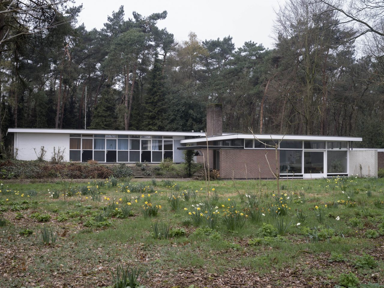
Van Daalen House, Bergeijk, The Netherlands, 1960
-
Van Daalen House, Bergeijk, The Netherlands, 1960
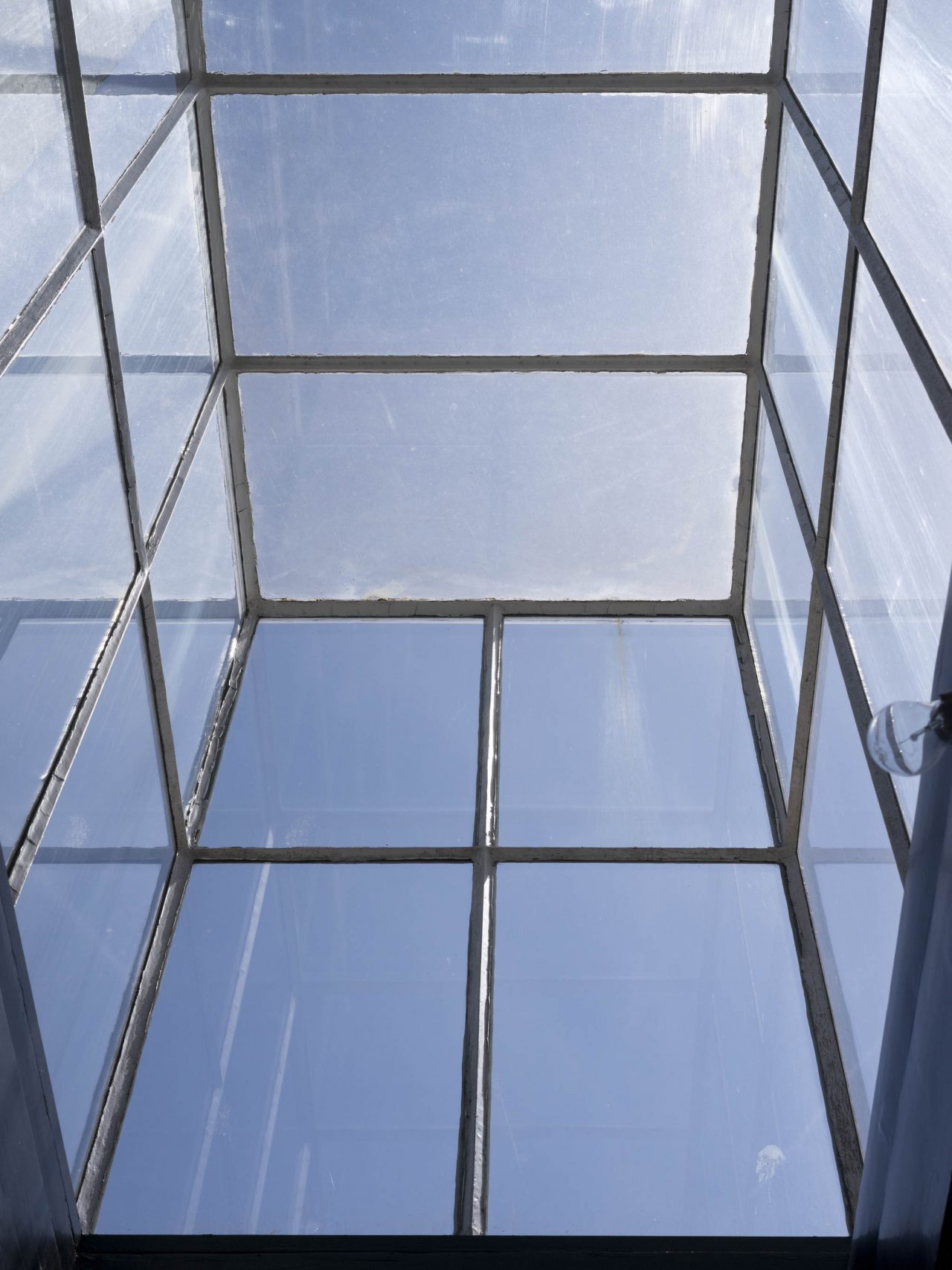
Rietveld also designed many roof lights or skylights, for daylight penetration as well as artificial lighting and sometimes both. Occasionally, Rietveld would design a whole glass house standing on the roof, functioning as a skylight but also providing roof access. He implemented such three dimensional skylights for instance on his first project Schröder House and on top of Mees House (Den Haag, 1936).
-
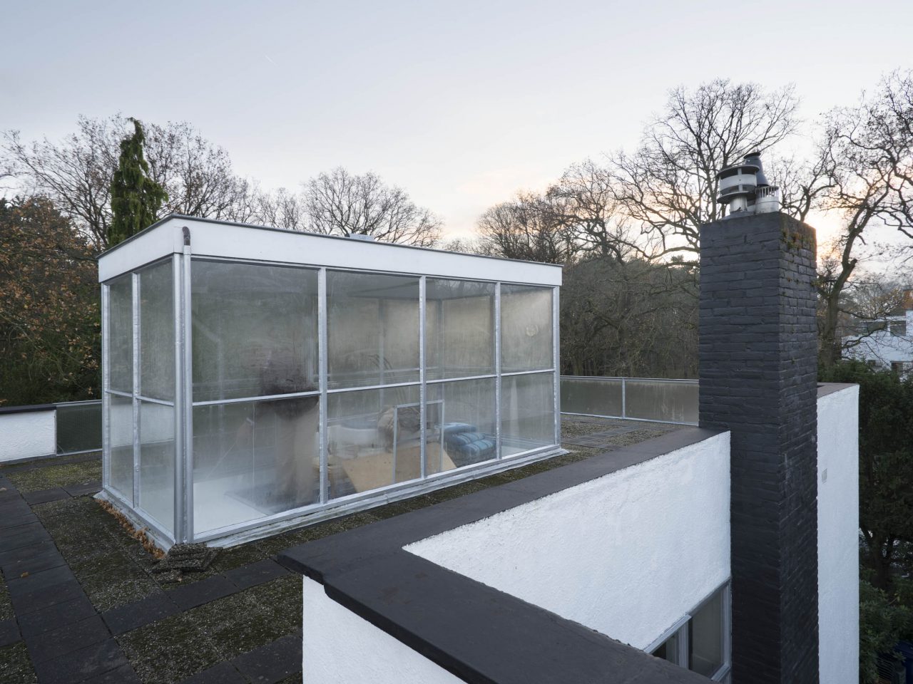
Mees House, Den Haag, The Netherlands, 1936
-
Schröder House, Utrecht, The Netherlands, 1924
Rietveld’s houses in its authentic condition are still unique today. He had a strong vision on functionality and aesthetics. Construction was to follow his ideas. Throughout his career, Rietveld remained the artist and craftsman he had always been since the beginning. His houses can be characterized as pieces of spacious art, just like his furniture. Rietveld’s windows are a defining element to achieve his sense of space.
Arjan Bronkhorst
Amsterdam, February 2023
All photos are protected by copyrights © Arjan Bronkhorst. All designs of Gerrit Rietveld are protected by copyrights managed by Pictoright in Amsterdam.
Literature
Bless, F., Rietveld 1888-1964. Een biografie, Amsterdam/Baarn 1982.
Bronkhorst, A., I. Van Zijl, W. Zwikstra, M. van den Eerenbeemt, Weelde van de eenvoud / Wealth of sobriety, Amsterdam 2018.
Brown, T.M., The Work of G. Rietveld Architect, Cambridge/Utrecht 1958.
Krabbe, C.P., D. Broekhuizen and N. Smit, Huizen in Nederland in de negentiende en de twintigste eeuw, Amsterdam/Zwolle 2018.
Küper, M., and I. van Zijl, Gerrit Th. Rietveld 1888-1964. Het volledige werk, Utrecht 1992.
Rietveld, G., ʻLezing voor de kleurendag – 17 november 1962, Amsterdam’.
Rietveld, G., ʻTweede min of meer herhaalde lezing tijdens de architectuurtentoonstelling in het Centraal Museum te Utrecht’.
Rodijk, G.H., De huizen van Rietveld, Zwolle 1991.
-
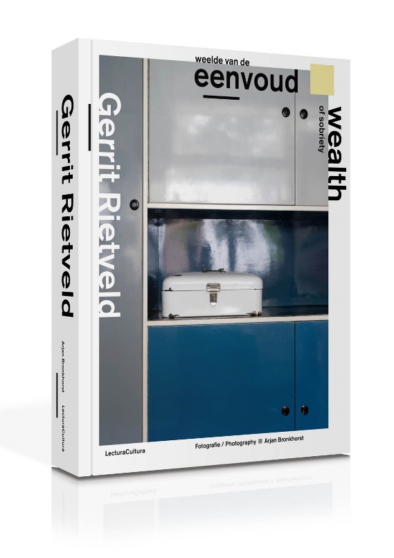
Gerrit Rietveld – Wealth of Sobriety
Photography Arjan Bronkhorst
Texts by Arjan Bronkhorst, Ida van Zijl, Willemijn Zwikstra, Marc van den Eerenbeemt
ISBN 978 90 8213 54 66
Hardcover, 24,5×31 cm, 528 pages, 388 photos, Dutch/English
Arjan Bronkhorst
Arjan Bronkhorst (b. 1972) is a photographer from Amsterdam. He began taking photos at an early age. Having started out in the corporate world, twenty years ago he decided to continue as a professional photographer. He specialises in architectural and interior photography, particularly historical buildings and monuments. He is also much sought after for his unique portraits. His clients include publishers, magazines, governments, architects and companies. In 2013 he published the best-selling photobook Grachtenhuizen, about the interiors and residents of the majestic 17th century Amsterdam canal mansions. In 2016 his photos of 100 Dutch church interiors were published in the book Kerkinterieurs in Nederland. In 2018 he published the book Weelde van de eenvoud / Wealth of sobriety, about his photo project about authentic Rietveld houses and interiors. He also portrayed their residents. His work was displayed in solo exhibitions by the Amsterdam Museum and the Centraal Museum at Utrecht.
RELATED ARTICLES
-
Jean Prouvé’s Windows
Four Tectonic Features that Reside Within Prouvé’s Window Details
04 Aug 2021
The Bauhaus and Its Influence in Japan
09 Jul 2021
Window Behaviorology in Switzerland
A Conversation with Peter Märkli
17 May 2021
Windows of Japanese Modernist Architecture
The Tatebayashi City Hall: Windows as Instruments for Municipal Communication
23 Jun 2026
NEW ARTICLES
-
Windows of Japanese Modernist Architecture
Hoshun Yamaguchi and Nobuko Yoshiya’s Forever Homes: Appreciating the Breadth of Isoya Yoshida’s Designs
09 Jun 2026
Window Behaviorology on Nordic Architecture
Alvar Aalto
Enso-Gutzeit Co. Headquarters16 Apr 2026
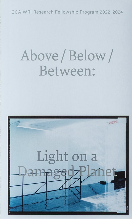
CCA-WRI Research Fellowship Program 2022–2024
Above/Below/Between: Light on a Damaged Planet31 Mar 2026
Contemporary Taiwan through a Window
Issue 17: The Angel Wings of the Overseas Chinese in Southeast Asia : The Kinmen Islands (Part 2)
17 Mar 2026