Series Windows of Japanese Modernist Architecture
The Prince Karuizawa: The Materiality of Kiyoshi Seike’s Windows
12 Oct 2023
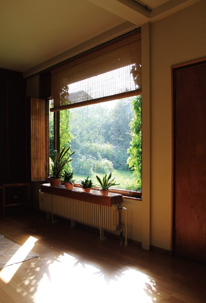
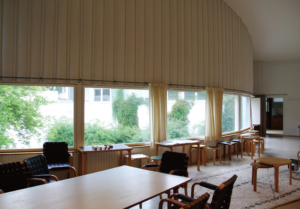
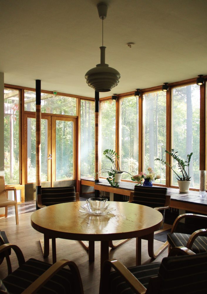
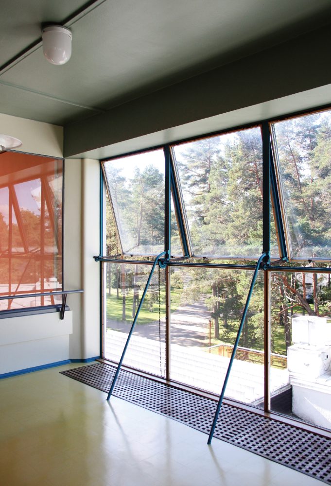
The New Karuizawa Prince Hotel (now The Prince Karuizawa) built in 1982 was designed by Kiyoshi Seike. Seike is known as the architect of a number of Prince hotels locations, with Karuizawa being the first. Comprising a public wing and an accommodation wing, the hotel is thoughtfully designed to harmoniously engage its rich natural surroundings through a variety of openings, such as picture windows that frame a view of the majestic Mount Asama for each of its guest rooms. Architect Fuminori Nosaku guides us through these openings, providing insight into how Seike’s architectural ethos are manifested in their design.
We visited The Prince Karuizawa during the fresh, verdant days of May. As we approached the building, we could catch glimpses of its brown roof and rows of repeated windows through the larch trees. When writing about windows [normally written in Japanese as 窓 and pronounced mado], Seike is known for using the term 間戸 [mado; lit. “gap door” or “bay door”]. He did so based on the view that the Japanese word for window must have originally described “a door fitted into a bay”, making it distinct from its English counterpart “window”, which is etymologically derived from “wind-eye” and implies an opening designed as a hole in a wall in the manner of a traditional European window. In other words, he believed that Japan’s windows evolved from doors such as shōji [translucent screens] and fusuma [opaque screens], which are used to cover the gaps between columns to partition interior and exterior spaces in Japanese timber-frame architecture. In this article, I would like to examine the openings that Seike designed for The Prince Karuizawa.
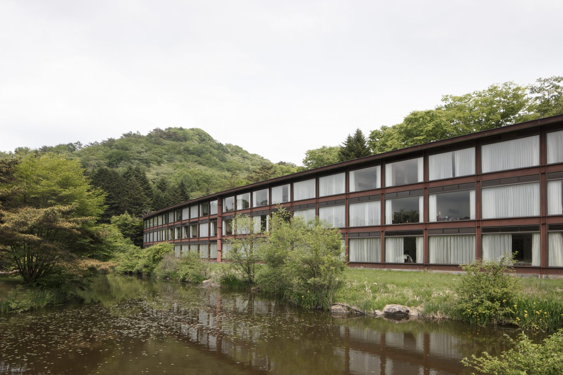
First, let us look at the hotel as a whole. The accommodation wing is a 126-meter-long, three-story building formed as an arc with a radius of 300 meters, and it is joined at its east end to the public wing, which houses the lobby and a restaurant. The public wing sits over the edge of a pond, allowing one to take in the view out to a golf course and Mount Asama beyond. Supposedly, the curved design initially encroached on the golf course plan developed by Yoshiaki Tsutsumi, the project owner, but Seike’s proposal was given priority, and the course was redesigned.
-
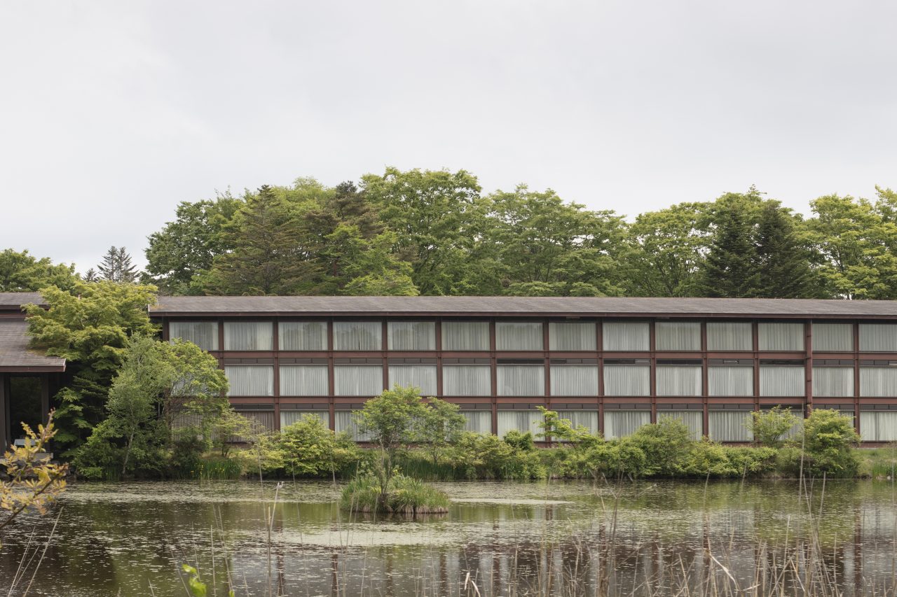
View of the hotel from across the pond on the north side. The public wing is visible on the left.
This raises the question, why is the long accommodation wing designed with a gentle curve? All the guest rooms on each story are arranged in a single row on one side of a corridor to capture the view towards the golf course and Mount Asama. The guest rooms number 108 in total (each of the three stories has 36 rooms). Contrary to descriptions of the rooms as mass-produced units, the building plans show that they are constructed of cast-in-place reinforced concrete. Presumably, they are so described because the repeated rooms have identically dimensioned layouts and furnishings. Seike undoubtedly must have felt uneasy about arranging the rooms in a straight line extending over a distance of 126 meters. Rather than dividing them into separate blocks or staggering them, however, he opted for the solution of laying them out in a single sweeping arc to create a majestic volume that engages the pond and golf course along its entire length.
Hotel corridors tend to become monotonously long and straight spaces, but the curve prevents this by concealing the view ahead. Hotel corridors also tend to be dimly lit, but here they are lined from floor to ceiling with glass blocks, making them the brightest spaces in the building. Seike likely chose to use the glass blocks out of consideration for privacy, as they protect guests from being fully exposed to eyes on the street side when walking in the corridors.
-
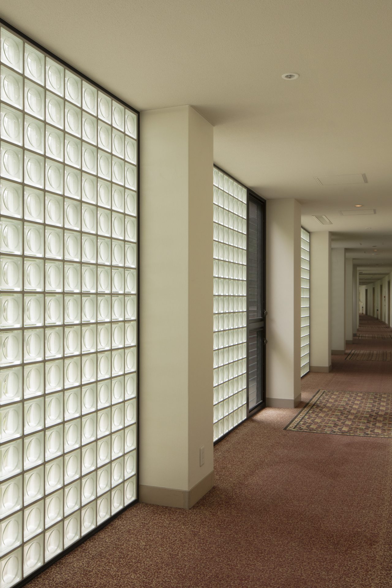
Sunlight streams in through the glass blocks along the accommodation wing’s corridors. -
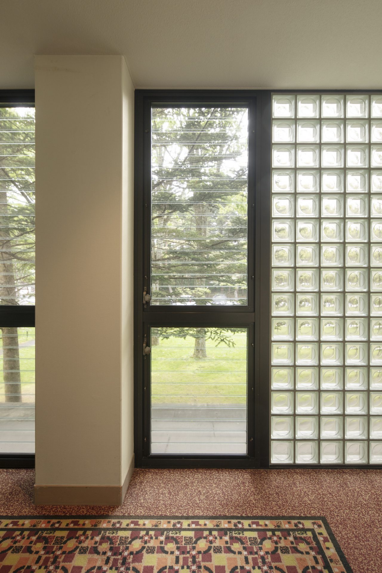
Interior view of the corridor-side façade.
Now, I would like to explain in more detail about the windows in the corridors and guest rooms. The corridor windows are composed of glass blocks and jalousies. The glass blocks are positioned to appear flush with the concrete columns when seen from outside, so the columns emerge inside the corridor as a result. Generally, most would avoid making obstructive columns in a corridor, but Seike gave priority to achieving a flush elevation. Inside, the line of columns running along the arc create a rhythmic effect. The stacked glass blocks, each measuring 145 millimeters square, fill up the gap between the floor and ceiling perfectly. This suggests that the ceiling heights were set based on the standard dimensions of the blocks. Installed next to the glass blocks are two tiers of off-the-shelf aluminum-frame jalousies for ventilation. They are handle-operated and equipped with screens on the inside.
-
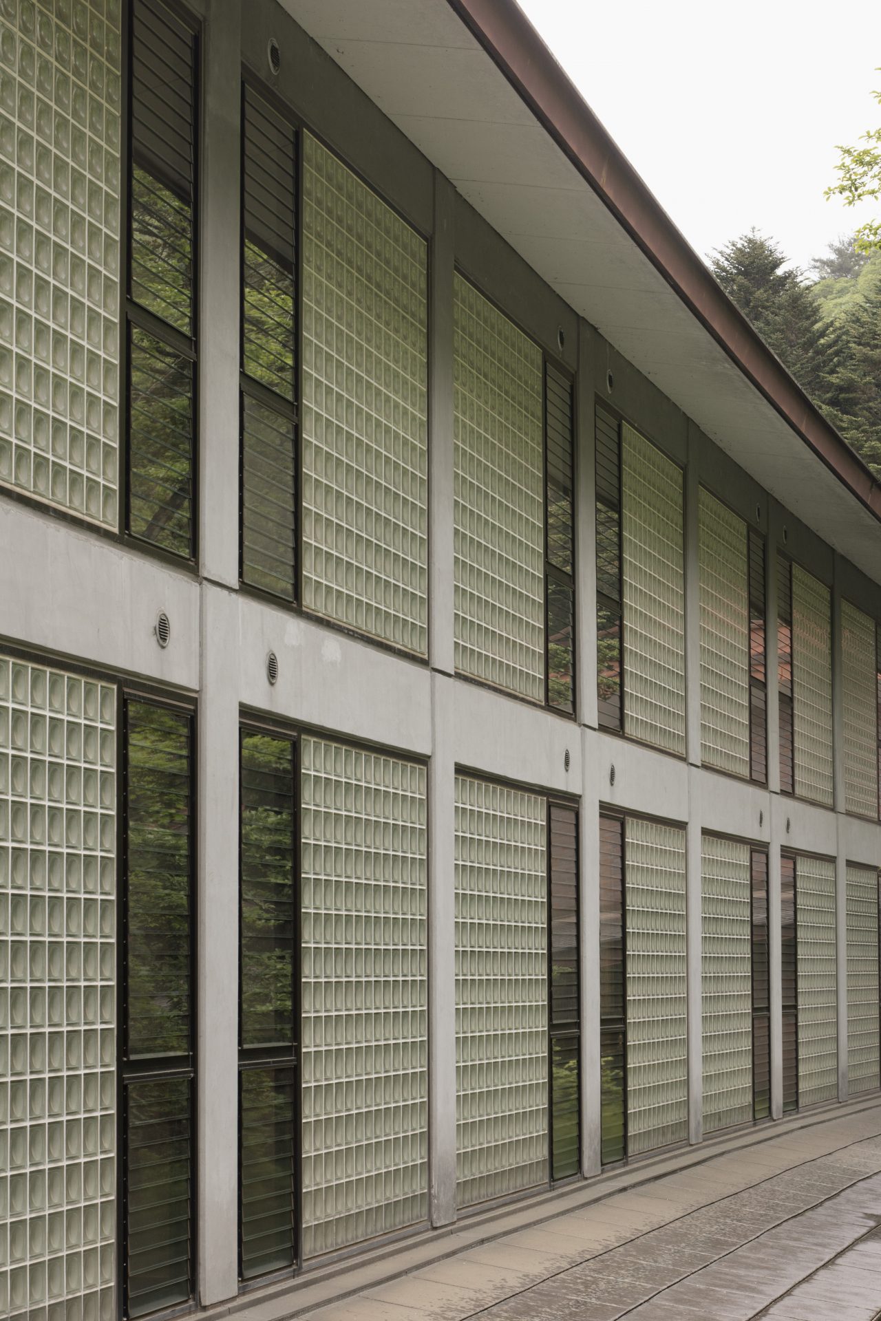
The gently curving façade on the corridor side. -
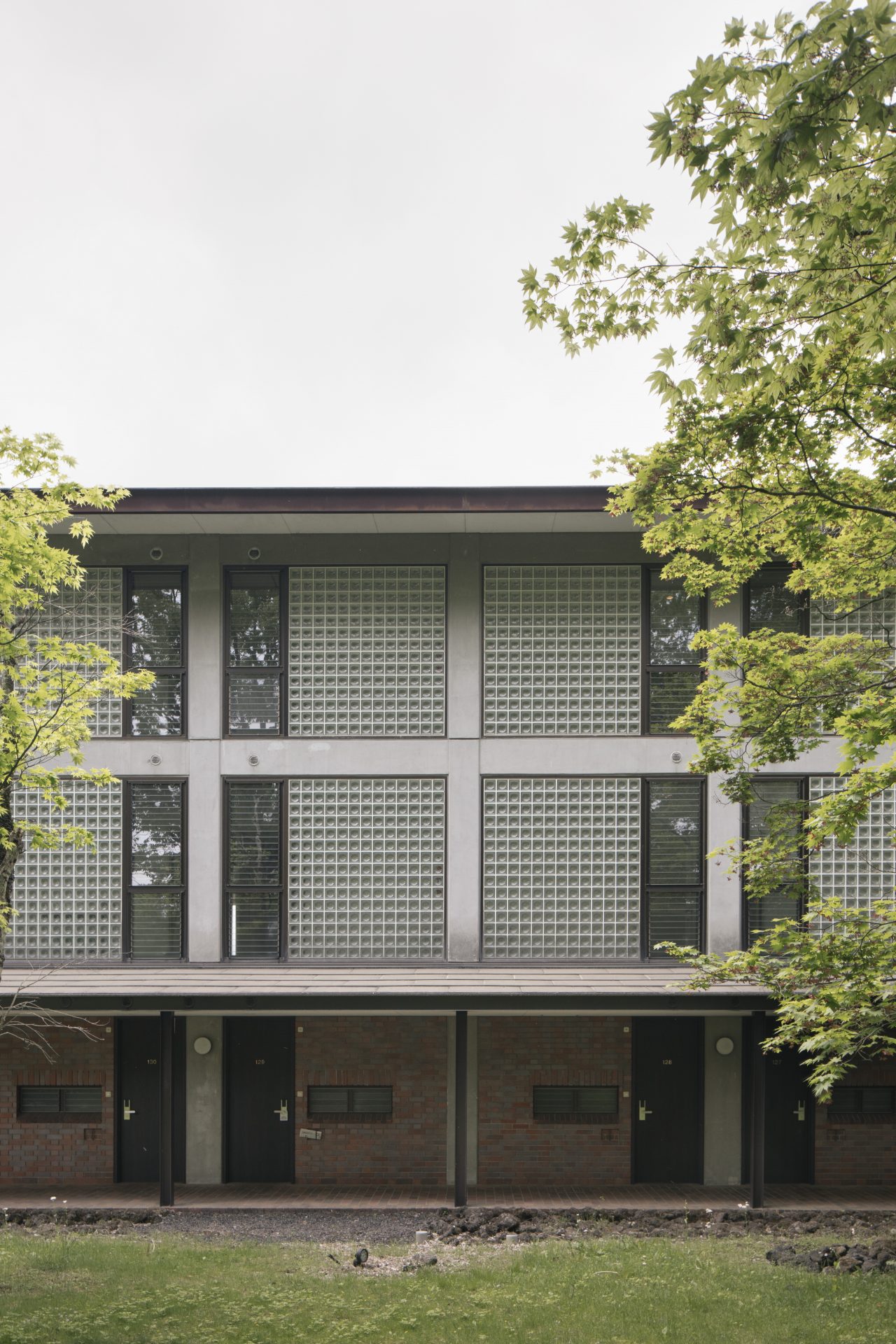
Glass blocks and jalousies fill the gaps between the concrete columns.
The guest rooms have wooden louvered doors, unlike most hotel guest room doors, which are made of steel for fire safety reasons. However, when you open the wooden door, you will find a steel door set back about two meters from the corridor. The reason for this configuration is related to the fact that many guests who stay in Karuizawa come to enjoy the natural setting. If the guest rooms only had steel doors, the interior environment would have felt closed off when the doors were shut. Seike therefore came up with this arrangement that allows guests to leave the steel door open and the wooden louvered door closed to bring the outdoor breeze into their rooms without compromising their privacy and security. Additionally, the layout enables adjacent rooms to be connected and used together by means of a sliding door that retracts into the partition wall between them.
-
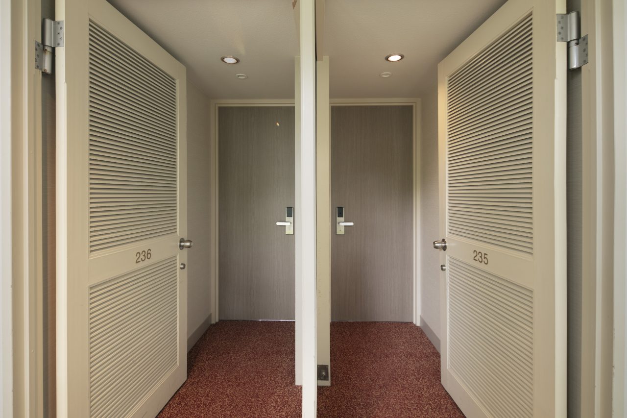
The guest rooms’ louvered doors and sliding partition door. -
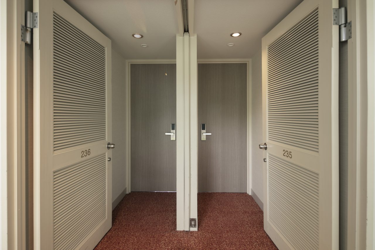
Adjacent rooms can be connected by opening the sliding door.
When you step through the steel doors, the view of the mountain, golf course, and pond will unfold right before your eyes thanks to the enormous 3,150-millimeter-wide by 1,900-millimeter-high fixed windows that span the full width of each guest room. These windows also sit just 350 millimeters off the floor, and originally there were heaters installed beneath them to counter cold drafts (these were later removed in a renovation). The 350-millimeter-high walls under the windows do not interfere with the view at all as they are slightly shorter than the seats of the chairs, yet their presence does provide a sense of protection—one probably would feel uneasy if the glazing extended all the way to the floor, especially in the third-story rooms. These short walls thus contribute to the open feel of the rooms, the viewing experience, and the comfort of the occupants. But there is even more to these windows. The curtain boxes above them incorporate aluminum vent grids, beyond which are crank-operated aluminum vent grilles that open to the outside air. This detail allows for ventilation without distracting from the view, and it creates paths for the breeze to flow through the building when used in combination with the guest rooms’ wooden louvered doors and the jalousies in the corridor.
-
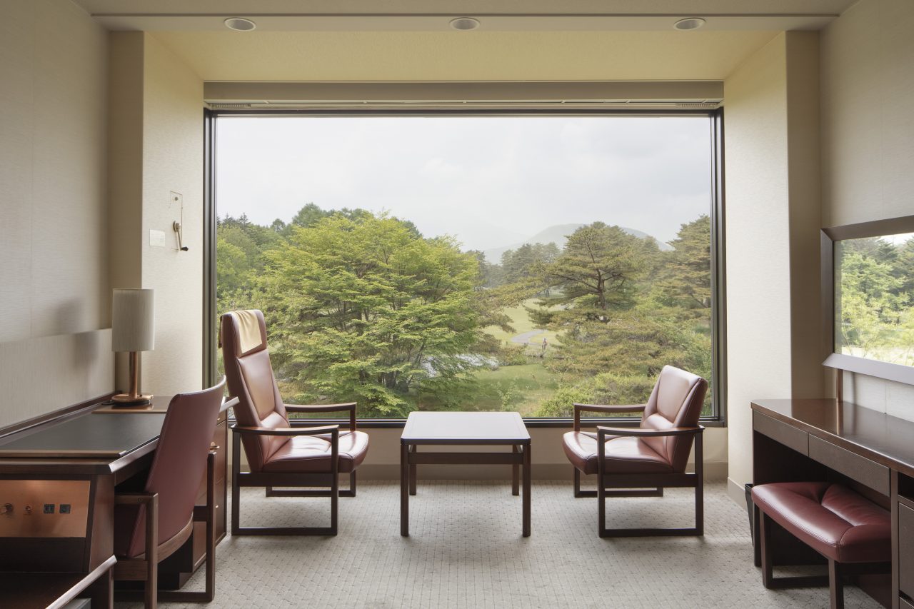
Guest room picture window. Each room offers a different view towards Mount Asama.
-
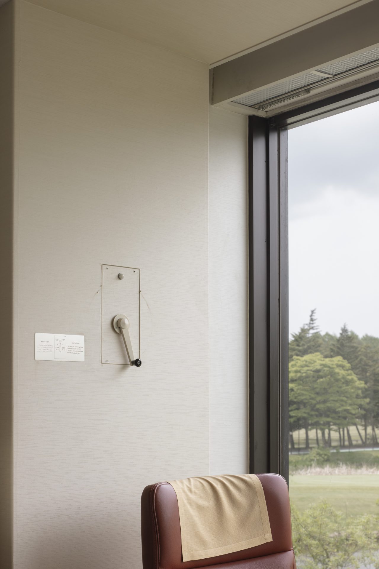
Curtain box with aluminum vent grid, pictured with the crank for operating the aluminum vent grilles.
On the outside, the guest room windows are framed within a grid composed of 400-millimeter-wide horizontal and 250-millimeter-wide vertical weathering steel members. The façade features no other elements than the steel, glass, and grilles, which repeat from end to end—or in other words, it is made up entirely of windows and frames. The brownish weathering steel creates a contrast with the green trees backing the building. The splash apron, which runs along the base where the roof water falls, is lined with lava rocks sourced from Mount Asama.
-
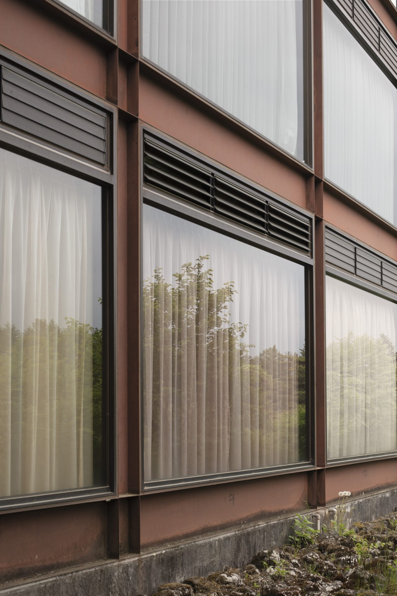
North façade. The glass is set within the steel frames.
Next, let us look at the public wing. Each half on either side of the ridgepole of its large gable roof has been allocated to the lobby and the restaurant, such that only one slope of the roof is visible from inside each space. The lobby is entered by passing under the delicate space frame canopy of the entrance porch and through the doors of the vestibule, and it is illuminated by a skylight that appears to split its sloped ceiling in two, straight down the middle. Because the wall at the far end of the skylight is aligned with the ridgepole and faced with mirrors, the ceiling and skylight appear to continue down the other side of the ridge. The skylight, which is lined with white thermoset-coated steel louvers positioned at intervals of 100 millimeters inside a milky white aluminum reflector dome, does not bring in direct sunlight, providing instead a soft diffused light, similar to that of a luminaire.
-
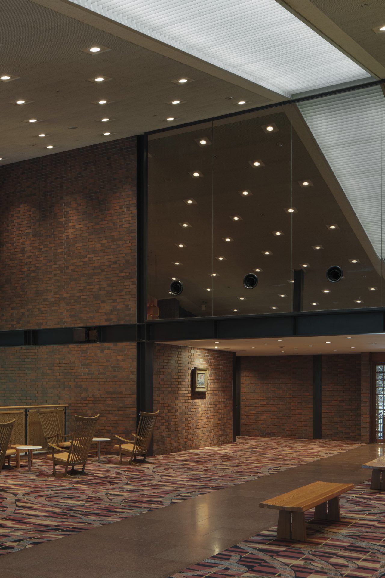
The lobby with a centrally-aligned skylight.
The restaurant is backed by a large brick wall positioned near the ridgepole and gently descends at an angle of approximately 12.5 degrees, setting up the view towards the pond. The roof is supported by a space frame that is held up only by the wall and two columns, so when seen on its own, it may bring to mind a gymnasium or grand exhibition hall. However, the combination of the delicate three-dimensional trusses and downlights has a charm to it that is reminiscent of woven craftwork. The restaurant tables are arranged in several clusters that are separated by sofas integrated with short brick partitions, and they are set at varying heights to ensure that the outdoor scenery is visible from every seat. Chamfered wooden bricks have been used only for the end headers of the brick partitions to prevent causing harm if accidentally bumped into.
-
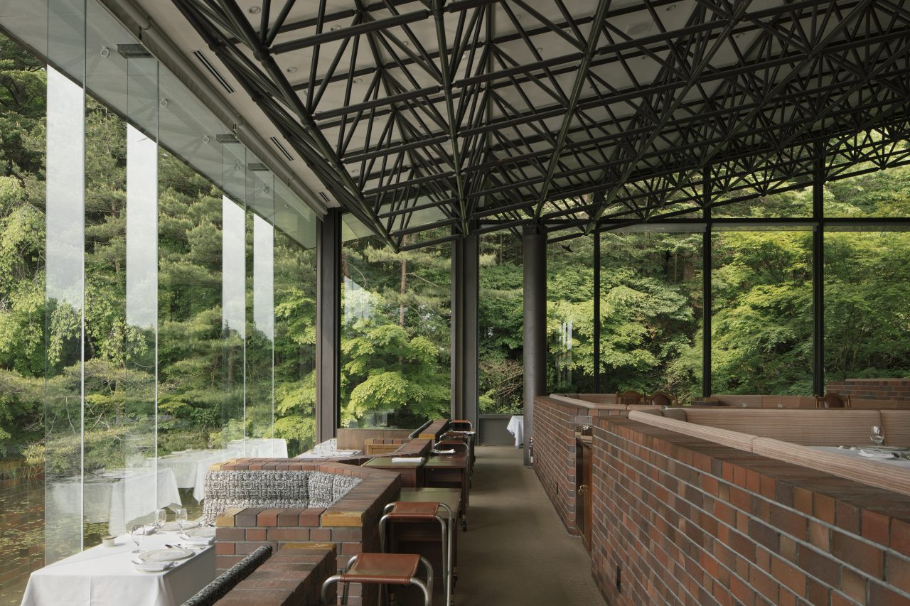
The restaurant seats are set at different heights.
-
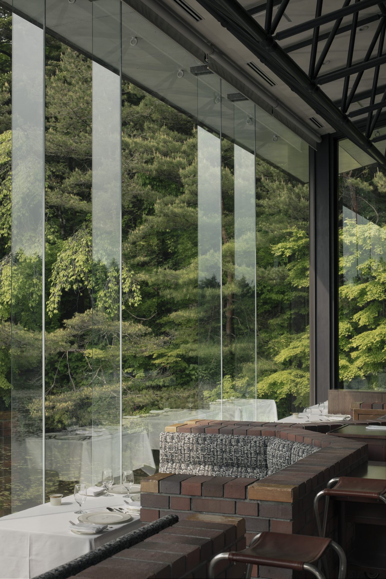
Restaurant tables beside the pond. -
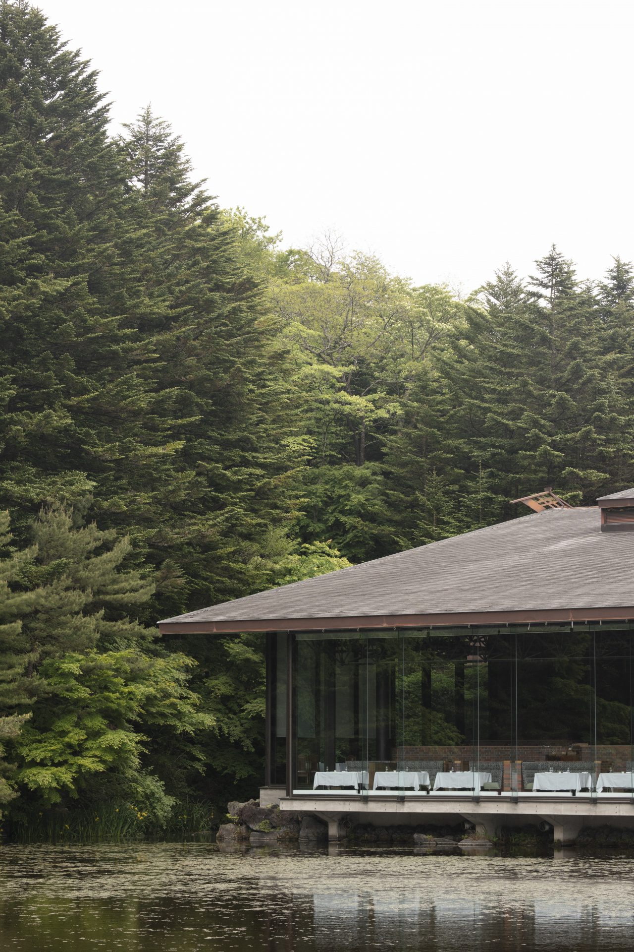
View of the restaurant from the north.
The tables closest to the pond are on the lowest level, and the water seems almost close enough to touch. The 4.8-meter-tall fixed panes of the window beside these tables do not have sashes; instead, they are supported by 15-millimeter-wide glass fins to resist wind loads. These fins jut outward from the window and so are exposed to the outdoor environment, but the eaves extend far enough to prevent them from becoming dirty from the elements. Had the fins been on the inside, they would have likely constrained the furniture layout and diminished the feeling of the pond being within reaching distance. The transparency of this window and the way in which it is structured suggest that Seike was very particular about its design.
Seike liked mixing state-of-the-art technology with commonplace technology and combining various materials. This is exemplified by the way he simultaneously made use of the space frames and glass fin window with off-the-shelf aluminum-frame jalousies and the familiar gable roof form. As for the materials he used, there are many: concrete, iron, weathering steel, aluminum, glass block, brick, carpet, red granite, lava rock, and rattan, among others.
-
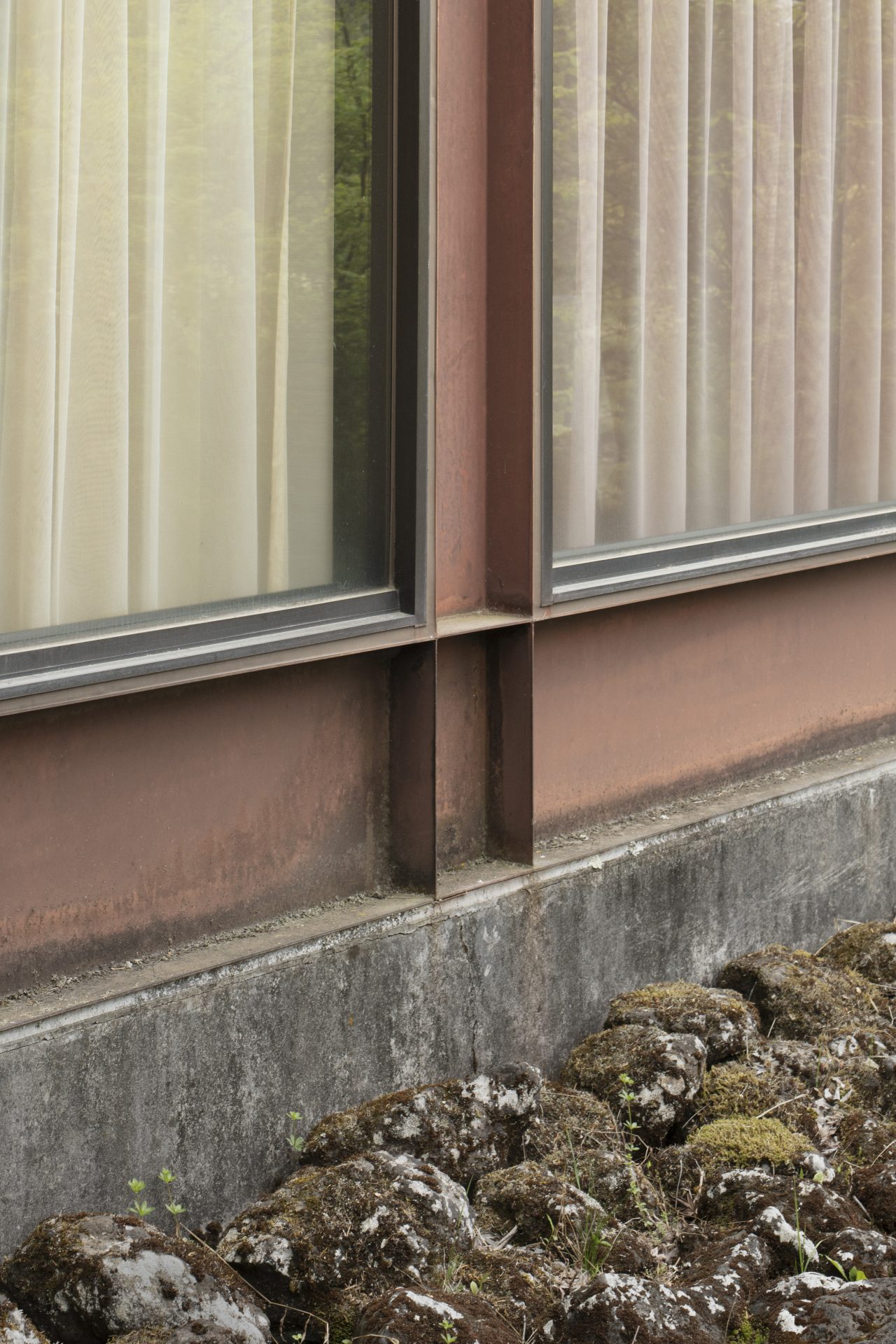
The lava stones of the splash apron. -
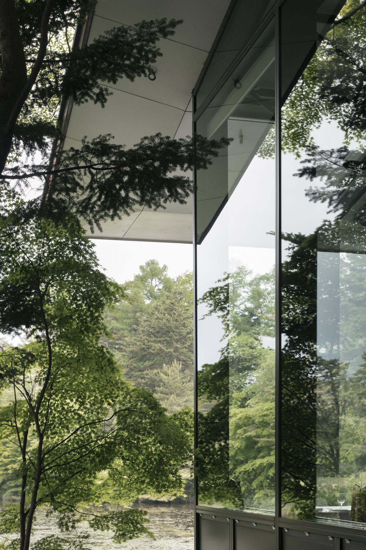
Exterior view of the restaurant.
-
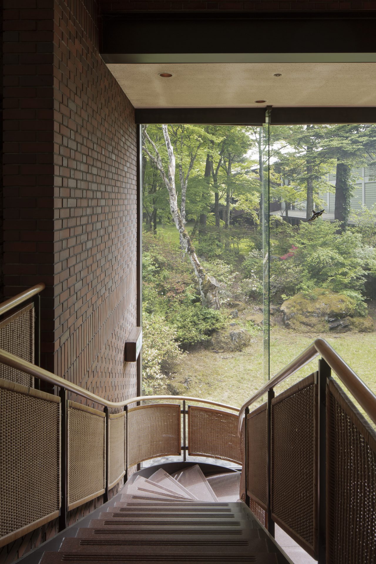
The stairway leading from the lobby to the cafe. -
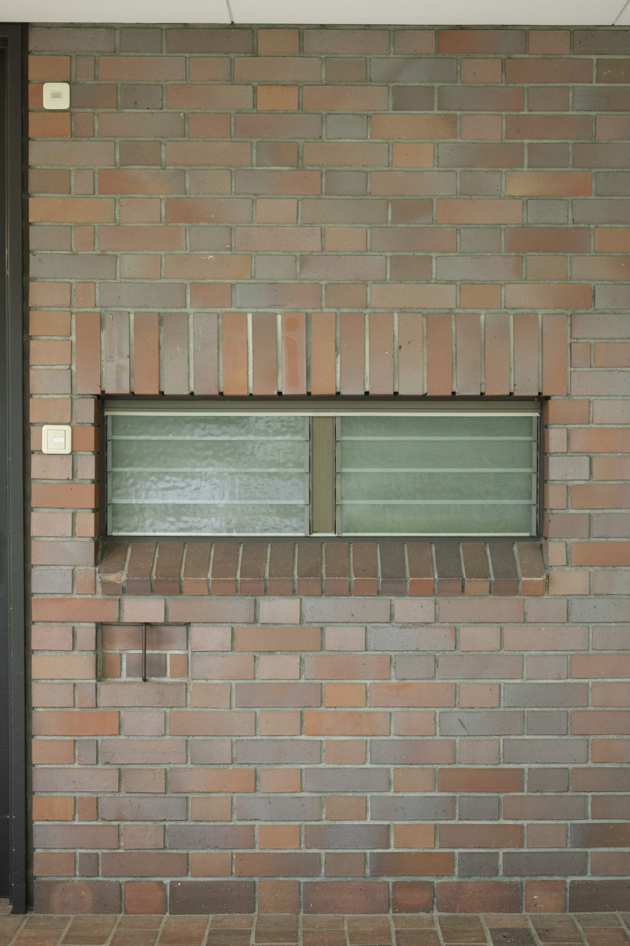
A jalousie window and newspaper box beside a guest room entrance on the south side.
These materials were selected not to produce a luxurious feel or for visual pleasure but rather as a result of carefully considering their characteristics, such as their heaviness/lightness, hardness/softness, reflectiveness, and structural properties. Moreover, they are used in ways that are honest and unforced, so that their inherent qualities are directly tied to the tectonics of the architecture. One could say that Seike’s designs of the openings are particularly illustrative of his architectural philosophy of valuing the mutual interactions between materials and forms, rather than forcing the materials onto the forms.
Fuminori Nousaku
Born 1982 in Toyama, Japan. Founded Fuminori Nousaku Architects in 2010. His work includes architecture, art, installations, renovations, and writings, and he also conducts research on architecture, urban environments, and ecosystems in collaboration with his university laboratory. Focuses of his architectural work include solar energy, soil regeneration, biodegradable materials, and the cycle of materials from production to disposal. Completed the master’s program in architecture at the Tokyo Institute of Technology Graduate School of Engineering in 2007. Earned a doctorate in engineering in 2012. Associate professor of architecture at the Tokyo Metropolitan University Faculty of Urban Environmental Sciences since 2021. Major works include the Takaoka Guesthouse (co-designed with Junpei Nousaku) and Holes in the House (co-designed with Mio Tsuneyama). Publications include WindowScape: Window Behaviorology (co-author; Film Art) and Fumiori Nousaku: Edifice of the Wild (LIXIL Publishing).
MORE FROM THE SERIES
-

Windows of Japanese Modernist Architecture
The Windows of Tomoya Masuda’s Naruto Cultural Center: A Faintly Bright Louvered Space
17 Jun 2025
Windows of Japanese Modernist Architecture
A Culmination of Sutemi Horiguchi’s Aperture Designs:
The Tokoname City Municipal Ceramics Research Institute (Tokoname Tounomori Research Institute)15 May 2025
Windows of Japanese Modernist Architecture
The Diversity of Windows in Kiyonori Kikutake’s Serizawa Literary Center (Serizawa Kojiro Memorial Museum)
25 Dec 2024
Windows of Japanese Modernist Architecture
The Windows of Hiroshi Hara’s Awazu House: Spaces of Light Illuminating the Darkness
26 Apr 2024
