Series Shoei Yoh: A Journey of Light
"Light is Light and Light"
04 Apr 2024
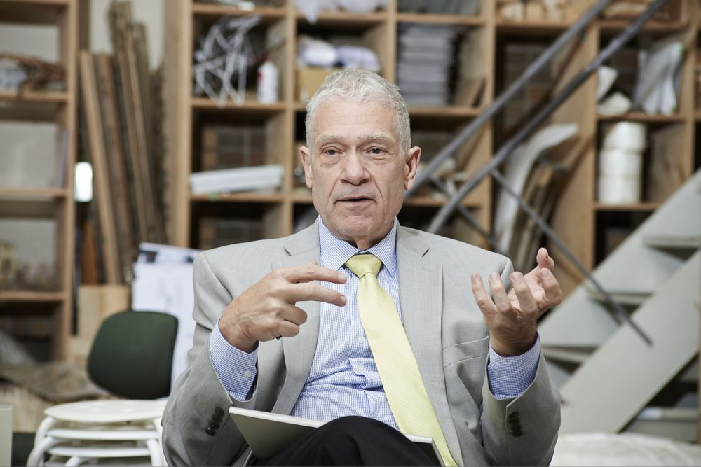
The Archaeology of the Digital exhibition held at the Canadian Centre for Architecture (CCA) in 2013 served as a catalyst for reevaluating the pioneering nature of Shoei Yoh’s digital designs. Martien de Vletter, the CCA’s Associate Director of Collection who was involved in the organization of the show, lays out for us the materials in the CCA’s Shoei Yoh fonds and reflects on her conversations with the architect.
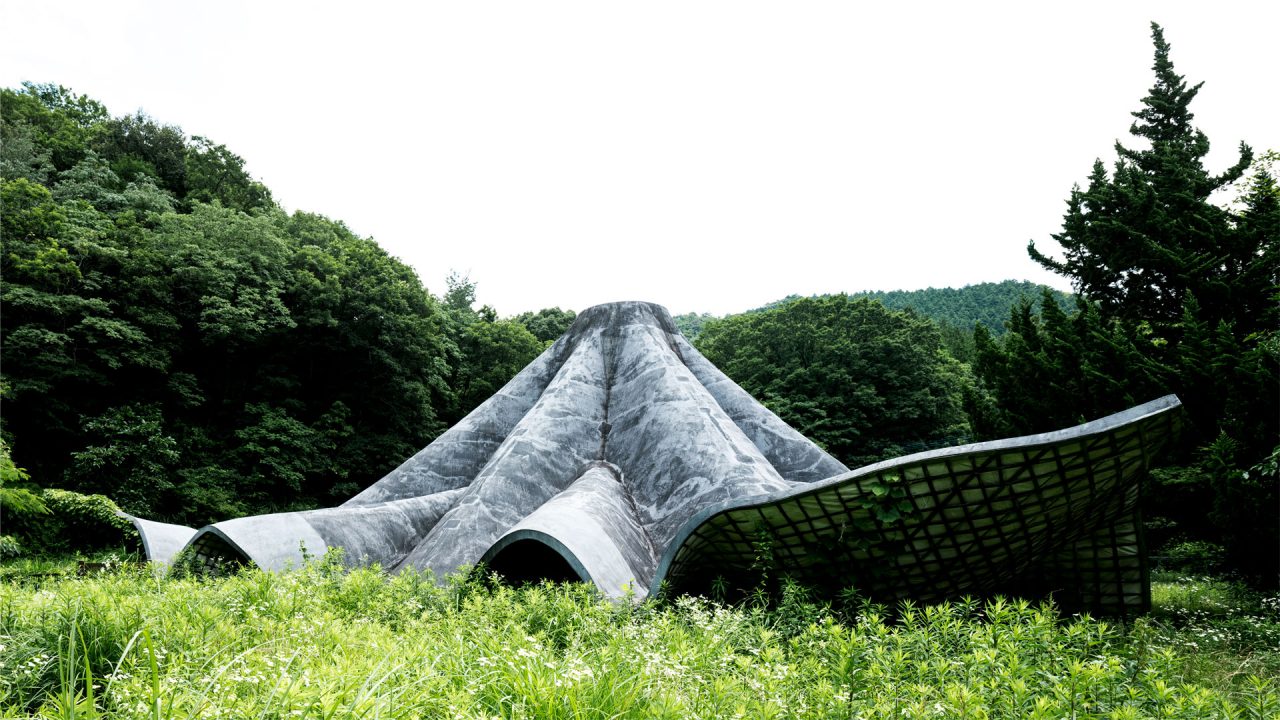
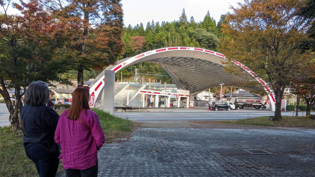
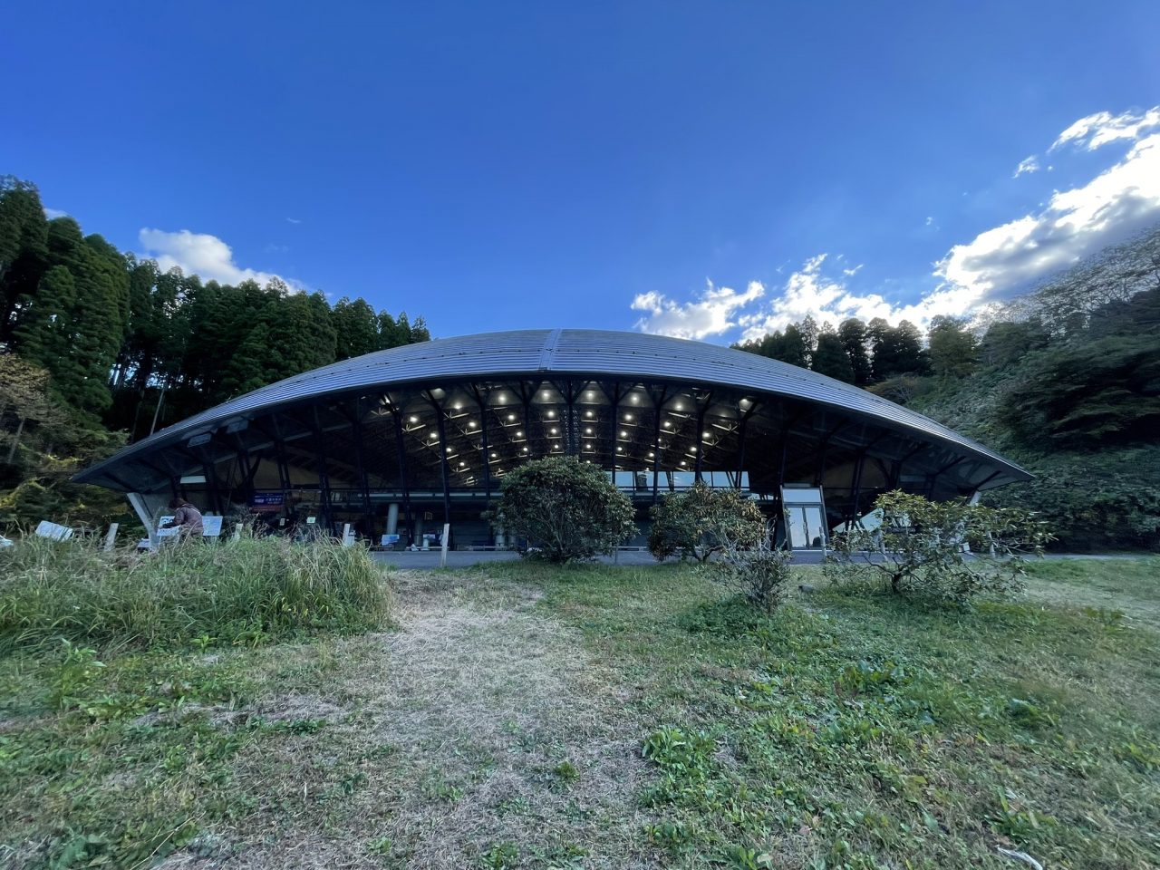
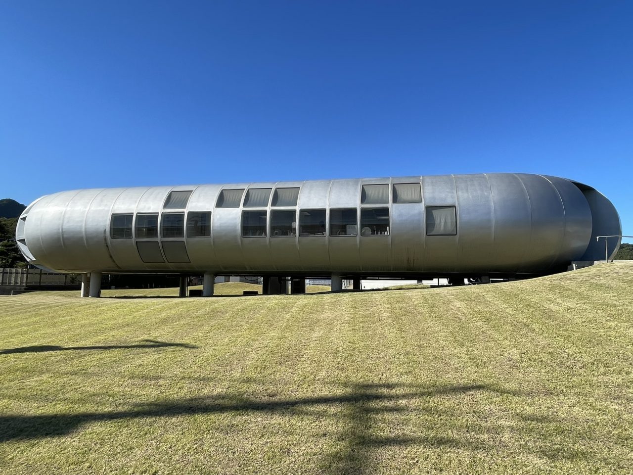
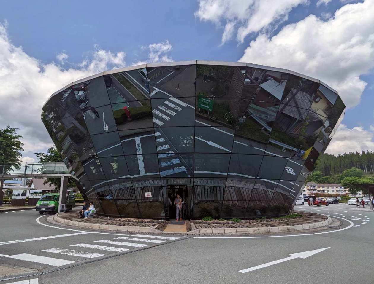
When examining the work of Shoei Yoh, windows or light are not necessarily the first aspects that stand out. At first sight, the Naiju Community Center and Nursery School (1994) appears to have no windows at all; anyone visiting will be chiefly intrigued by the roof which looks like a handkerchief thrown on the land but is rendered in concrete, defining the building form and hiding the windows beneath it (so the roof gives them shade). The Glass Station (1993) is entirely open, allowed for by its roof structure that again defines the building form in typical Yoh fashion. The Oguni Dome (1988) also distinguishes itself from anything else by its roof. The Kinoshita Clinic (1979) becomes intriguing when focusing on windows and light (but your eye is caught first and foremost by its unusual “outer space” shape), and the Oguni Bus Terminal (1986), with an entirely glass façade, is the summum of windows. In all of these projects, Shoei Yoh took radical design decisions.
However, during his visit to the Canadian Centre for Architecture (CCA) for the first Archaeology of the Digital exhibition in 2013, Shoei Yoh emphasized his interest in the roof as merely a by-product of his efficient and economical design philosophy, so I am somewhat biased regarding the radicality of his design intentions. But what the CCA’s interest in exploring Yoh’s work originally stemmed from was not his roofs per se; it was his very early adoption of digital technology in their design (though Yoh claims he himself never used a computer). As Greg Lynn writes in his introduction to the Archaeology of the Digital publication:
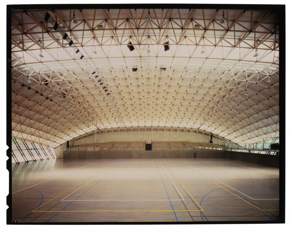
Yoh strove to find forms in natural and physical forces visualized by analytic digital tools. In his two gymnasium projects he used physical phenomena like snow loads, wind forces, structural spans and natural light to create a structural frame whose pattern evoked natural forces and forms. He turned to digital technology with the ambition to express an optimized and complex pattern of the kind found in nature. The construction repertoire also relied more on structure and its expression than on massing and volume, as was the case for [Frank] Gehry and [Peter] Eisenman.
As Dr. Masaaki Iwamoto writes in his introduction to this essay series, Yoh was also a pioneer in using timber. His discoveries from working with timber trusses in Oguni in the 1980s then helped inform the complexly nuanced roof designs of the Galaxy Toyama Gymnasium (1992) and Odawara Municipal Sports Complex (1991) that he developed in more of a parametric manner, as he explains in one of his interviews with the CCA:
Heavyweight snow was the most critical load for the big roof spans I designed for Odawara and the Galaxy Toyama [Gymnasium]. So I carefully recorded the changing depth of the truss. I solicited the engineer at Taiyo Kogyo—he examined many times back and forth, changing the depth or relocating the supporting posts to support, in order to get enough slope for water drainage.
His discoveries in using timber were pushed by the use of digital technology:
During the nineteenth and twentieth centuries objects had to be made the same—like the Ford Model-T—to increase productivity and lower prices. Mass-production was more economical then. But the computer, through modelling, can account for all different kinds of shapes, lengths, and wood angles, so that production costs remain the same or cheaper, sometimes even saving energy and decreasing CO2 emissions.
-
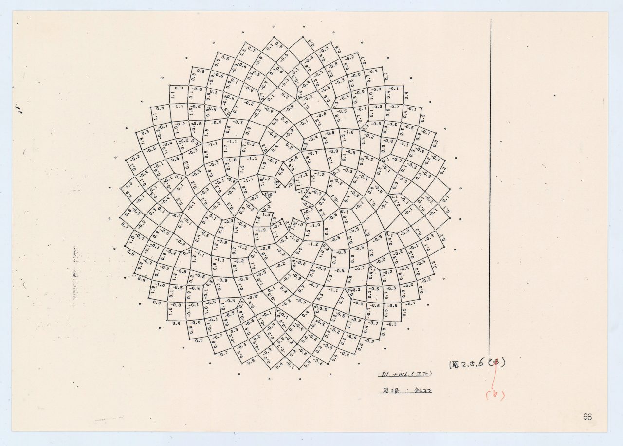
Oguni Bus Terminal, structural analysis drawing. Pen over electrophotographic print on paper, 30 × 22 cm. Shoei Yoh Archive, Kyushu University.
Let’s look a bit closer at the projects materials we are caring for at the CCA. Shoei Yoh donated materials of seven projects to the CCA in 2012. Two of these projects, the Galaxy Toyama Gymnasium and the unbuilt Odawara Municipal Sports Complex, were shown in the first Archaeology of the Digital exhibition in 2013.
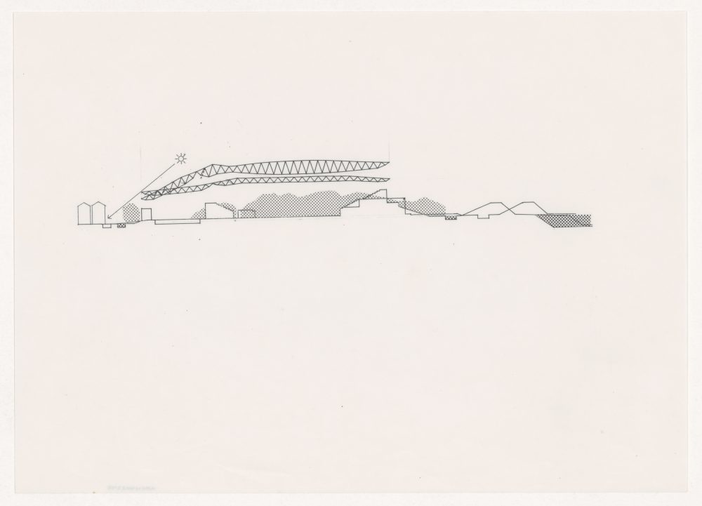
The Galaxy Toyama Gymnasium in Imizu, Toyama, is the most voluminous in terms of material in the archive and can be considered related to two other projects: the Odawara Municipal Sports Complex and the Prospecta Toyama ’92 Observatory Tower (1992). The Galaxy Toyama Gymnasium project is documented through CAD files related to the roof design, printouts from computer simulations of the roof, design drawings, presentation material, architectural and structural working drawings, models, and textual records. You can find hints to the Prospecta Toyama ’92 Observatory Tower in these designs. The Odawara Municipal Sports Complex and the Galaxy Toyama Gymnasium were developed around the same time, and for both projects, digital technology was used to calculate the dimensions of elements in a space frame roof structure. The roof practically is the building in both cases. The Odawara complex called for multiple athletic facilities to be housed in a three-story structure with a roof adapted to the different uses of the space and to different external conditions and forces. In order to achieve this adaptability, computer simulations were executed to determine the appropriate dimensions for each element in a grid of three-dimensional trusses. The archival material documenting the Odawara Municipal Sports Complex includes design drawings, printouts from computer simulations of the roof, proposal documents, and some photographs of the site.
-
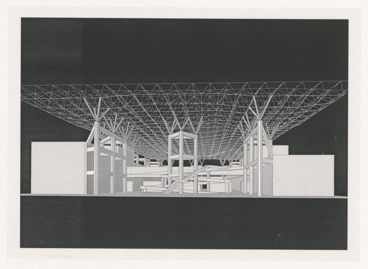
Interior perspective for Galaxy Toyama Gymnasium, Imizu, Japan. Electrophotographic print on paper, 30 × 22 cm. ARCH402201, Canadian Centre for Architecture, gift of Shoei Yoh.
The Galaxy Toyama Gymnasium, along with the Prospecta Toyama ’92 Observatory Tower, were both designed for the 1st Japan Expo Toyama ’92, and the project files for each contain some material related to the other—which in the digital age has become more and more common, with the interchangeability of designs. And this was definitely something that fascinated Yoh in his desire to be efficient and economical in every step of the design process. We therefore even considered describing the Shoei Yoh archive at the CCA as a period than as seven individual projects, as a lot of material of one project relates to or is even copied in another.
The other built projects—the Prospecta Toyama ’92 Observatory Tower, the Glass Station, the Naiju Community Center and Nursery School, and the Uchino Community Center for Seniors and Children (1995)—are documented through drawings, models, and photographic material.
-
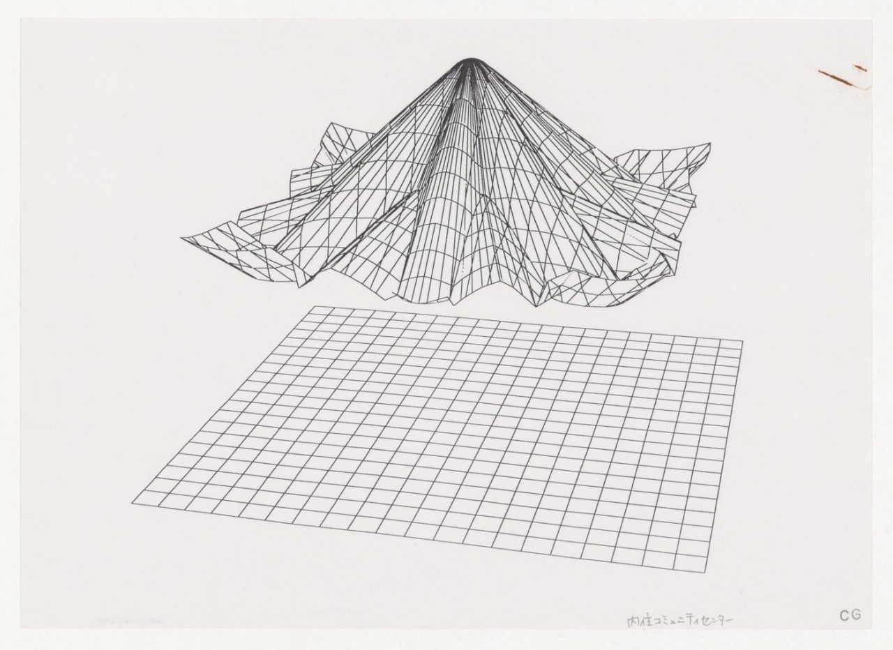
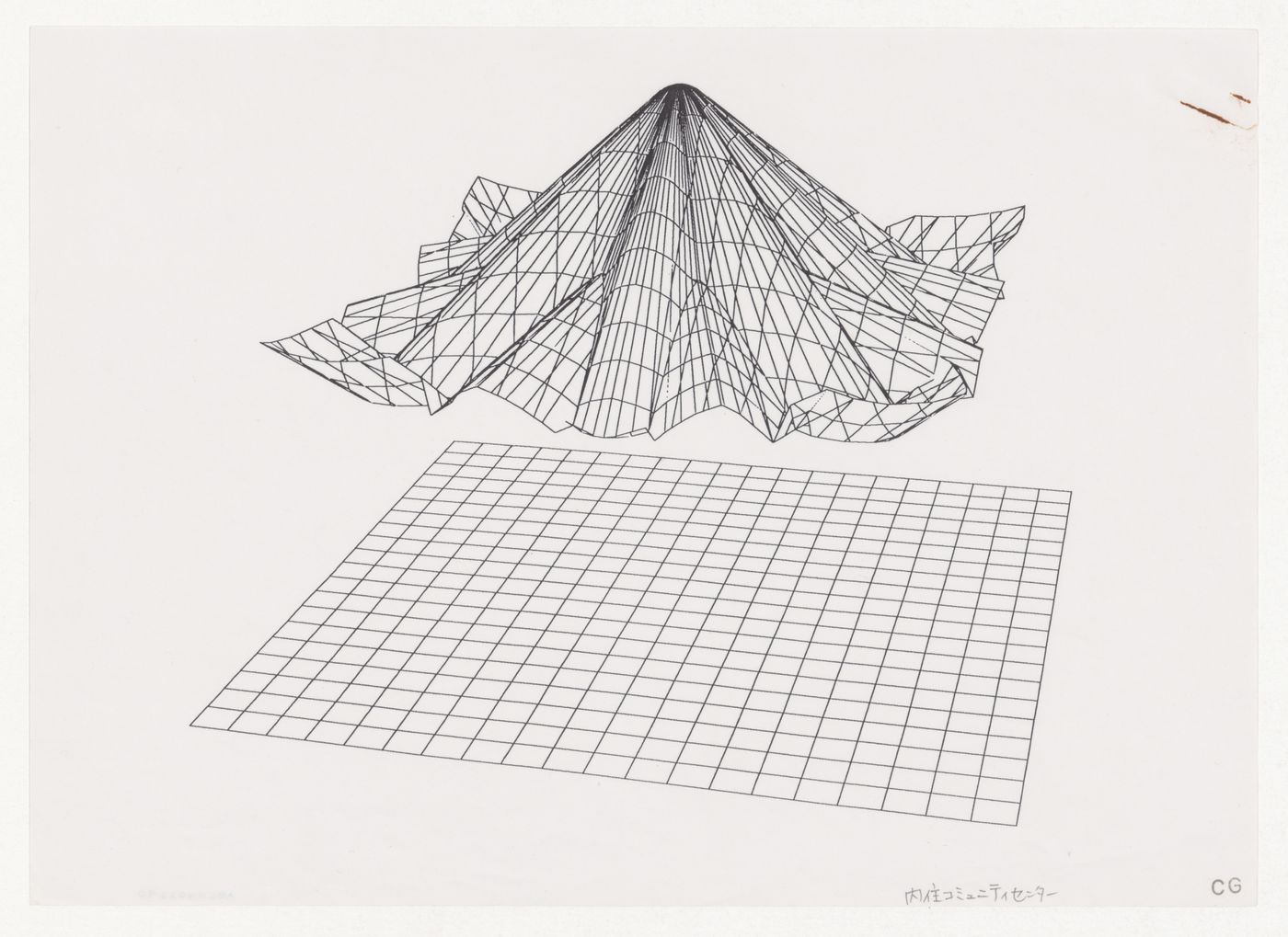
Wireframe perspective for Naiju Community Center and Nursery School, Fukuoka, Japan. Electrophotographic print with ink stamp and graphite on paper, 21 x 30 cm. ARCH402290, Canadian Centre for Architecture, gift of Shoei Yoh.
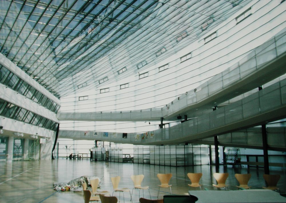
The Glass Station was designed from 1990 and completed in 1993. The office, pumps, shop, and workspace of the service station are covered by an undulating canopy composed of asymmetrical concrete arches that form the boundaries of a lattice of pretensioned steel rods and aluminum channels into which panels of glass bonded to sheets of perforated stainless steel were inserted, sealed with polyester film, and secured with structural silicon. Here again, the roof is the building. In a different but similarly radical way, this is the case for the Naiju Community Center and Nursery School, designed from 1993 and completed in 1994. The project is documented in the archive through site plans, site views, design development drawings, a model, and photographic views of a computer graphic and of the built work.
The final project file in the series is for the Bi-Centinial Tower (2010) in Taichung, Taiwan, which only consists of a few presentation documents. Drawings in the series include hand drawings and printouts or photocopies of drawings created using digital design software. Apart from the CAD files related to the roof design for the Galaxy Toyama Gymnasium, the digital materials are still images in .jpg format, all related to the Odawara Municipal Sports Complex or the Galaxy Toyama Gymnasium. Some of the documents in .jpg format are duplicates of paper documents in the series.
-
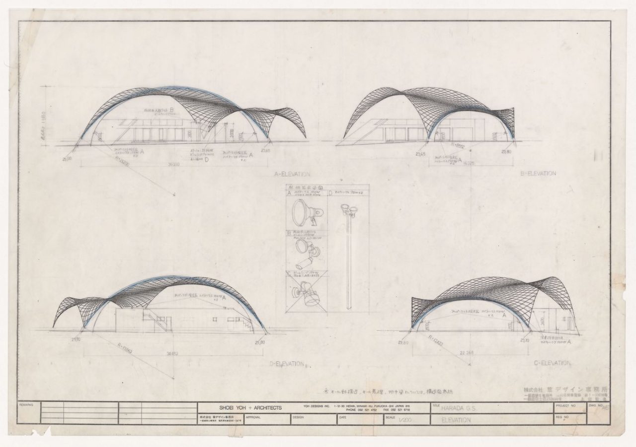
Elevations and details for Glass Station, Oguni, Japan. Graphite and colored pencil over electrophotographic print on paper, 42 x 60 cm. ARCH402254, Canadian Centre for Architecture, gift of Shoei Yoh.
The most radical Shoei Yoh design with respect to windows, light, or openings is perhaps the Oguni Bus Terminal, with its 360-degree glass façade. On the other end of the spectrum there is the Naiju Community Center and Nursery School, which has no windows at all. Somewhere in between there is the Kinoshita Clinic, where the windows and openings are very clearly articulated as part of the façade, but perhaps are only intended to emphasize the curvature of the building form.
Yoh goes on to speak about light as follows in the aforementioned interview:
I always wanted natural light, even for a big gymnasium like in Oguni. We don’t need artificial light in the daytime. We always use daylight, like the Pantheon. . . . I wrote an essay titled “Light is Light and Light”. Light has no weight, but has brightness.
Yoh’s words invite us to think about his work as “light” in the dual sense of being “lightweight” and “light-filled”—both of which again speak to his desire to design efficient and economical buildings. And indeed, compared to works of the same period by other architects, there is a distinct lightness to the work of Yoh. This lightness remains an attribute even through to his later works, such as the Tenjin Minami Station (2005) in Fukuoka. From the conversations I had with Yoh, it was clear that his interest in lightness stemmed not from any ideological or stylistic underpinnings; rather, it was driven by his pursuit to achieve an economy of means. “Efficiency” and “affordability” were two terms he frequently used, each with his own definitions. It was these concepts, which seem particularly pertinent in light of current discussions around sustainability and ecological design, that gave rise to some of the most radical and interesting architecture I have seen in Japan.
Martien de Vletter
Associate Director of Collection of the Canadian Centre for Architecture (CCA). Responsible for the collection’s acquisition strategy, descriptions and access, as well as its management and care. De Vletter is particularly invested in the preservation of and access to born-digital archives, which has been a main area of interest for the CCA since she assumed her role in 2012. She developed with her team the CCA’s strategy for acquiring born-digital archives, preserving often obsolete files, and making the archives accessible for research. She has published a paper on this work, titled “Don’t Be Afraid of the Digital” (2018). She also worked with Álvaro Siza, the Serralves Foundation, and the Calouste Gulbenkian Foundation from 2014 on developing a collaborative model of custodianship for Siza’s archive. Since 2020, she has been focusing on how collection descriptions impact our understanding of historical material and their context. Prior to joining the CCA, De Vletter studied architectural history in Amsterdam and worked as the Chief Curator of the Netherlands Architecture Institute (Rotterdam) and Publisher of SUN Architecture (Amsterdam).

