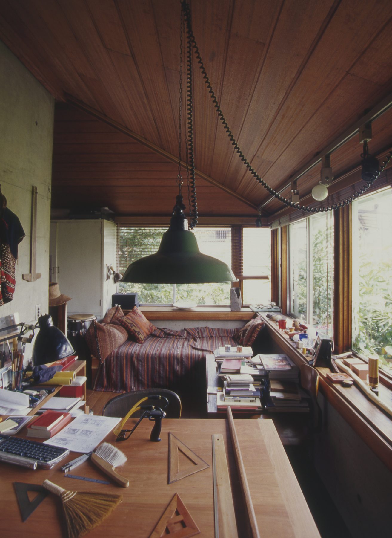
Series Vague Focal Space at the Window
No.0: Six Topics for Makoto Ueda’s Interpretation of the Window Space
18 Apr 2022
- Keywords
- Architecture
- Columns
- Japan
To kick off the series “Vague Focal Space at the Window,” I interviewed Makoto Ueda, the former Editor in Chief of Toshi Jutaku (Urban Housing) and GA HOUSES. Here, Mr. Ueda has offered six examples that are important when considering “Vague Focal Space at the Window.” He will tell us what viewpoints one should take into account when thinking about the “window space,” along with discussing some of his written articles.
Topic 1: The first place she had ever been alone
Former East Dormitory of Tokyo Woman’s Christian University, Tokyo
Designed by Antonin Raymond
Built in 1924
“A room facing the courtyard gives every student a complete view of lush greenery outside the window. It must have been a small brand-new world for every student. The students must have known through a minimal room that they were recognized as a single personality for the first time, to be happy, to suffer, to pray, to face themselves, as well as to be given their own rooms.” (Makoto Ueda, 2000)
-
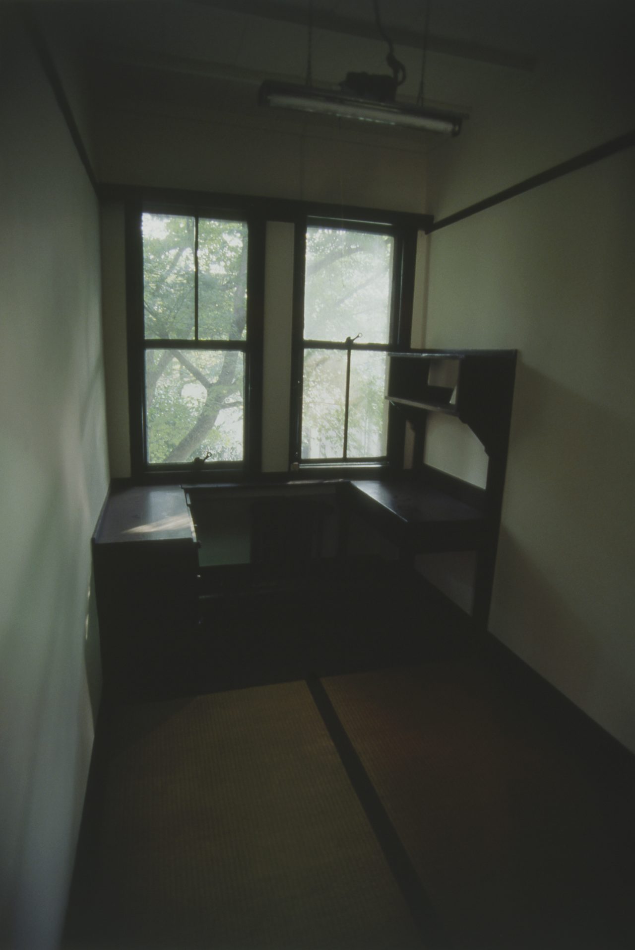
A private room in Former East Dormitory of Tokyo Woman’s Christian University. Photo by Makoto Ueda
Ueda: It is quite common now that every house in Japan has a children’s room. However, in Japan, such a room was a rarity in those days, about 100 years ago. For many students, a private room in a dormitory was their first experience having their own room. This might be the first time they had ever experienced welcoming people into their own space. I heard that there were some groups, called “Oretsu,” which consisted of ten people per group, in this dormitory. Although there was a large common room, like a lounge, the groups would often gather in a tiny private room, chatting with each other. They seemed to have a lot of fun. The group members would come and go quite often, and by the time they graduated, they had formed relationships with their peers. Because of this system, students were emotionally and psychologically nurtured in the dormitory during school.
I see. What do you think the windows meant to students?
Ueda: When they entered the room, the first thing they saw was the bed, and when they looked at the floor, tatami mats were laid out in such a way so that the dented lines on mats’ surface were directed toward the window. The thin, long beam on the wall also went toward the window. When I visited, I got the impression that my vision was naturally led to look outside the window. The space by the windows was floored in wood and equipped with a desk and a shelf. At the time, the university loaned a bed to the students who wanted one.
When thinking about a student writing with her right hand and having natural light stream in from the left window, the desk’s arrangement strikes one as naturally designed. A student would stand up to look out the left window and sit down on a chair to look out the right window. The windows have the same shape, but the right and left windows have different characteristics. For example, if I were to draw a student in this space, the standing person would be placed at the left window and the sitting person at a desk in front of the right window. It is the window side of the room that invokes such a figure.
Topic 2: A large circular window as the entrance to a city
Nakagin Capsule Tower, Tokyo
Designed by Kisho Kurokawa
Built in 1972
“It resembles a teahouse with the size of two and three quarters tatami mats and the body fits tightly inside the room. And when I get close to the disproportionately large circular window, I feel as if only this room were floating in the sky of Tokyo. I feel like I’m living in a window. As I had expected from the beginning, this window is the entrance to the city.” (Makoto Ueda, 1998)
-
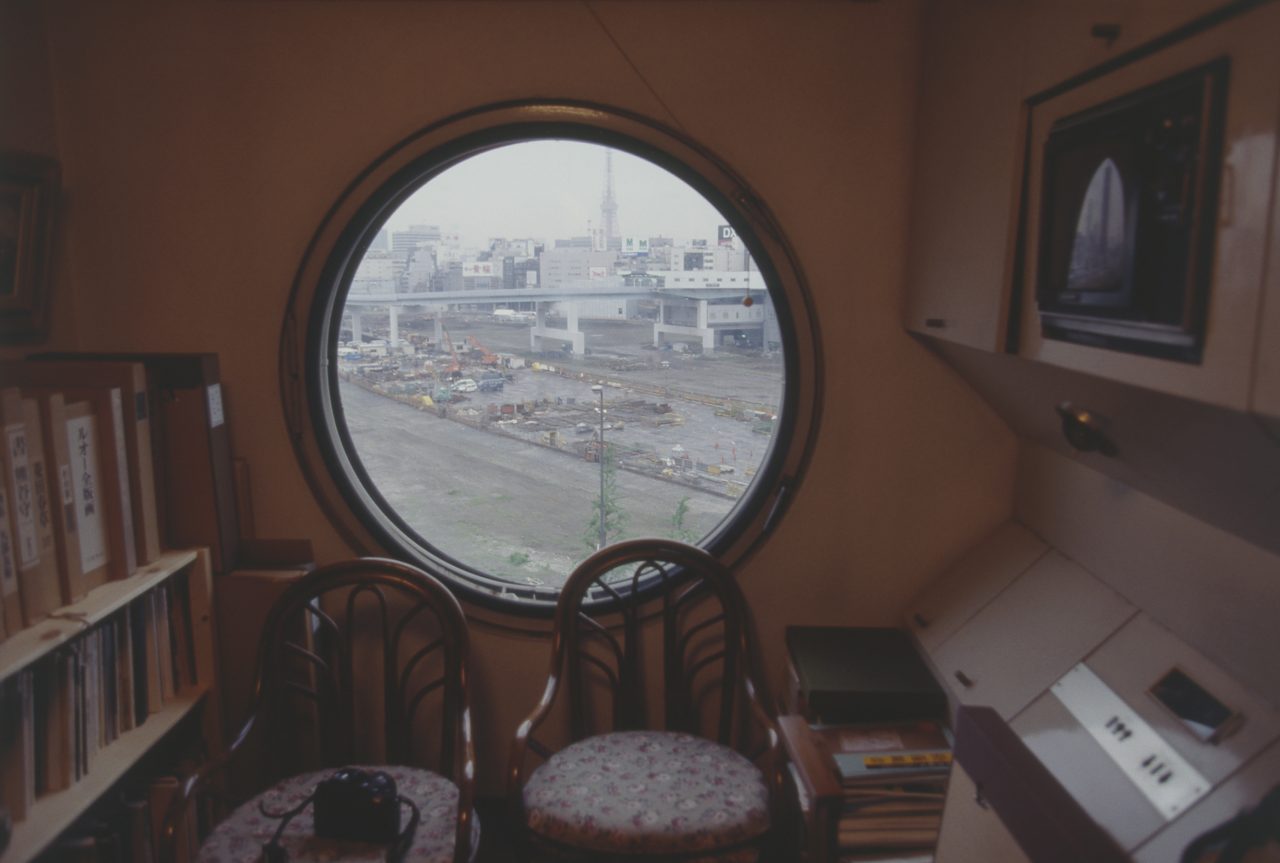
Urban view from a room in Nakagin Capsule Tower. Photo by Makoto Ueda
The next architectural site you mention is the Nakagin Capsule Tower in Tokyo. It was very refreshing to hear you point out that the windows here serve as entrances to the city. There is a large entrance hall on the first floor, a squarely spiral staircase leading to each capsule or room with landings at each of its four corners. This landing has two entrances, and each entrance turns 90 degrees because the landings are at the corner of the staircase. When I enter the room, there is only one entrance to a room on one side of the same floor. Then, this round window appears when I enter the room.
Ueda: If you have ever been to the tower, you know it is much larger than it looks in pictures. It is quite true that people enter through the entrance, but in their minds, they feel as if they have entered the room directly through the round window. Outside, we can see an urbanscape of buildings and highways. This window’s effect is that it reflects ourselves as being part of the city.
This part of the description, “I feel as if only this room were floating in the sky of Tokyo,” is also very interesting.
Ueda: In fact, sleeve walls are inserted to keep the next capsule out of sight. I can feel the designer’s careful attention here, especially regarding the window space. Only the view of Tokyo can be seen through the round window. The effect, together with the entrance’s design, is that it makes us feel like we are floating when entering the room.
Why this circular window is a device that connects the city with the room is also embedded in such a design.
Topic 3: Where family members meet
My House, Saitama
Designed by Tsutomu Abe
Built in 1974
“At the highest area in the center of the house is the “nest” of the parents, like a sacred place, and the son’s bed is placed in the corner of the gallery below. There was a study table beside the bed, and globes, telescopes, and textbooks on the window-table and on the built-in shelves. On the other side was my father’s desk, and the window-table and the shelves led up to the desk. Father’s technical books and his tools for work met and mixed with his son’s dictionaries and die-cast toy in the middle of the room.” (Makoto Ueda, 1983)
-

The second floor of “My House”, a Tsutomu Abe’s self-designed house, with windows, along with the windowsill, surrounding the interior. Photo by Makoto Ueda
-
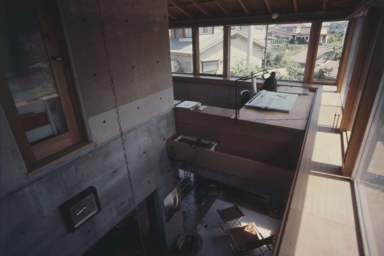
The second floor and the void of “My House” . Photo by Makoto Ueda
This is an example of a detached house, not an apartment house.
Ueda: For an example of a detached house, I chose Tsutomu Abe’s “My house” because I was interested in the relationship between Mr. Abe and his son.
This is a square and nested plan. The first floor is made of reinforced concrete and has long windows; the second floor is made of wood and has windows all around. It is called a ribbon window.
Ueda: At both ends of this one side are Abe’s and his son’s personal spaces, and when I look closely at the long windowsill and shelves, I can see that their own tools and books are mixed together in the middle of the long windowsill. I do not know of any other relationship with such a fine balance. It must have been the window that established the balance between them. I think the balance would have been difficult to create on the first floor because the degree of openness to the outside differed from the second floor.
The objects on the windowsill seem to reveal their relationship and personality.
Ueda: On the second floor, an external wall of reinforced concrete rises waist-high, and a windowsill extends on the wall. Near the windowsill are chairs and a bed; the windowsill can be used as a simple desk.
The ribbon window is open, but the windowsill adds unity to the plan by providing a comfortable space for residents and connecting members of the family. Thinking about the view from the window, we can see that the building is effectively located on the site. The house stands on the corner of a crossroad in a residential area, but the site is square; only this house is built at an angle against both the site and the roads. This is why there are four triangular gardens on the site and the garden is lush with greenery. The most luscious part of the foliage comes in from the window as a view. On the other hand, when we look at the building from the outside, we get the impression that a community space has been made in the corner of a crossroad.
Ueda: This house was used as the setting for the movie, Cho No Nemuri. The movie includes a scene in which the second floor was suddenly cut off by a crane from the outside, and the scene was very fresh because its composition is totally different from the structural expression like an architectural photograph. The windows on the second floor, nestled in and out of the trees, also serve as a screen that reflects the state of life.
Topic 4: Cherry blossoms seen from every household window
Ito House, Tokyo
Designed by Tadao Ando
Built in 1990
“The scene of three families, six adults and three children living together is both hidden and seen in a multifocal way, depending on the seasons, times and activities; the scenery is the outstanding point in this house. The only focal point that unites the nine residents is outside each room. The living room, the dining room, and the bedroom all focus on a large cherry tree left in the southeast corner of the site.” (Makoto Ueda, 1995)
-
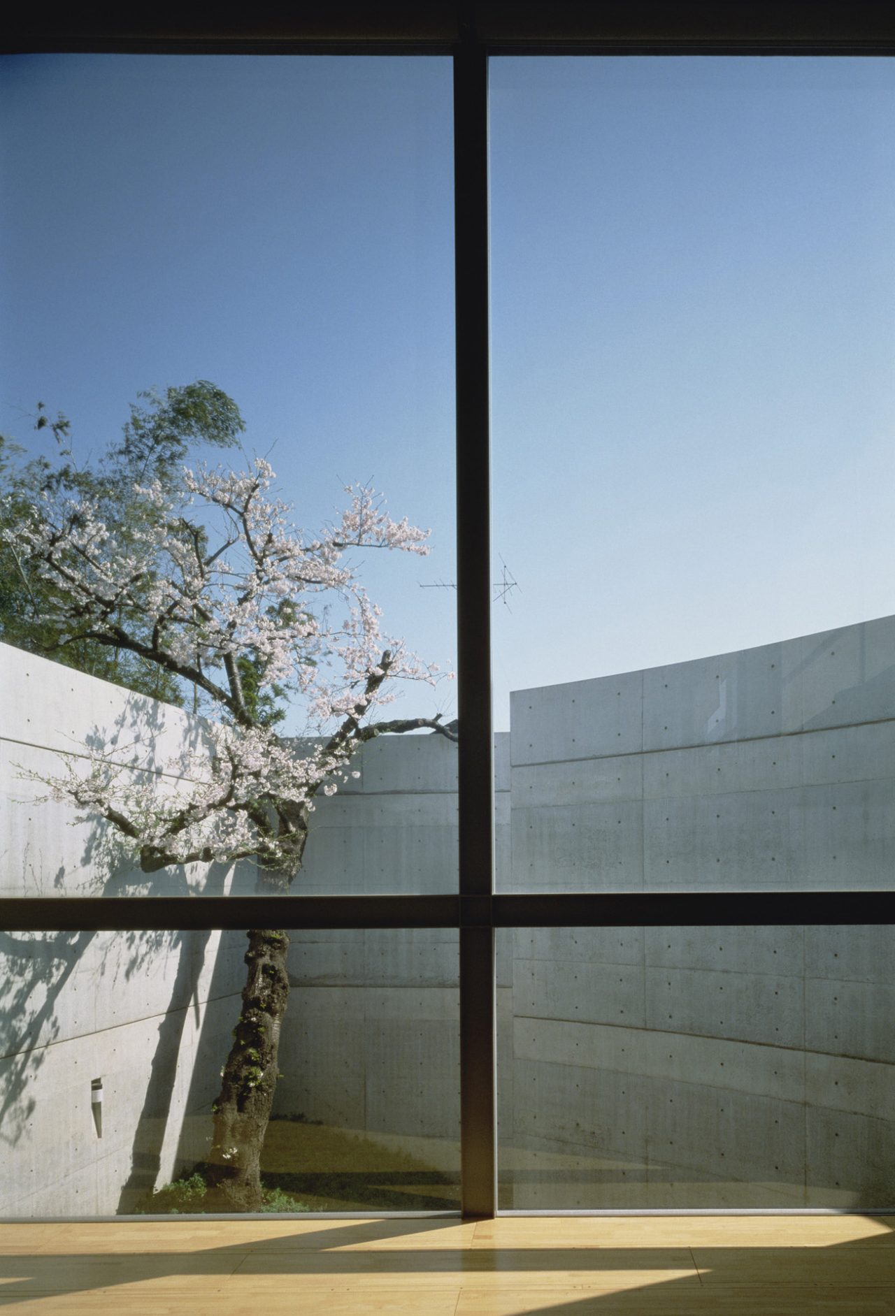
View of cherry blossoms through the window in Ito House. Photography by Photography Department of Shinkenchiku-sha
In the case of multi-family housing, each family’s rooms are placed somewhat separately. The Ito house was also a house in which three families—a parent-generation family and two children-generation families—had been living.
Ueda: The Ito family had lived in a two-story house designed by Makoto Masuzawa, on the same site since the 1950s. However, after the children grew up and left home, they returned with their own families, so they decided to rebuild the house. So, they asked Ando to build a house in which all three families could live together. Although the three families live together in a single house, each family is independent and there are spaces that accommodate both individual and communal living. It would be more complicated if certain facilities, such as offices and shops open to the public, were needed instead of being able just to live in an apartment complex. Ando’s suggestion is for the same thing to be seen from every room, even though the distance, direction, and appearance are changed incrementally. Based on this concept, the plan and section were drafted. From each room, one can see a single cherry tree that rises on the edge of the property and is planted inside the high concrete walls that surround the property and the entire house, as it were itself a member of the family. Although the cherry blossoms viewed from the windows of each family’s living room, dining room, and bedroom are in fact the same tree, Ando is mindful of how the expressions can differ from one room to the next. This is an architectural solution for how family members can interact with each other every day through a single tree.
Especially during the cherry blossom season, I am quite sure everyone looks out the windows often.
Ueda: When designing a museum, a church, or a variety of halls, Ando tries to ensure that the same trees and gardens appear repeatedly on the flow line. When inside one of Ando’s buildings, I feel an indescribable sense of deja vu; but even in a house, I pass through a maze of passageways and rooms and, suddenly, at the terrace on the second floor, the road’s path passes on into a void at the end. This also seems to evoke a kind of deja vu, but regardless, I feel the immense power of architecture there. It is as if the flow of the house were almost planned to unite the families.
Topic 5: A distant but familiar teahouse
Flying Mudboat, Nagano
Designed by Terunobu Fujimori
Built in 2010
“The center of the oval room was occupied by a large oval table, and when five or six people sat in line on benches by the wall, they could no longer move, and the ease caused by the distance from other persons is very comfortable. Fujimori explains that in a traditional teahouse, people are forced to focus their attention because they face each other with all their hearts and minds, unlike this house. There are two or three large windows on each side of the wall that are flipped up like wings so that the real ground can be seen from this flying vehicle.” (Makoto Ueda, 2011)
-
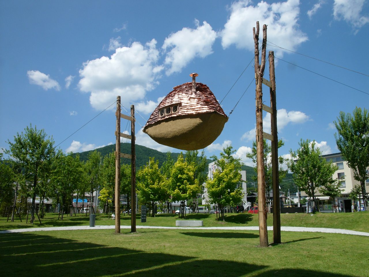
Exterior view of Flying Mudboat. Credit: Terunobu Fujimori
-
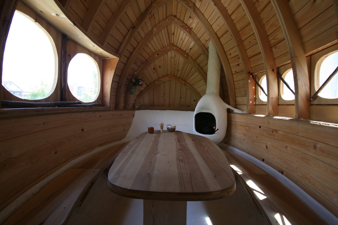
Interior view of Flying Mudboat. Credit: Terunobu Fujimori
This is an amazing teahouse that looks like it is floating in the air.
Ueda: It is as bold as if it were designed for a temporary exhibition. This house has an amusing design, as if the architect might be dissatisfied with the other teahouses nearby, which are either too high or too low, so he finally made it appear to fly through the air. Also, it was a wonderful choice to design the window in such a way as to make it protrude; it makes us strongly conscious of the window space. From the house, we can see the smiles on the faces of people on the ground looking up at the window. One also feels like the scenery from the window opens out into a different kind of world created by this amazing teahouse. Anyone can experience this space during the limited exhibition period, and experiencing the house works as an opportunity for one to start thinking about what a teahouse and a house actually are.
How did you feel about it? Given that this is so small, every space is by the window.
Ueda: As Fujimori once explained, half of our bodies are hidden under the table. So, we can feel relaxed. Because we enjoy climbing up the ladder to enter the house with some difficulty, even strangers can have a good conversation. Because it feels like a corner of a cafe, a simpler space would be better. The window’s shape is almost circular—like Kurokawa’s large circular window floating in the sky, mentioned in Topic 2—but it is rather interesting that it is impossible to categorize it only by its shape, and that there may be some hidden similarities between this window and Kurokawa’s. We may notice an unexpected typology of shapes and functions, as we compare and contrast them. Fujimori’s space is not only small, but is also like a piece of clothing, offering a sense of security and a sense of relaxation.
Topic 6: An unimaginably beautiful window
Studio Gotenyama, Tokyo
Designed by Manabu Chiba
Built in 2006
“The window frame with 70 to 90 cm depth is made of stainless steel on both sides of the top and bottom, making it a mirror tube. The outside scenery is reflected from various sides, and the real image is seen through a layer of imaginary images. The beauty was beyond my imagination. The surrounding buildings are so dense that we can see only the back of the next house close to the window. The scenery could be a damaged wall or a tiled roof, or an expressionless tile and part of a wall.” (Makoto Ueda, 2011)
-
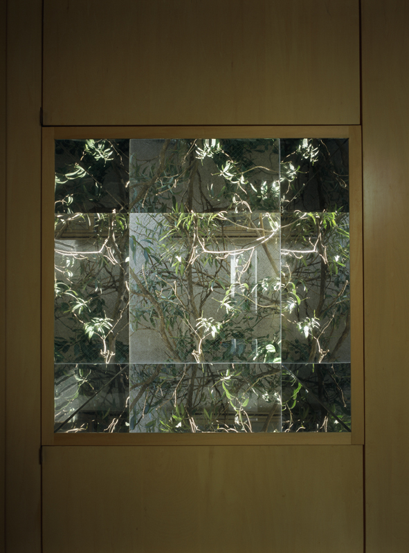
A window of Studio Gotenyama, with trees outside. Photo by Masao Nishikawa -
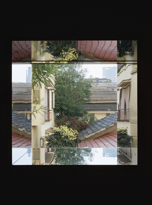
A window of Studio Gotenyama, with walls and roofs of neighboring houses outside. Photo by Masao Nishikawa
This last example is a building with excellent windows.
Ueda: The window frames of “Studio Gotenyama” are very deep because all the plumbing and storage are gathered around its perimeter. All four internal sides of the window frame are covered with a mirror finish that reflects the outside scenery. Usually, no matter how well it is designed, it is not that beautiful, but this one was really quite stunning. In this example, the client is engaged in the art industry, and I thought the client must felt like the client had gotten each unique piece of expensive art for free. The design of window is a kind of invention that can be applied beyond the house genre.
The windows’ power seemed to have changed the scenery itself.
Ueda: What we do not want to see has been reborn as art. Normally, the best part of the view outside the window is cut off and, if the view is not good, then the scenery is blurred with frosted glass. In contrast, this building actively takes in the scenery. The great thing about this designer is that he solves the problem poetically, according to the object.
Windows can be designed, but the window space cannot be designed
Thinking back on all six examples, I am wondering if you could tell me what things are important when observing the window space?
Ueda: If we are only concerned with windows, then we can focus on designing the windows only. But if we design the space around the window, then we should also take furniture, such as chairs, into consideration. Just like a painting of a space by a window, it also includes people. We should also take into account the trees and the views of the city outside the window. To design the window space, one must consider not only the client but also the relationship between the space and other items or people, like a painter does. Therefore, I selected six examples from the articles on the buildings I have visited and written about; I have also summarized them and converted the description of “window” into “window space,” ensuring that no part or word order is changed and no addition is made. I wanted to avoid getting emotional when I rewrote the article with the window frame in mind. My sources are: “Shugojutaku Monogatari” and “Toshi Jutaku Chronicle,” published by Misuzu Shobo, and the August 2011 issue of the monthly magazine, Misuzu. Selecting and summarizing the articles within these limited conditions also offered the chance for thoughtful reflection.
What do these six examples have in common?
Ueda: Among their commonalities are how they reflect that there were many skillful designs, but naturally seasons change, time passes, and trees grow. Adjacent houses are also renovated. Also, the former east dormitory of Tokyo Woman’s Christian University was symbolic, but there are differences among the people who use the building, and the windows’ roles subtly depend on one’s life stage; this is true even if the people who live in the same room are similar to one another, like in the multi-family house that Ando designed. There are many variables that define the window space’s quality. There were times when the design was different from what the architect had expected. After all, we might conclude: “Windows can be designed, but the window space cannot be designed.” With that in mind, I think that the tangled anticipation and unexpected outcomes should be described in the series. Based on this point, I am indeed looking forward to this series.
Makoto Ueda
Makoto Uedo was born in Tokyo in 1935. He graduated from Waseda University School of Letters, Arts and Sciences I. He has worked as editorial staff for Kenchiku, as an Editor-in-Chief of Toshijutaku (first published in 1968), and as Editor-in-Chief of GA HOUSES. Currently, he is a freelancer and the Editor-in-Chief of SUMAI Library Publishing Company. He also received the Architectural Institute of Japan Culture Award 2003; he has written many books, including Shugojutaku Monogatari (photo by Hiroo Kikai, published by Misuzu Shobo, 2004) and Toshi Jutaku Chronicle (two volumes, published by Misuzu Shobo, 2007 and 2011).
