Series Window Behaviorology in Switzerland
A Conversation with Christ & Gantenbein
31 Mar 2022
Christ & Gantenbein was formed in 1998 by Emanuel Christ and Christoph Gantenbein after graduating from ETH Zurich. To date, they have been involved in a wide range of projects, including the renovation and expansion of the Swiss National Museum in Zurich, Kunstmuseum Basel and the ongoing Zurich University Hospital. In parallel with their practice, they are continuously investigating architectural typologies in cities around the world.
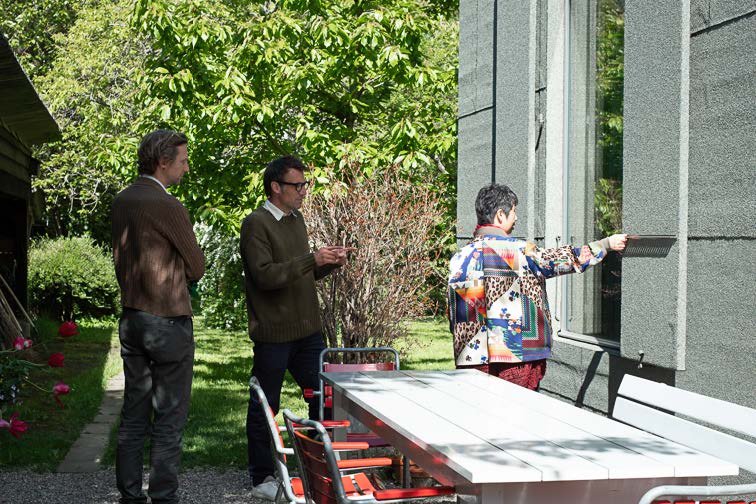
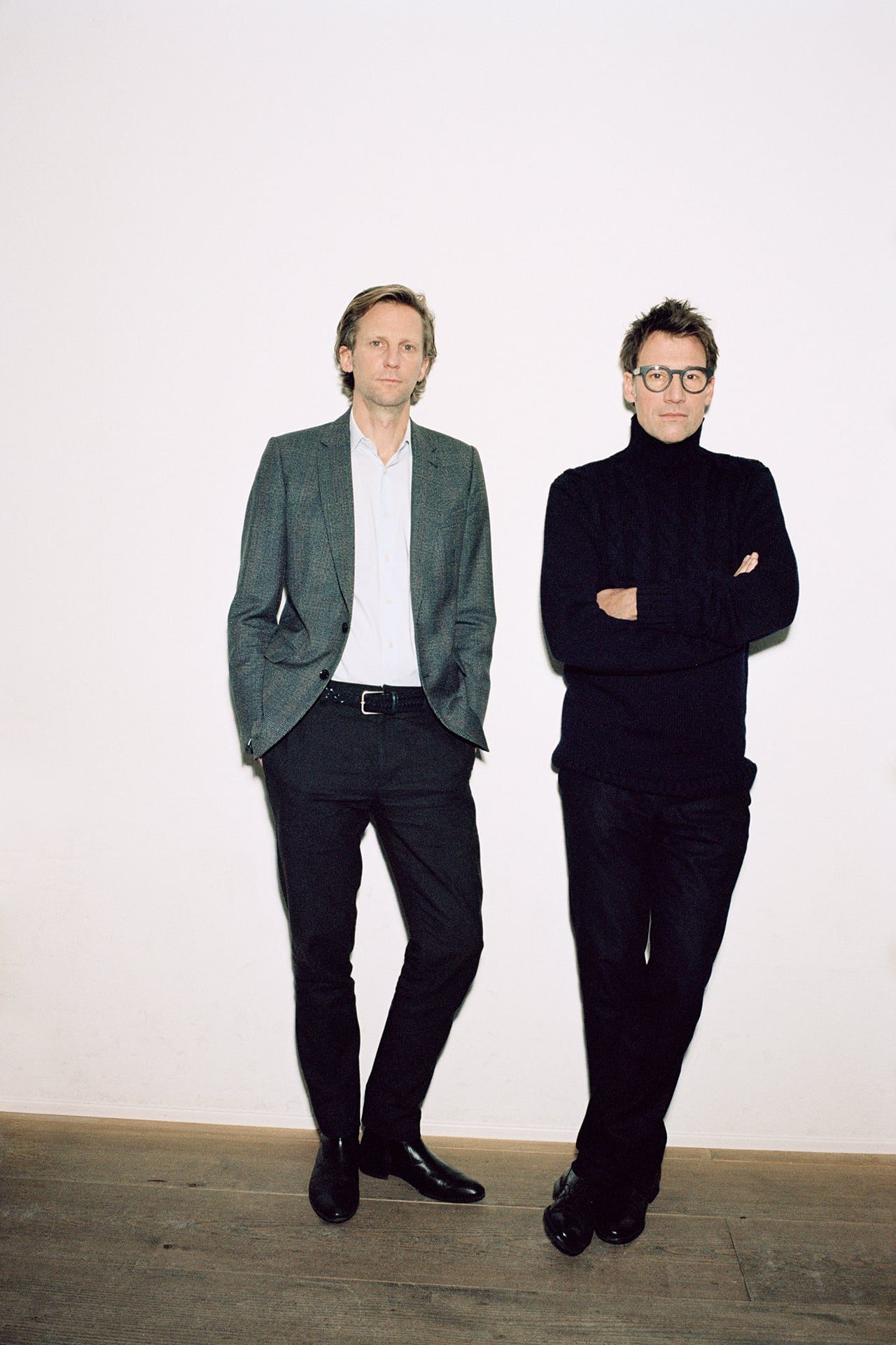
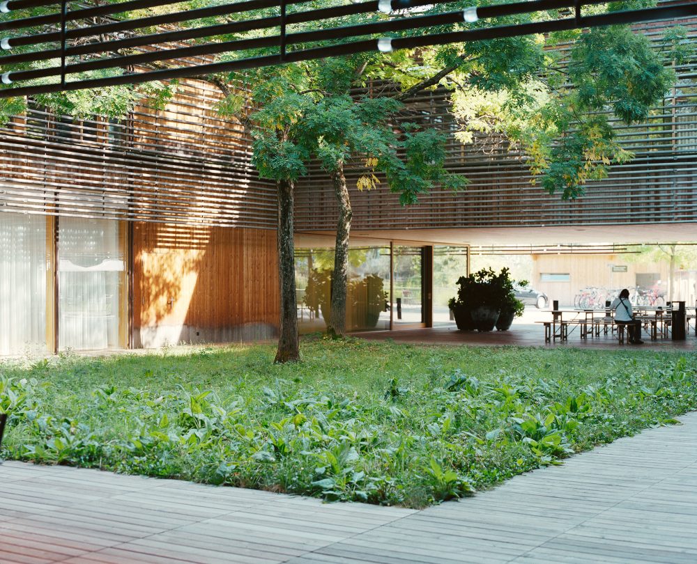
Momoyo Kaijima and Simona Ferrari from the Chair of Architectural Behaviorology at ETHZ interviewed the duo in a corner of a lush garden near Basel, site of their early work, Garden Pavilion.
Chair of Architectural Behaviorology (CAB): We’d like to start by discussing the relationship between window and typology. The notion of typology is central to your research, but it also seems to be an important theme of your design practice, as shown for example by your projects for the Landesmuseum in Zurich or the Kunstmuseum Basel, where the context of the work – an extension – required you to confront an existing typology. This variation of form through history is something that interests us in our research on windows as well. In many respects, the form of the window is closely tied to developments in technology, which over time have allowed for ever larger glazed surfaces. But the window isn’t just an expression of technology, it’s also a representation of society – as typology is more broadly. With buildings like the Landesmuseum you’ve been dealing with the question of what the typology of the museum means today, for our society, but you also seem to be at a turning point in your career, as you’ve begun to explore architecture at a larger – one could almost say, infrastructural – scale.
Christoph Gantenbein (CG): For us, architecture always comes out of architecture. You can understand it historically, in relation to built precedents. But it also has to do with the context, with how the new structure relates to what is already there. It can do this on various levels, through its body, its materiality and means of construction, for example. The fundamental issue, however, is the typology – how is the building organized, what is its underlying principle, how does this principle relate to the surroundings?
On this level, the Landesmuseum and the Kunstmuseum are in direct typological relation with the existing buildings. In both projects, the question was how to create a composition of two parts – one newer, one older – that would work together as a container for the activities of an institution.
In the case of the Kunstmuseum Basel, the extension is analogous to the older building across the street in terms of its inner logic and its spatial organization: the entry on the ground floor, the exhibition spaces on the first floor that interact with the urban space via windows, and finally the more introverted, top-lit spaces on the second floor. The two buildings somehow belong to the same family.
-
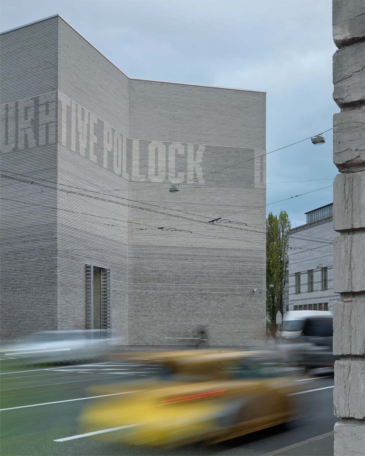
Kunstmuseum Basel, Basel, Switzerland, 2010-16 : ©︎Walter Mair
Emanuel Christ (EC): But alongside this analogy, you also have a process of differentiation or distinction. There’s always a negotiation between the two projects. At the Landesmuseum, the spatial composition is very rich, with two colliding geometries. The basic typological order is that of the enfilade, but the museum is also a collage – a fairly accidental combination of existing spaces with a labyrinthine quality. The extension adds to the collage, but at the same time it clearly offers a new type of space.
-
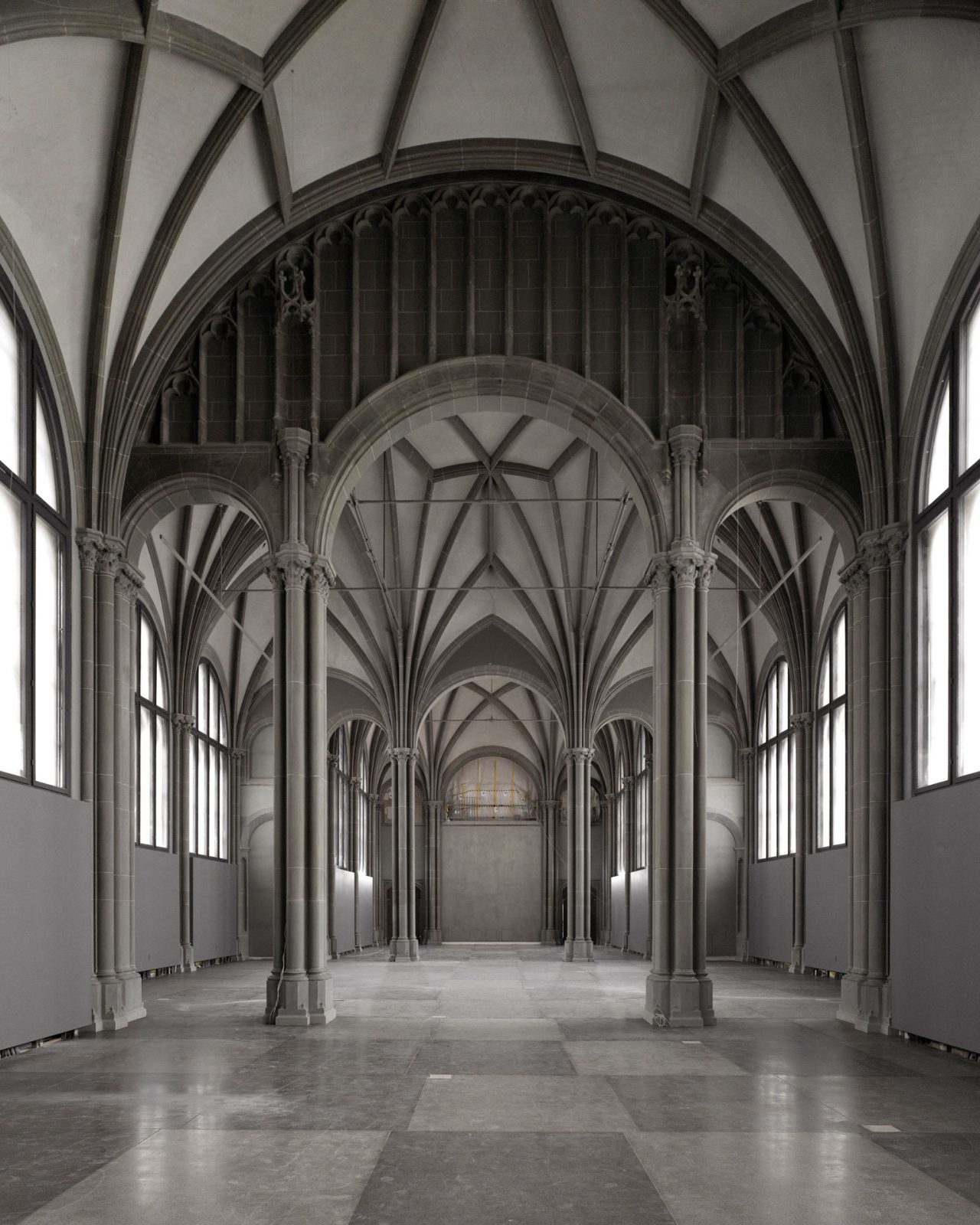
Swiss National Museum Renovation, Zurich, Switzerland, 2002-20 : ©︎Roman Keller
-
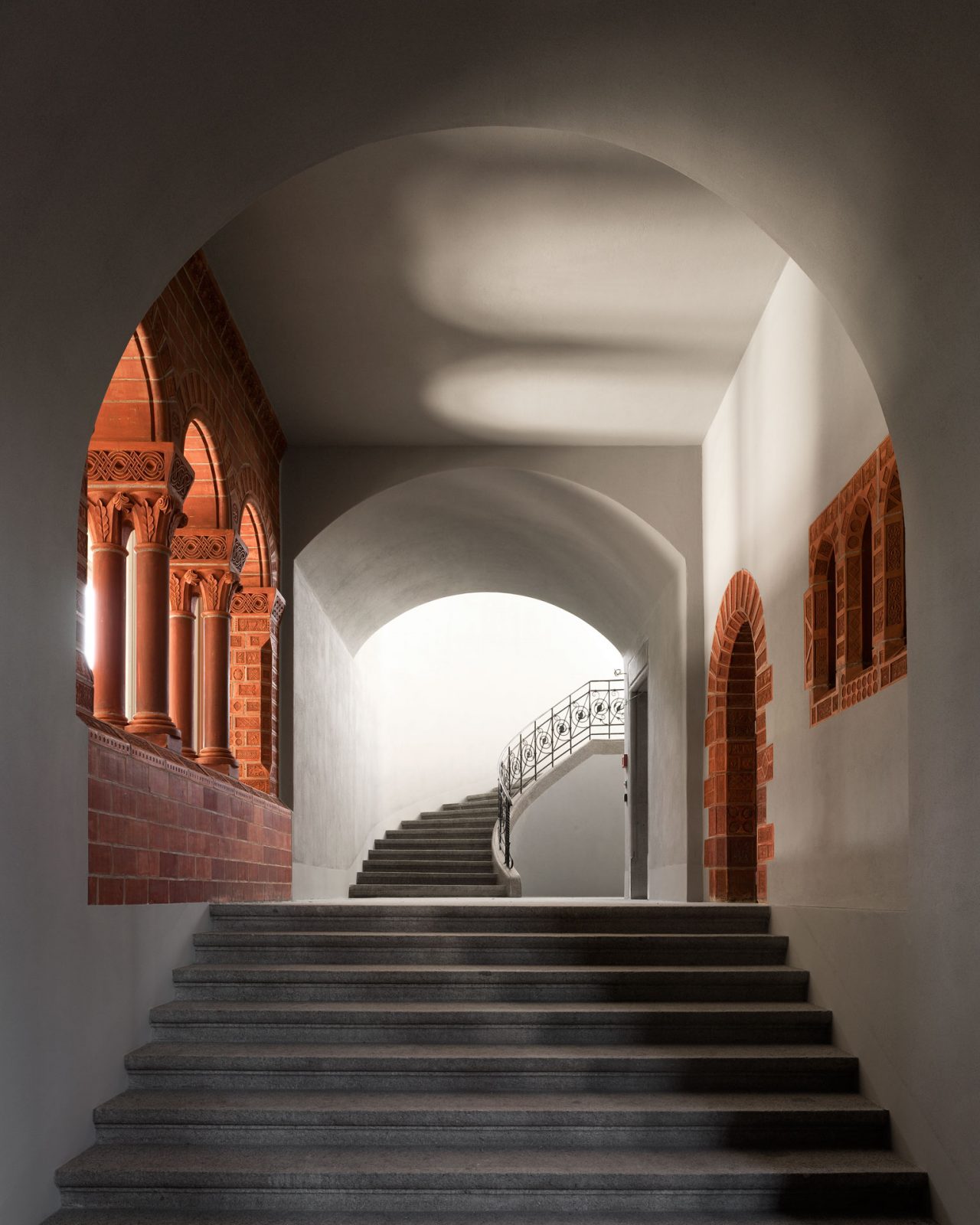
Swiss National Museum Renovation, Zurich, Switzerland, 2002-20 : ©︎Roman Keller
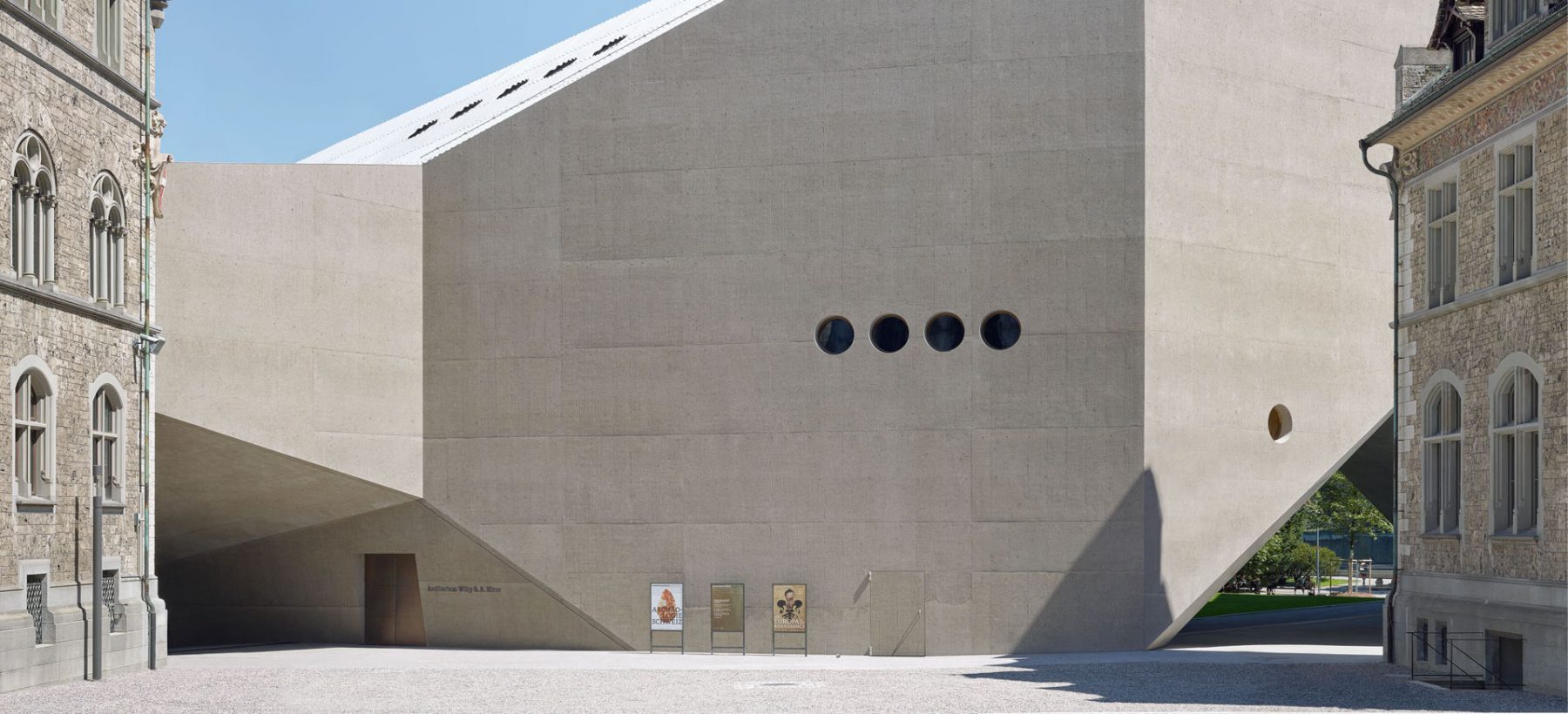
I find your reference to the scale of infrastructure interesting, as that was kind of the scenario for the development of the windows in the Landesmuseum. In Switzerland we have these phenomenal engineered spaces in the mountains or underground. Looking at our extension almost as a piece of infrastructure gave us a way to approach the dynamics and the scale of the space, which goes far beyond a traditional gallery. Like in a power plant, the windows are not so much windows, as technical openings: very precise connections between the interior and exterior. Inside, however, the space offers more intimate moments on a human scale, for example with the height of the windows.
-
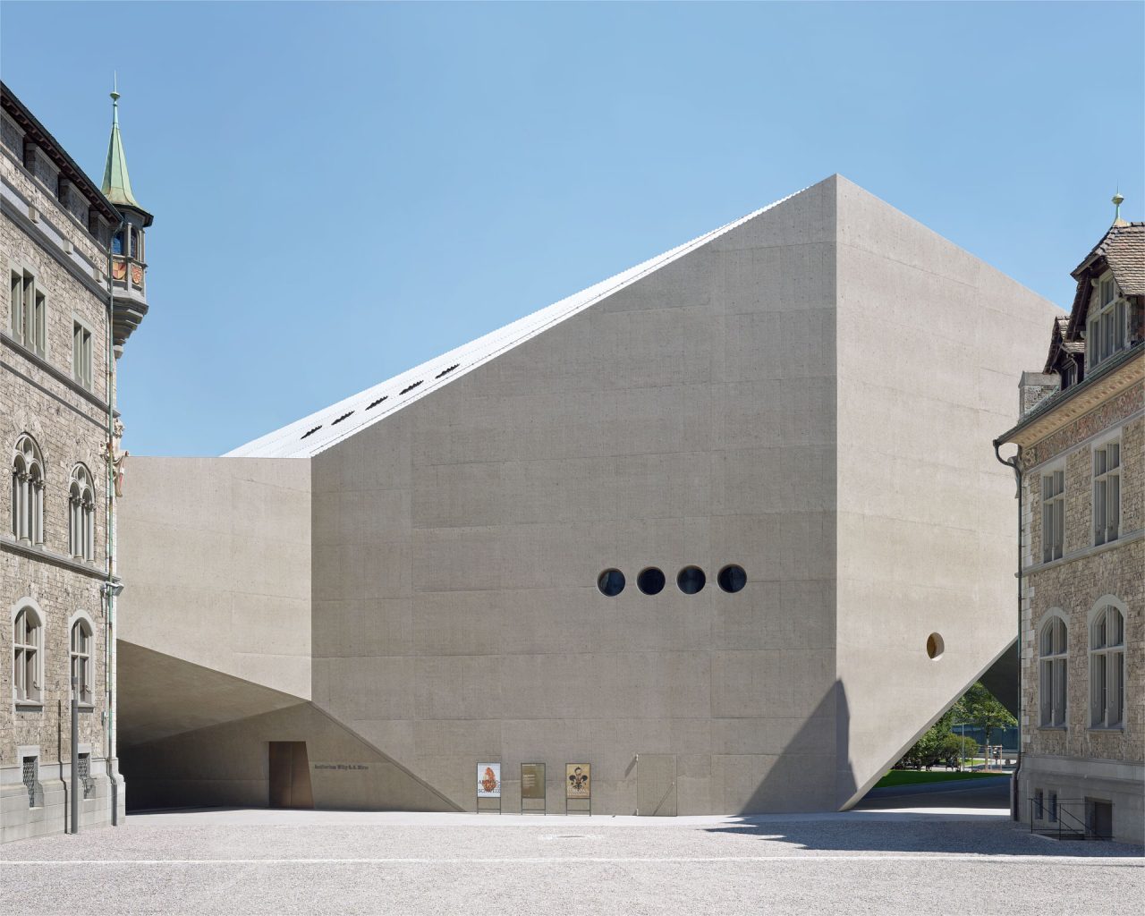
Swiss National Museum Extension, Zurich, Switzerland, 2000-16 : ©︎Walter Mair
CAB: The reference to the notion of infrastructure was also meant to suggest the honest and direct way in which infrastructure fulfils a specific need. Museums have evolved a lot, and you have no hesitation about moving away from earlier precedents and directly addressing what contemporary society needs from a museum building. In a sense, typology is the manifestation of the connection between people and architecture.
EC: Type naturally relates to society, as a generally accepted or even collectively produced solution. In that respect, it would seem to be the opposite of an individual gesture. But as we see it, every design, however unique, also reaches a certain level of generality, as an interpretation or iteration of that type.
The windows in the Landesmuseum, for example, simply exist to bring in daylight; it’s a museum that displays objects. But this goes against the grain of contemporary museums – the late-twentieth-century type – where the role of the window is not to illuminate the exhibits, but to establish a relationship between inside and outside for the visitor, often with the addition of a panoramic rooftop or large entrance foyer. The gallery itself is a closed box, and the experience of art is totally disconnected from the external surroundings. This type, in turn, represented a fundamental paradigm shift from the late modernist model, where they tried to open up the museum, get rid of the wall completely, as at the Louisiana Museum, for example.
-
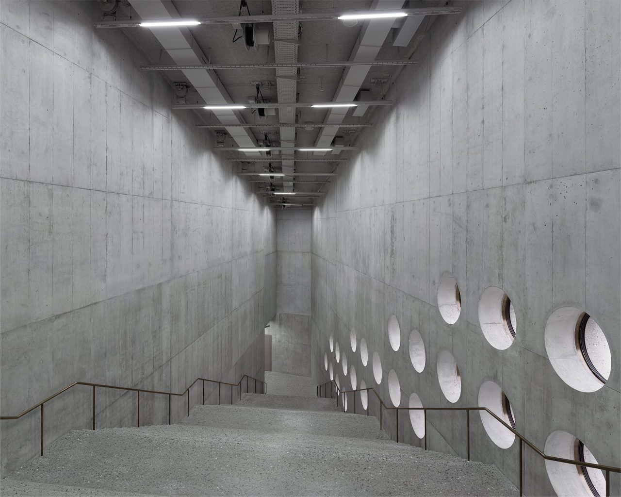
Swiss National Museum Extension, Zurich, Switzerland, 2000-16 : ©︎Walter Mair
CG: In museum circles, the window is often seen as problematic, as compromising the focus on the exhibition, distracting from its narrative. But as architects, we see things differently: for us, the specific site of the museum means something. It matters whether I visit an exhibition in the Landesmuseum – or the Louvre or the British Museum – and the perception of the exhibits is again completely different from seeing it on the internet. How the object arrived at that location is also an important part of the story.
EC: So, ideally, the perception of the artwork is combined with the perception of the place – the specific spatial condition in which you view it. This again goes back to the question of the window and the way it addresses the human scale and the relation of the body to space.
-
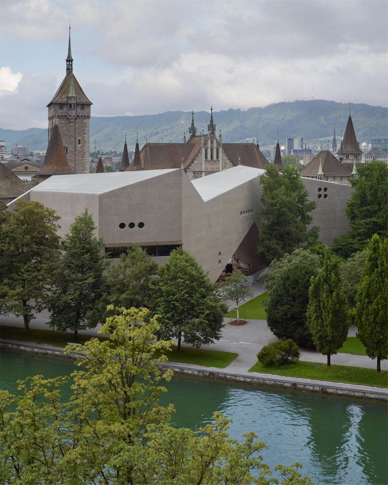
Swiss National Museum Extension, Zurich, Switzerland, 2000-16 : ©︎Walter Mair
CAB: How do you investigate the different sizes and proportions of windows in the design process?
EC: At the Landesmuseum, once we’d come to understand the windows as technical openings – some of them are primarily for ventilation, after all – we made the decision to drill them out of the wall. It seemed the most reasonable and precise way of doing it. So, the diameter of the windows is the maximum we could achieve with the drilling machine: 110 cm.
-
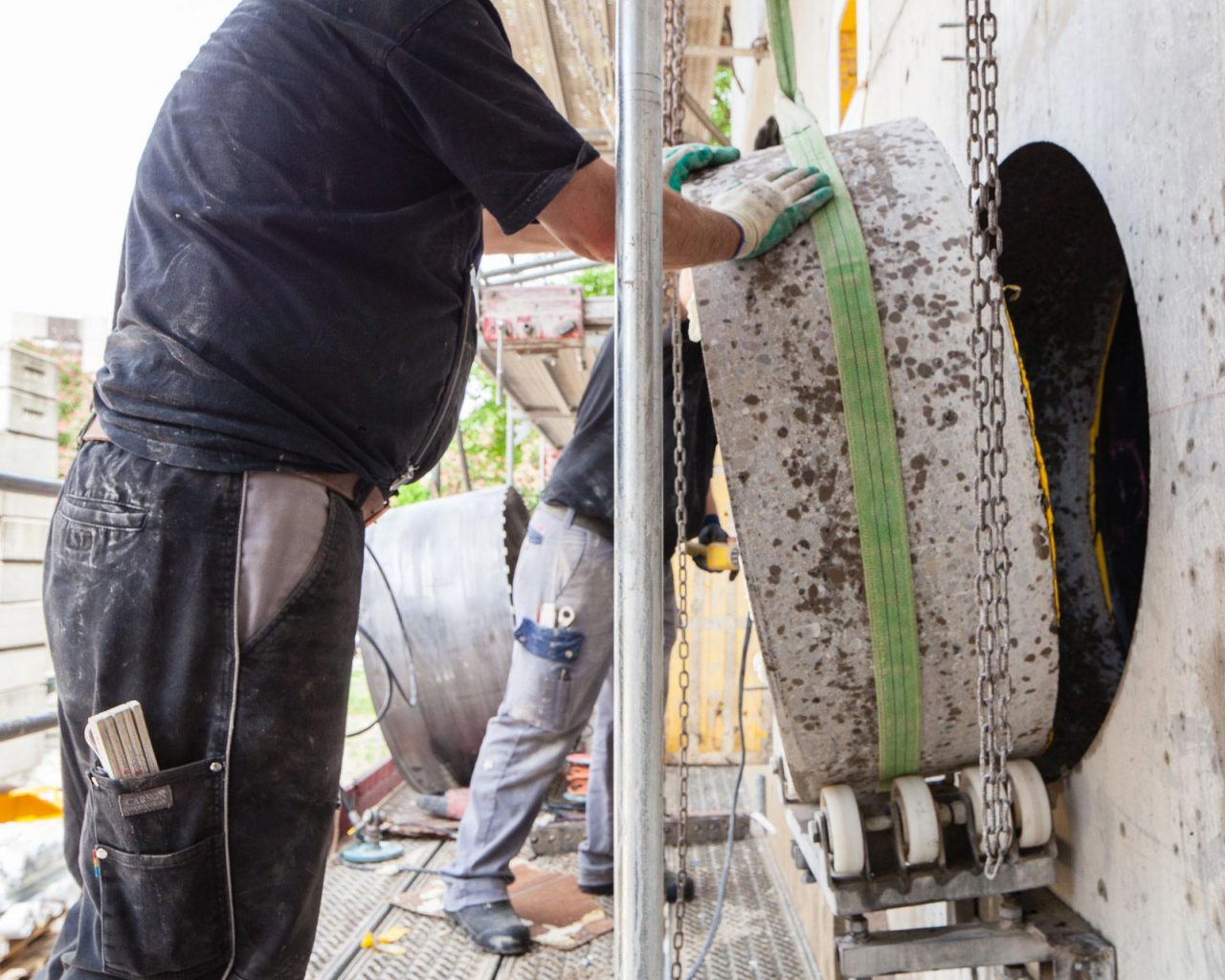
Swiss National Museum Extension, Zurich, Switzerland, 2000-16 : ©︎Roman Keller
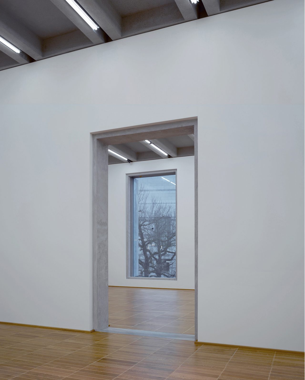
It was different at the Kunstmuseum. It was more a question of proportions and the desire to create moments where inside and outside start to come together or blur a little. In that case, we built models and 1:1 mock-ups to approximate the actual experience, measure it with our own bodies.
-
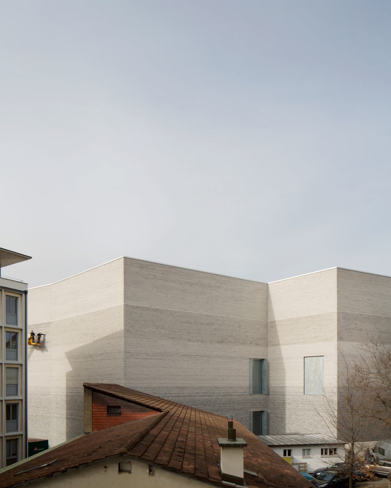
Kunstmuseum Basel, Basel, Switzerland, 2010-16 : ©︎Stefano Graziani
-
Kunstmuseum Basel, Basel, Switzerland, 2010-16 : ©︎Walter Mair
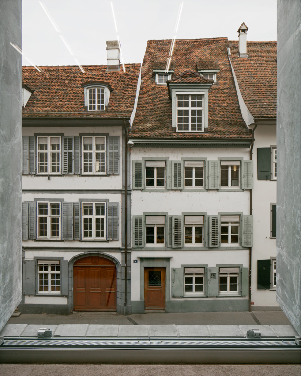
CG: But the window cannot be designed in isolation. On the one hand, it connects with the typology of the plan, so you have to consider how it relates to the space and to the other elements of the interior – ceilings, floors, doors. On the other hand, the proportions of the windows relate to the urban space, and they determine the building’s appearance from the outside.
CAB: Usually the design of the window involves a certain technical dimension. Yet when you experience the space of the Kunstmuseum, you get the impression that the window and its technical scale are disappearing. You perceive an opening that draws you to the outside in a very direct manner…
-
Kunstmuseum Basel, Basel, Switzerland, 2010-16 : ©︎Stefano Graziani
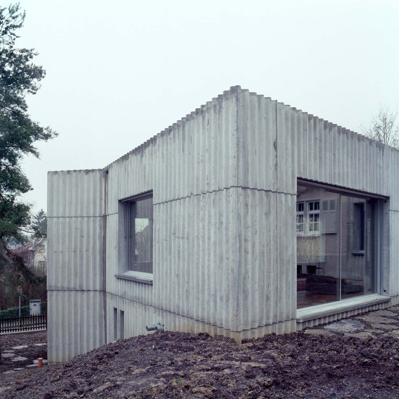
EC: That’s an interesting observation, which is perhaps connected to the notion of ruin. As Christoph just mentioned, windows define the physiognomy of the building; they’re like the building’s eyes. Yet in our buildings, it’s the wall that is the main presence; the architectural element of the window is very reduced, almost non-existent, ruin-like.
CG: For us, there’s also respect for (even fear of) the impact that the window technology can have on the expression of the building. Window construction is a crucial part of architecture. You can describe the physiognomy of a city through the detailing of its windows: think of the windows of Haussmann’s Paris or those nineteenth-century quarters in German cities. With a smaller project with a reasonable budget, it’s still possible to develop beautiful windows within these technical constraints, but when you work at a larger scale, under high economic pressure, there’s a risk that the technological aspects will escape your control and dominate the expression of a building.
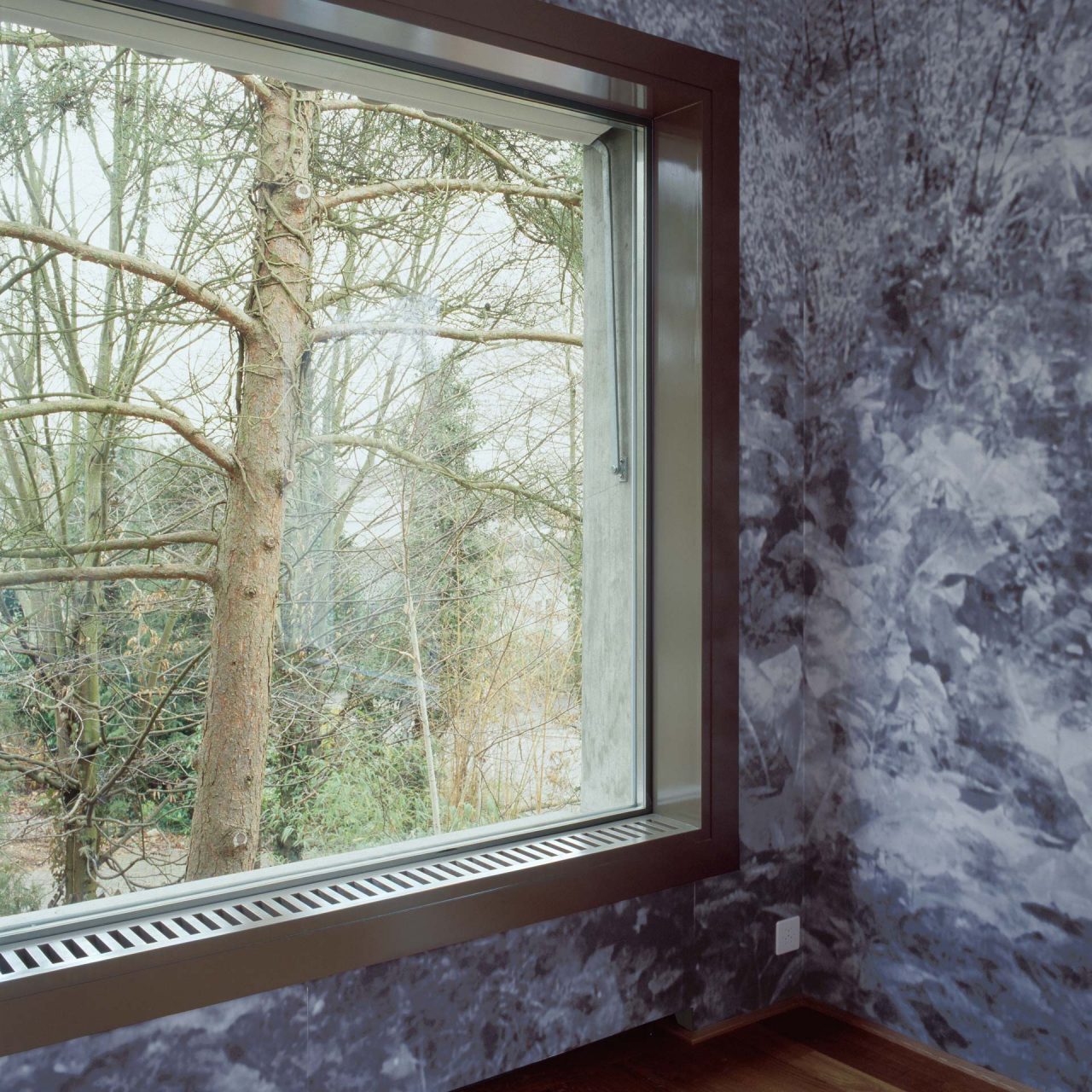
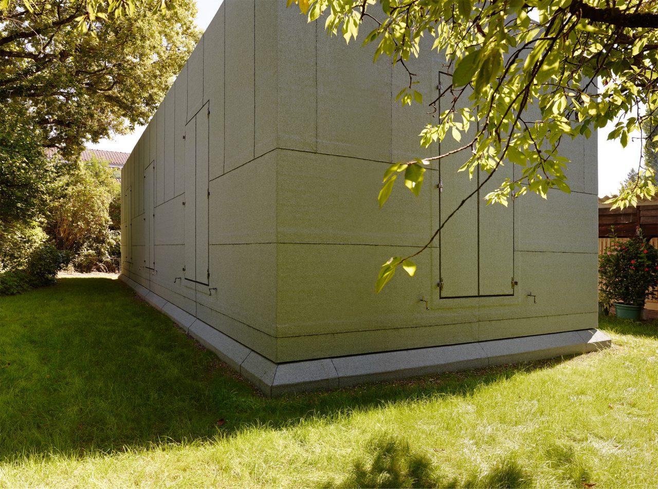
EC: So, in our work, the window has an elementary presence that could also be read as an absence of the window. This design strategy started in our very early project, the Garden Extension Arlesheim, which could be seen as a small-scale rehearsal for the project at the Landesmuseum. While the physical presence of the volume is very refined, the windows are simply openings cut out of this volume. That’s also where we started to have this sort of ambiguous big garden pavilion/ruin idea.
-
Garden Extension Arlesheim, Arlesheim, Switzerland, 2001-02 : ©︎Roman Keller
-
Garden Extension Arlesheim, Arlesheim, Switzerland, 2001-02 : ©︎Roman Keller
Now, it would be interesting to discuss whether this is a strategy of abstraction or not. Maybe, in the end, it’s an academic discussion, as we don’t think in terms of an abstraction of the window. In the case of the Landesmuseum extension, for example, there is a high degree of concreteness and physicality.
The cutouts in the walls reveal the cut of the terrazzo, the way it is polished, and then there are the windows with their brass frames. So, there’s a celebration of the presence of the material, almost as if it were an archaic construction. In the case of the Kunstmuseum Basel, the window frames are more hidden, but we have the shutters. We love the idea that they have a physical presence – that they stand out from the façade when they open up, casting a shadow. Of course, we could have chosen to conceal the screens by integrating them in the wall, but that’s not something we would do. For us, it is important to reduce the elements to the fundamentals of architectural form, but without pursuing a sense of abstraction.
-
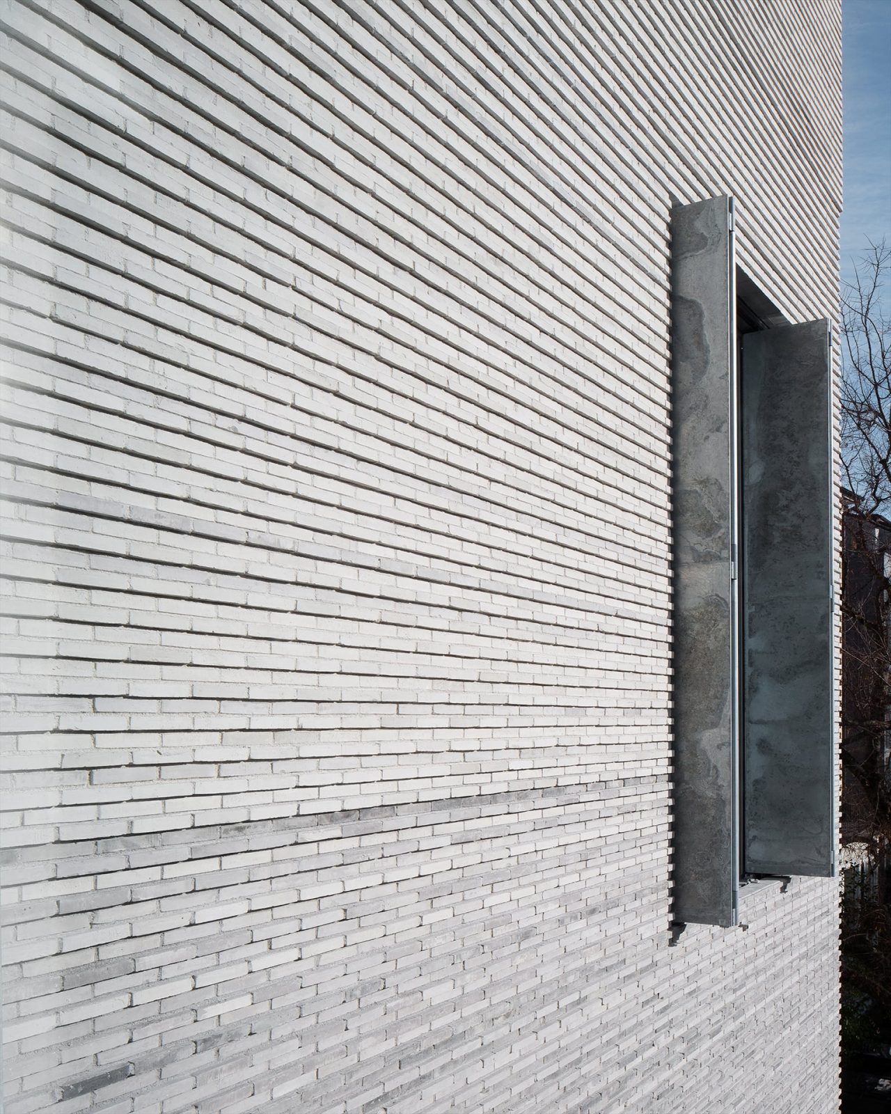
Kunstmuseum Basel, Basel, Switzerland, 2010-16 : ©︎Stefano Graziani
CG: When it comes to the design of the window, the physicality of the wall is one of the issues at stake. The window tells us about the reality of the construction and the materiality of the building, which is exposed through the section – nothing can be hidden.
CAB: To finish, we’d like to discuss your ongoing design of new buildings for the Zurich University Hospital. There’s a very large technical component to hospital design nowadays, which turns them into another kind of infrastructure. At the same time, however, they require attention to the human scale. The hospital is also an institution that’s closely connected to its social context and thus the question of typology is again very relevant: hospitals have transitioned from large wards accommodating many patients to single rooms, for example…
EC: Indeed, the question with this project is how to manage this huge technological machine so that it relates to both the human and the urban scale and becomes part of the city. In this respect, Zurich University Hospital is something of a special case. In other European countries, as the costs of healthcare have escalated, city hospitals have been replaced with large-scale facilities outside the urban centre. In Zurich, there’s still the belief that a hospital has a part to play in the renewal of a city.
CG: The single rooms for patients were a central component of the program; they take up five floors in total (including two for intensive care). However, the window does not relate specifically to this one type of space but rather deals with an extremely heterogeneous program that encompasses very different kinds of spaces, from emergency rooms to admin offices, etc. The floorplan is comparable to that of an office building, where interior walls come and go. It’s about flexibility, which in a sense is against typology. So, the window is part of the technical skin of the building. It’s more of an independent element here. If we think about the window as something related to both the physiognomy of the building in the city and the interior space, the latter aspect only comes in on a secondary level.
-
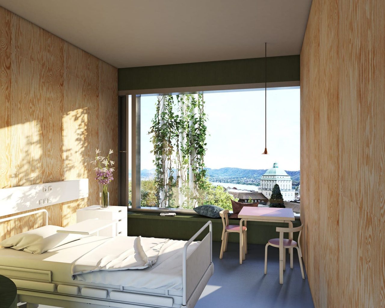
Zurich University Hospital USZ, Zurich, Switzerland, 2019-28 : ©︎Christ & Gantenbein
CAB: The images of the hospital project show the use of a green facade. Is this a way to conceal the kind of excessively technical expression that we talked about earlier?
EC: I think that, in the first instance, it’s not about hiding the architectural elements; it’s about the idea of creating a certain spatial depth in the facade that can offer a sense of complexity and richness. When I sit in a room that is partly framed by plants it immediately impacts how I sense the space. I have a totally different perception of the outside.
-
©︎ Chair of Architectural Behaviorology
Again, this goes back to the question of the human scale. Another point would be the idea of healing environments: it is a proven fact that the presence of plants contributes to our well-being. Plants also provide shading and help create an ideal microclimate. In older hospitals, it wasn’t difficult to integrate this aspect, as the building would be surrounded by a garden, but with the large-scale hospitals of today, it’s not so easy.
There is also the issue of defining the relation of the project to the existing context. We’re not building onto a museum this time, but it’s still an extension, if you will. When the original Zurich University Hospital was built in the late 1940s, it had this combination of natural elements, such as growing plants, and a connection with the outside world, in the form of balconies and loggias. Balconies are no longer allowed today for safety reasons. Still, we want to reassert the presence of these natural elements. All the rooms should have this connection with the outside, this interaction with nature, with the daily rhythms and the passing of the seasons.
To go back to what Christoph said at the beginning about how architecture draws from its own precedents, this also applies to the hospital’s design. We want to bring the elements of the sanatorium, the veranda, even the domestic loggia into the context of a high-end, technological building complex. In a way, this could be seen as a statement against abstraction. We want to build something more than just a highly efficient, hermetically sealed box.
CAB: The greenery allows you to bring different scales and layers into the hospital architecture. It could be seen as either an infrastructure or a garden.
EC: Yes, the reference to the garden is absolutely true. We will build a metallic tectonic system that can incorporate the growth of plants. It’s not about uncontrolled growth, though there’s perhaps still a romantic element to it. What’s important here is this logic of layering: the body of the building with the windows and then the tectonic system of columns and beams. So, rather than hiding the elements, it’s more a case of the architecture being ʻoverformed’ by nature, which is something extremely beautiful. To a certain extent, this brings us back to the notion of ruin. For example, in Milan you have these typical Novecento houses where the built mass is almost completely overgrown by plants, and the window has its own presence, like here in the Garden Pavilion. Since the form is defined by the architecture and not by nature growing freely, it creates an interesting, ambiguous correspondence of architectural and natural forms.
-
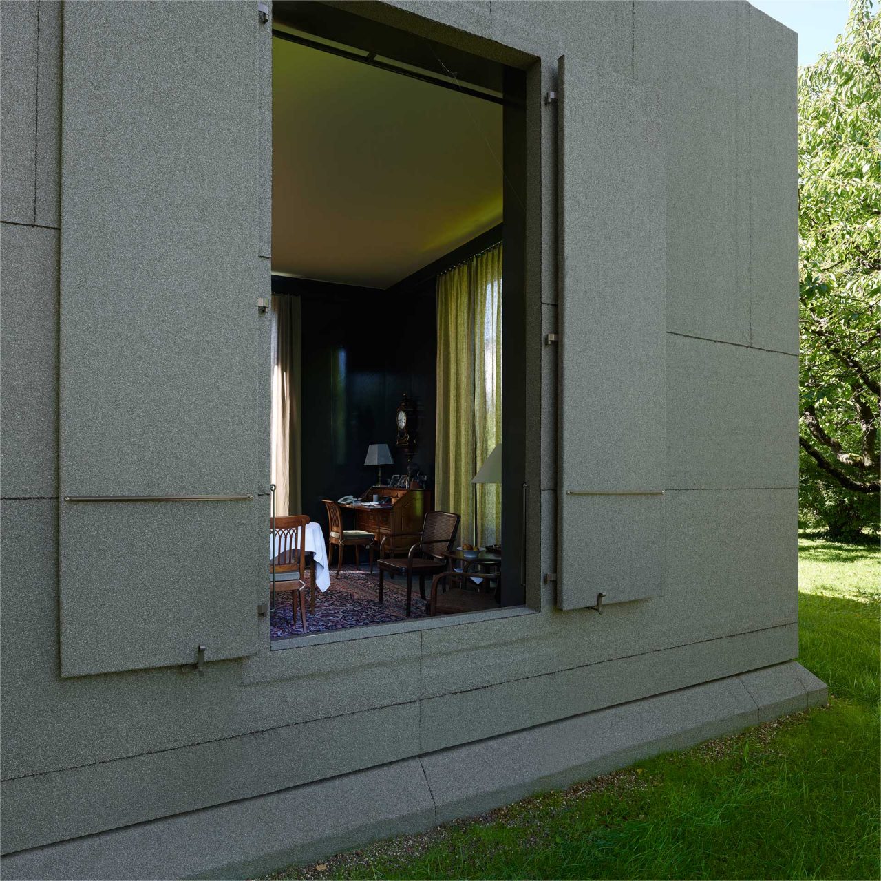
Garden Pavilion, Basel, Switzerland, 2011-12 : ©︎Walter Mair
-
Garden Pavilion, Basel, Switzerland, 2011-12 : ©︎Walter Mair
CAB: The reduction of the element of the window to an almost ruin-like figure is a recurrent theme in your designs. As you indicated, this could also be seen as an act of resistance against the technical expression of the window. But why do you think such an approach is relevant today? In other words, what is the value of the ruin for contemporary society?
CG: Much more than the idea of a building in a possible future – so, the thematization of the temporality of architecture – what interests us about the ruin is the way it reduces architecture to its typological quality, ie, to the spatial structure. This determines how a building is organized, how it positions itself in an urban context, what types of use it offers. The window plays a decisive role in this, establishing a relationship between inside and outside. That’s why in our projects the window is important as an event, whereas we find its construction, for example its materiality, its division, rather problematic: these qualities can intrude and weaken the primary event of the opening.
For us, thinking of the house as a ruin, that is, as a pure spatial structure, is linked to the idea of an almost anonymous architecture, an architecture without a personal signature, an architecture in a modestly restrained and at the same time pure, absolute state.
-
©Lukas Wassmann
Emanuel Christ
Emanuel Christ (*1970) studied architecture at ETH Zurich, EPF Lausanne and HdK Berlin. Together with Christoph Gantenbein, he founded Christ & Gantenbein in Basel in 1998 and continue to receive numerous awards worldwide. Their built work includes the renovation and expansion of the Swiss National Museum in Zurich as well as of the Kunstmuseum Basel (both 2016). Emanuel Christ taught at HGK Basel (2002–2003), ETH Studio Basel (2000–2005), Robert Gordon University Aberdeen (2005), Oslo School of Architecture and Design (2008), Accademia di Architettura in Mendrisio (2006, 2009), ETH Zurich (2010–2015) as well as at Harvard GSD (2015–2017). In 2018 Emanuel Christ was appointed Full Professor of Architecture and Design at ETH Zurich and, in 2021, Kenzo Tange Design Critic in Architecture at Harvard GSD.
Christoph Gantenbein
Christoph Gantenbein (*1971) studied architecture at ETH Zurich. Together with Emanuel Christ, he founded Christ & Gantenbein in Basel in 1998. Their built work includes the renovation and expansion of the Swiss National Museum in Zurich as well as of the Kunstmuseum Basel (both 2016). Christoph Gantenbein taught at HGK Basel (2002–2003), Accademia di Architettura in Mendrisio (2004, 2006, 2009), Oslo School of Architecture and Design (2008), ETH Zurich (2010–2015) as well as at Harvard GSD (2015–2017). From 2008 to 2017 he was member of the managing board SIA Basel. In 2018 Christoph Gantenbein was appointed Full Professor of Architecture and Design at ETH Zurich and, in 2021, Kenzo Tange Design Critic in Architecture at Harvard GSD.
Momoyo Kaijima
Momoyo Kaijima has served as Professor of Architectural Behaviorology at ETH Zurich since 2017. She founded Atelier Bow-Wow with Yoshiharu Tsukamoto in 1992 after her initial studies at Japan’s Women’s University and completed her post-graduate program at the Tokyo Institute of Technology in 2000. An associate professor at the Art and Design School of the University of Tsukuba since 2009, she has also taught at Harvard GSD (2003, 2016), Rice University (2014–15), TU Delft (2015–16), and Columbia University (2017). While engaging in design projects for houses, public buildings, and station plazas, she has conducted numerous investigations of the city through publications such as Made in Tokyo and Pet Architecture. She was the curator of the Japan Pavilion at the 16th International Architecture Exhibition — La Biennale di Venezia.
Simona Ferrari
Simona Ferrari has been a teaching and research assistant at the Chair of Architecture Behaviorology (ETH Zurich) since 2017 and works independently as an architect and artist. She studied architecture at the Politecnico di Milano, TU Vienna, and the Tokyo Institute of Technology as Monbukagakusho Fellow. From 2014 to 2017 she worked with Atelier Bow-Wow in Tokyo, completing several international projects. She is currently pursuing an MA in Fine Arts at the Zurich University of the Arts. Ongoing projects include the winning proposal of Europan 15 for the former industrial site of Acetati in Verbania, IT (with Metaxia Markaki).
Top image: Swiss National Museum Extension, Zurich, Switzerland, 2000-16 : ©︎Walter Mair
MORE FROM THE SERIES
-

Window Behaviorology in Switzerland
Swiss Window Journeys: A Conversation between Andrea Deplazes, Laurent Stalder, and Momoyo Kaijima
17 Dec 2024
Window Behaviorology in Switzerland
A Conversation with Silke Langenberg
25 Jul 2024
Window Behaviorology in Switzerland
A Conversation with François Charbonnet (Made in)
25 Jan 2024
Window Behaviorology in Switzerland
A Conversation with Christine Binswanger, Raúl Mera (Herzog & de Meuron)
24 May 2023
