Series Windows of Japanese Modernist Architecture
The Windows of the Migishi Atelier: Inheritance and Change
01 Apr 2022
- Keywords
- Architecture
- Essays
- Japan
- Renovation
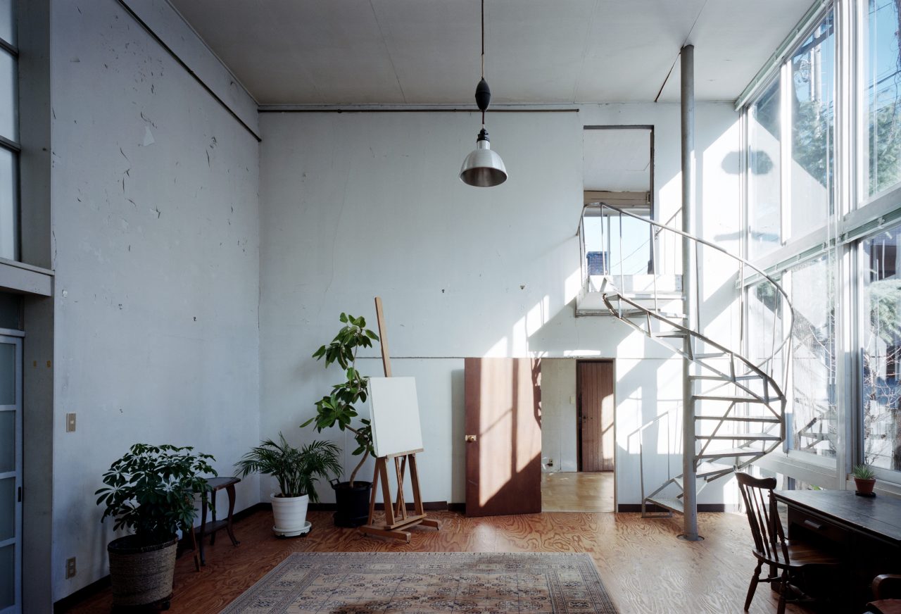
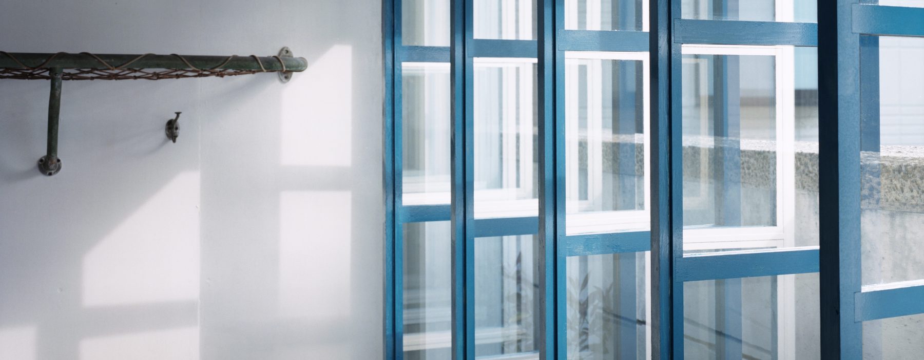
In October of last year (2021), the Migishi Atelier (Kamisaginomiya, Nakano, Tokyo) was opened to the public after the architecture collective GROUP completed a partial renovation of its interior walls and former entrance. Built originally for the painter Kotaro Migishi (1903–1934) in 1934, the building was designed by Bauhaus-trained architect Iwao Yamawaki (1898–1987) and is known as a precious surviving work of early Japanese modernism. As its most distinctive feature is the large glass window extending across its front face, GROUP’s renovation project was particularly meaningful in that it restored the old entry approach that passes alongside this window, enabling visitors to once again experience the spatial sequence as it was originally envisioned.
-
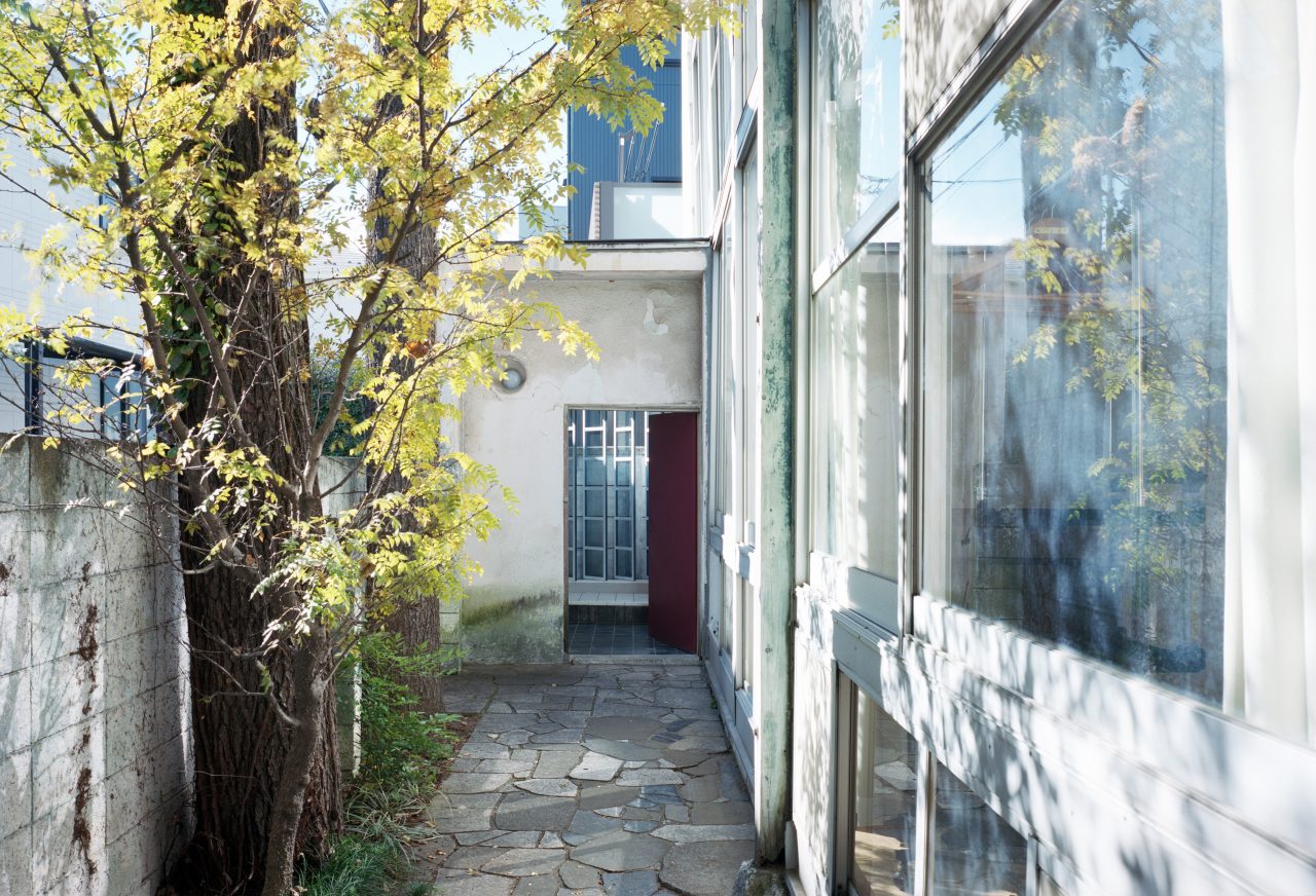
The approach leading to the repaired former entrance. The remade window is visible at the back. (photographer: Yurika Kono)
-
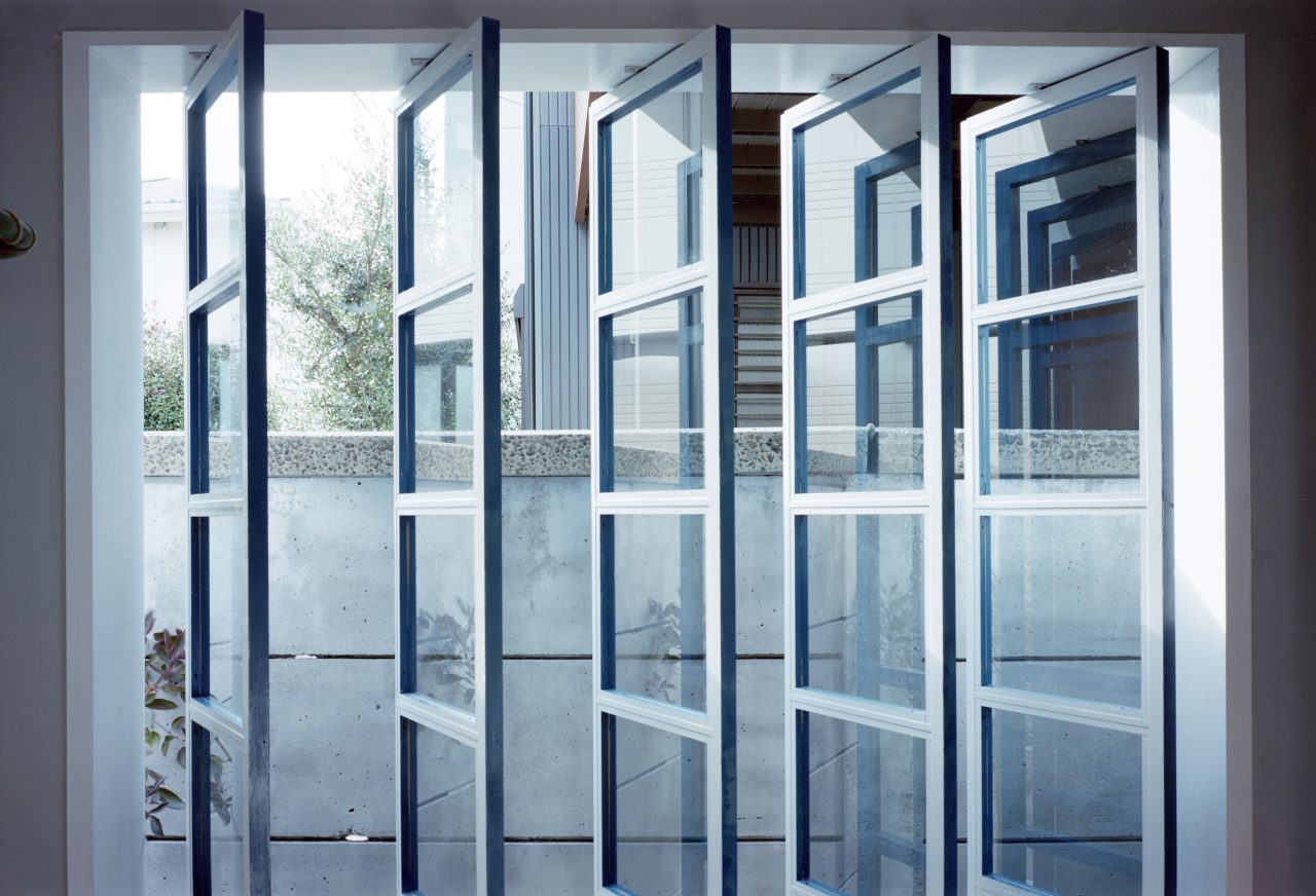
The remade window of the former entrance. (photographer: Yurika Kono)
-
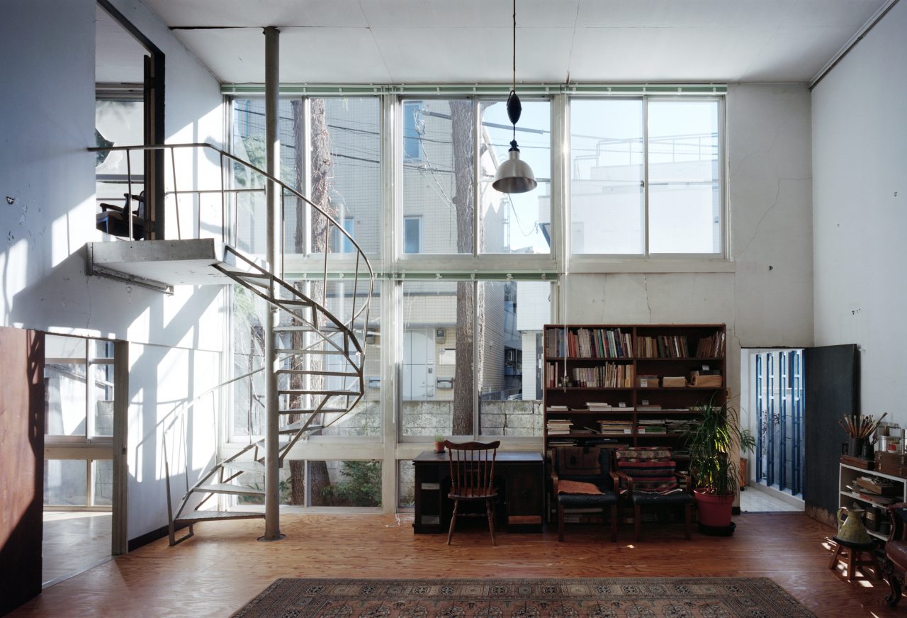
View towards the entry approach from inside. (photographer: Yurika Kono)
It is important to note, however, that this large window had already been considerably altered since the building was first built. At the time, the window was composed of fixed wood sashes (with some top hung sashes for ventilation purposes), but it is now made up of double-sliding aluminum sashes that were installed at a later time.
-
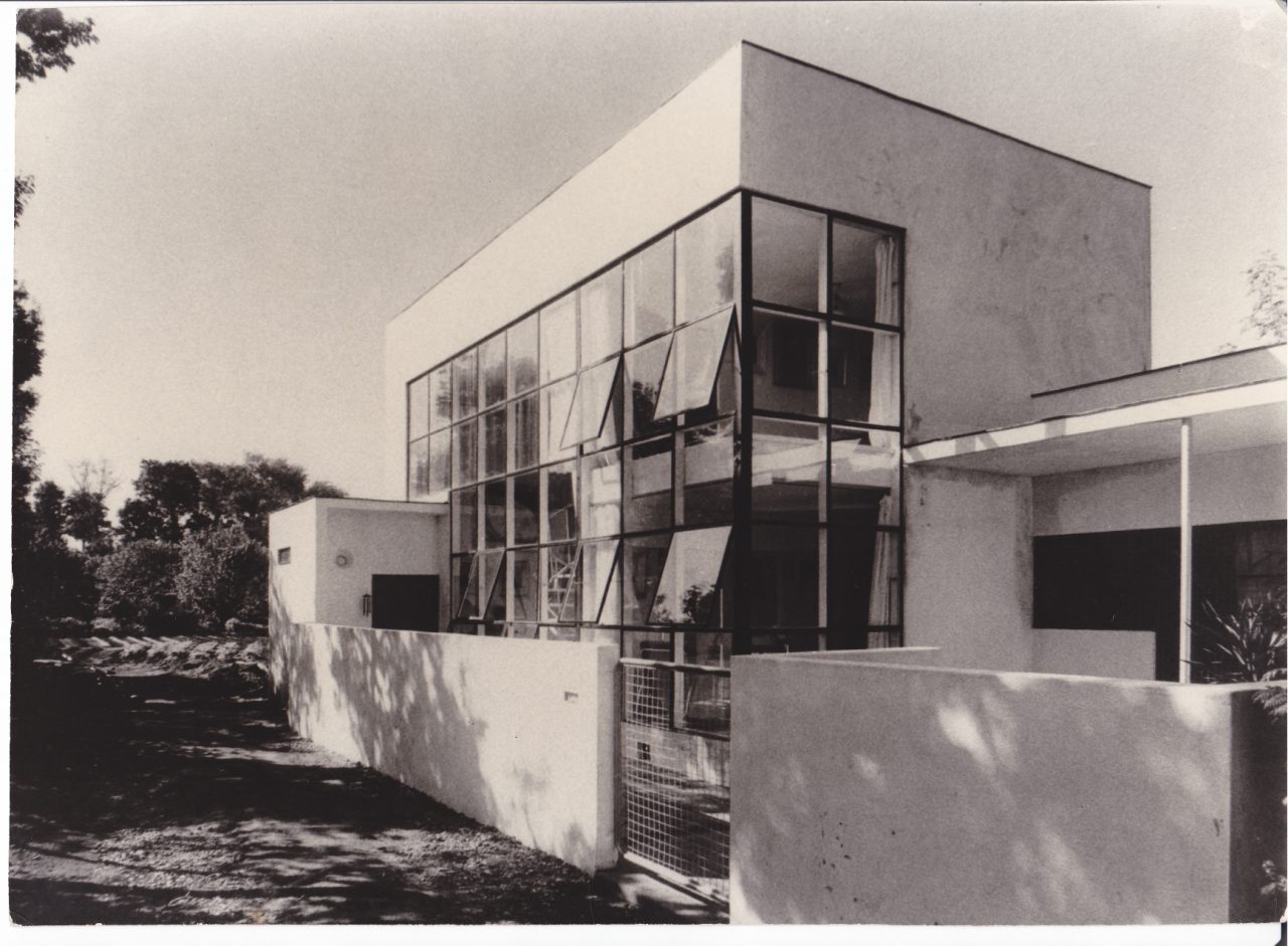
View from the east at the time of completion. (photographer: Iwao Yamawaki)
The grids of thin even lines formed by these wooden sashes contributed greatly to the sharp, light look of the building as pictured in the completion photographs shot by Yamawaki himself. One can appreciate from his writing at the time the great effort he put into creating the design in response to Migishi’s wish for a “glass building” with glazed walls on all but the north side despite being constrained to working in wood.
The dream plan to cover three of the walls with large glazed surfaces may certainly be feasible, but it would be too great an adventure for a wooden structure with this small a budget. Considering also the fact that such a building would likely be practically unusable as a workspace, I settled on making glass openings only on parts of the two walls on the south and east sides. However, I did fully extend these glazed surfaces from floor to ceiling. Their studs, which I spaced at three shaku [approx. 900 millimeters] by shortening the depth of the building as much as possible, double as the window frames by supporting the three-shaku-square glass panes set in recesses cut into their outer faces. I also included several top-hung sashes for ventilation. As for the rim beams of the second-floor study, I pushed them in and intentionally made it so that their white-painted faces show through the glass to the outside. Iwao Yamawaki, “Minamimuki no Gashitsu: M-shi no Atorie” [A south-facing painting room: M’s atelier], Kokusai Kenchiku [International architecture] (November 1934): 443.
In addition to the idea of utilizing the studs as the window frames as described here, the way the frames were painted also had a significant effect on how these windows were perceived. To be more specific, according to the same article, the window frames were painted with dark blue paint, but as can be seen in the photographs, this color was only applied to their outer faces, while their side and back faces were painted white. This made the gridded window frames appear to float forward like abstract surfaces when viewed from outside, but from the inside, the dark blue grids would have been hidden, causing the frames to become less conspicuous and heightening the sense of continuity between the inside and outside.
-
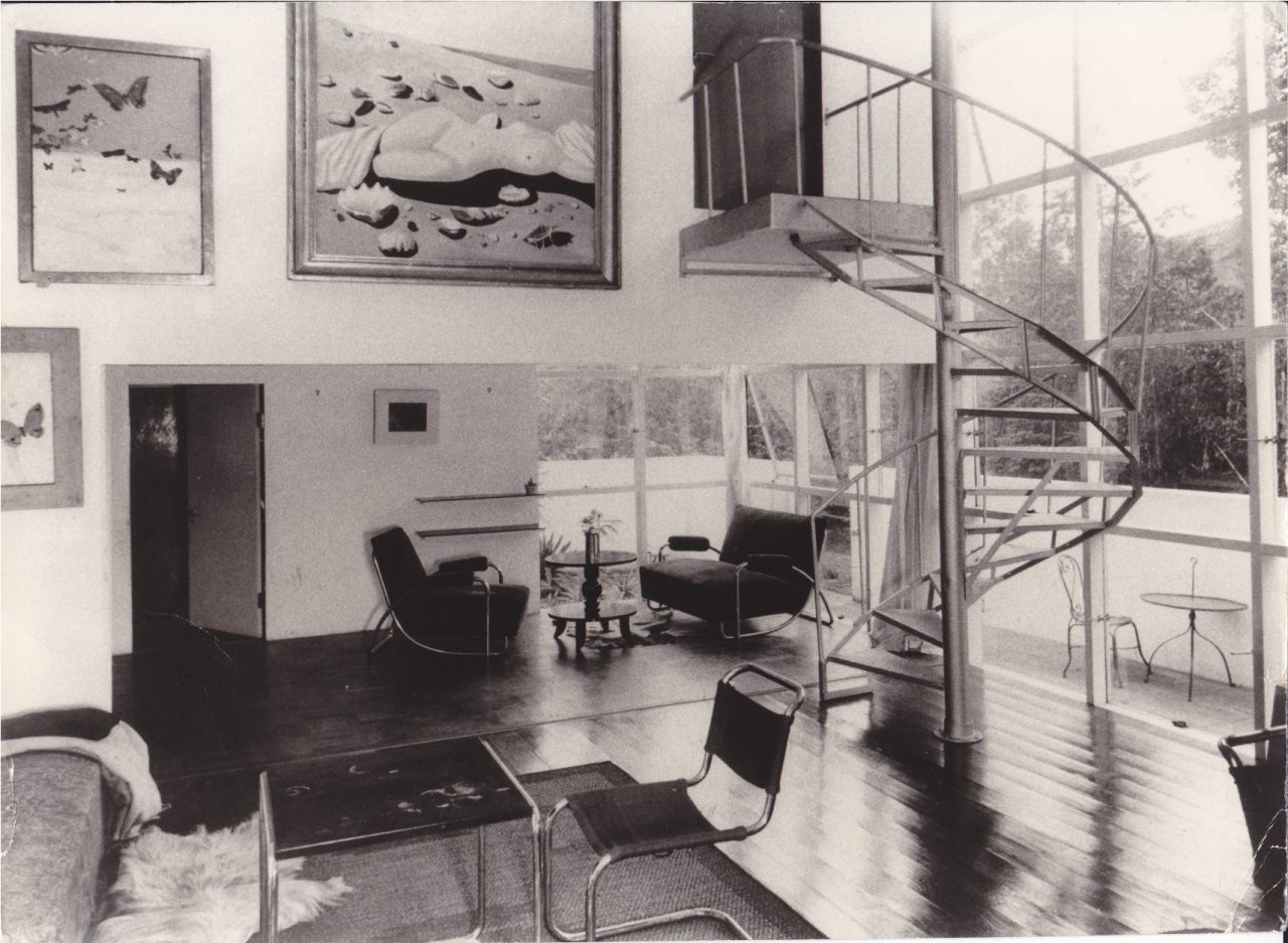
Interior view at the time of completion. (photographer: Iwao Yamawaki)
The same paint scheme was applied to the fixed window that used to exist in the building’s former entrance, which was also a subject of GROUP’s renovation project. Judging from the plans, it was composed of a one-shaku-grid frame and could be described as a scaled-down version of the large front window (however, its grid is more pronounced to the eye because of the difference in the relative sizes of the glazing and frame members). There do not seem to be any early photographs of it taken from inside the entrance, but one can imagine that it too was designed to enhance one’s sense of connection to the view outside, giving a different impression from its exterior side with the articulated grid.
-
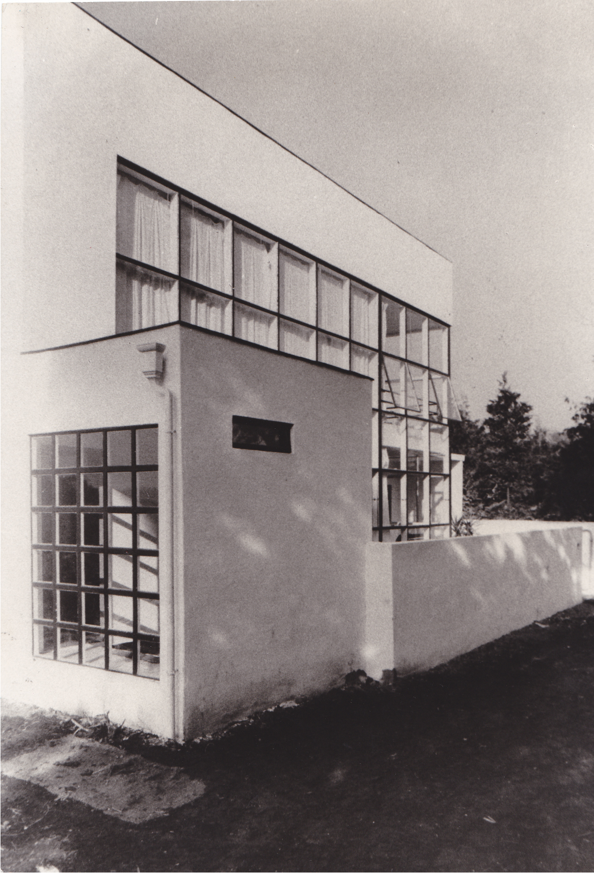
View from the southwest at the time of completion. (photographer: Iwao Yamawaki) -
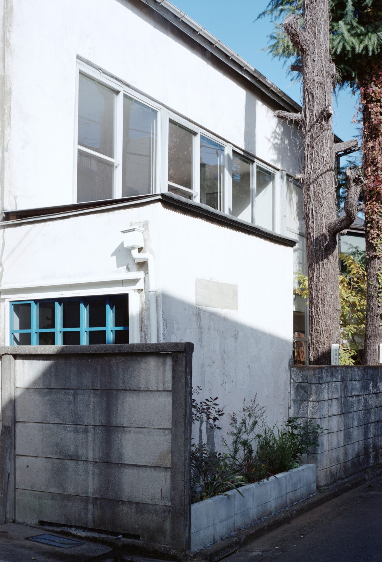
View from the southwest today. (photographer: Yurika Kono)
Like the large front window that was refitted with aluminum sashes, the window of the former entrance had also broken, and this led to it being sealed with a makeshift corrugated sheet cover. The original window frames that Yamawaki thoughtfully designed hence no longer exist, and there is no way to be certain what color they were painted based solely on the black-and-white photographs. However, there are traces of paint that can be found on parts of the building today, namely on the wood column attached to the front façade and also on the fascia along the second-floor eaves. GROUP used these as clues when deciding on what color to paint the wood sashes of the window that they remade for the former entrance.
-
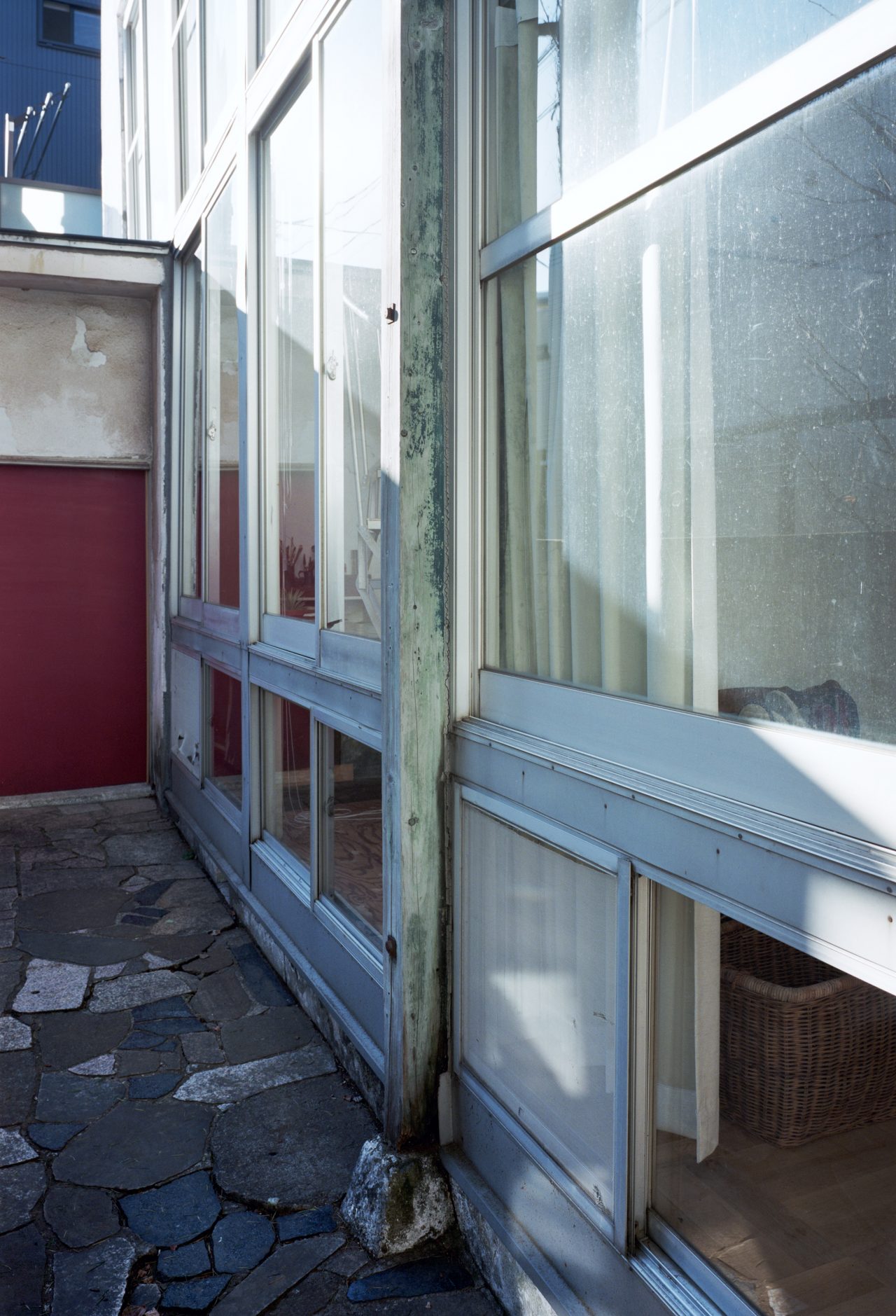
Exterior column presumably added for reinforcement. Traces of blue paint remain on its surface. (photographer: Yurika Kono)
However, as the earliest photographs of the building show, the truth is that neither the exterior column nor eaves initially existed, so they were presumably added in later renovations. Unfortunately, the details of their history could not be ascertained at the time of writing this piece, but it can be confirmed that there was a column in a similar position to the one existing in a photograph of the building published in the 1957 supplement issue of the magazine Atorie [Atelier] that was dedicated to Migishi.
-
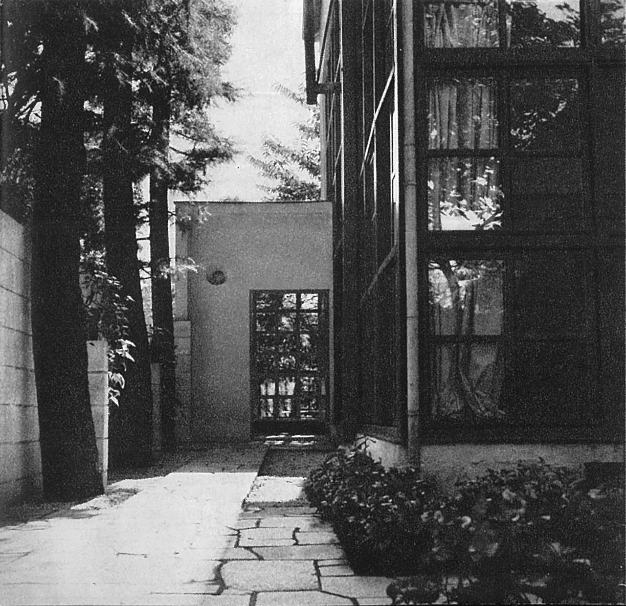
Photograph of the Migishi Atelier published in the 1957 supplement issue of Atorie. (photographer: unknown) Source: Setsuko Migishi, ed., Bessatsu Atorie: Migishi Kōtarō; Himerareta Gajō [Atelier supplement: Kotaro Migishi; The secret painting room] (Tokyo: Atorie, 1957).
While the windows would not yet have been refitted with the current aluminum sashes at the time the photograph was published, it cannot be concluded that the pictured frames are the same ones the building was built with. What is known is that the glass panes had already been replaced, as there is an anecdote that they broke during the wartime air raids. There also appear to be cross-shaped glazing bars in the east window, and its frame seems to be thicker than it was originally.* As for the color of the frames, one obviously cannot be certain with a black-and-white photograph, but they do appear to be a dark color that matches more closely with those in the early photographs than the current ones made of aluminum. If the frames are indeed the originals (or replacements true to the original design), and if the exterior column painted in the same color as them has not been recolored over the years, then the paint traces on the column could very well be considered as precious evidence for determining the color of the original design.
This photograph is particularly interesting for what it tells not only about the column but also about various other changes made to the building’s appearance during the time between when it was built and today (there is very little descriptive material concerning this period of the Migishi Atelier’s life, and it is scarcely addressed in previous articles about the building). For instance, plants can be seen growing thickly at the east end, where there once was a pond and where there now stands a concrete extension that serves as the building’s entrance. At the corner of the building, one can see the gutter downspout that was not part of the original design, so the eaves probably also already existed. Finally, culminating the approach sequence along the stone-paved path leading from the gate is a view not of the boundary wall and neighboring house that exist today, but of a wooded landscape captured in the gridded frame of the former entrance’s now remade window.
-
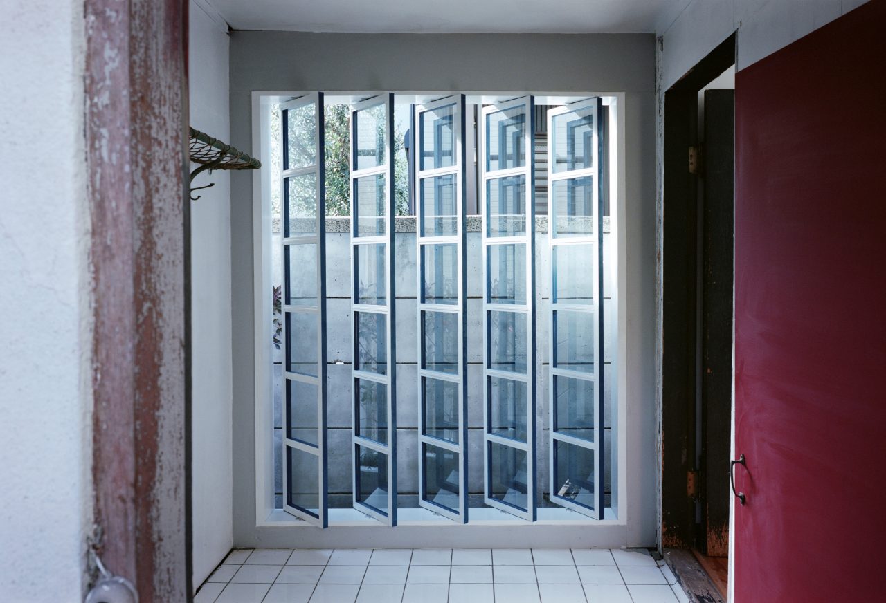
The renovated former entrance. (photographer: Yurika Kono)
It was not only the building that changed during the more than eight decades after the Migishi Atelier was built; the same could be said of its surroundings. The woods of the Musashino area turned into a residential neighborhood, and a boundary wall was erected right in front of the former entrance’s window. GROUP took these changes into consideration when remaking the window, which they divided vertically into an array of rotatable wood sashes and glazed with panes faced with mirror film so that the scenery is brought inside via the reflected light. They also adapted the original paint scheme to the rotating design by painting only the interior face white and the three other faces blue. As should be evident from these decisions, the remade window is not a literal restoration of the original window but rather a contextually informed redesign that relates to Yamawaki’s design, the traces of the past left in the building’s details, and its changed environment.
-
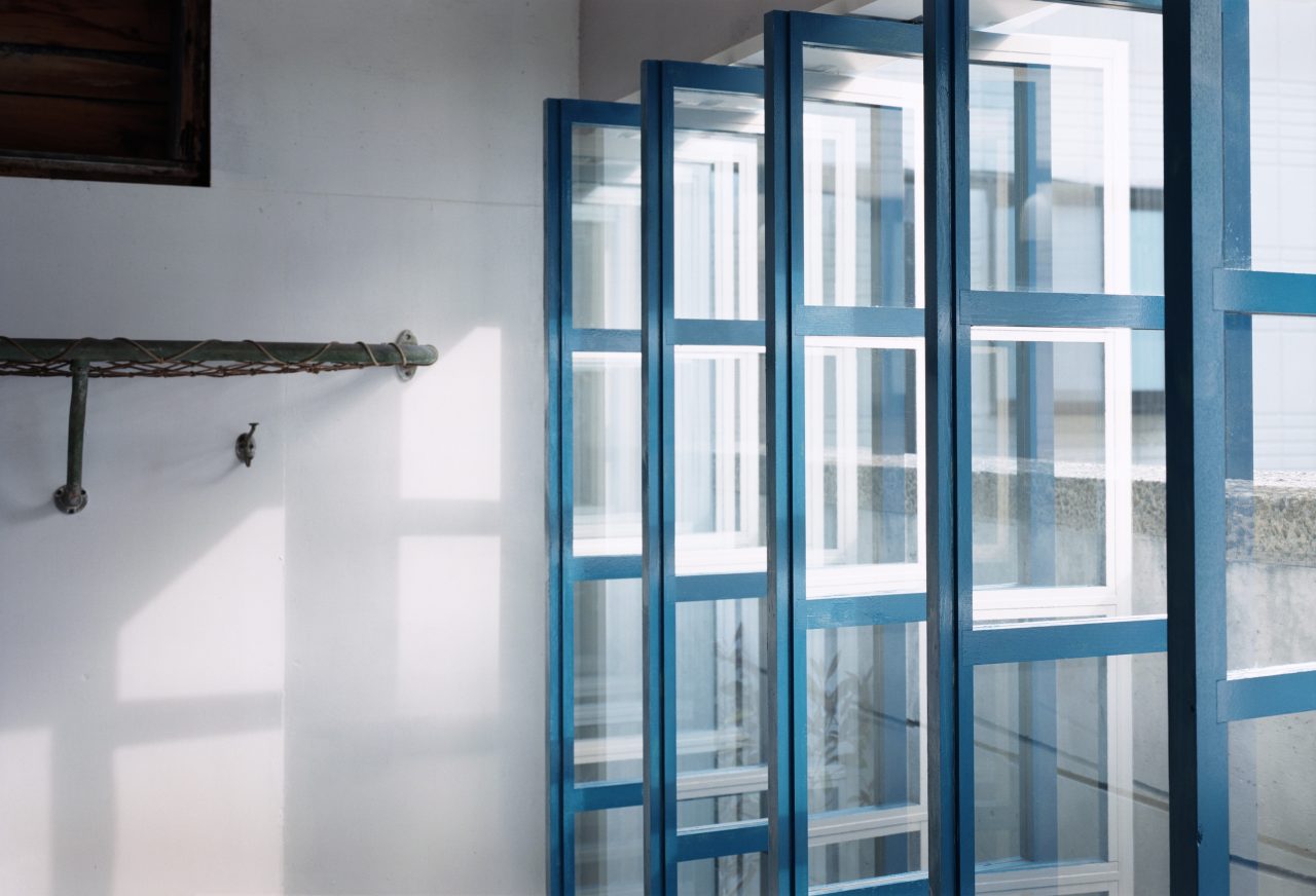
The remade window of the former entrance. (photographer: Yurika Kono)
One of the things that came to my mind when I saw the reflections in the remade window was the image of rippling light reflected from the pond beside the building—a feature that Migishi was very particular about when he initially envisioned his atelier. While I do not know whether this was part of the design intent, it felt to me as if the rotating window had inherited the painter’s playful vision of “reflected sunlight, refracted by the water’s surface, dancing on the ceiling of the white room” and given it a new life in its own whimsical reflections.
*Postscript: After writing this piece, I was given the opportunity by the Migishi Atelier’s current owner, Aiko Yamamoto, to look at photographs of the building that were probably taken around the same time as the one included here. They revealed that what appear to be cross-shaped glazing bars are actually double-sliding sashes with horizontal glazing bars across the middle. These sashes are also what cause the window frame to appear thicker, but I was able to confirm that both the frames on the east and south sides were of a similar thickness to those documented at the time of the building’s completion (however, it still remains inconclusive whether they are in fact the originals).
Acknowledgements: I would like to thank Aiko Yamamoto, who is currently looking after the atelier, and Takahiro Ohmura of GROUP for sharing their insights into the building and the renovation project.
Project Overview
Migishi Atelier (Migishi Atorie)
Architect: Iwao Yamawaki
Location: Nakano, Tokyo
Year Completed: 1934
A work of wooden modernist architecture designed for the painter Kotaro Migishi by Bauhaus-trained architect Iwao Yamawaki. On the southeast side of the clear-cut composition of orthogonal forms is a two-story-high glass window, which is adjoined by a steel spiral staircase and once opened up to a view of thatched farmhouses and fields. Although Kotaro passed away before seeing his completed atelier, the building was used by his wife, Setsuko, as her home and atelier, and it is currently being used as a photography and filming studio. The structure is recognized as a Registered Tangible Cultural Property by the Japanese government.
Migishi Atelier: https://www.leia.biz/
Ichinomiya City Memorial Art Museum of Setsuko Migishi: http://s-migishi.com/
Migishi Kotaro Museum of Art, Hokkaido: https://artmuseum.pref.hokkaido.lg.jp/outline/mkb/
Takahiko Kanemaki
Architectural historian. Born 1990. Completed the doctoral program at the Department of Architecture in the Graduate School of Engineering at The University of Tokyo. PhD (Eng). Notable papers include “Corwin Willson’s Proposal for ‘Mobile House’ and Its Ideological Background” (AIJ Journal of Architecture and Planning, August 2020). Articles include “Infection and Space as Membrane” (Kenchiku Tōron, August 2020).

MORE FROM THE SERIES
-

Windows of Japanese Modernist Architecture
The Windows of Tomoya Masuda’s Naruto Cultural Center: A Faintly Bright Louvered Space
17 Jun 2025
Windows of Japanese Modernist Architecture
A Culmination of Sutemi Horiguchi’s Aperture Designs:
The Tokoname City Municipal Ceramics Research Institute (Tokoname Tounomori Research Institute)15 May 2025
Windows of Japanese Modernist Architecture
The Diversity of Windows in Kiyonori Kikutake’s Serizawa Literary Center (Serizawa Kojiro Memorial Museum)
25 Dec 2024
Windows of Japanese Modernist Architecture
The Windows of Hiroshi Hara’s Awazu House: Spaces of Light Illuminating the Darkness
26 Apr 2024
