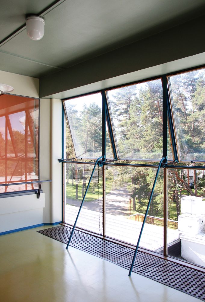
Series Window Behaviorology in Switzerland
A Conversation with
Gigon / Guyer
17 Jun 2020
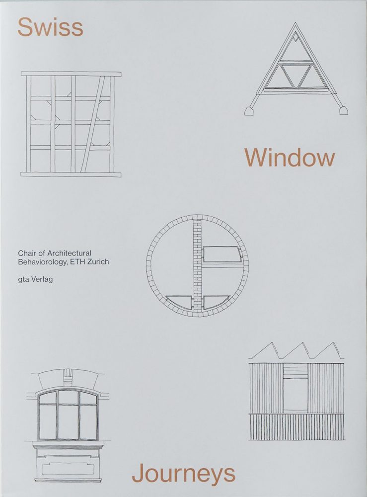
The Chair of Architectural Behaviorology at the Swiss Federal Institute of Technology in Zurich (ETHZ), led by architect Momoyo Kaijima, conducted a series of interviews with architects based in Switzerland on their approaches to designing windows.
The first interview was with Annette Gigon / Mike Guyer Architects, who are also Professors at ETHZ. Since they established their practice in 1989, Gigon / Guyer have expanded their practice from the design of art museums, including the international award-winning Kirchner Museum, to a succession of high-rise buildings that have been completed in recent years, including Prime Tower in Zurich.
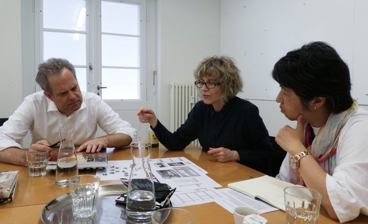
Momoyo Kaijima and research assistant Simona Ferrari visited Gigon / Guyer at their studio in Zurich to explore their process of designing windows and the philosophy that underpins it by looking to their previous projects.
Chair of Architectural Behaviorology (CAB): In spring 2018, our studio focused on windows in Switzerland. It made for a very interesting study: within a relatively small territory, different geographical settings generate diverse weather conditions, and the cultural influences from adjacent countries are all reflected in the window design.
We’d like to extend our investigation into the windows designed by architects, to understand the most important criteria influencing their design. You were guest critics in our studio, and we’re interested to hear more on your thoughts on windows and how these have developed in your architectural work, also in relation to environmental and energy concerns.
Annette Gigon (AG): It’s true that the window has constantly been an important element for us. It allows you to look into the building, but also to look out: we often think of it as the “eye of the building”—which is, by the way, the root of the English word window: “wind-eye”.
Since the oil crisis in the seventies, we’ve been aware that buildings need to be well insulated in order to use less energy. The technology of glazing and frames has evolved over the last decades. We’ve gone from double glazing, to gas-filled insulated glazing, to triple glazing. And with the lower thermal transmittance of glazing and frames, we’ve dared to make bigger openings. It’s about finding a balance between considerations of efficiency and the desire to open up the building and look into the surroundings.
CAB: Your built oeuvre now spans about three decades, encompassing a very diverse range of building types. Over the years you’ve gradually engaged with larger-scale housing developments and office towers and have been involved in the major developments in Zurich, such as the Prime Tower and Europaallee. But perhaps we could begin from the beginning, with your earliest residential projects…
Mike Guyer (MG): For us the window always develops in relation to the wall. In the case of the Detached House for a Doctor’s Family we designed thick walls of insulating brick. The windows are vertical, rather small because the wall cannot support large spans, and precisely placed. They are reminiscent of the farmhouse windows in the vicinity. Their conventional wooden frames are set flush to the inside. The shutters, also made of wood, can be stored within the depth of the reveal.
AG: Because that project is in a protected rural site we had to comply with strict building regulations. Even the roof pitches had to fall within a precisely defined range of angles. We tried to observe these rules in an unusual, defamiliarizing way. While the window openings of the upper floors form a kind of reference to the traditional farmhouse, the French windows of the ground floor do not. Likewise, the shutters which fold into the reveals are more often found in townhouses.
-
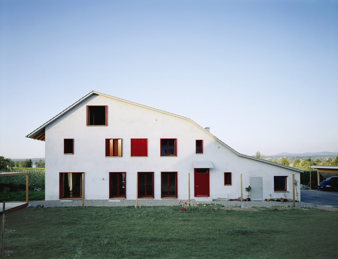
Detached House for a Doctor’s Family, Canton Zurich, 1994 : © Christian Kerez, Zurich
-
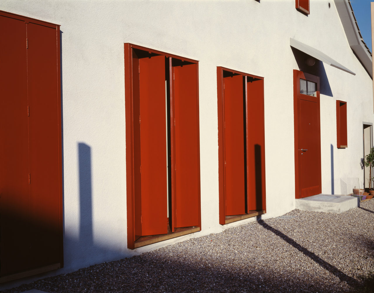
Detached House for a Doctor’s Family, Canton Zurich, 1994 : © Christian Kerez, Zurich
MG: The Housing Development Broëlberg was created in a different setting—land around a manor house that had to be developed while at the same time preserving its parkland character. Here we designed wider windows. These are also timber-framed but with a glazing system developed specifically for this project: the glass panes cover the wooden frame from the outside. It was quite a challenge in terms of the budget, so as a trade-off the walls are of low-cost masonry construction with exterior insulation.
AG: We then chose a dark brown render for the outside of the complex and a bright orange for the interior façades. Both colors are intended to express the non-mineral, soft, “organic” material of wall, with its skin-like layer of render. So the windows are like gemstones in bezel settings on the façades.
-
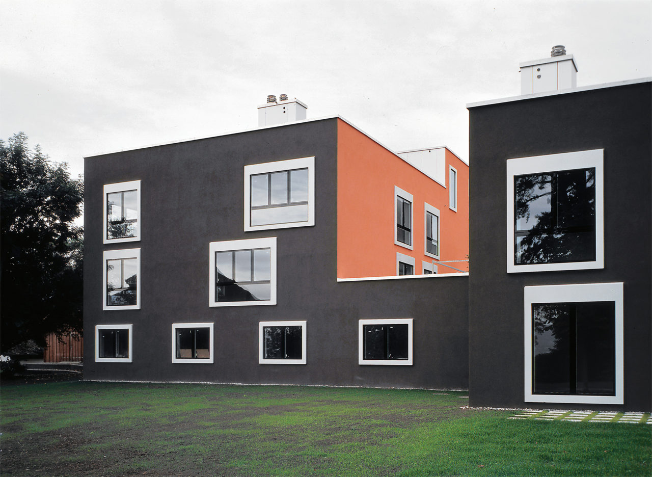
Housing Development Broëlberg I, Kilchberg, 1996 : © Heinrich Helfenstein, gta Archiv / ETH Zurich
MG: The wide aluminum frames around the windows also contain the sun protection.
AG: It’s a solution that derives from existing ones, but we exaggerated the width of the vertical and horizontal elements of the frame. This also hints at picture frames, framing the views into the surrounding parkland and across the lake.
MG: All apartment types have quite luxurious living rooms with a kitchen and dining area, so in these spaces we were able to place the windows more freely.
AG: Here, we also introduced a kind of winter garden or glazed loggia: a climate buffer zone which is not heated but has insulated windows inside and outside.
CAB: You want to achieve a sense of openness but at the same time there is a strong intention to make something like jewelry. This makes us reflect on how the window is a very special element in Swiss architecture.
-
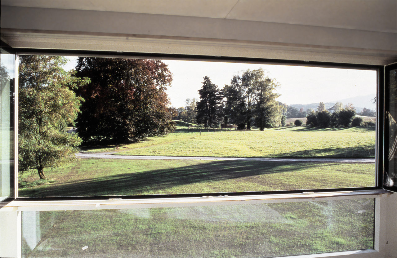
Housing Development Broëlberg I, Kilchberg, 1996 : © Harald F. Müller, Singen, Germany
MG: Do you know Bruno Reichlin’s article “The Pros and Cons of the Horizontal Window. The Perret–Le Corbusier Controversy” (1984)? He talks about horizontal and vertical windows, focusing on the house Le Corbusier designed for his mother on Lake Geneva. In Europe in the early years of reconstruction after the Second World War there was intense discussion around how an elevation should be drawn, whether modernist principles should prevail or not. Today it’s not this issue that shapes design decisions, but rather the DNA of every building—its specific site and idea —as well as its construction.
CAB: Yes, the window also relates to the wall. We see it more as an element in itself, but we need to carefully consider its relation with the building’s structure and the context.
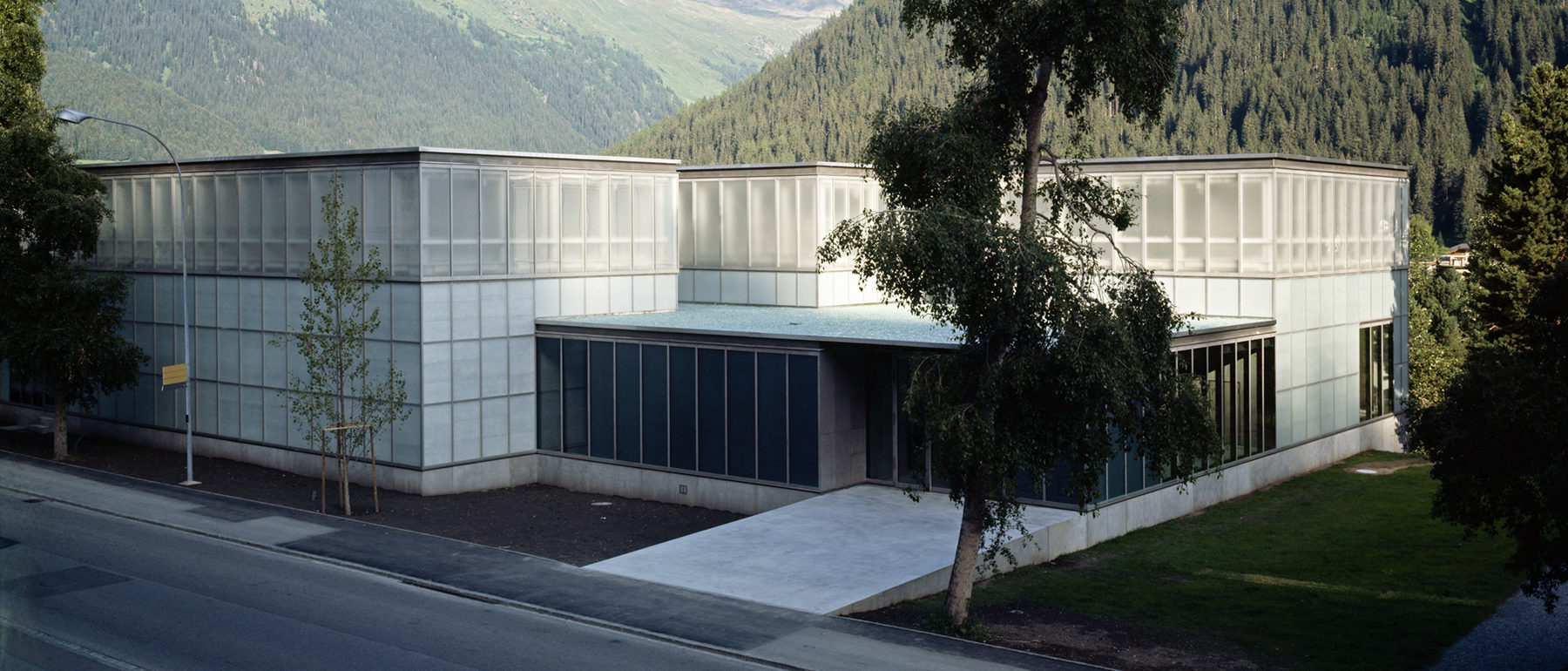
AG: Right, the structure is crucial and normally the “opposite” of the window. But in the Kirchner Museum, for instance, the glazing of the facade is directly mounted on the load-bearing steel supports. The two elements—window frame and structural post—can be combined in one, if the steelwork is very precise. Of course, such conditions are special and rare.
-
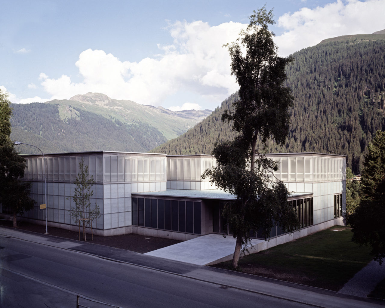
Kirchner Museum Davos, 1992 : © Heinrich Helfenstein, gta Archiv / ETH Zurich
-
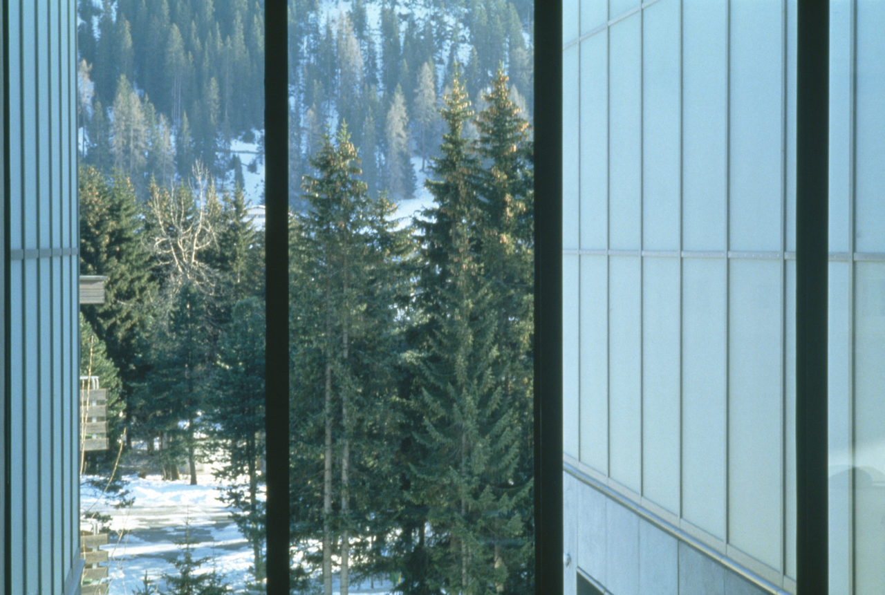
Kirchner Museum Davos, 1992 : © Heinrich Helfenstein, gta Archiv / ETH Zurich
MG: In the case of the railway Signal Box in Zurich, the exterior walls consist of two layers of concrete separated by insulation. We wanted to emphasize the windows by setting them flush with the outer wall. To this end, we built a kind of double window, with the outer face consisting of a single laminated glass pane, which creates an intermediate climate zone.
AG: The outer layer is not airtight but forms a kind of shield against sun and wind, allowing you to keep the blinds closed even in windy weather. Maintaining shade is something that is important for museums as well, and we also applied this solution in the extension to the Kunstmuseum Winterthur.
In the end we had three layers from outside to inside: wind shield, blinds, insulated glass window.
-
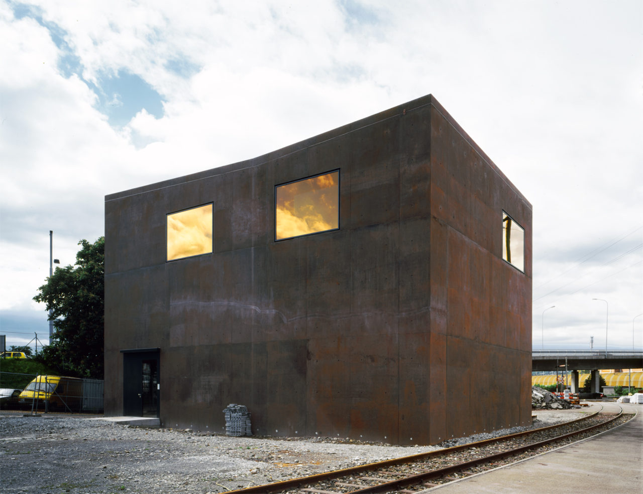
Signal Box, Zurich, 1999 : © Heinrich Helfenstein, gta Archiv / ETH Zurich
-
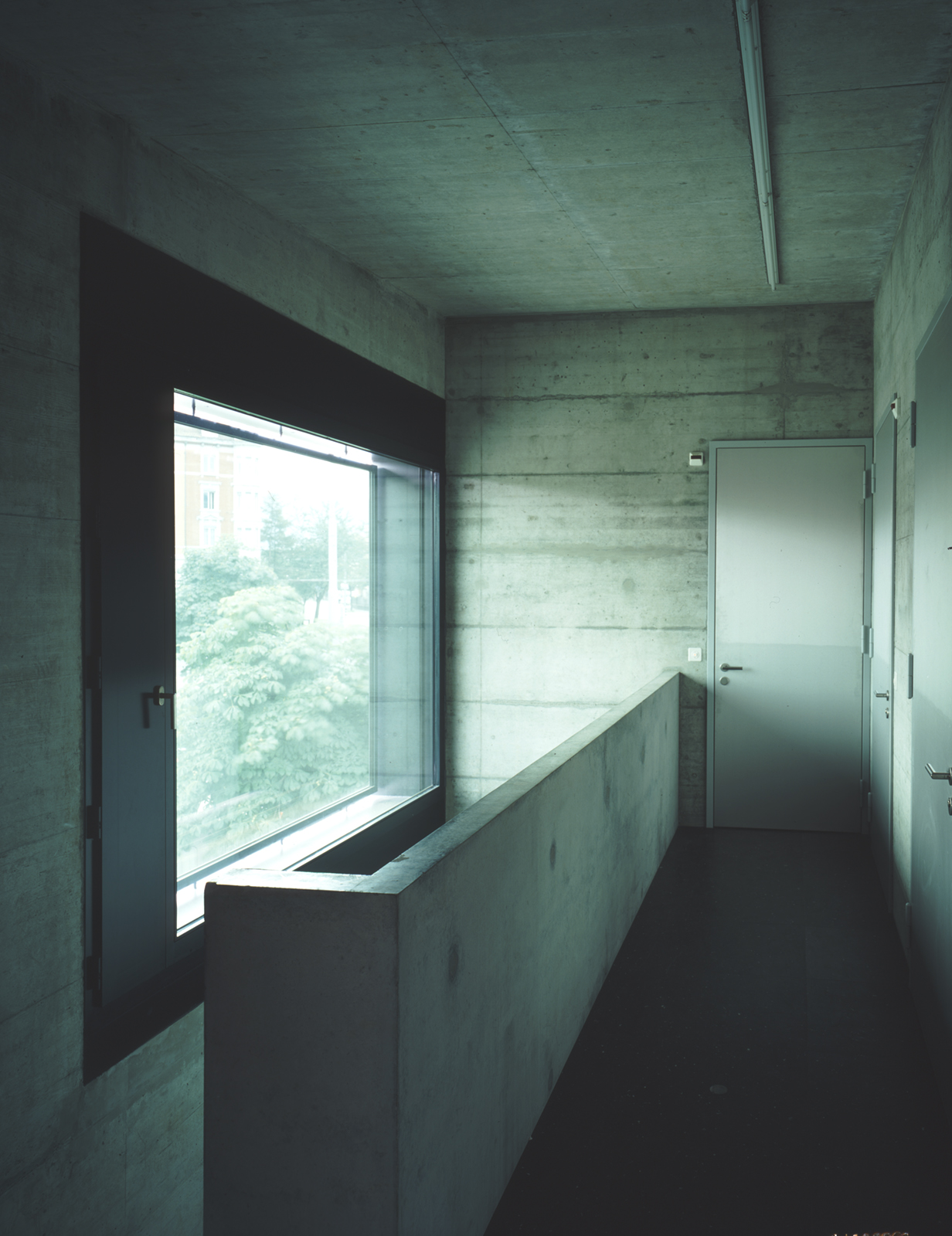
Signal Box, Zurich, 1999 : © Heinrich Helfenstein, gta Archiv / ETH Zurich
MG: The interesting thing with this construction is that you can also make the window sizes and proportions different on the inside and outside. On the inner side the window is usually smaller, whereas the outer window can be enlarged and addressed together with the concept of the cladding. It becomes part of the construction envelope.
AG: What we like about this solution is that it allows an insight into the construction behind the glass cladding—a literal explanation, which might also be beautiful. A similar principle is at work in the Kirchner Museum, where you catch a glimpse of the warming insulation behind the etched glass of the wall construction. In a way, we let the public in on our process of learning and building. When we studied at ETH in the eighties, the recommended depths for insulation in building construction were still very low, but this was already an issue and being debated. We were interested in working with these insulating layers, treating them adequately.
-

Extension Kunstmuseum Winterthur, 1995 : © Heinrich Helfenstein, gta Archiv / ETH Zurich
CAB: Can you tell us where this idea of several layers comes from? It is solely related to material and climate control?
MG: Well, in Switzerland today you’re required to have insulated glazing and means to protect against the sun. These are the general conditions, all the rest is supplementary.
AG: There is also a traditional aspect to this idea of layering, which comes from our fascination with historical windows from the turn of the last century. There was often an outer window flush with the façade—a Vorfenster (“fore-window”)—which was usually only mounted in the cold season and stored away in the attic in summer. I grew up with these windows. You can find them especially in older townhouses. Their placement makes the façade appear as a continuous skin, with a beautiful play of light on the delicate glass.
-
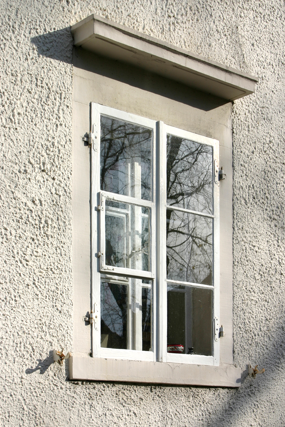
"forewindow" – historical window of a townhouse in Zurich : © Gigon / Guyer, Zurich
We were able to use these double, custom-made box-type windows where only a few were required in a building. In Winterthur, there are just three of these windows; most of the outer wall surface is closed, with the light coming through industrial skylights in the sawtooth roof. The windows are exceptional elements allowing visitors to look outside and orientate themselves while circulating through the nine exhibition rooms. The outer layer of these windows cost almost as much as the inner layer, so they’re not feasible for a housing project.
-
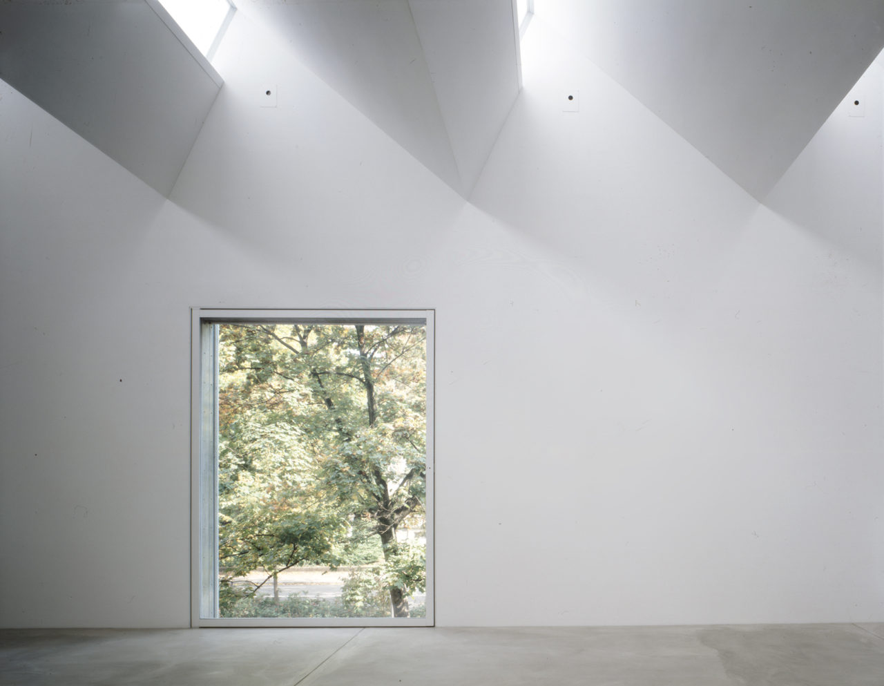
Extension Kunstmuseum Winterthur, 1995 : © Heinrich Helfenstein, gta Archiv / ETH Zurich
Likewise, with the Signal Box, the windows are also just a few special elements which express the idea of looking onto the railway tracks. Here we even had the outer layer of glass coated with a copper-colored sun protection film, which relates to the pigmentation of the concrete with iron oxide—the equivalent of the rust in the rail yard. The windows take on the guise of eyes with mirrored sunglasses. Although the tracks are now controlled via computer screens, we wanted to maintain this expression of supervision which signal boxes have always had.
MG: The buildings we’ve talked about so far are rather small, with a large portion of opaque walls. For obvious reasons we cannot apply the same solutions to office buildings. Let’s take the Prime Tower in Zurich, for example, which is interesting because it has the thinnest façade construction we’ve ever designed—a curtain wall of glass that is in itself highly efficient, with three layers consisting of five glass panes and different coatings that also work as sun protection. Strong winds at this height meant the slat blinds could not be exposed to the outside.
In the competition phase we had proposed a kind of double-layered façade with openable windows, but we had to abandon this concept on grounds of cost, maintenance and efficiency.
-
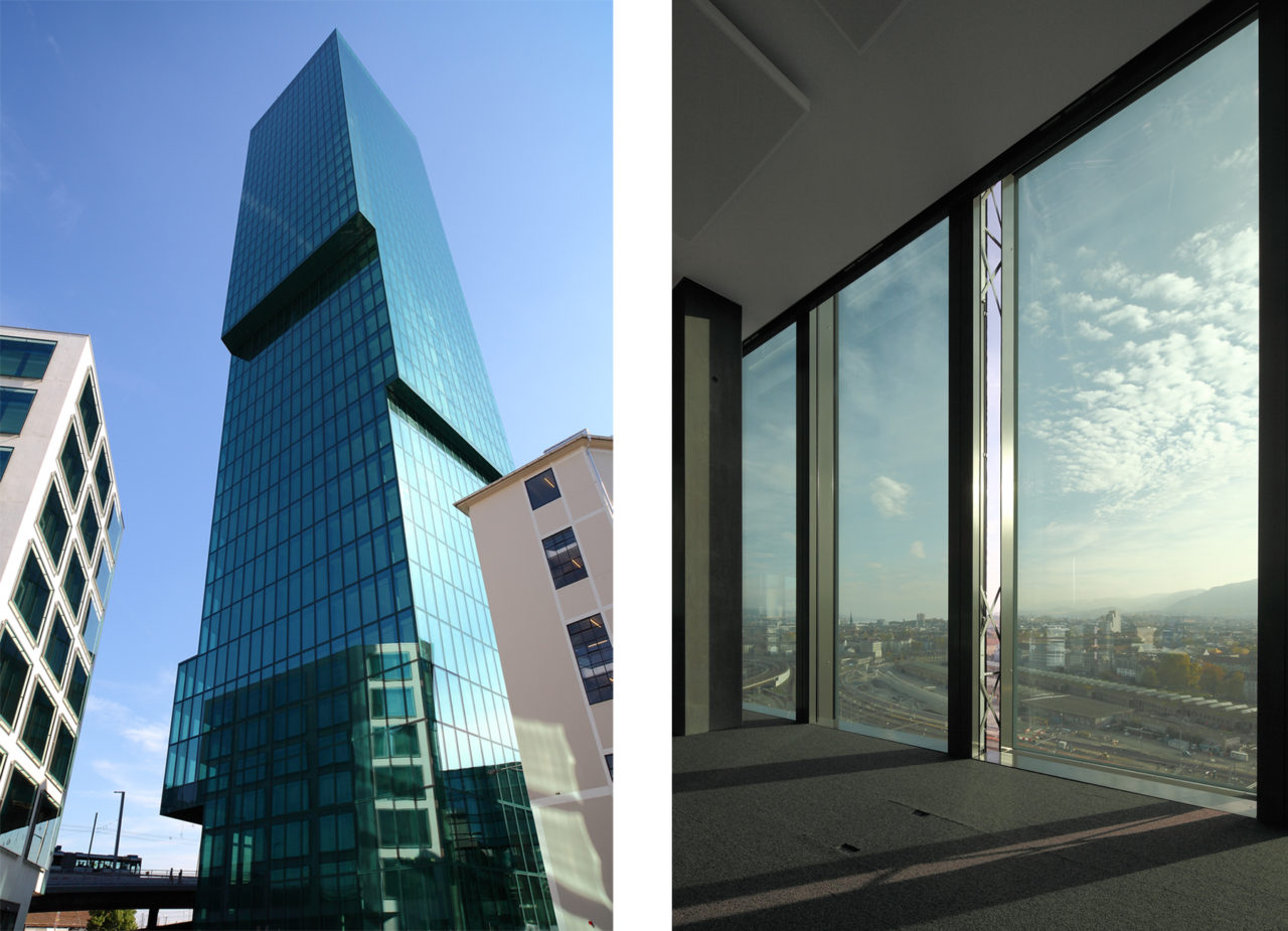
Prime Tower Office High-rise, Maag-Areal, Zurich, 2011 : © Thies Wachter, Zurich
AG: We had an opportunity to pursue this double layer idea a little later, in the Lagerstrasse office building in Europaallee, Zurich. We designed a façade with an outer layer that works like a kind of sunscreen. Inlaid with a metallic textile, it reduces the solar impact by 25 percent but is still transparent enough to look through from the inside. There is space for maintenance, blinds in between it and the inner layer of insulating windows. We used a parallel solution in another building, the Würth Haus in Rorschach. On one side the outer layer screens the wind coming from the lake, and on the other it dampens the traffic noise from the busy road nearby.
-
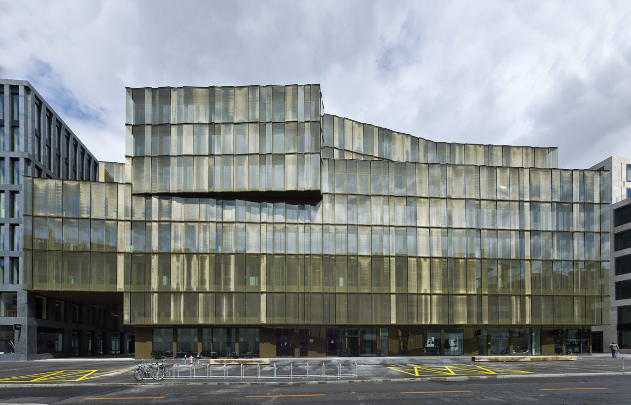
Office Building Lagerstrasse House, Europaallee 21, Zurich, 2013 : © Stefan Müller, Berlin
CAB: Each one of these windows is an innovation, an interesting design element that reflects the condition of society. How do you develop these ideas for windows? Do you first discuss among your team or do you involve the window company or the engineer from the outset?
AG: We usually start with an idea but later we discuss, develop and test new solutions together with companies and craftsmen. For example, the metallic textile inserts I mentioned earlier—we already wanted to pursue this idea at the beginning of the nineties, and we proposed it in early competitions, but at the time the technology was not yet available. Finally, we discovered a glass with an aluminum-coated polyester mesh that can be dyed in different tones. Of course, the use of textiles was also an interpretation of Mies van der Rohe’s beautiful “curtain wall” in his drawing for a Skyscraper on Friedrichstrasse, which is reminiscent of drapery.
-
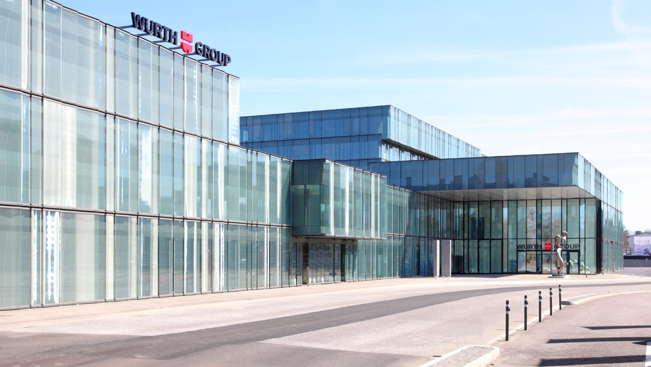
Würth Haus Rorschach – Administration and Training Centre with Congress Hall, 2013 : © Thies Wachter, Zurich
MG: Often the city requires us to build mock-ups before granting final permission for the project. They’re really fragments of the building, so it’s quite an expensive proposition for the client. This level of investment is only feasible when there is a commission, so we always have to work with a company to put new ideas into practice. We cannot work in the same way as the Institute of Technology in Architecture (ITA) at ETHZ, with its strong financial resources for calculations and 1:1 prototyping.
AG: A good example here are the windows of the residential tower at Löwenbrau Areal, the most high-tech windows we’ve ever made.
MG: The window works like a garage door; it has a small motor with a mechanical transmission. In this building we revisited the idea of the winter garden in the form of a buffer room enclosed by an inner glass partition—the people buying the condominiums could choose whether they wanted to have it installed or not. I think the need for a flexible indoor–outdoor space is something that should be taken as seriously as the need to optimize the square meters of the condominium. Nevertheless, if the client had asked for a low-tech solution, we would have found an equally good one.
-
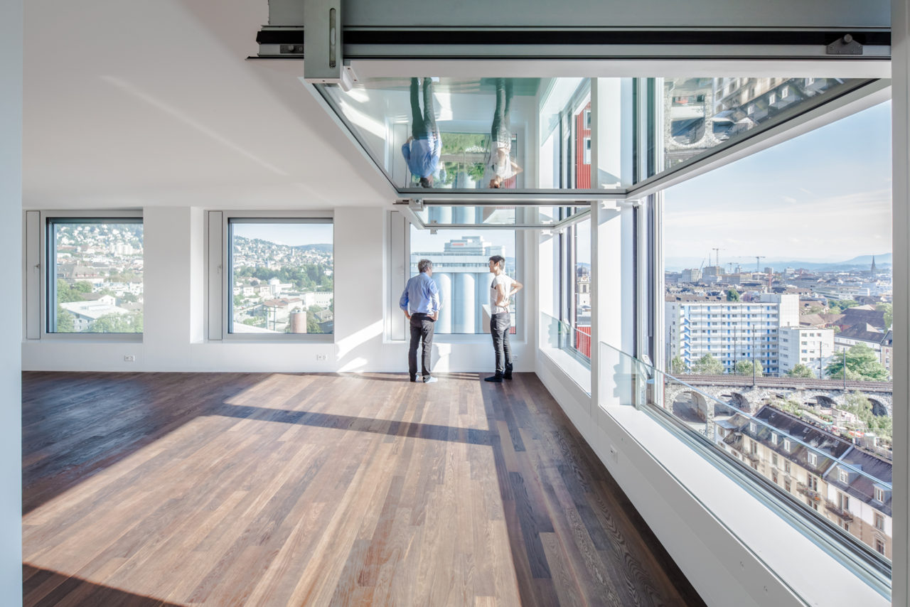
Löwenbräu-Areal – Residential Tower, Zurich, 2014 : © Thies Wachter, Zurich
CAB: In Switzerland there are more and more glass buildings, something that is also related to the lower cost of glass. But how do you strike a balance between construction costs and the cost of maintaining the building in terms of energy consumption for cooling and heating?
MG: Normally a solid wall is cheaper to build—and maintain—than a glass wall. But there are also cost relations which are not so obvious. In high-rise buildings, for example, a thin glass wall will maximize the rentable area and achieve a better ratio of window to floor area.
AG: The facades of housing projects have to be less expensive of course, so they usually have smaller windows and cheaper wall constructions. But with office buildings the façade is often also a representative element, and more of the budget is invested there while less is spent on the interior finish, which the tenants pay for.
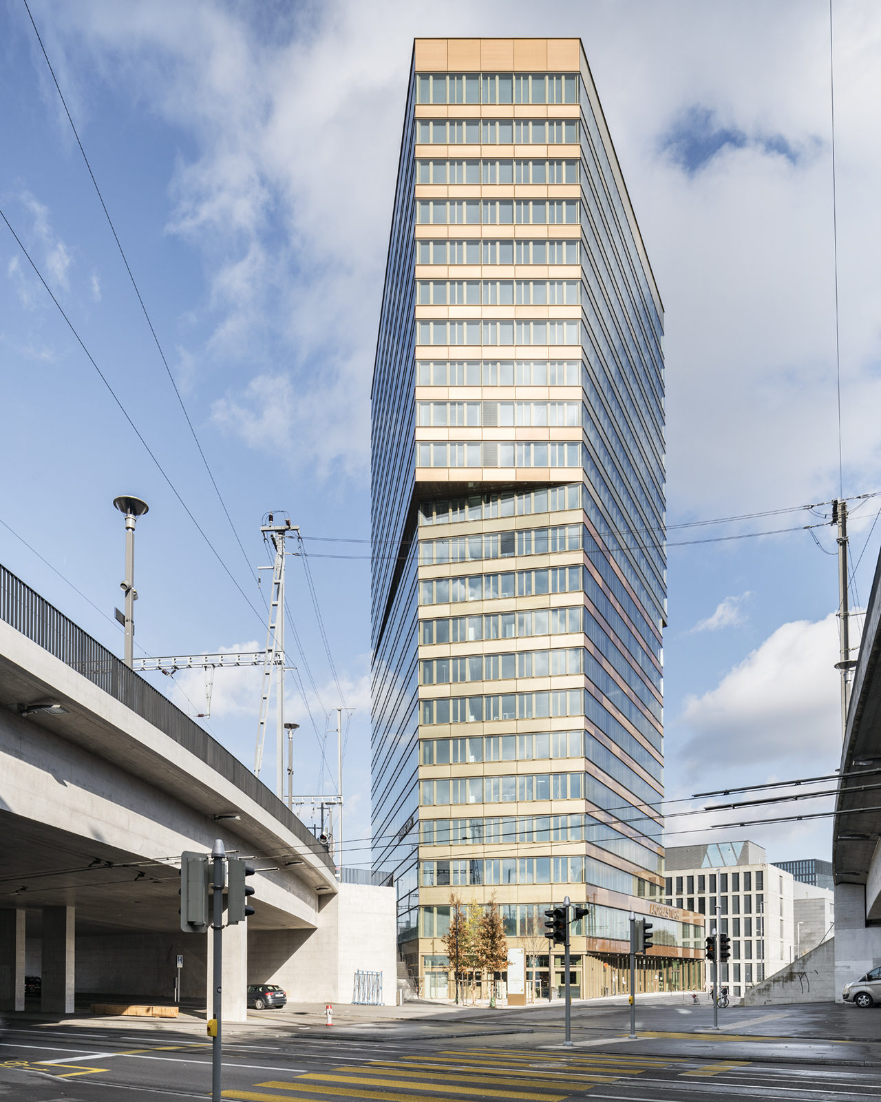
MG: Given our current state of knowledge, we’re aiming for building shells that are as low-tech as possible. We’ve lost faith in the ever-increasing use of mechanization. The Prime Tower was an interesting experience for us, but other projects with a double-layered façade, like the Andreas Tower in Zurich Oerlikon, do not need an electrical system to control the opening of the windows. You can just open them manually, and if somebody forgets to close a window overnight it’s not a disaster.
Tenants are now reluctant to rent offices with completely closed façades—the kind that are necessary for traditional mechanical ventilation. Today’s climatization systems are much more stable; they don’t collapse when windows are opened.
-
Office high-rise Andreasturm, Zurich Oerlikon, 2018 : © Roman Keller, Zurich
Talking about the situation today, the most salient concerns are how to avoid overheating in summer, what kind of materials we use, and how much electricity we consume. The question is, how do we respond? To go beyond triple glazing would be unreasonable, because of the energy required to produce a fourth or fifth layer of insulation glass. So you have to somehow add external layers of different materials that demand less energy: textiles, perforated wood panels and so on. This is the question of the embodied energy required to produce, transport and finally recycle the elements of a building. For example, instead of aluminum window frames, we would rather use wood.
AG: We’ve become more and more interested in these issues, but they’re still not so easy to judge with the tools and data currently available—especially in relation to life cycles. Interestingly the embodied energy for aluminum and steel is not that bad if elements can be used for 60 years and more. Also, using wood frames can be difficult for larger dimensions or certain exposures, and for some functions it’s not solid and durable enough. But in any case insulation glass has a given lifespan of only around 30 years.
CAB: If you then expect to test more low-tech approaches in the future, what would be the context?
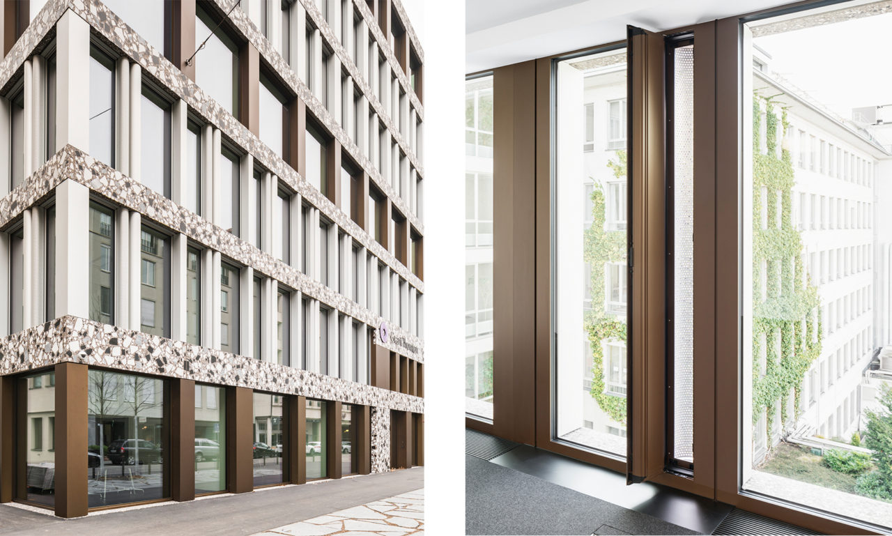
AG: I think we should attend to both, high-tech and low-tech, and use them according to the specific task—for instance, either photovoltaic elements, or simple manual ventilation slots protected by perforated metal “ducts” next to the windows, as in our Claridenstrasse 35 office building, or again the glazed loggias. By the way, we call these “seasonal rooms”, as there is more potential to use them during summer and winter, unlike a balcony which is unusable for almost half of the year here in Switzerland.
-
Office Building Claridenstrasse 35, Zurich, 2018 : © Roman Keller, Zurich
MG: With these layering concepts, elevations tend away from the tectonic. To assert a tectonic appearance with this layering, you can superimpose a second wall with openings into which elements like a glazed balcony can be inserted. All these decisions are closely linked to the kind of expression you would like to achieve with the building.
CAB: We imagine that this layering would render a more inhabitable condition in terms of light and climate, which people could change in different ways… Very interesting, thank you very much.
Annette Gigon / Mike Guyer Architects
Gigon/Guyer was established in 1989 by the two partners, Annette Gigon and Mike Guyer. Their firm soon attracted international attention with projects such as the Kirchner Museum in Davos, the Museum Extension in Winterthur, Kunstmuseum Appenzell, and the Archaeological Museum and Park Kalkriese in Germany.
In addition to other museum projects, Gigon/Guyer have expanded their practice in recent years to include residential architecture and office buildings, among them the
office high-rise Prime Tower in Zurich and the Würth Haus Rorschach. They taught as Visiting Professors at the EPF Lausanne (2001–02) and the ETH Zurich (2008–09). Since 2012 Annette Gigon and Mike Guyer have been Professors at the ETH Zurich. The work of Gigon/Guyer has been honored with several prizes at home and abroad, including the Fritz Schumacher Prize in Germany, the RIBA Fellowship in Great Britain, and the Daylight Award, one of the most prestigious architecture prizes in Switzerland.
Momoyo Kaijima
Momoyo Kaijima has served as Professor of Architectural Behaviorology at ETH Zurich since 2017. She founded Atelier Bow-Wow with Yoshiharu Tsukamoto in 1992 after her initial studies at Japan’s Women’s University and completed her post-graduate program at the Tokyo Institute of Technology in 2000. An associate professor at the Art and Design School of the University of Tsukuba since 2009, she has also taught at Harvard GSD (2003, 2016), Rice University (2014–15), TU Delft (2015–16), and Columbia University (2017). While engaging in design projects for houses, public buildings, and station plazas, she has conducted numerous investigations of the city through publications such as Made in Tokyo and Pet Architecture. She was the curator of the Japan Pavilion at the 16th International Architecture Exhibition — La Biennale di Venezia.
Simona Ferrari
Simona Ferrari has been a teaching and research assistant at the Chair of Architecture
Behaviorology (ETH Zurich) since 2017 and works independently as an architect and artist. She studied architecture at the Politecnico di Milano, TU Vienna, and the Tokyo Institute of Technology as Monbukagakusho Fellow. From 2014 to 2017 she worked with Atelier Bow-Wow in Tokyo, completing several international projects. She is currently pursuing an MA in Fine Arts at the Zurich University of the Arts. Ongoing projects include the winning proposal of Europan 15 for the former industrial site of Acetati in Verbania, IT (with Metaxia Markaki).
Top image: Kirchner Museum Davos, 1992 © Heinrich Helfenstein, gta Archiv / ETH Zurich
MORE FROM THE SERIES
-

Window Behaviorology in Switzerland
Swiss Window Journeys: A Conversation between Andrea Deplazes, Laurent Stalder, and Momoyo Kaijima
17 Dec 2024
Window Behaviorology in Switzerland
A Conversation with Silke Langenberg
25 Jul 2024
Window Behaviorology in Switzerland
A Conversation with François Charbonnet (Made in)
25 Jan 2024
Window Behaviorology in Switzerland
A Conversation with Christine Binswanger, Raúl Mera (Herzog & de Meuron)
24 May 2023
