Series The 16th International Architecture Exhibition, La Biennale di Venezia 2018
Interview with Tom Emerson, 6a architects
22 Apr 2019
- Keywords
- Architecture
- Interviews
Based in London, 6a architects is an acclaimed architectural office best known for its numerous cultural and educational projects including the Fashion Gallery of the Victoria & Albert Museum or Cowan Court, Cambridge. Their Photography Studio for Juergen Teller was nominated for the Royal Institute of British Architects’ (RIBA) Stirling Prize.
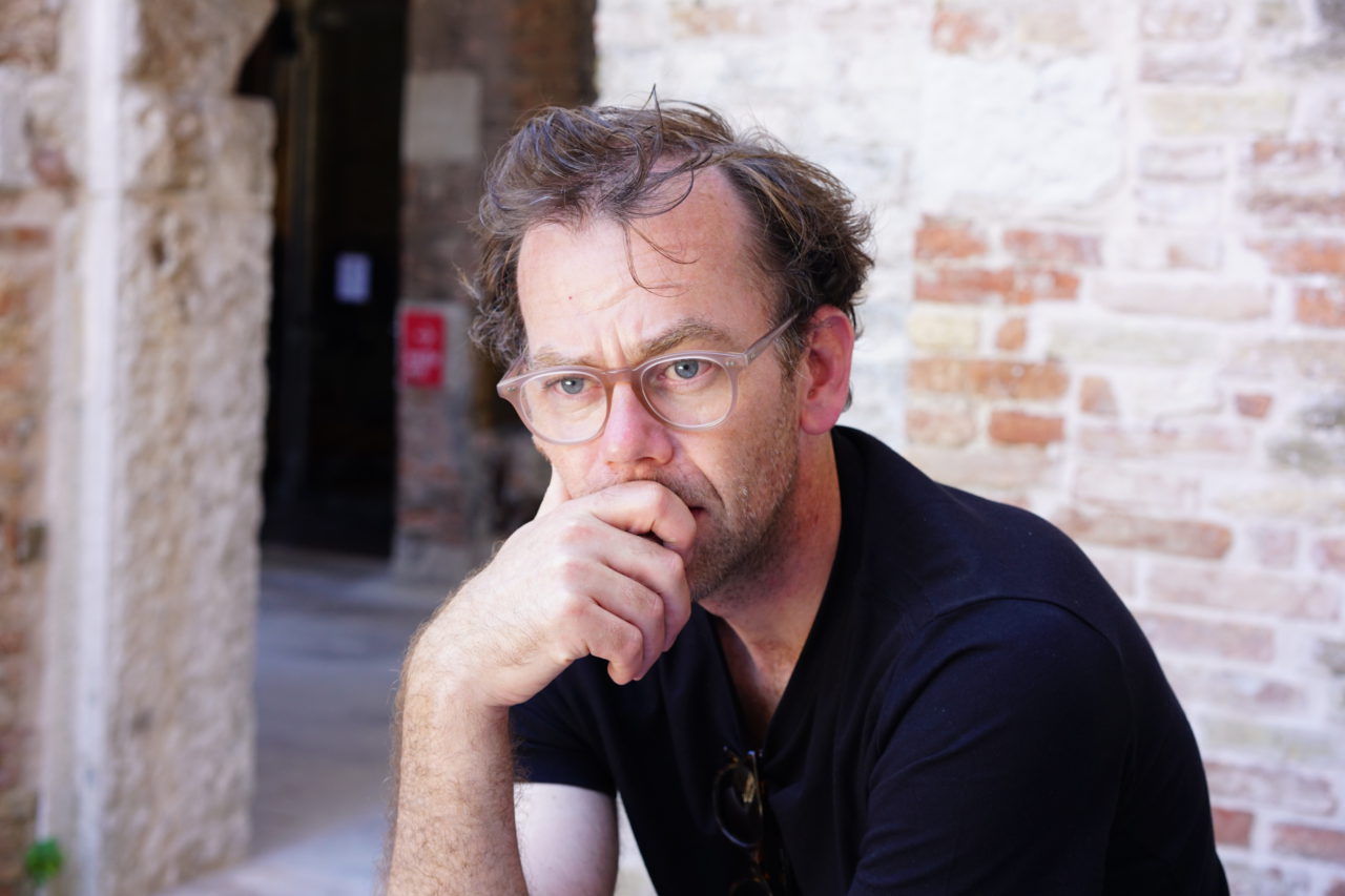
We spoke with Tom Emerson, one of the founders of 6a and also a professor at The Swiss Federal Institute of Technology Zürich (ETHZ), about their practices and the ideas that underlie them.
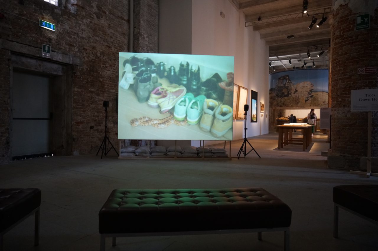
As participants of the 2018 Venice Biennale, 6a architects exhibited the short film ʻTrees Down Here,’ which reflects on the natural history of Cowan Court, Churchill College Cambridge (2016).
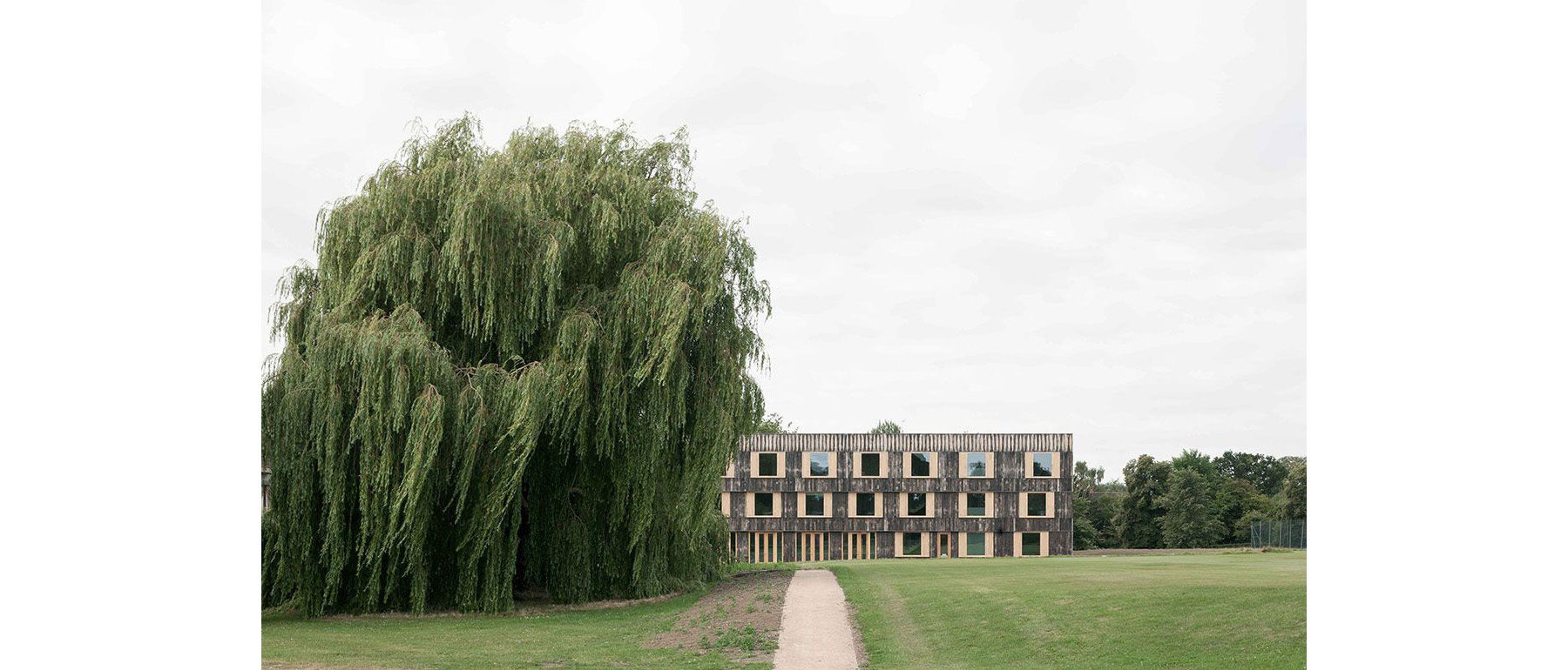
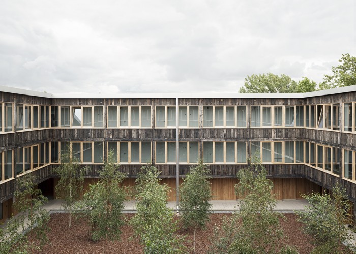
Cowan Court is a student hall of residence and is the first new court in Churchill College, University of Cambridge since it was founded in the 1960s. It was our intention to do something that engaged with the natural history of the college, and thus the court is made of rough timber to reflect the Brutalism of its original buildings. Cambridge is very much a landscaped culture, so for us it was very important to be able to present the building as a part of the landscape.
-
Tom Emerson, 6a architects
We commissioned the artist Ben Rivers who makes films which are related to themes and aspects surrounding the environment such as how we exist in the environment, and how humans are part of natural history. The film is a sort of dreamlike description of the various landscapes of the college, such as all the trees that stand in its premises, the animals, the people and its environment, as well as the changing seasons.
Ben Rivers is a director known for his experimental style, such as his previous collaborations with Ben Russell. We understand that the film was also screened at various film festivals last year including the New York Film Festival.
It seemed like a highly unique idea to produce a short film at the Biennale. What had inspired you to produce a film instead of a model?
-
6a architects, Cowan Court, Cambridge (2016) Photo Johan Dehlin
We felt that Biennale always has a lot of large models on exhibit, and perhaps sometimes there’s almost a bit too much for viewers to absorb everything. By presenting a film people had a moment to stop, pause, and sit down for a while. It’s just a little bit of calm.
Furthermore, there was the potential to do things that are more atmospheric in the context of a film. Architecture is very much about the materiality of the building, but also the materiality of landscape. Numerous animals such as owls or snakes appear in the film, as well as natural elements like trees and snow. In this respect, it attempts to give you a different kind of experience to a model.
In the exhibition caption there was a quotation of an old Greek proverb that reads, “A society grows great when old men plant trees whose shade they know they shall never sit in.”
What the proverb essentially states is that we need people to make things for the future. For example, if an old man plants a tree, while he himself will never sit underneath it, his children or his grandchildren perhaps will. It is the idea of the future being something that you prepare for now, but experience later.
-
Ben Rivers (Director), Tom Emerson (Producer), Trees Down Here (2018) installation view as the Venice Biennale 2018
When Churchill College was founded in the early 1960s, there was one tree which Winston Churchill planted. Now that oak tree is 60 years old and very big. In this sense he was the old man who had planted the tree, which students can today sit under. When we made our building, we planted 30 trees.
You are also inheriting the history of the building.
Yes. We’ve inherited the historical aspects of the building and are now introducing our own elements to it. Like the proverb, it somehow seems to resonate with our project.
Please tell us about the windows in this building. Why did you decide to install bay windows in each of the rooms?
In the original college built in 1960s, every room had a bay window with a window seat, and students could sit in the bay window and look outside. Now due to environmental issues, the walls of buildings are made much thicker with a lot of insulation. The wall of our building was about 60 cm thick, so we said, “Well, that’s about the same as the original bay windows.”
-
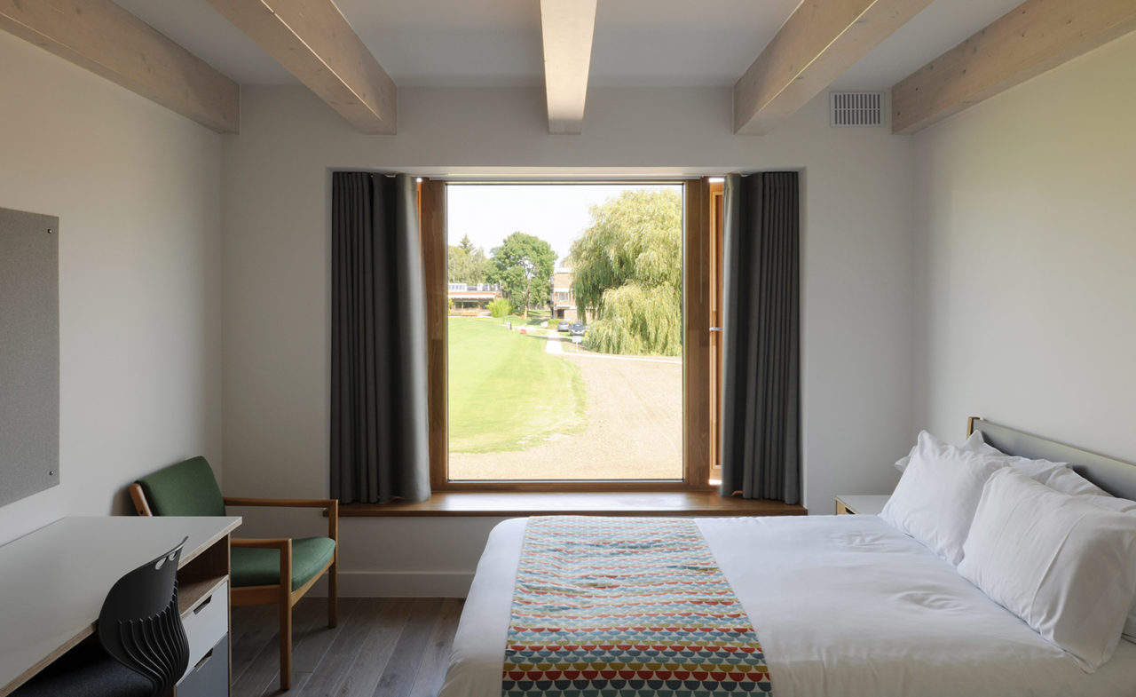
6a architects, Cowan Court, Cambridge (2016) Photograph by David Grandorge
This led to the idea of each student having their own window seat. If you push the window right onto the surface of the building, then you can make a space in the wall for people to sit in. It’s a place for relaxing, reading, for just gazing outside. You could say it’s like having a little room inside the room.
You mentioned the issue of insulation, and it is our understanding that this building adopts a ʻpassive design.’ Could you please elaborate on this?
The major strategy in the passive design is conservation of energy, and the main way to achieve that is by having a very highly insulated envelope. As I’ve said before, there is 30 cm of insulation on the walls, as well as on the roof, and on the floor. It’s therefore extremely well insulated.
The windows are triple glazed, so they’re very, very high performance, with insulated shutters for ventilation. It’s also very airtight. So for it all to work, all the parts of the building including the walls, roof and windows have to be incredibly well sealed so that air doesn’t pass around them. That was the first step.
-
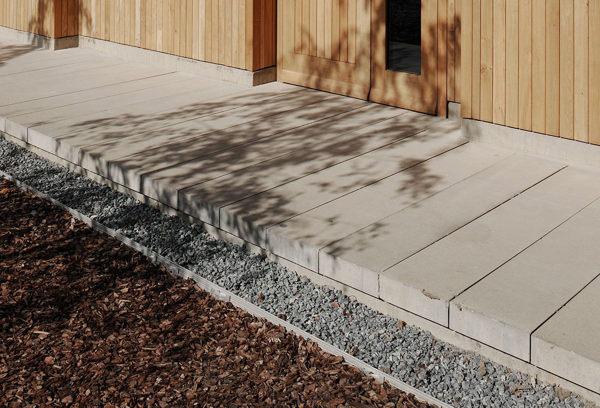
6a architects, Cowan Court, Cambridge (2016) Photo David Grandorge
Then the second passive aspect is natural ventilation. Since the whole building is naturally ventilated with the shutters, the students can manage their own ventilation rate. As you’ve seen, the corridors have these opening windows on which automatic sensors are installed, enabling the monitoring of CO2 levels in the air as well as changes in temperature.
The windows can always open and close in order to ensure that there’s the right air quality and the right temperature. Then there’s also a triple vent in every room that allows background ventilation. Therefore even if you close all the doors and windows it still manages to maintain a very small amount of background ventilation, meaning that the air stays fresh but is achieved so passively.
Then on the roof, there are photovoltaic cells all the way around which provides solar electricity to the building. Another point is that since the building is made of timber it is very low in body energy.
-
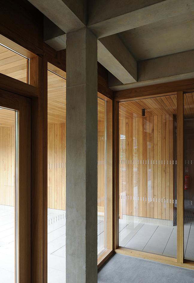
6a architects, Cowan Court, Cambridge (2016) Photo Johan Dehlin
Why did you come to adopt a passive design for this building?
It is now expected to design low energy buildings both legally through the Building Regulations and ethically, especially in cultural and educational buildings. Part of this stems from a desire to minimize a building’s energy consumption. Also passive design makes for more healthy and natural environments for the users.
Please tell us about the new MK Gallery, Milton Keynes which had just opened in March 2019? Could you say that this project also has characteristic windows?
Yes. Remember, all our projects are related to windows, but one with a very spectacular one is the new contemporary art gallery for Milton Keynes, the MK gallery. This is basically a big steel box with very large windows. A large circular window in the auditorium is overlooking the buildings at the end of the city, where the city meets the park.
Milton Keynes is a utopian urban project of the late 1960s. LA and the Garden City are woven together into a carpet grid laid over the rolling Buckinghamshire landscape so it’s got this incredible view.
-
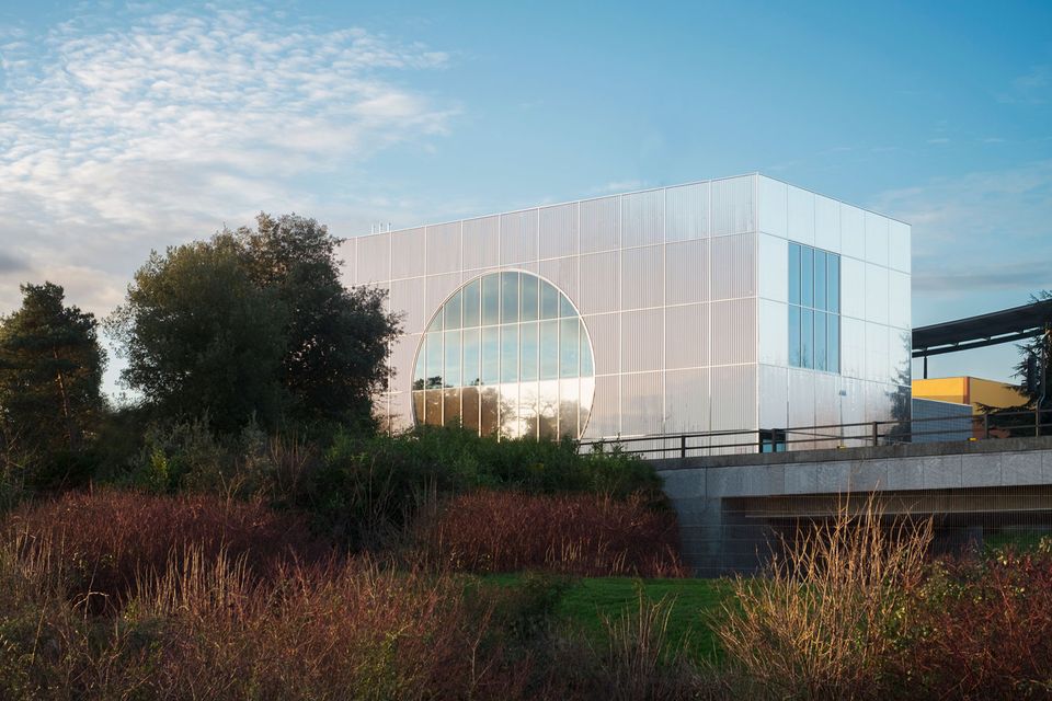
6a architects, The MK Gallery, Milton Keynes (2019) Photo 6a architects
-
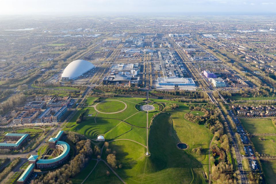
The city area and parks of Milton Keynes developed according to a grid system. Photo Iwan Baan
We’ve made this very large window that’s in the shape of a semicircle. This circle sort of frames the landscape in a completely different way to a square window. It makes you very aware of the view, and it’s like you’re looking out at the landscape from a cave. It has this almost natural form. It’s about 10 meters long x 5 meters high semicircle. It’s a very impressive, kind of monumental window.
You could say that in your projects, there is a close relationship between windows and the landscape.
Yes, certainly in the two projects in Cowan Court and Milton Keynes. They’re both projects that are very closely attached to landscape, with the former being situated within the landscape, and the latter right on the edge of the landscape. In this respect, the windows are very important elements that you use architecturally to frame or construct that visual relationship with the landscape.
You have also designed the photography studio for Juergen Teller, who is known for working with Marc Jacobs on the advertising campaign for his collections. One imagines photographers are particularly conscious towards light. Was there anything you paid special attention to when developing you design in terms of the way the light enters the room?
With this project, everything was extremely precise. Juergen Teller is a photographer, but he doesn’t photograph against white backgrounds as in a studio. He hates that. He shoots his subjects in various situations, so it’s always like real life.
-
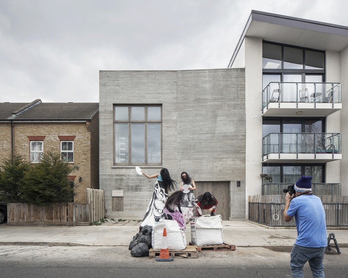
6a architects, Photography studio for Juergen Teller (2016) Photo Johan Dehlin
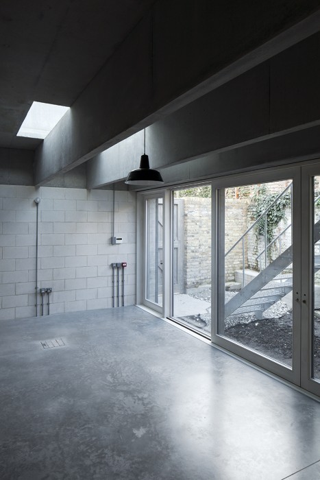
The thing with this studio is that it has light coming in from the roof, which means there is really good north light. This light never falls directly, but instead filters into the space through gaps in lateral concrete beams and from skylights overhead. There’s light that flows in from the side.
In this way, every room has light from the top and light from the side, with a lot from the top and a little from the side, partly because the color of the light is different. The north light is colder than the sidelight, which is warmer. This means that then things like skin tone appear more interesting due to there being two tones of light around.
While ʻnatural light’ is an issue often discussed in the context of architecture, it was surprising to hear that you had designed this project with awareness towards each of the subtle differences in light entering from all directions of the building.
Every room in this building has light from above and light from the side. Even the small rooms always have two windows. This is the rule for the lighting that you want. There’s no correct way of doing it, nor is there an incorrect way of doing it. There are different ways of doing it according to different types of work, and for different types of people. Juergen shoots with natural light, but there could really be lots of other ways too.
-
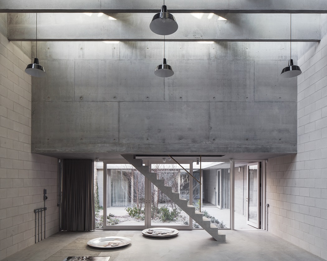
Photography Studio for Juergen Teller (2016) Photo Johan Dehlin
Are there any specific ideas or schemes reflected in the design of the windows themselves?
We looked at old windows in warehouses in London. These windows generally never have a sharp corner. They always have a slightly rounded corner because in buildings like warehouses, the windows often get things smashed against them. The corners are made a little bit softer so they don’t get damaged, but it also means that when light comes in the window it makes a much softer edge than a sharp corner.
So let’s say, with this sharp corner, the light is very bright here and darker there, with the line also being very sharp. If this is a circle, then that is much gentler.
So it’s softer visually with the light, then the window frame is very slightly softer on. It’s a very subtle thing, but it makes the building have a slightly different atmosphere.
You have to be extremely close to it to be able to recognize it, but every single one of these edges is at different scales. Nobody notices, I know. Nobody else knows. It’s a way of building this quite tough, really contemporary structure. It somehow has an uncanny effect because it looks like one thing, but the atmosphere is something quite different.
-
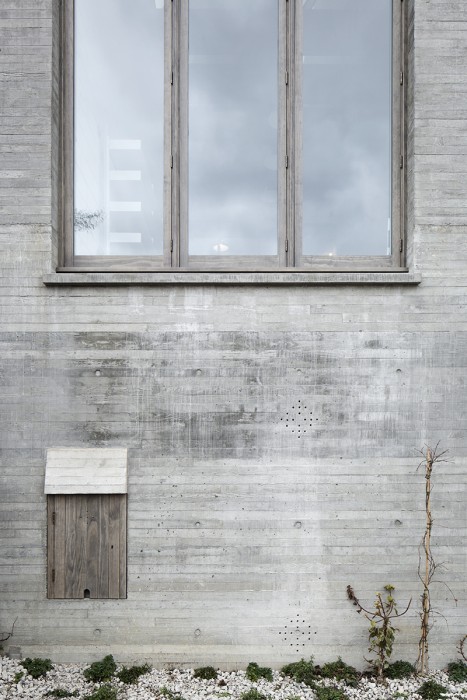
Photography Studio for Juergen Teller (2016) Photo Johan Dehlin
-
Photography Studio for Juergen Teller (2016) Photo Johan Dehlin
What kind of materials are you using?
Juergen Teller’s studio is a new building all made out of concrete. It’s quite tough and brutal, but the windows are made in wood. The wood and concrete go really well together because concrete is cast against wood. When you cast concrete, you do it against a wooden structure, so the memory of wood is always present in the concrete. So then to make the windows in wood somehow seems to fit with the overall atmosphere of the building.
We felt that you like using materials like concrete and wood in your projects which ʻage’ over time.
Yes. Again, it goes back to the comment about the Greek proverb of things growing, decaying, and being natural. I’m not interested in building architecture that stays exactly the same forever. In a sense, when you finish a building, it’s like the first day in the life of the building.
You could compare it to the first day in our own lives when we start as babies, grow up, get old, get even older, and then eventually die. We are indeed always changing, and I kind of want architecture to have that quality. I want to say, “Yes, this building is not the way it was built 500 years ago. It’s very beautiful because it’s old, worn, and has texture and traces”. This is what I consider perfect, and is a point we are interested in our work.
Tom Emerson (Architect/ Professor, ETH Zürich)
Founded 6a architects with Stephanie Macdonald in London in 2001. 6a architects has received several RIBA Awards, the Schelling Medal in 2012 and was shortlisted for the Stirling Prize in 2017. Books include Never Modern produced in collaboration with Irénée Scalbert (Park Books, 2014) and a monograph by El Croquis was published in 2018. He studied at the University of Bath, the Royal College of Art in London and the University of Cambridge. He taught at the Architectural Association, Cambridge and, since 2010 has been professor of architecture at the ETH Zürich.
http://www.6a.co.uk/
https://www.emerson.arch.ethz.ch/
MORE FROM THE SERIES
-
The 16th International Architecture Exhibition, La Biennale di Venezia 2018
Thresholds between Coexistence and Architecture
25 Jun 2019
The 16th International Architecture Exhibition, La Biennale di Venezia 2018
Windows: Openings and devices
12 Dec 2018
The 16th International Architecture Exhibition, La Biennale di Venezia 2018
Liquid Light
12 Oct 2018
The 16th International Architecture Exhibition, La Biennale di Venezia 2018
Spaces In Between
01 Oct 2018
