Series The 16th International Architecture Exhibition, La Biennale di Venezia 2018
Thresholds between Coexistence and Architecture
25 Jun 2019
- Keywords
- Architecture
- Interviews
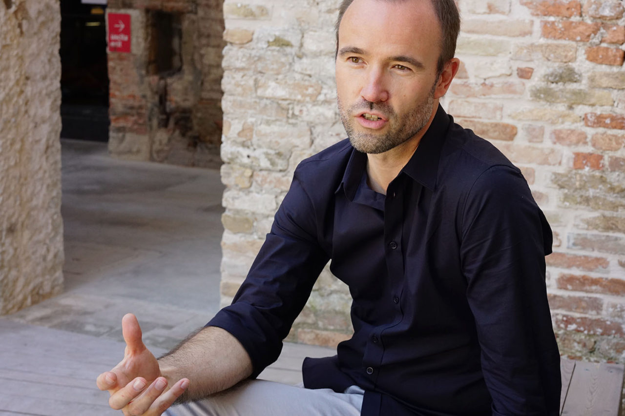
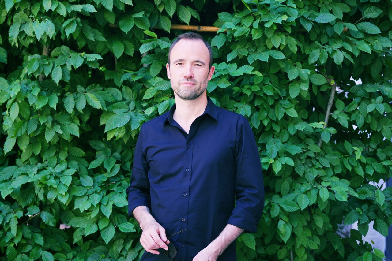
Tom Avermaete is an architectural theorist who teaches at ETH Zurich. Besides working on numerous books and architectural exhibitions focusing on the relationship between public spaces and architecture in cities, Avermaete has been active in a wide range of activities, such as producing the 29 year-old architectural magazine OASE. Windows make a connection between us and cities or regions in a physical sense, but metaphorically they connect us emotionally to the city—according to him. What possibilities does he find in windows? We spoke to him about them by referring to three existing architectural works as examples.
Tell us about your book “Architectural Positions: Architecture, Modernity and the Public Sphere” that was published in 2007? It gives interesting insights into how architecture makes a connection between the external and internal to make great public spaces.
This is a book of great importance to me because I believe that the way in which architecture contributes to public places is essential. Sometimes we can view architecture as a technical question. Let’s say that I am designing a building. Then I will need to make sure that it has enough light inside and that it is well acclimatized, and so forth. These are, of course, all important aspects of architecture, but what was very central in the book is that we were also asking ourselves questions beyond these technical questions. It makes us think how architecture can contribute to a vaster realm, a sphere of collective activities, a sphere that is indeed related to an urban dimension of architecture as well. In the book, we asked architects to think about where the frontiers between private and public were located, and what we think about that. We didn’t want to offer thoughts of just one architect, so we chose thirty-six architects to give us their ideas. What’s interesting is that you learn about the different ways in which architects view these issues and how they address them through their work.
What I found fascinating in the book was that we incorporated these differing views from these people who are all that we might designate contemporary architects; important people who emerged in the last twenty or thirty years, such as Aldo Rossi, Rem Koolhaas, Matthias Ungers, Peter Zumthor, Peter Eisenman and Toyo Ito. These are very famous architects, and we felt that, in a way, we were facilitating a conversation among these people and promoting their understanding of each other’s work. Naturally, virtually every architect believes that thresholds are extremely important, but will look at them differently. This is what the book is addressing through talks with thirty-six architects. It’s worth noting that the younger architects were very interested in this book. They felt that it set out for them a number of viewpoints from which they could choose. So, we looked at what these thirty-six architects thought, and a great number of younger architects told us that the book could help them define their own positions, which was pleasing.
-
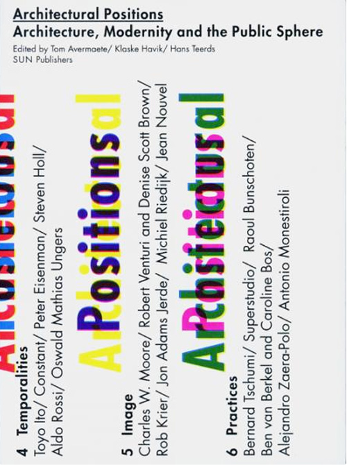
"Architectural Positions: Architecture, Modernity and The Public Sphere"(Sun Publishers, 2007)
Can you tell us about what you call “threashold elements” in the book?
These are elements that exist at the threshold between public and private. Some architects prefer to make the threshold thin and switch from public to private very quickly, though some say that the thresholds need to be very thick. In the modernist tradition, of course, architects try to make these thresholds invisible, with very thin lines between private and public, whereas more traditional styles tend to employ thresholds that are literally chasms. You will have to walk through several meters of building to go from the public to the private or the other way around.
Can you give us an example of how windows contribute to public places as the threshold between public and private?
I’m fascinated by the way buildings contribute to shared spaces, what they do to these public spaces, and I believe that windows are extremely important in this aspect. They can be literally central to a building, but they are also important as a phenomenon. They influence the ways in which people view the city, and I’m not talking about the physical way they look at it but the image they have in their minds, and the relationship they have with a city or an area. I believe windows are extremely important in the contribution they make to this relationship between buildings and our shared environment.
This reminds me of the article “Transparency: Literal and Phenomenal”(Perspecta, Vol. 8., 1963) by Colin Rowe and Robert Slutsky, which addresses both literal and metaphorical transparency, which I believe is what windows have. They make a connection between us and cities or regions in a physical sense, but metaphorically they connect us emotionally to the city—it’s fascinating as an architect to consider both of these aspects in one’s work.
I can give you three examples, which are all kind of unique.
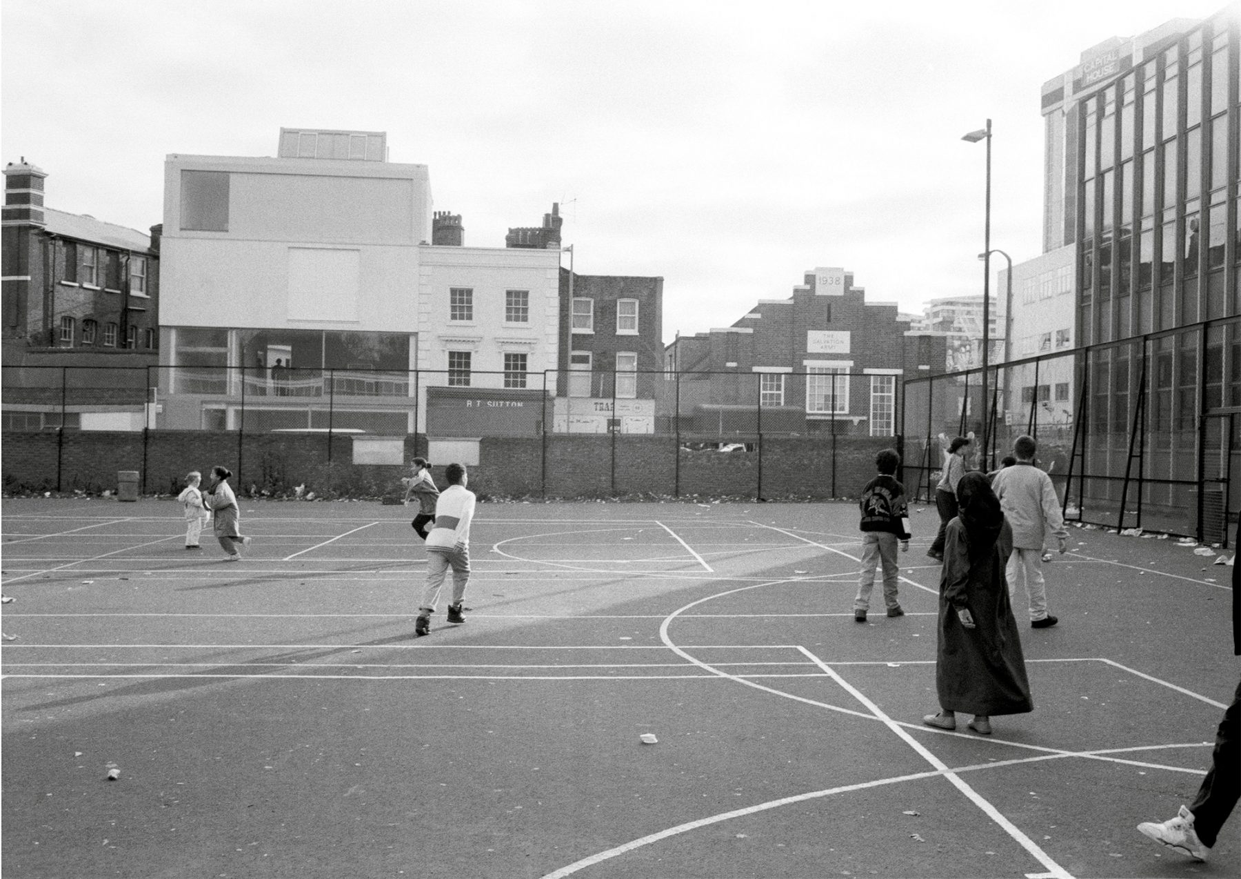
The first is that of the Lisson Gallery, an older building by Tony Fretton. I expect you’ve seen it, but I’d like to talk about it a little bit because I find it highly influential. The building went up in 1990, so it’s about 28 years old. It’s a standard London suburban building. They needed a building for an extremely long-established and famous art gallery. If you look at the façade, you can see it’s almost one long window. I think this building establishes a relationship between the art gallery, a private space, and the public world outside on the street.
-
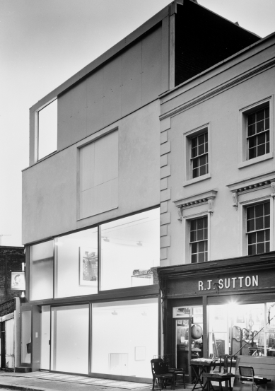
Courtesy of Lisson Gallery and Tony Fretton Architects © Chris Steele-Perkins
Tony Fretton did an extraordinary thing here by marrying up the kind of holy spaces of an art gallery and the humdrum world of the street, bringing them together in amazing ways. Generally, these realms have no relationship. Art galleries are sort of sacred, quiet spaces for contemplation, and the street is all movement and noise. Fretton has used the window to create a relationship between the two, to interweave them with each other.
-
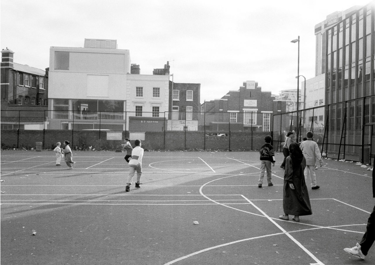
Courtesy of Lisson Gallery and Tony Fretton Architects © Chris Steele-Perkins
Imagine you’re on this perfectly humdrum street, in the working world, and you’re confronted with the silence of an art gallery. And conversely, you’re in the quiet space of an art gallery, but you can see and feel the street life outside.
So, I think you can see the relationship; you can see Fretton’s idea. It’s definitely modernist, it shows us that these are two different worlds and generally art galleries separate themselves with very broad thresholds from the public realm; you’ll generally have grand entrances, staircases and so on. These two worlds, one of contemplation and the other of everyday life, are generally far apart, but here they are drawn towards each other, and both of them benefit. The window is what allows this. You could almost say that it forges a sort of tension between the worlds. When I first saw this building in the 1990s, I was extremely taken with it. It was the first art gallery art I’d seen which achieved this. At the time the Lisson Gallery was showing Anish Kapoor’s work, which is almost a world of its own, and while you were looking at the work, you could feel life and motion from the street all around you. This is a very special building.
-
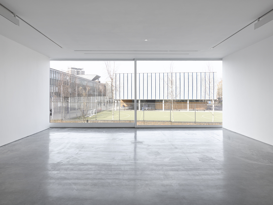
Courtesy of Lisson Gallery and Tony Fretton Architects ©Tony Fretton Architects
It is very different from standard galleries where the architecture is designed to keep the everyday out effectively.
Exactly, and you can see just how important the windows are in achieving this. I think we should aim to make thresholds as narrow as we can, and that’s something I’d like to discuss.
And the second example is…?
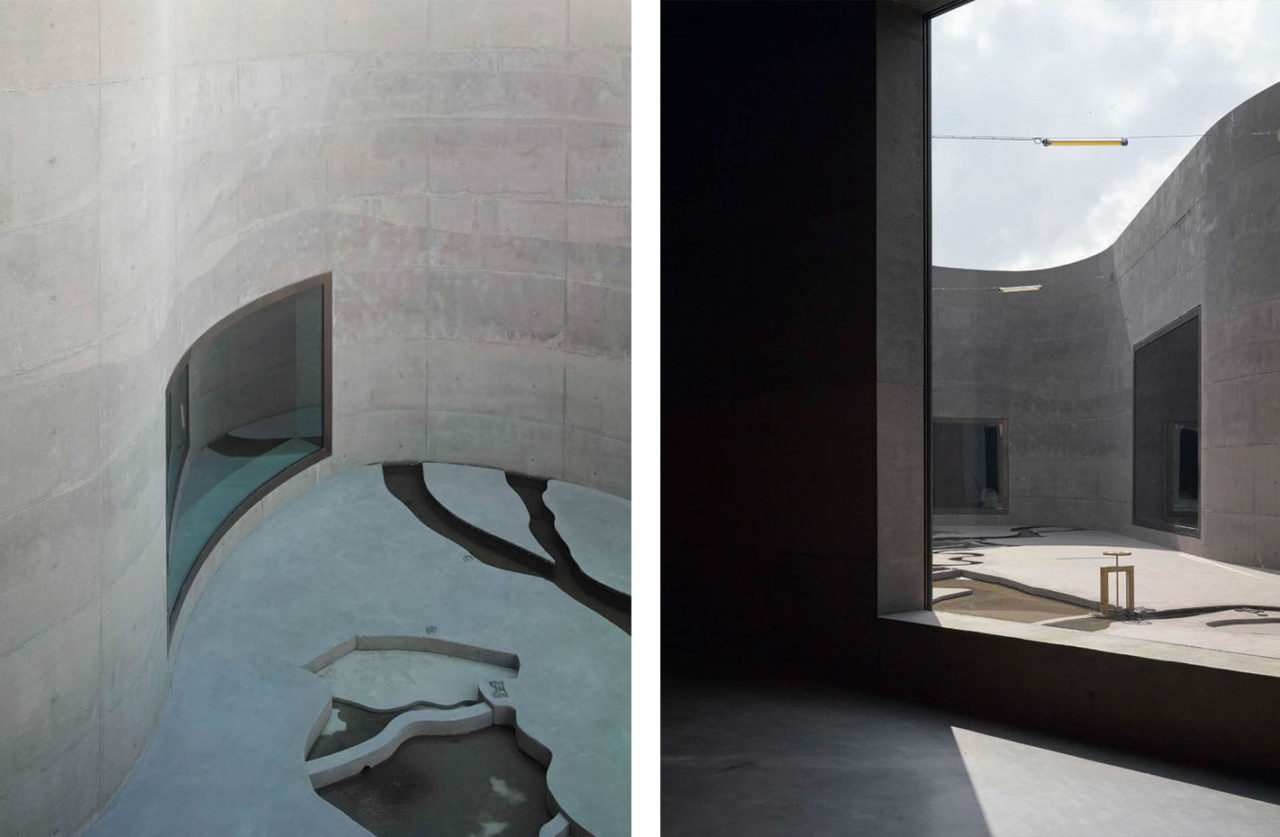
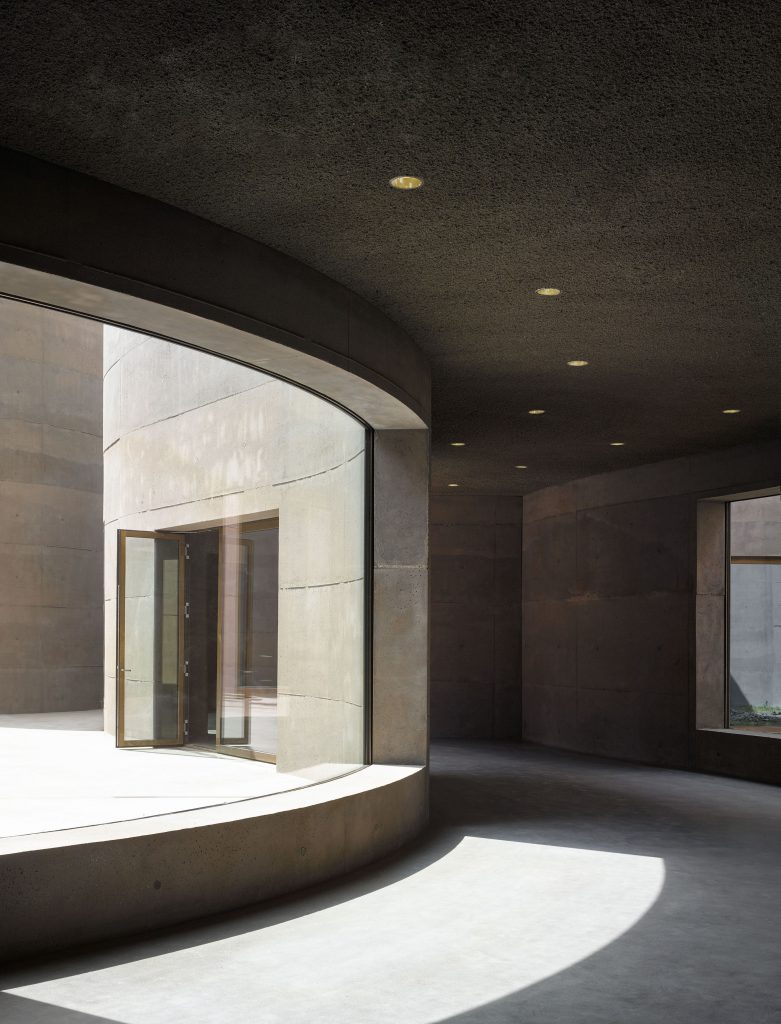
It’s a more recent project by Anne Holtrop. Hfe is a comparatively youthful architect. It’s Waterline Museum near Utrecht, and you can see that it’s sunk down into the soil. It used to be an old fortress; you know how they used to dig fortresses into the ground? He was invited to create a new museum in this place.
The most interesting, you can see it underground, now if we move round you can see some windows. Take a glance through those, and now let’s go back, for example, let’s look at this. What I find fascinating about this is that the way he works, you can’t see it immediately, but we see the museum’s underground, and he’s building the relationship with the soil, he’s using the windows the convexity and the concavity of the windows.
-
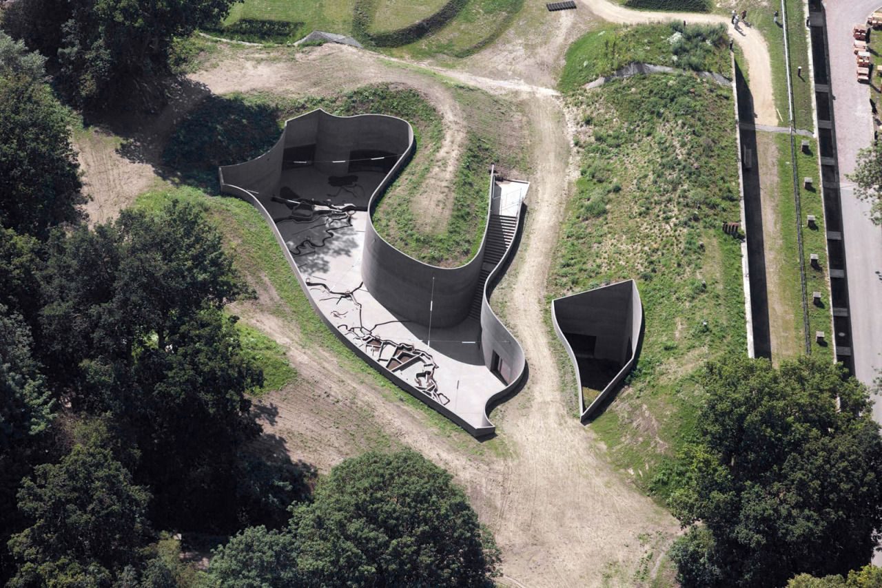
Courtesy of Anne Holtrop © Bas Princen
-
Courtesy of Anne Holtrop © Bas Princen
You see the window becomes a part of the architecture and it doesn’t have to be flat, it can be concave or convex. Here the windows are being used to create a relationship with what we might call the plasticity of the soil. If you’re working with soil, it’s not geometric, it has curves, convexities, and concavities, it resembles a sculptor’s clay, or really a type of architecture itself. The architect here is copying the earth’s qualities. And you can see how having the windows convex or concave changes the relationship between the inside and the outside worlds is. This is different from the work of Tony Fretton; the plasticity of the window redefines the threshold. I find this fascinating in the way Anne Holtrop creates a relationship with the earth he’s working with and striking up this new relationship between the external and the internal. This is one of the most interesting uses of windows that I’ve seen recently.
-
Courtesy of Anne Holtrop © Bas Princen
So, while we are really looking at the ability of the window to mirror the soil and strike up new relationships between the internal and the external, we’re not talking about just being transparent, but also, naturally, the reflections. As soon as you create a convex or concave window, then the reflections will be different, that’s obvious. You have to be extremely clever to use these properties effectively. And now we come to my third example.
Tell us about your third example.
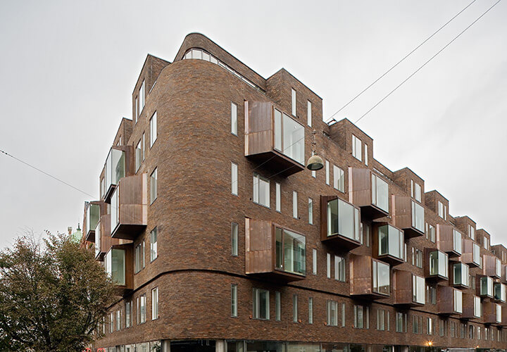
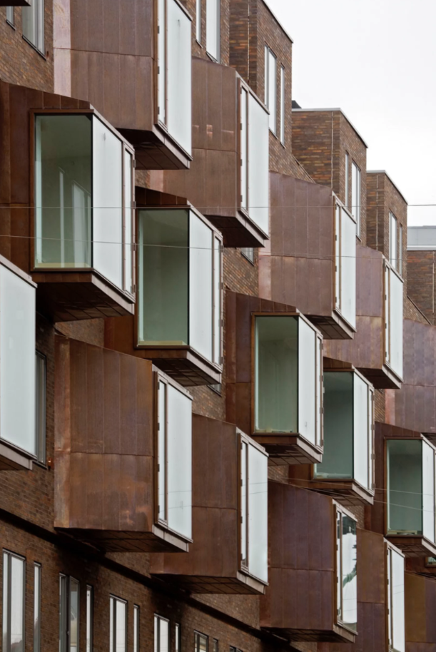
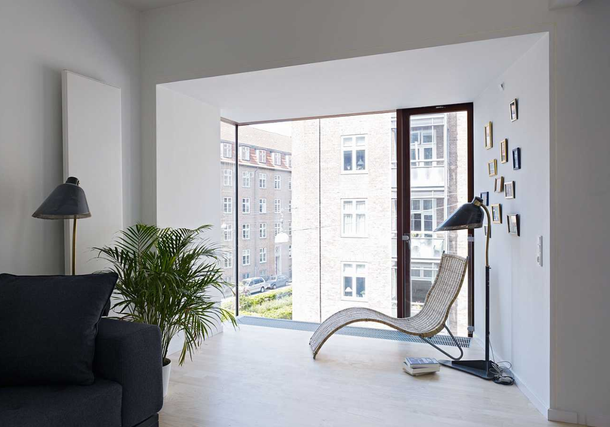
It’s Østerbrogade 105 by C. F. Møller Architects. It is in Denmark, in Copenhagen. This is another fascinating example. I wanted to choose something a bit different, naturally. Fretton is concerned with making a threshold very narrow, and Holtrop uses concave and convex windows to give it a different character to thresholds. In this case, the Danish architect is trying to make the threshold broader, we’re talking about a certain conception of the domestic environment. What you see here is a housing project from Copenhagen. Denmark is in northern Europe, so he doesn’t enjoy the best weather, and we are looking here at the domestic environment, which is very much at the forefront of architecture at the moment, the place where the family live out their lives, and for a long time this was seen as completely separate: on the one hand you have your family unit, and, on the other, public life. The windows here, these bay windows, these symbolize that threshold.
-
C.F. Møller Architects © Torben Eskerod
-
C.F. Møller Architects © Torben Eskerod
If you’re really all together as a family, if you look at this, I don’t know if you can see the interior, but you can imagine it. This is somewhere you can be with your family, but at the same time, you can be linked to the city. Simultaneously it’s extremely private. The place where have your private life with your family, your children, your spouse and so on but you’re in public as well. I think this reflects the way Danes see their society. They believe in openness. They don’t believe in hiding things away. In a way they live their lives in public. You can see here that the domestic environment is intertwined with the public environment and the window symbolizes this. You can see a unique expression of the connections between the private and public environment in a specific cultural situation, that is the Danish culture, a society where what others might consider private is to a great degree lived out in public, and the windows here express that. So, I think I’ve shown you three most fitting examples of the part windows had to play in modern architecture.
-
C.F. Møller Architects © Torben Eskerod
This is what contrasts to traditional Japanese architecture with the sliding dividers between rooms.
That’s a good point, the Danes can do this because there’s a lot of technical control over the building. They have control of the acoustics, the climate, and that helps them to do this so effectively.
So, they have their privacy. They want to remain private, but simultaneously be connected to the outside world.
Yes, I think you can say that the Danes are very concerned about what we might term being intimate; in their culture, intimacy can exist within social spaces, so you are both intimate and out in public at the same time, which is almost unique. In my part of Europe, around Belgium and Holland, this doesn’t happen. It just doesn’t go on. Perhaps a little bit in Holland because nobody has curtains on the windows, and you can see into their houses. However, these windows by C. F. Møller Architects make this absolutely concrete, combining the intimacy of private lives to public discourse.
I was extremely interested in the concept of coexistence. How various cultures live with each other. I don’t know if we can relate windows to this, but I do believe it’s related to the question of thresholds, and naturally, as we’ve seen, windows are a part of that. Windows are a part of the threshold, so are other parts of architecture, for example, balconies and doors. These elements of the architectural threshold are extremely influential in the ways in which we coexist. They exist at the boundary between the public and the private, the individual and society. We have warmth and cold, the visible and the invisible, the dirty and the clean. These elements, the thresholds separate them. What these aspects of architecture do to negotiate between different states and spheres, much more so than other parts of architecture, makes us take a fresh look at the architectural threshold. If you look at, say, floors or ceilings, they don’t do the same job, and that’s what I think is so important about threshold elements.
Tom Avermaete
Chair for the History and Theory of Urban Design at ETHZ, Professor of Architecture at the Technical University of Delft and author of several books, including “Another Modern: The Post-War Architecture and Urbanism of Candilis-Josic-Woods.” He is an editor of OASE Architectural Journal, The Nordic Journal of Architecture and one of the initiators of the research and exhibition project “In the Desert of Modernity: Colonial Planning and After” (Berlin 2008, Casablanca 2009, Marseille 2013). His recent work includes the book “Making a New World? Re-Forming and Designing Modern Communities” and an exhibition at the CCA on two major urban experiments in the Global South: Chandigarh and Casablanca
Top image: Chris Steele-Perkins
MORE FROM THE SERIES
-
The 16th International Architecture Exhibition, La Biennale di Venezia 2018
Interview with Tom Emerson, 6a architects
22 Apr 2019
The 16th International Architecture Exhibition, La Biennale di Venezia 2018
Windows: Openings and devices
12 Dec 2018
The 16th International Architecture Exhibition, La Biennale di Venezia 2018
Liquid Light
12 Oct 2018
The 16th International Architecture Exhibition, La Biennale di Venezia 2018
Spaces In Between
01 Oct 2018
