Series Shoei Yoh: A Journey of Light
From Interiors to Non-Architecture
22 Oct 2024
- Keywords
- Architecture
- Columns
- Essays
- Japan
Architect and architectural history researcher Masaaki Iwamoto, who has been leading the development of the Shoei Yoh Archive, sheds light on Yoh’s early works, from his de facto debut project, the Coffee Shop Marshmallow, to the Stainless Steel House with Light Lattice, together with the key concepts of “light” and “non-architecture”.
Shoei Yoh began his career as an interior designer before becoming an architect. While shifting from interior design to architecture is not uncommon today, it was almost unheard of at the time. In fact, the Japanese field of interior design itself was still in its formative years in the 1960s, when Yoh began his design activities. The concept of interior design only started gaining recognition in the early 1960s, thanks to the efforts of the nation’s first generation of designers like Isamu Kenmochi and Riki Watanabe. It was not until the late 1960s to the 1970s, when a number of young stars, including Shiro Kuramata, Susumu Kitahara, Shigeru Uchida, and Takashi Sugimoto, emerged riding the wave of Japan’s rapid economic growth, that the profession of the interior designer gained widespread recognition. Yoh was one of these key individuals who spearheaded the development of interior design in Japan.
Yoh’s foundation in interior design had a definitive impact on his later creations, as his work with commercial spaces was what led him to discover his lifelong theme of “light” and to explore experimental designs unfettered by architecture’s established conventions. In this piece, I will look back on Yoh’s work from the 1970s to trace the trajectory of his path from designing interiors to architecture—or, to use his words, “non-architecture”.
Becoming an Interior Designer
Shoei Yoh was born in 1940 in Kumamoto in Kyushu. He moved to Tokyo for high school and later enrolled at Keio University, majoring in econometrics. However, after seeing the Air France Tokyo Office (1960) designed by Charlotte Perriand, he became determined to study abroad in the United States to pursue his newfound interest in design. This led to him to study fine art and applied art at Wittenberg University in Ohio. Upon returning to Japan in 1964, he began working as an interior designer at Pacific House in Tokyo. Pacific House took American designers under its wing and primarily designed interiors for American-funded hotels and offices. According to Yoh, he worked on the office interiors for Reader’s Digest (1966) in the Palaceside Building as an “auxiliary” to a designer named William Kennedy. Incidentally, Yoh and Susumu Kitahara, who would later become a leading figure in the Japanese interior design world, worked as colleagues there, joining the company just one day apart.
In 1968, Yoh was presented with an opportunity that led him to move back to Kyushu: he was invited to design the interiors for Shizutaro Urabe’s Nishitetsu Grand Hotel (1969) by a company called NIC in Fukuoka. Founded in 1966 as a joint venture between Nishi-Nippon Railroad (Nishitetsu) and the Iwataya department store, NIC was a general design company involved in furniture retail and interior construction. Its name stands for “Nishitetsu-Iwataya Company”. NIC made a major impact on the design scene in western Japan by spotlighting modern design from both within and outside Japan, bringing aboard figures such as architectural critic Ryuichi Hamaguchi as advisors at a time when “interior design” was still a fresh term. Yoh established his reputation as an interior designer by heading NIC’s design division, the Design Center, until 1969.
Thin Transparent Membranes
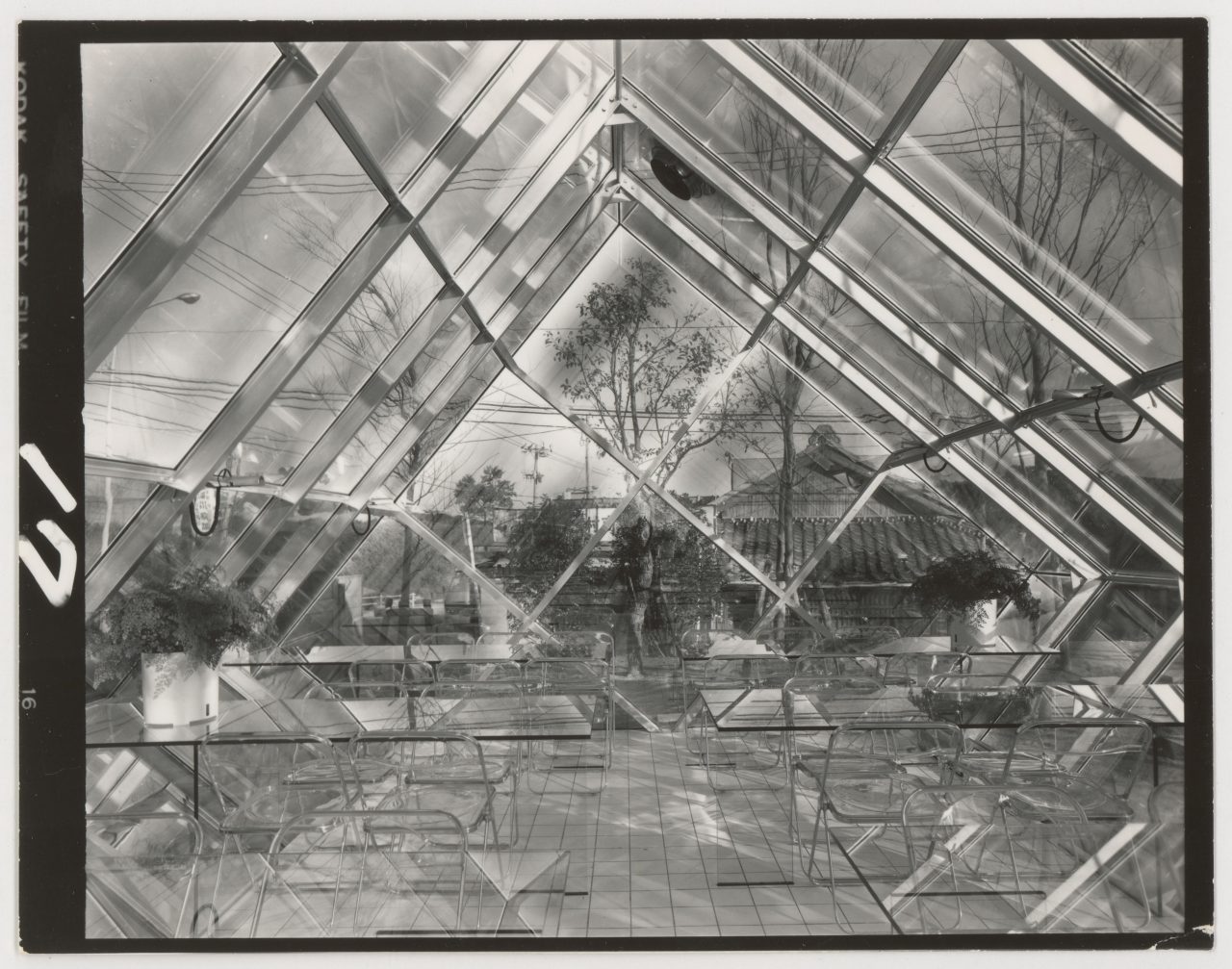
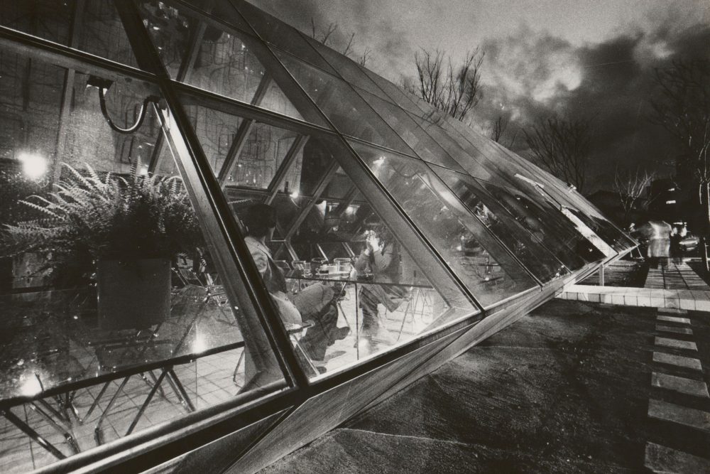
In 1969, the Coffee Shop Marshmallow was completed in front of Fukuoka’s Hakata Station. Although designed and built by NIC, this was the first project to which Shoei Yoh’s name was personally credited, essentially making it his debut work. The single-story, flat-roofed structure with a rectangular plan is encased in large glazed surfaces on three sides. These façades exhibit an exceptional degree of transparency as they are made entirely of glass, including the mullions. As Yoh explains, “They are neither windows nor walls, and there is no boundary between the interior and exterior; all there is is a single thin, transparent membrane.”
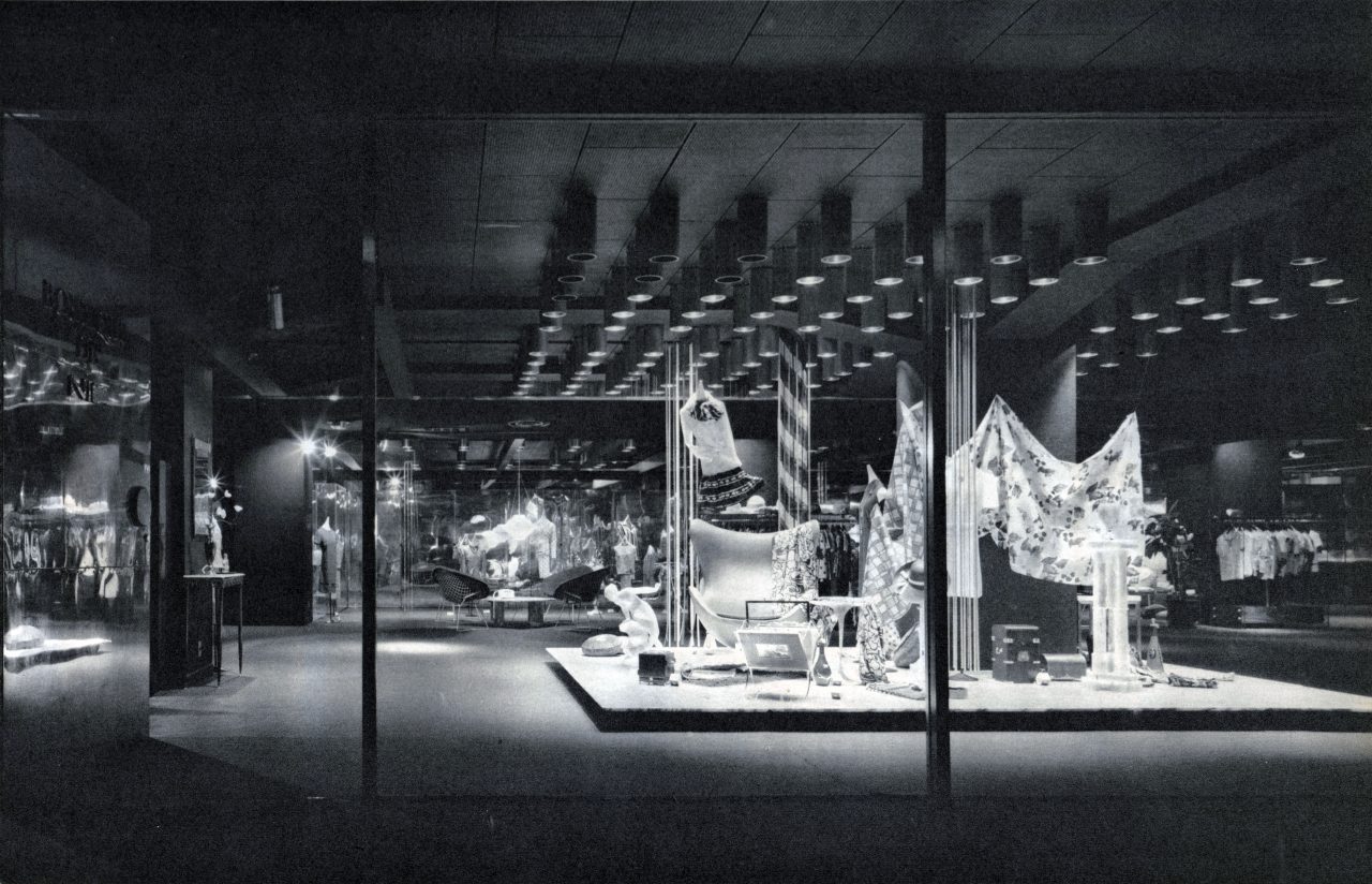
Yoh explored the potential of using glass to create “thin transparent membranes” in several projects during his NIC years. One could point to Ludwig Mies van der Rohe’s glass houses and to Buckminster Fuller and Frei Otto’s dome and membrane structures as influences behind this work. However, Yoh differs from them in that he focused on glass from the standpoint of commercial space design. His goal was to eliminate the designer’s personal expression from the spaces and to “beautifully showcase the people and objects” within them. In other words, he sought to have the glass “erase” the architectural design so that the occupants and products would stand out as the proper protagonists of his stores. Yoh writes about the Boutique de NIC (1969), where he created illuminated glass display cases that appear to float in the dark, as follows: “If white appears whitest when set against black, and colorful textiles are most vibrant when set against a neutral background, then what more do diamonds need than a single ray of light?”
Luminous Furniture and Luminous Interiors
Shoei Yoh also began designing a series of light-emitting furniture pieces known as Luminous Furniture during his time at NIC. The earliest example is the glowing counter he designed for the coffee shop JOUJOU in 1969. At the Café Solar, completed in 1970, he combined his ideas of luminous furniture and thin transparent membranes. The transparent building, encased with glass on all sides, is furnished with tables that emit light, which reflects off the mirror-finished ceiling to illuminate the entire space. This ensemble of glass, mirrors, and light-emitting furniture gave rise to what Yoh describes as “a visual zero-gravity space of sorts where everything vanishes”.
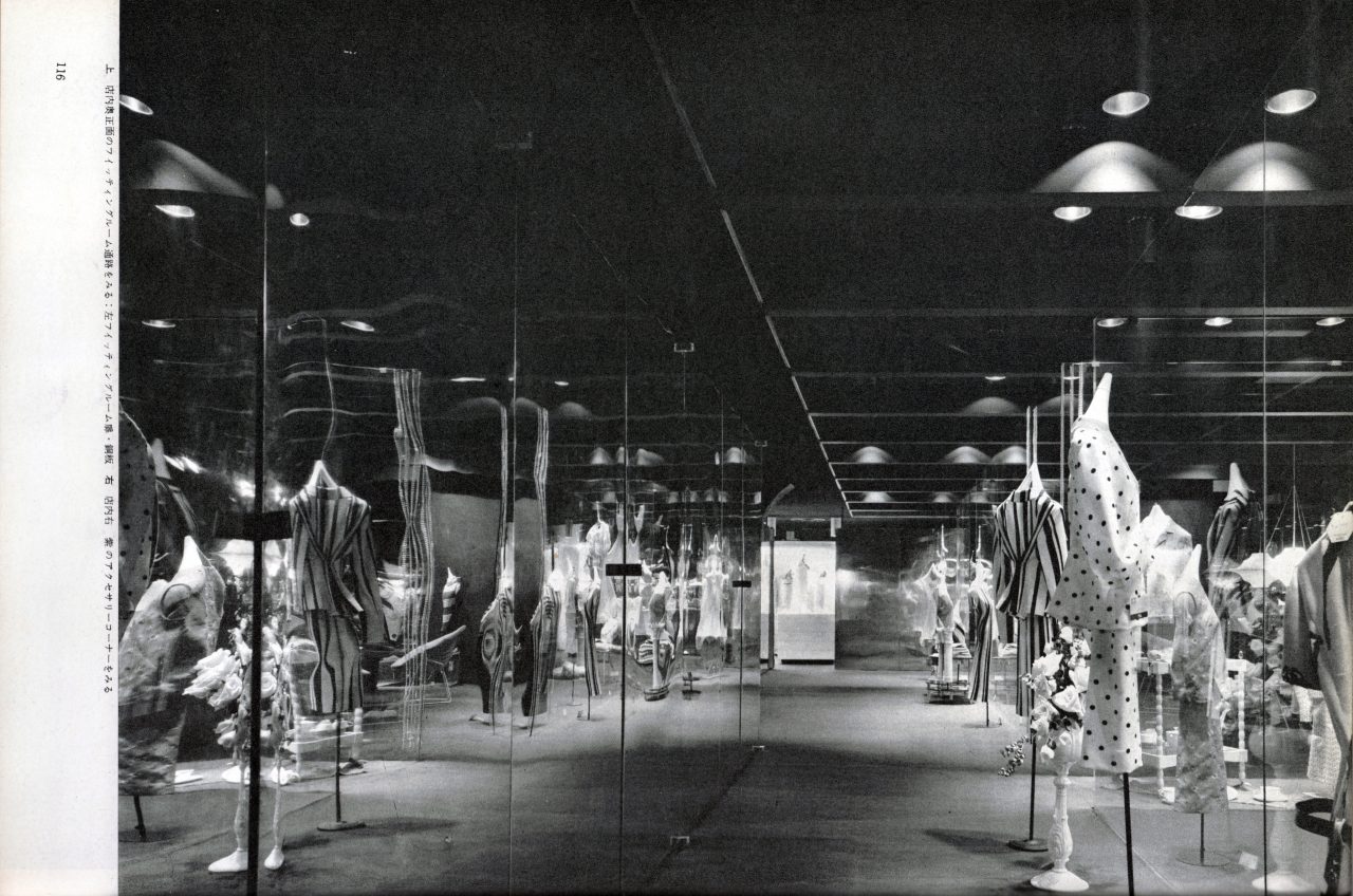
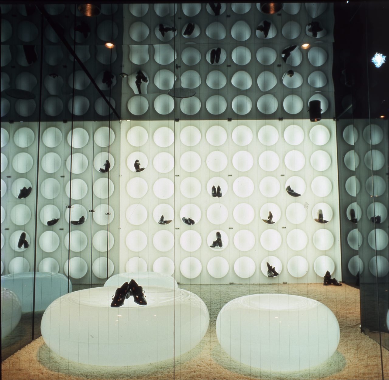
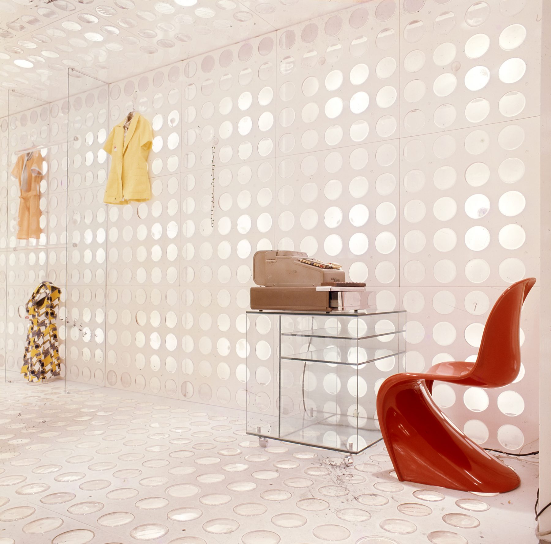
In 1970, Yoh left his job to establish the Yoh Design Office in Fukuoka. This did not mark the end of his interest in light, however. In 1971, he completed the shoe store Shoemaker Cornelia in Fukuoka and the boutique Jolie Kaneshige in Kokura. In these projects, Yoh further developed his idea of luminous furniture and experimented with creating “luminous interiors”, where the furniture, walls, and floors all emitted light. The intention was to erase the presence of lighting fixtures by seamlessly integrating them with the architectural elements. Thus, again, he aimed to “beautifully showcase the people and objects”.
Light is Light and Light…
While continuing his exploration of luminous furniture and luminous interiors in the 1970s, Shoei Yoh also developed original designs for lighting fixtures. In 1973, he designed the Lighting Tube, which is composed of a single-ended fluorescent tube sealed within a semi-transparent acrylic tube. A few years later, he created the Wireless Lamp (1977), which has neither a power cord nor electrodes. Consisting of a tube filled with mercury gas, it functions by using microwaves to excite the mercury atoms, causing them to emit light. The design represented an attempt to reduce a lighting fixture to pure light through thorough abstraction.
Through developing these works, Yoh became aware of light’s potential for manipulating perceptions of heaviness and lightness, leading him to the concept of “luminous gravity conversion”. This concept is explicitly expressed in the interiors he designed for Asahi Printing (1974). He integrated lights into the cantilevered counter in the lobby in such a way that its weight “dissolves the moment the light is switched on”. Five years later, he designed another cantilevered counter for the interiors of GA Tap (1979), this time emphasizing its weight by creating a “non-existent shadow” on the floor. He writes about this as follows: “Objects without shadows appear massless, while deep shadows heighten the intensity of light. Both are merely illusions.”
-
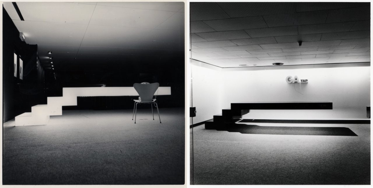
Left: Asahi Printing (1974), luminous counter. Right: GA Tap (1979), counter. The faux dropped shadow emphasizes its weight. Photo: Yoshio Shiratori. Shoei Yoh Archive, Kyushu University.
Yoh’s contemplations on light and gravity eventually led him to his thesis, “Light is Light and Light” (1987).
Light is light [i.e., bright] and light [i.e., weightless]—it has no material weight. On Earth, the space around matter is permeated by light, and we are only able to perceive the existence of matter because of its accompanying shadows. There are things around us whose material presence fades because they are reflective, luminous, or transparent. Their lack of visual presence temporarily confuses or deceives our senses, sometimes making them appear as though they are liberated from gravity or levitating. But then we come to realize that it is just an illusion.
Yoh conceptualized light as a “weightless material”. One could say he poetically interpreted the basic premise of particle physics that photons have no mass. Manipulating light to erase the sense of gravity and the presence of matter—this is the leitmotif that consistently runs throughout Yoh’s oeuvre.
In 1977, Yoh completed the Coffee Shop Ingot, where he enveloped the roof and walls entirely in glass. This marked a watershed moment in his pursuit of bright and light spaces.
Designing Non-Architecture
The Ingot was an innovative building in that it was the first in Japan to feature glass structurally fixed with silicone sealant along all four of its edges. Dr. Tomo Inoue discusses the technical significance of this in detail in his essay in this series. Here, I would like to focus on how Shoei Yoh himself viewed the Ingot.
There are neither roofs, columns, nor walls, and the space, too, dissipates as it expands infinitely into the bright sky, melting away into nature. Can this even be considered architecture? Or could it be anti-architecture? No, it is neither. Yet, this is precisely what I have been searching for all this time. The very fact that it is non-architecture will undoubtedly make it my ultimate refuge.
Yoh, who used glass to make the space disappear, described the Ingot not as “architecture” nor “anti-architecture” but as “non-architecture”. It was Arata Isozaki who, inspired by the counterculture movement, originally used the term to take a stand against Architecture with a capital “A”. However, by the time postmodernism had taken hold in the late 1970s, anti-architecture was essentially on its way to becoming the mainstream in the architecture sphere. It was in this context that Yoh latched onto the term “non-architecture” with the hope of escaping the binary world of “architecture vs. anti-architecture”. But what exactly does non-architecture mean?
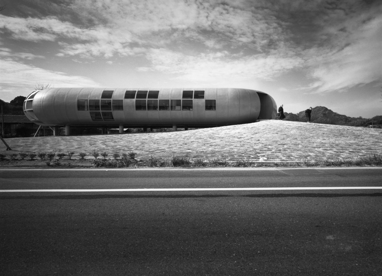
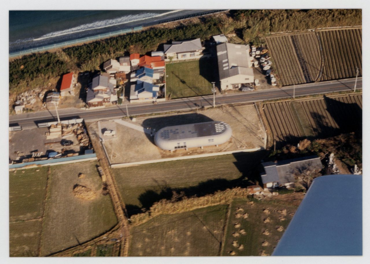
In 1979, Yoh completed the Kinoshita Clinic. He writes as follows about this building, which looks like a spaceship that landed on a beach in Fukuoka: “Consciously striving to create non-architecture means deliberately ignoring the details and conventions of architecture established over thousands of years; it also entails searching for new contexts and methods by copying the windows, doors, and other details of automobiles and aircraft.”
The Kinoshita Clinic was the first building in Japan to utilize fiber-reinforced plastic (FRP) exterior cladding, and it has curved glass windows that open and close on hinges made of silicone sealant. Yoh’s architect peers were astonished by such “non-architectural” details that adapted methods used in product and interior design. Yoh’s non-architecture was grounded in the vast, broader field of design, and thus provided a crucial anchor point for the architect whose roots lie in interior design.
-
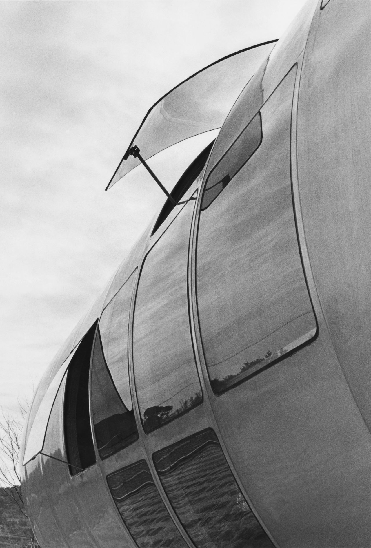
Kinoshita Clinic. Photograph partially discolored from age. Photo: Yoshio Shiratori. Shoei Yoh Archive, Kyushu University.
Light as a Natural Phenomenon
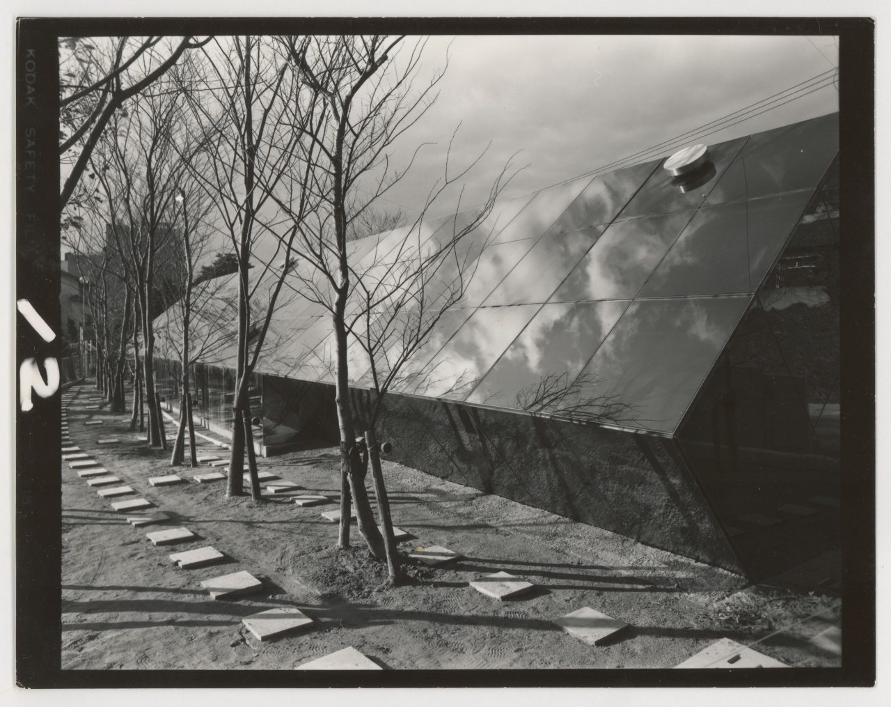
Shoei Yoh’s attempts to make all things vanish did not end even after he created what could be described as the epitome of transparency in the Ingot. His desire to erase the structural frames of the glazing led him to the idea of inverting the relationship between the glass and the frames of the Ingot. This gave rise to the Stainless Steel House with Light Lattice (1981), where narrow slits of light form an “immaterial structure”. The light, lucid space can be seen as the culmination of Yoh’s explorations with thin transparent membranes, luminous gravity conversion, and non-architecture. What he ultimately discovered after erasing all that could be erased was the natural phenomenon of light itself: “Light, transitioning silently, expresses the time of day and the passage of the seasons…”
After synthesizing his interior design work from the 1970s in the Stainless Steel House with Light Lattice, Yoh turned towards exploring the idea of architecture as a natural phenomenon. His job title also changed from “interior designer” to “architect” around that time. Of course, this must have been a trivial detail for Yoh, who was focused on pursuing non-architecture…
-
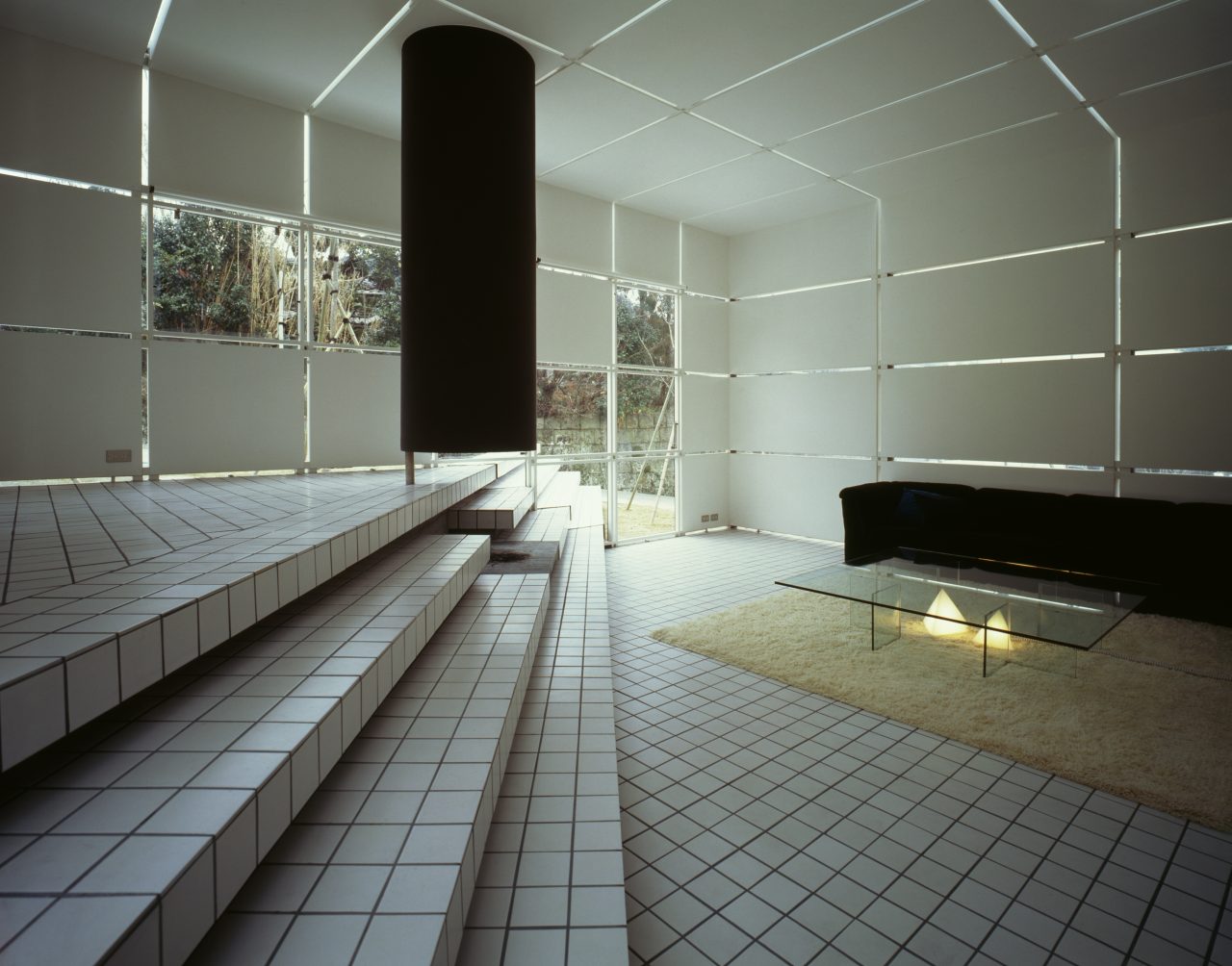
Stainless Steel House with Light Lattice. Photo: Yoshio Shiratori. Shoei Yoh Archive, Kyushu University.
Top image: Jolie Kaneshige. Photo: Yoshio Shiratori. Shoei Yoh Archive, Kyushu University.
Masaaki Iwamoto
Born 1982 in Tokyo, Japan. Assistant Professor, Kyushu University. First-class licensed architect. PhD (Eng.). Research fellow at the ILEK Stuttgart in 2006. Completed a master’s in architecture at The University of Tokyo in 2008. Former staff member at Kazuhiko Namba + Kai Workshop and partner at Vo Trong Nghia Architects. Co-founded ICADA in 2015. Founded the Shoei Yoh Archive (https://shoeiyoh.com/) at Kyushu University after the architect donated his personal archive to the university in 2019. Specializes in modern and contemporary Asian architectural history and is engaged in research on Vann Molyvann and Shoei Yoh. Architectural works include the Knot-hole House, TRIAXIS Suma Kaigan, Biolab/Foodlab at Kyushu University, and Auxetic Pavilion. Awards include the Gold Prize and Bronze Prize of the Kukan Design Award (2019), Excellence Award and Forestry Agency Director-General’s Award of the Japan Wood Design Award (2021), Kazuie Yamada Award (2021), and iF Design Award (2023).
