Series Windows of Japanese Modernist Architecture
Windows of the Aichi University of the Arts
by Junzo Yoshimura and Akio Okumura:
The Concrete Science of Living with Nature
19 Jan 2024
The Aichi University of the Arts was built to the designs of Junzo Yoshimura and Akio Okumura in 1966. Situated in the forested hills of Nagakute, Aichi, the campus was planned with consideration of environmental elements such as light, air, and sound, as well as the five senses. This article explores the ideas that informed Yoshimura and Okumura’s plan through focusing on the designs of window spaces in four of the campus’s buildings, including the iconic Lecture Building.
February 28, 2023. The afternoon air was still chilly on the skin. I took a tour of the Aichi University of the Arts campus with several people associated with the university so that I could speak with them while viewing the buildings. Afterwards, as I was walking along a lush path leading to the gymnasium at the very back, a question came into my mind: Why has this campus, whose overall plan, composition, and intended public character are intrinsically premised on the presence of people—namely, its creative students and instructors—left me with the impression that it was designed with a concrete vision of living1 harmoniously with the natural biological and physical environment?
-
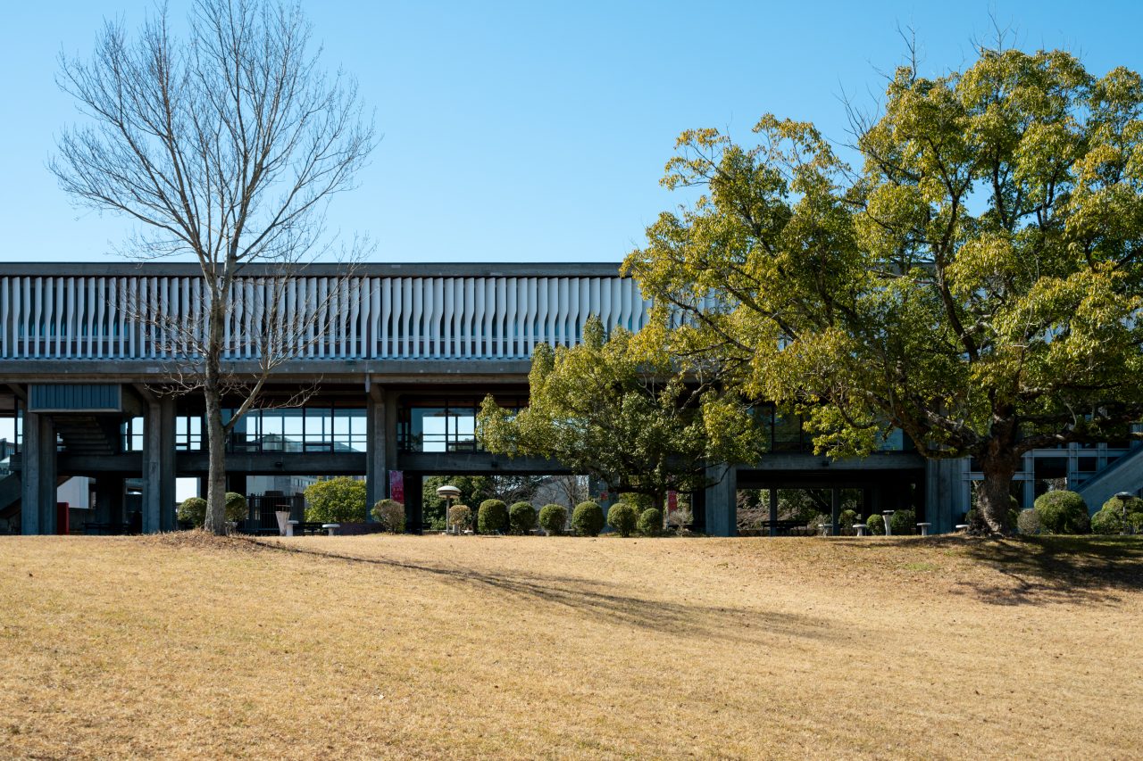
Looking towards the Lecture Building from the east.
How did Junzo Yoshimura and Akio Okumura, the campus’s architects whose practices had been centered around wooden housing, anticipate such a landscape for living? Or in other words, how were they able to envision and plan an environment meshed so harmoniously with nature on the given site of the Aichi University of the Arts campus project? Could it be because they approached it through a scientific lens, giving thorough thought to the living organisms, resources, and other concrete phenomena of the natural world without disconnecting themselves from their physical senses or perceiving things through abstract concepts like many of us architects tend to do today?
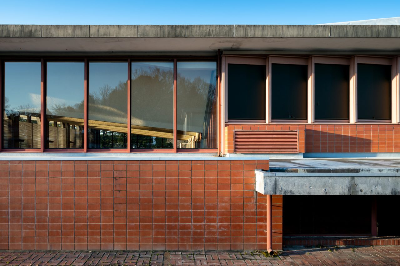
In this article, I will retrace my visit to the campus while focusing on four scenes centered around windows in the Lecture Building, Sogakudo Concert Hall, University Art Museum, and Studio/Laboratory Buildings to contemplate how its design may have been informed by a concrete science2 of living with nature.
-
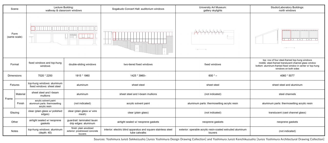
The four window scenes.
The Reasoning for the Placement of the Ashtrays and Benches
The Aichi University of the Arts is situated about a 10-minute car ride to the west of the closest Aichi Loop Railway station. Emerging from the gently sloped entrance path that takes you right up through the richly wooded environment, I could see one of the Lecture Building’s ceramic murals and louvered faces above the crest of the hill. I then proceeded up the grand stairway attached to the plinth at the building’s feet, noticing the pavement transition from asphalt to brick tile as I arrived onto a plaza. I began to form a clearer picture of the lay of the campus as I walked across this plaza that extends in the north-south direction.
-
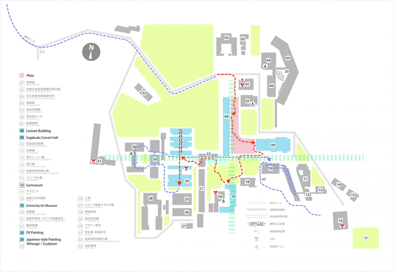
The Lecture Building stands along the ridge of a hill that forms a north-south axis through the heart of the campus, and the former music department buildings and art department buildings are contraposed around it to the east and west, respectively. Its openings and pilotis are positioned to allow sightlines through in the east-west direction, while the plaza below offers views in all directions.
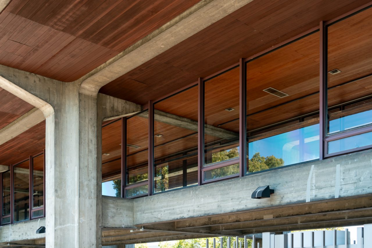
When standing on the plaza, I was naturally drawn towards the Lecture Building on my right-hand side. The building is composed of one classroom level held up in the air at third-story height on a gate-like structure and one walkway level suspended beneath it. The piloti level is furnished with chairs, tables, and noticeboards.
Of the three external stairways positioned along the length of the building, the southernmost one is set on a higher tier of the plinth. Following its faintly purple-colored handrails will bring you to a pair of faded light blue steel double doors that lead into the suspended walkway.
-
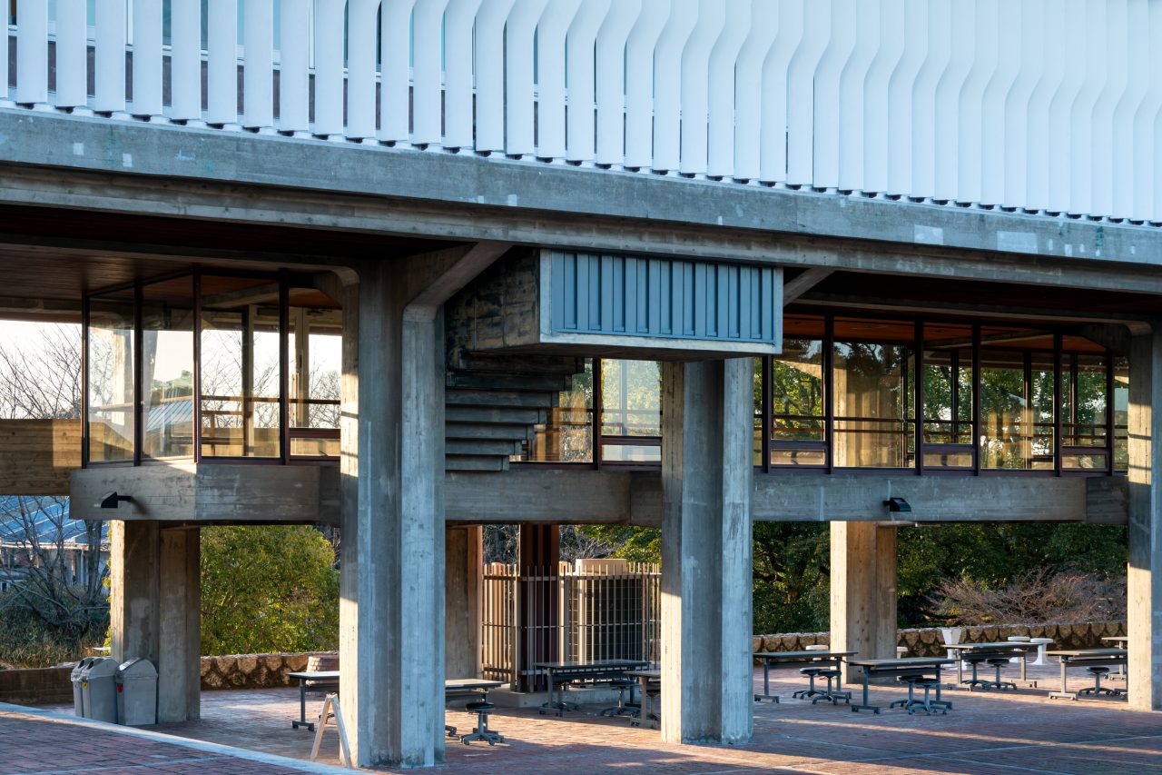
View of the Lecture Building from the east.
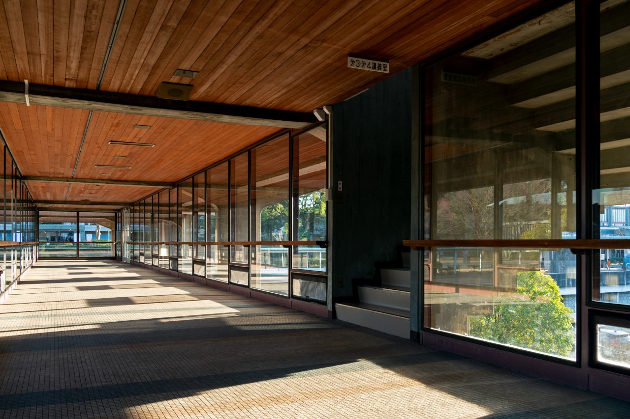
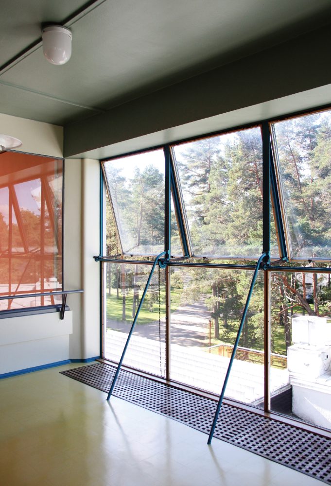
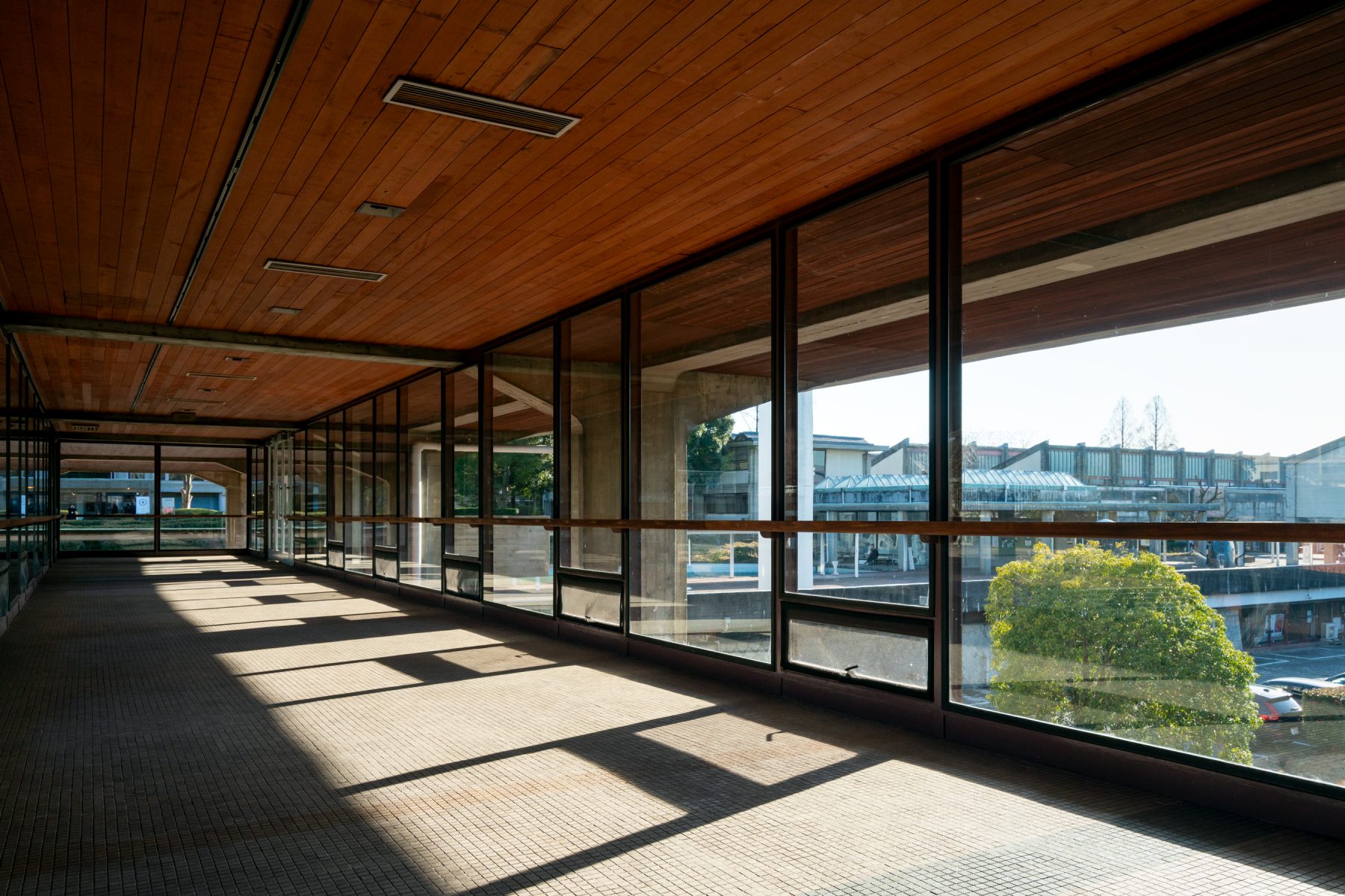
The walkway is about three meters wide and very deep but vertically compressed, such that the beams show through the ceiling despite being tapered to prevent people from bumping their heads at the entrances of the stairways leading up to the classroom level. The overhead surfaces between the beams are paneled with wood both on the interior and exterior. Full-height openings line the sides of the walkway, naturally causing your eyes and body to gravitate towards the outside. Semi-matte mosaic floor tiles catch the light brought in through these windows and diffuse it throughout the space. The fixed windows are framed in steel to take the wind loads, while their top-hung operable insets are set in aluminum sashes, and all the glazing is sealed with neoprene gaskets. The faces of the aluminum sashes have been finished with thermosetting acrylic resin to reduce their material contrast with the frames. Flat bars, projecting inwards from the I-beam mullions, support softly curved guardrails that are made of vertically laminated wood and positioned at a height that does not interfere with the views. Inside this space, you can get a total feel of the architecture, from its structure to its tactile properties.
The landings of the stairways leading to the classroom level are equipped with hit-and-miss windows that provide ventilation for the walkway level. It seemed like they could always be left open except during heavy storms, as they are sheltered under the piloti space.
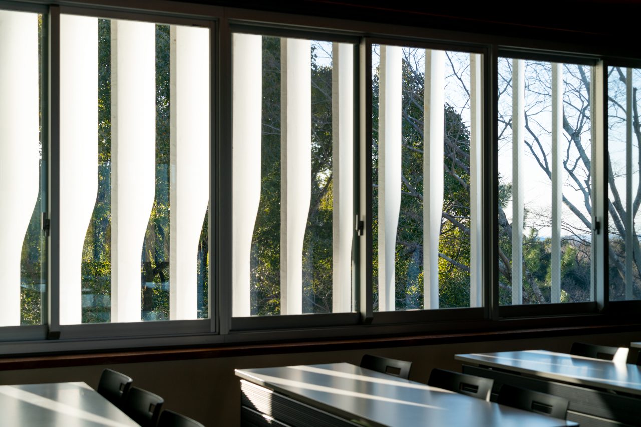
The classroom level is composed of a series of spaces illuminated from two sides by uniformly sized aluminum sash windows running along the length of the east and west walls. On the outside, prestressed concrete louvers, rotated to block the southern light, line the space beneath the eaves that extend horizontally from a vaulted roof and incorporate gutters. Downspouts, hidden from view by the angled louvers, drain into brick-tiled catch basins on the ground.
-
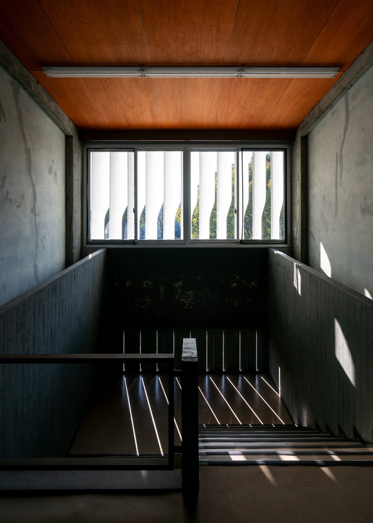
The stairwells are designed with hit-and-miss windows for passive ventilation.
If you look carefully at photographs taken on the walkway level shortly after the building was completed,3 you can see that it was originally furnished with ashtray stands and three-seater benches designed by Yoshimura and Okumura, and people used to sit beside the windows. The wide guardrails seem to be dimensioned just right for placing a can of coffee when seated. The walkway thus begins to seem like it was intended not merely as a place for taking in the sweeping views of the greenery, but as a salon-like space for people to lounge in.
-
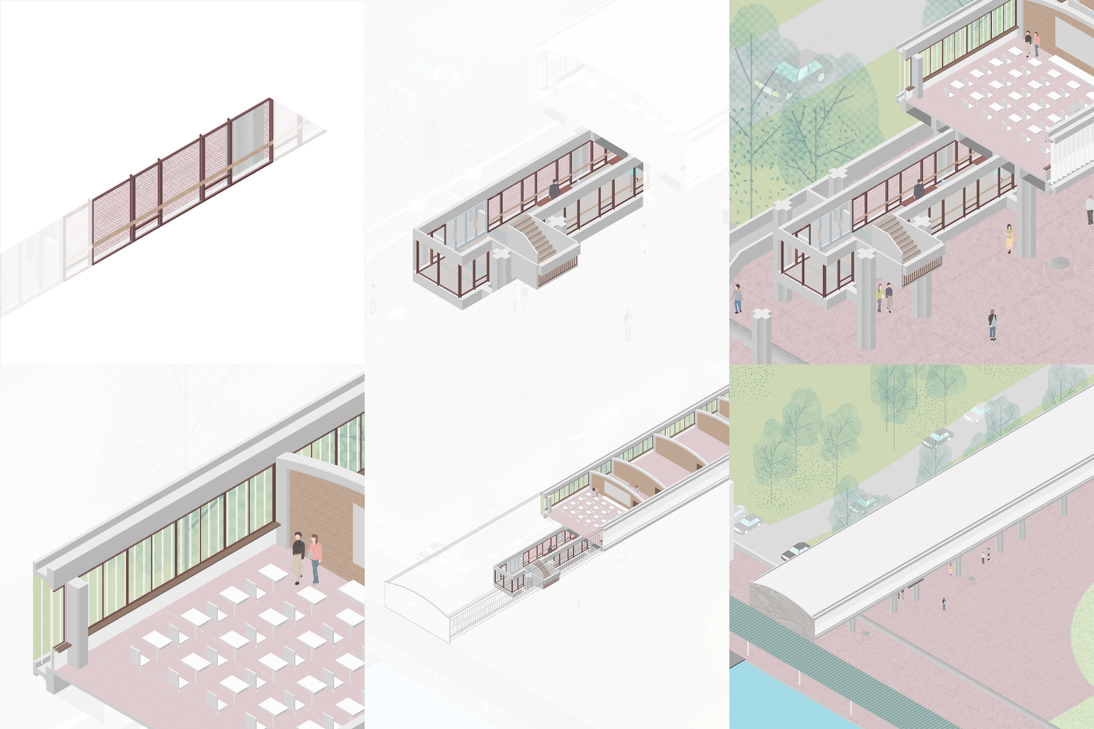
The Lecture Building’s windows and their context (GIF animation).
This scene could not have been created without any one of the features described, whether it be the building section composed of the walkway level inserted between the classroom and piloti levels, and the openness of the walkway it achieved; the positioning of the guardrails, ceiling, and windows that lower the space’s center of gravity, guiding your eyes towards the outside; or the careful consideration of the dimensions and materials of the elements throughout. It can be regarded as a definitive instance where Yoshimura and Okumura emblematically manifested their approach of designing spaces for living from the inside out.
A Hall for Playing Music
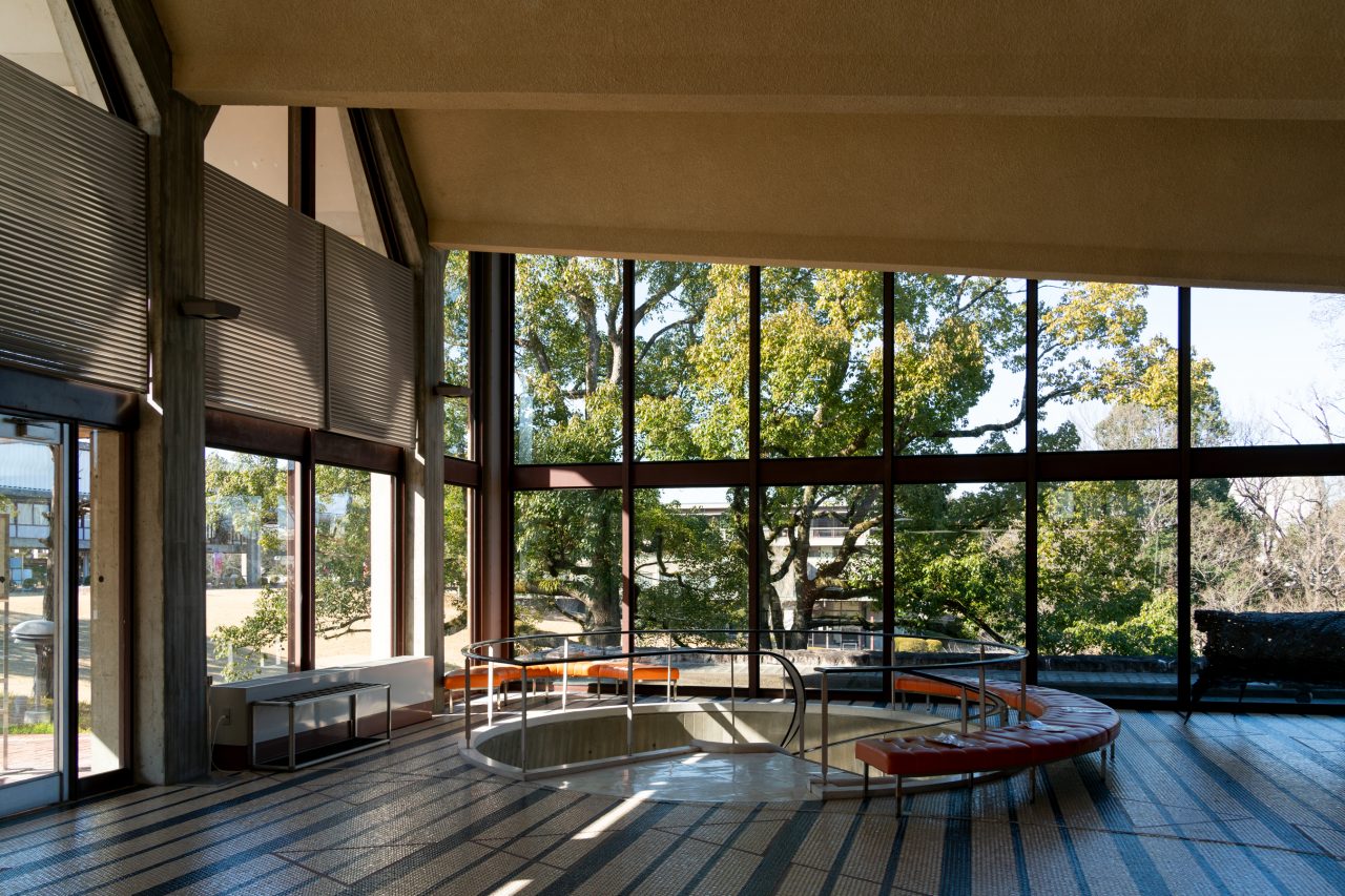
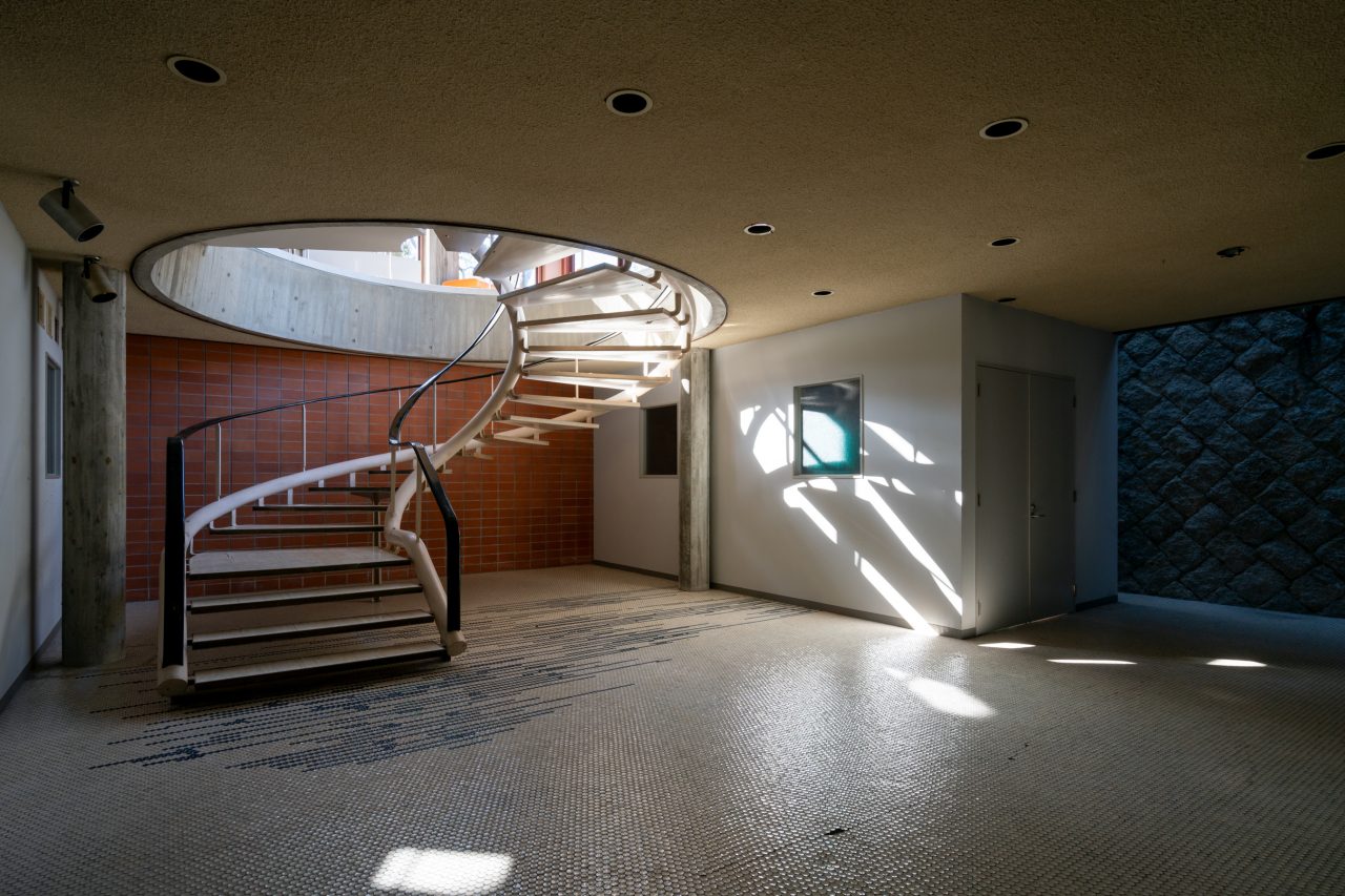
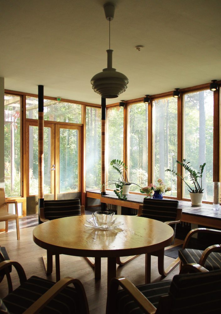
As I headed eastwards along the brick-tiled plaza, my eyes went to a structure with a long-span folded-plate roof standing facing the Lecture Building. Entering one of its vestibules led me into the foyer of the Sogakudo Concert Hall. In the foyer, all the openings between the roof and its supporting columns and beams are glazed, while the floor finished with round mosaic tiles laid in a striped pattern is empty, save for several three-seater benches and a spiral staircase that bores down through a circular hole to a subterranean level. These stairs go to the lobby, where daylight filtered inside through glass blocks fitted into the gap between the exterior wall and a retaining wall on my left-hand side. The cloakroom was positioned in front of the stairs, while the waiting rooms and restrooms appeared to be located off to the right. The layout suggests that audience members can check their belongings here before entering the auditorium through the side aisles.
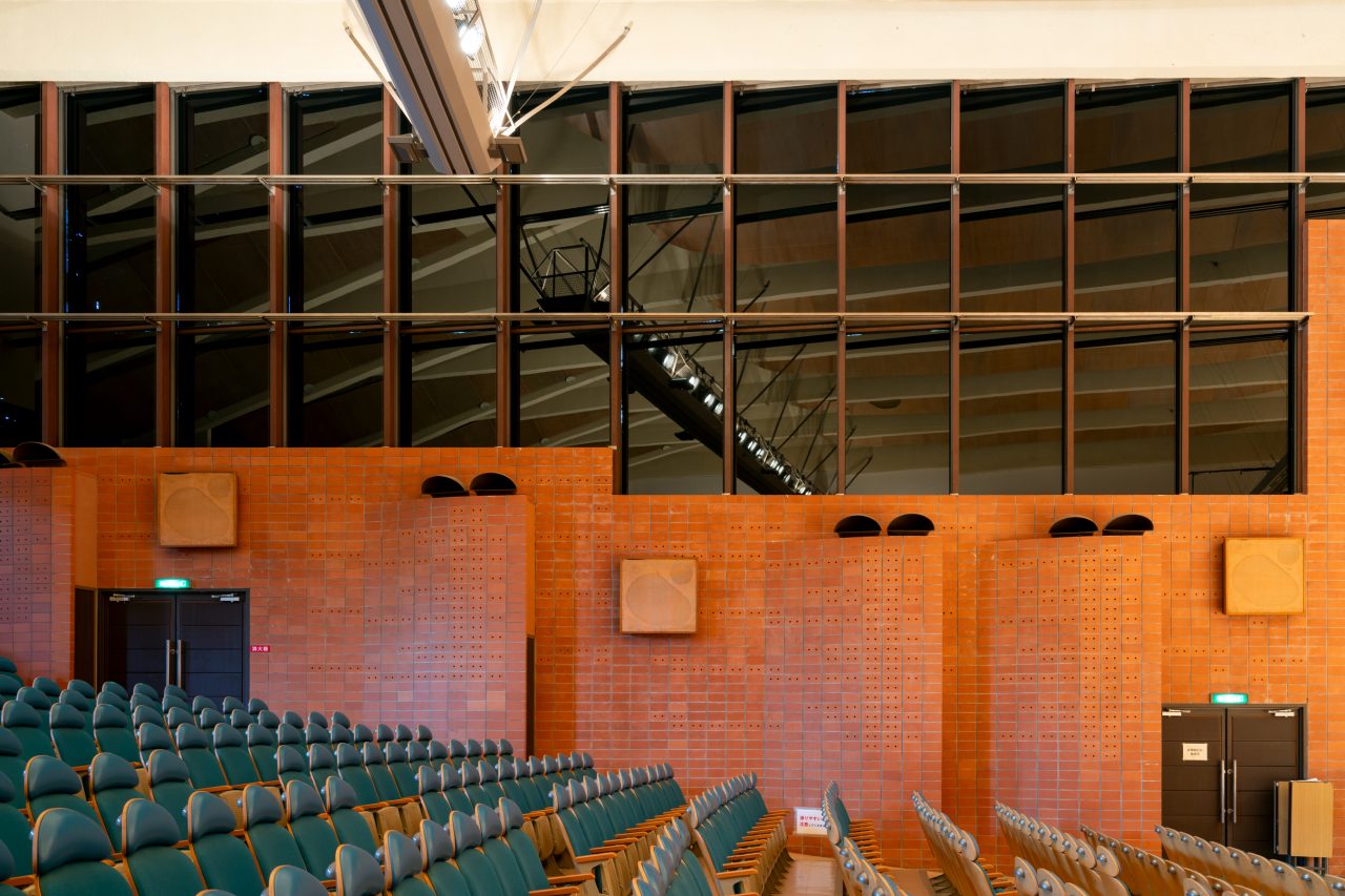
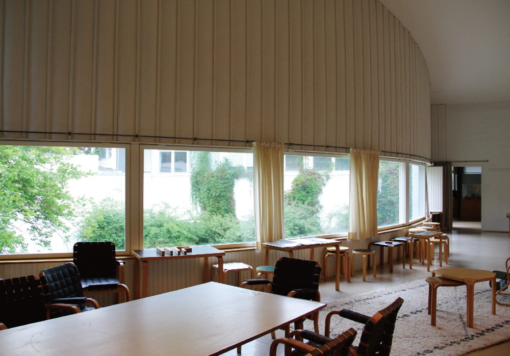
After returning upstairs, I entered the auditorium to find two bands of fixed windows running along the upper part of the hall’s side walls, continuing the windows of the foyer. These windows are rotated towards the east, structured with I-beam mullions like the Lecture Building’s walkway windows, and step down rhythmically following the sloped seating. The walls around the window frames are faced with sound-absorbing ceramic blocks and incorporate air supply and return vents shaped like spoons. Electrically powered blinds that double as blackout curtains were specially developed to address the issue of sun shading. The HVAC system was short-lived, however; sun-shading film and barriers have been used in place of the blinds ever since they stopped working.
Just as Yoshimura describes the Sogakudo as a hall not for “listening” to music but for “playing” music,4 the building’s exposed structure and the designs of its windows also suggest that it was envisioned to create an environment like that of an open-air stage surrounded by greenery. The same could be said of the Yatsugatake Kogen Music Hall (1988) that Yoshimura designed in the late years of his life.
-
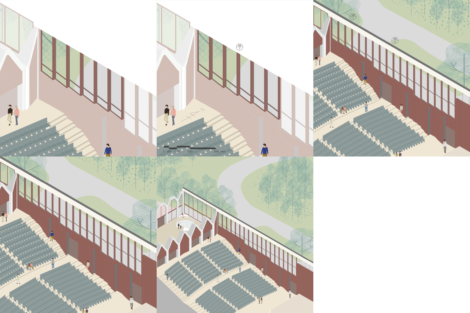
The Sogakudo’s windows and their context (GIF animation).
Next, I walked up to the covered walkway that runs along the edge of the upper tier of the plaza in the east-west direction. Looking back at the Sogakudo, I noticed that the walkway is positioned so that you can see through the upper part of the building in the south-north direction via its continuous windows. The walkway itself is covered by a thin prestressed concrete slab that spans between girders set on columns spaced about 2.5 meters apart, and it acts as a visual gateway for receiving campus visitors by giving frontality to the plaza. Additionally, it incorporates the main utility trench that connects the building systems (electricity and HVAC) of the various campus structures, thus facilitating the circulation of more than just people.
Forms that Capture Movements
Stepping through the main entrance of the University Art Museum, I found myself in a gallery with a compressed ceiling of about 2.5 meters and a full-height opening along its north side. Here, too, a brick-tiled floor catches the light from the window, which looks out towards the ceramic mural on the south end of the Lecture Building beyond the covered walkway. In contrast to the first gallery, the second gallery, accessed via a descending ramp, is a double-height space. Again, a brick-tiled floor catches the light, which is drawn in between the ceiling beams through skylights that are tilted northward and shielded from the direct southern sun by fins. These skylights were installed with operable louvers that allowed the gallery to be blacked out. The cross-sections of the beams are formed according to the movement of the light, and they also incorporate exhaust air ducts. The custom-made lighting tracks spanning length of the beams are the only other visible elements. Such forms and details that are designed with consideration of the movement not only of light but also air and heat are not exclusive to the University Art Museum; they can be found consistently all throughout the campus.
-
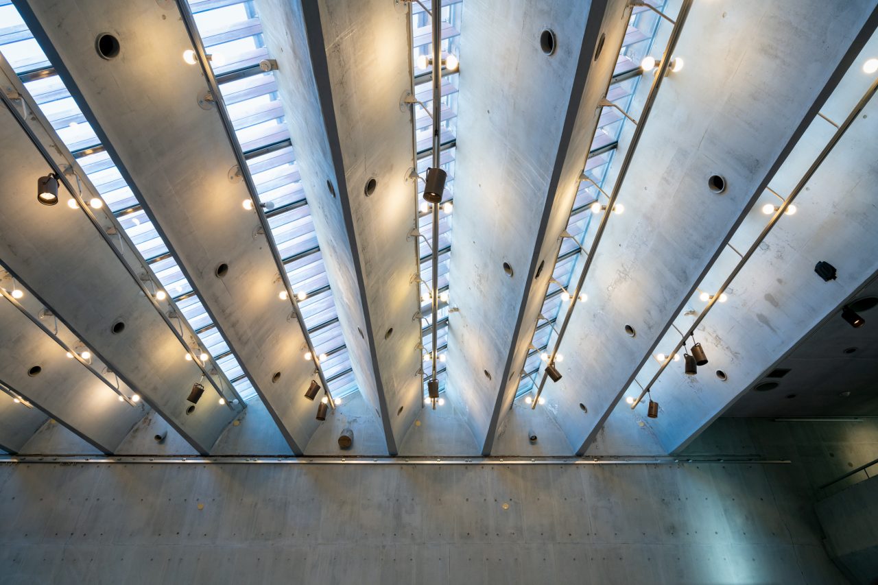
The skylights of the large gallery.
-

The University Art Museum’s windows and their context (GIF animation).
From the museum, I returned to the covered walkway and headed westward, or in the opposite direction from the Sogakudo. I made a stop at the plaster studio, which offers a clear view of the axis of the campus referred to as the “sukitōshi” [lit. “see through”]. It was at this point that I noticed the faint residues of vivid purplish, bluish paint on the faces of the prestressed concrete slab of the covered walkway. It was explained to me that the campus was originally very colorful, as bright colors were used not only on the handrails and doors of the Lecture Building but also on other elements, such as gutters, of buildings throughout the campus. The window frames and mullions, however, were apparently finished with neutral colors so that they would blend in with their surroundings.
-
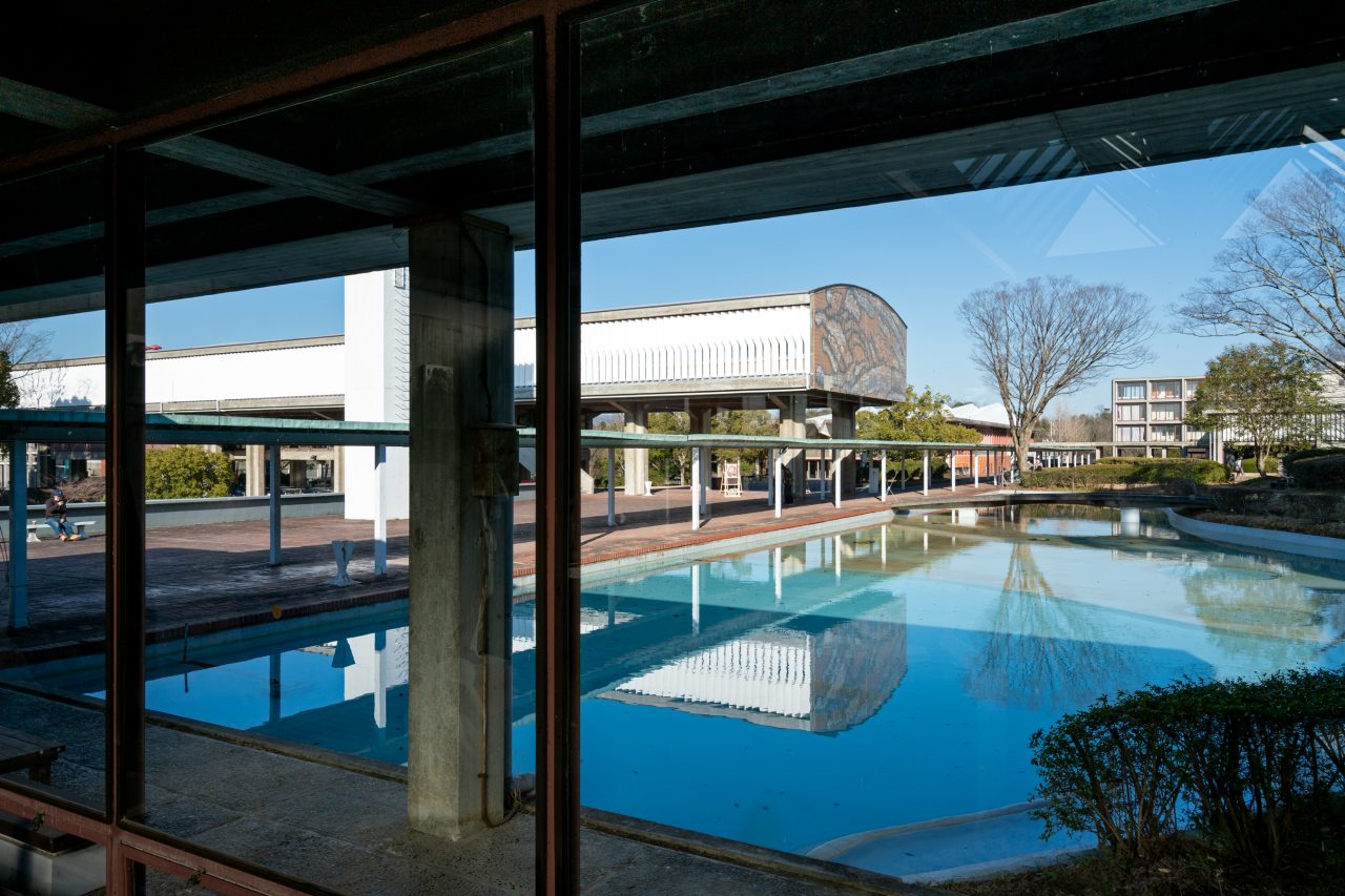
View of the east-west covered walkway from the plaster studio.
Spaces for Painting
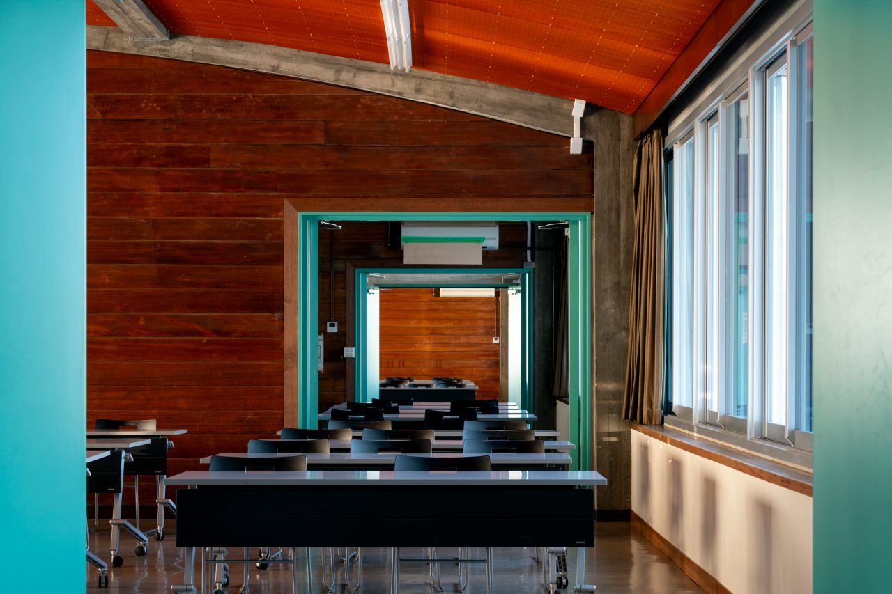
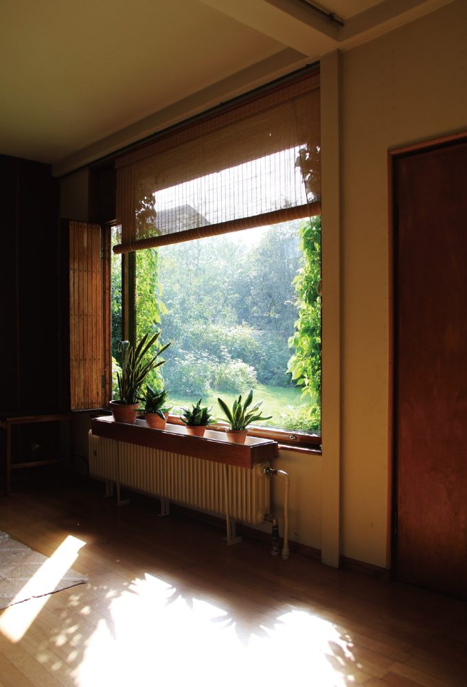
Continuing westward brought me to the Studio/Laboratory Buildings that house the various art departments. This building cluster is composed of individual structures (“cells”) with repeating shed roofs and large north-facing openings. I first looked at the oil painting cells. The walkway connecting the cells has been formed by splitting the plinth into a series of tiers that follow the topography and are connected by stairs. I followed the walkway down to enter the cells. The studio spaces, which are located beyond an anteroom and preparation room, were illuminated by a soft light brought in through the stacked windows that climb the northern walls. The time was around 3:00 p.m. The stacked windows are composed primarily of translucent channel glass windows, which fill the spaces with a diffused light, and have top-hung windows at the top and bottom for ventilation. By drawing back the large retractable partition walls, I could see that each cell is composed as a two-part unit consisting of the anteroom and studio spaces, while their glazed openings connect across the partition to form a single four-light window.
-
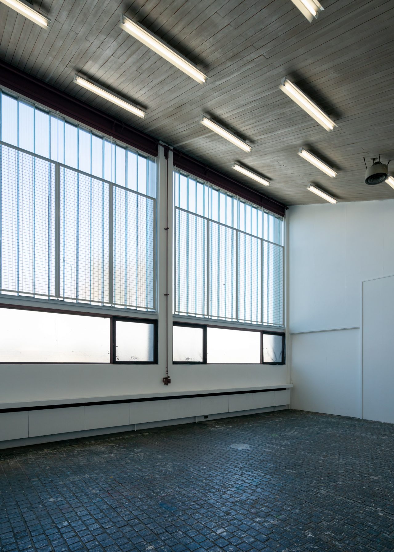
Daylight filtering in through the translucent channel glass in a studio.
-
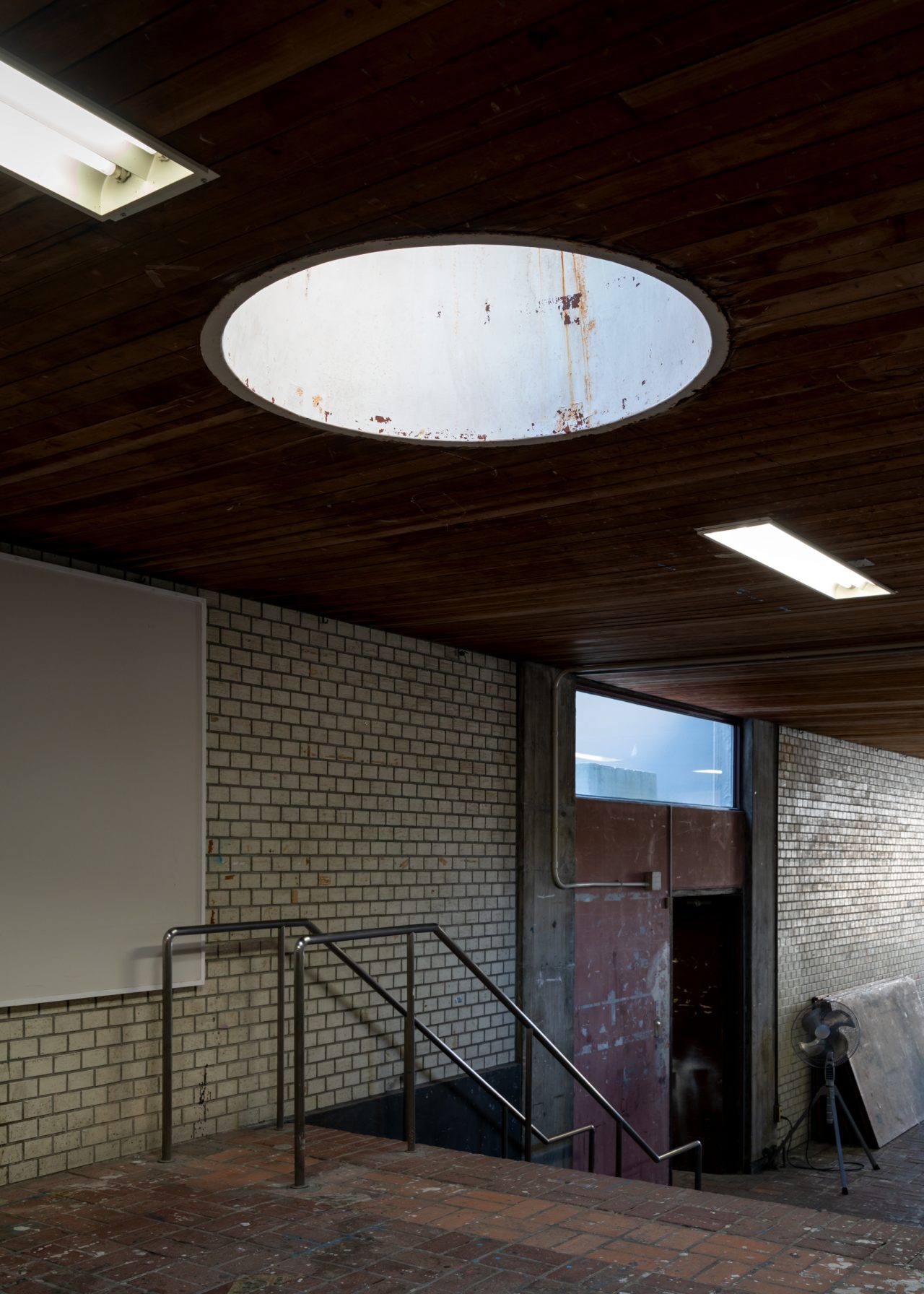
A skylight in the Studio Building, designed so that students can sketch under natural light.
-
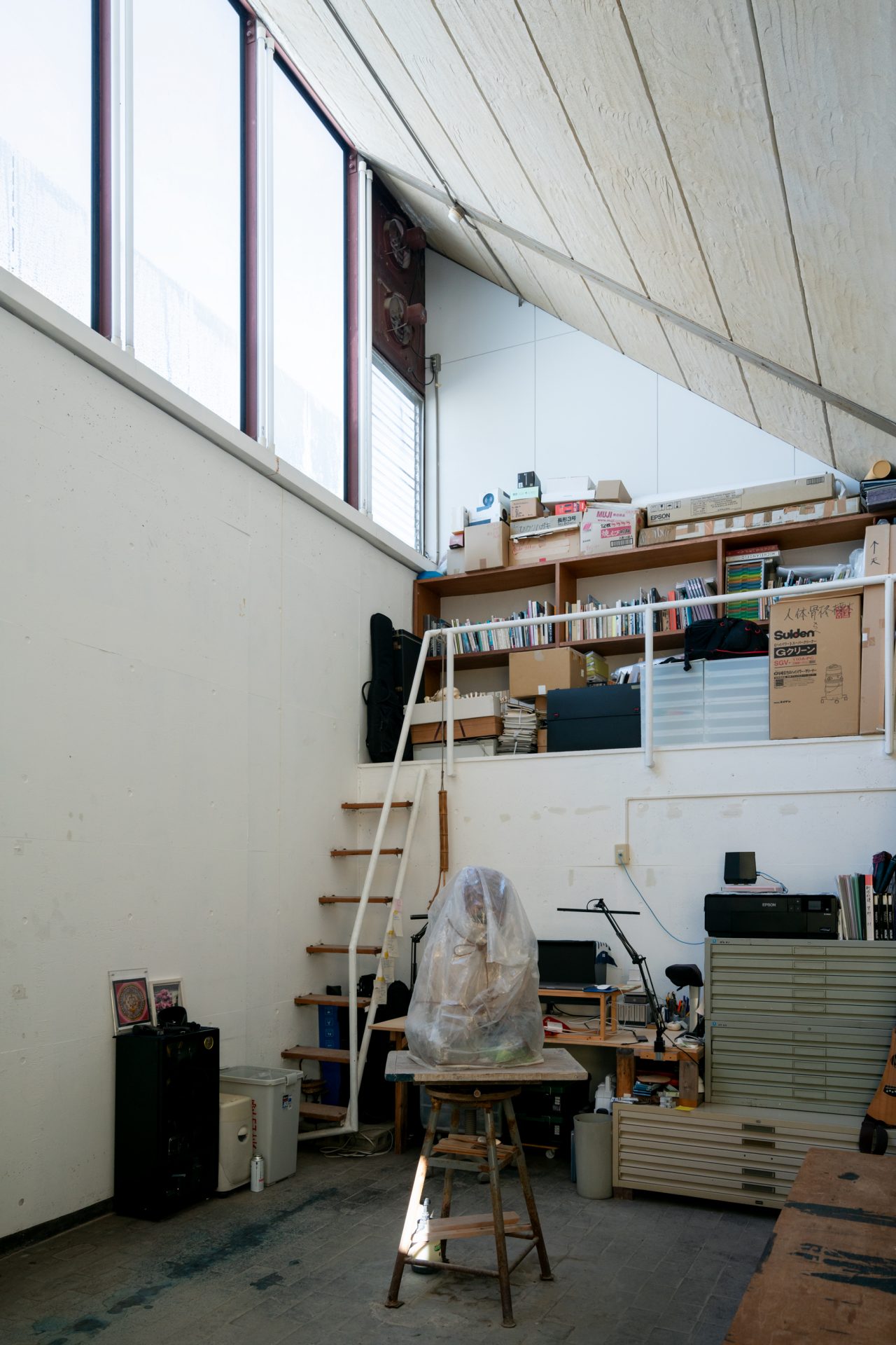
Inside the Laboratory Building. Fluorescent lights line the mullions of the continuous clerestory windows positioned on the north wall.
-
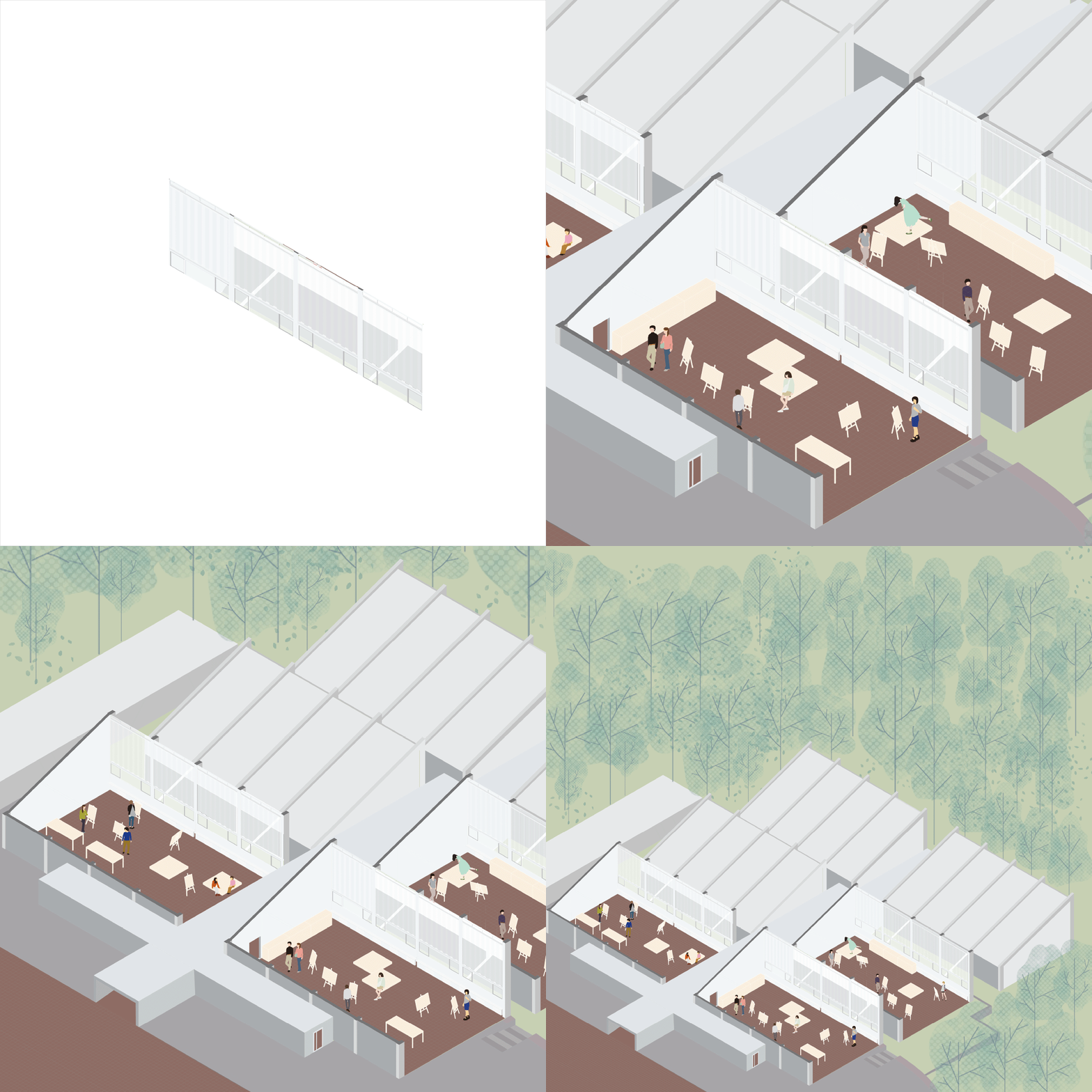
The Studio Building’s windows and their context (GIF animation).
I found myself wondering what theories have been developed with regard to the design of spaces for painting. Theories regarding spaces for appreciating paintings, addressing aspects such as color temperature and glare control, have been developed mainly in the context of museum exhibition design, but I can think of no such guidelines regarding spaces for making paintings aside from the lighting standards set out for different room uses and working environments. Okumura, however, attempted to scientifically inform the design of these studio spaces by compiling quantitative data in his laboratory to determine how the sunlight would be distributed through the windows. This use of empirical measurement and observation is illustrative of the approach with which he thought about living environments from within.
From Experimentation to Experience
Having now looked at how the campus’s windows contribute to my impression that it has been designed as a place for humans to live harmoniously with the nature, I would like to look for further reasons for this in Junzo Yoshimura’s ideas. He had the following to say when he was interviewed by [architectural critic] Takashi Hasegawa:
Hasegawa Speaking of water, Tokyo’s low-lying districts are inseparably tied to water. That probably also has something to do with it.
Yoshimura Yes, certainly. Also, when I was a child, I used to go to the beach every year during the summer break. So, I just feel there is something incomplete about landscapes without water. [ . . . ]
Hasegawa Also, aside from its aspect as a landscape element, water, along with air and light, are all important to the issue of building systems.
Yoshimura In my office, we think a lot about the building systems. In a sense, the systems are just as important as the forms. Without the systems, humans cannot inhabit the forms; they are what today’s architectural styles have been shaped by. However, in Japan, I think there was a perception that the form is more important for architecture, while the systems are somewhat secondary. But I consider them to be extremely important because they are deeply related to things like fire, air, and light, as you said. And the truth is, if you design the systems well, the design of the form becomes very clear and hence more appealing. Imagine that you finish an entire room with a single material. It can still become a great design if you install a nice lighting piece. Oppositely, you could instead work very hard on developing various details and such, but if you miss with the lighting, the effect of the design will be completely ruined. That is how important the lighting is.
Such aspects are handled skillfully in good architecture. The Katsura Imperial Villa is exemplary. The way it makes use of those windows fitted with shōji [translucent screens], for example: there are daylighting windows under the eaves of the gabled roof, where you would not expect there to be any light to capture. I even wonder if that is where [Frank Lloyd] Wright got the idea for his windows.5
We can understand from these words that the building systems, which reflect scientifically grounded considerations of light, wind, water, and fire, are integrally tied to the forms that Yoshimura designed in anticipation that they would produce landscapes where people could live harmoniously with nature. The windows of the Aichi University of the Arts campus thus can be seen as the fruits of the architect’s observations of such landscapes combined with his imaginativeness with the building systems.
Yoshimura’s work as an architect was mainly focused on wooden houses (with some parts built in steel and reinforced concrete), but he also developed many designs for large-scale, non-wooden, non-residential projects, including the International House of Japan (1955). Even in the projects marked in red in the figure below, he explored the possibility of creating hybrid-structure buildings. Furthermore, even when designing non-wooden buildings and non-residential projects, he drew on concrete techniques used in the folk houses and traditional architecture that he observed and surveyed during his travels, and he left behind numerous works and sketches of building forms and systems designed for living.6
-
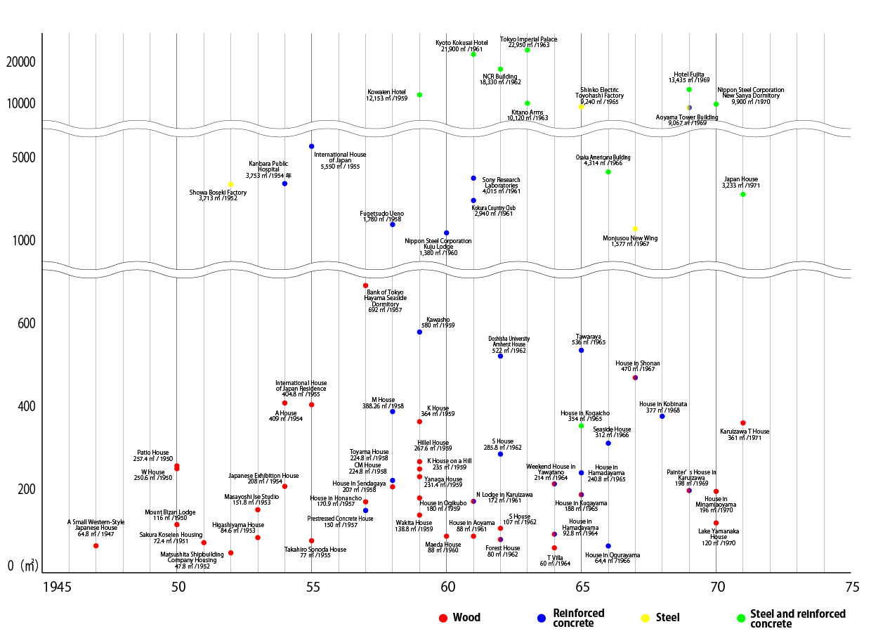
Chronology of projects by Junzo Yoshimura Architect & Associates organized by structure type and area.
When I look through all of Yoshimura’s published discourse, I come away with the impression that he regarded the term “experimentation” more cautiously than his contemporaries and predecessors, even while he worked with experimental environmental housing himself. One then begins to see even his experimental work as reflecting experientially informed considerations tailored for concrete scenes of living.7
It is important not to forget that the Aichi University of the Arts campus was co-designed by Akio Okumura. Okumura, who, together with his personal and professional partner Makoto Okumura, absorbed Yoshimura’s philosophy over many years, was more of an experimenter: he would later go on to apply his unique perspectives on the passive interactions of humans and nature to conduct experimental research and development of systems for heat utilization and passive ventilation that do not rely solely on openings. For example, he presented analyses of fireplaces and developed the OM Solar underfloor heating system, which utilizes solar gain from the roof. Okumura’s experimental spirit certainly would already have been in him from the time of the campus project, adding to Yoshimura’s experience-based observations and imagination as an active ingredient of the concrete scientific approach manifested in the designs of the campus’s windows. It should also be noted that the area requirements and other such information compiled in the schematic planning documents point to the involvement of a third collaborator in the project: the Aichi Prefectural Government.8 The university campus should hence be recognized as the product of the joint efforts of the two architects and the Aichi Prefectural Government Buildings Division.
-
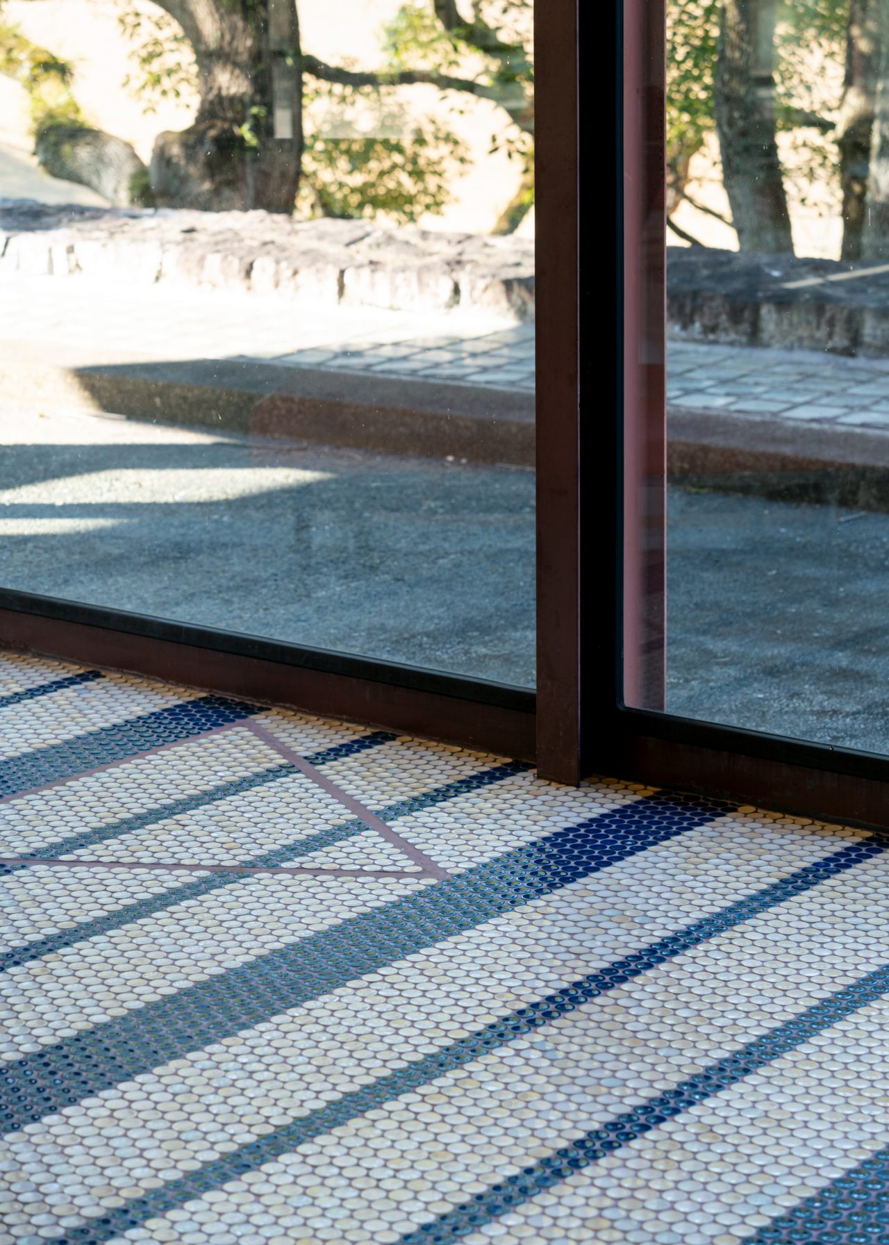
The foyer of the Sogakudo. Mosaic tiles can be found throughout the campus.
The Landscape Lives On
In the years surrounding the completion of the campus, Yoshimura worked actively on concurrent projects such as the Tokyo Imperial Palace (1968), Japan House (1971), and Nara National Museum (1972) while also continuing his explorations of housing. Even just by briefly examining the details of the Toyama-Yoshida House (1965), where he employed the same channel glass he used for the north windows of the Studio/Laboratory Buildings, or the Setagaya House (1978), where he employed the same large retractable partition door also from the campus’s studios, you can see that he continued to consistently implement the process of drawing on and applying ideas rooted in his experiences of living regardless of the nature of the buildings he designed. As for Okumura, he relocated his base of operations from his university in Tokyo to Nagano while still working on the campus project.9 There, he began designing the Hoshino Lodge (1973), where he incorporated a pot-burner oil stove with a chimney heat exchanger, preluding the work that he would go on to develop. He then established the Kiso-Sangaku Woodworking Shop, founded his joint practice with his partner Makoto, and continued engaging in activities informed by a scientific perspective.
This has been an analysis of the Aichi University of the Arts campus combined with my personal thoughts. Before ending, I would like to call attention to the fact that the aging campus, now more than half a decade old, is at a critical stage in its life.10 Although I cannot share all of them here, Akio and Makoto Okumura’s ideas on maintenance were ahead of their time for architects. In a text they penned together, they quote [architectural historian] Hiroyasu Fujioka’s words “Naosukoto wa tsukurukoto” [“To mend is to create”] and urge for “maintenance supervision” to be codified as a phase after design development, construction documents, and construction administration, requiring architects to work with the building users to determine how the completed project should be maintained.11 This text also reveals their strong opinions regarding the replacement of buildings and the preservation of nature in Japan’s foothill landscapes
As I was walking along a forested path leading to the gymnasium at the very back of the campus after completing the tour that started at the Lecture Building and ended at the Studio/Laboratory Buildings, I got lost in my thoughts, reflecting on how the landscape that Yoshimura and Okumura drew up while walking these ridges was still very much alive today, even though the times have changed. Then, suddenly, the trees thinned to reveal the gymnasium with its space frame roof, designed to allow views through from the nearby buildings perched on the hillside. A tremor ran through me; I felt as though I was being asked, “What would you have created here?”
Notes
1 : Here, the word “living” is intended in the sense not merely of inhabiting spaces made for humans but of coexisting with the natural physical and biological environment.
2 : Claude Lévi-Strauss uses the term “science of the concrete” to describe the way indigenous people form a concrete understanding of things through thorough observation. He explains the idea in his book La Pensée sauvage using the following illustration of an indigenous person engaging in an act of bricolage: “This cube of oak could be a wedge to make up for the insufficient length of a pine board, or else a base, which would show the grain and polish of the old wood to advantage. In one case it will be extension, in the other matter.” Claude Lévi-Strauss, Wild Thought (La Pensée sauvage, 1962), trans. Jeffrey Mehlman and John Leavitt (Chicago: The University of Chicago Press, 2021), 22. In this article, I want to examine Yoshimura and Okumura’s concrete praxis in respect to this ability or mindset focused on the precise observation of even the subtlest of changes in natural phenomena, including plant and animal life, wind, light, and air. As a related note on the topic of science, Yoshichika Uchida argues that there is a need for a logic that brings together the fields of science, technology, and art in his discussion about what it would take for his concept of an open system of building production to become widely accepted. Yoshichika Uchida, Kenchiku Seisan no Ōpun Shisutemu [An Open System of Building Production] (Tokyo: Shokokusha, 1977). Uchida positions the fields of science and art as being at odds with each other, assessing the former as being about “looking for errors to refine its theories” and the latter as being about “looking for characteristics to refine their expression”. As for the field of technology, he describes it as being about “looking for more efficient tools through the repeated evaluation of their effects in relation to the desired objectives”, meaning that it is a field that changes with the times. This article was born out of my experience of the Aichi University of the Arts campus, which led me to realize that the landscape created by Yoshimura and Okumura years ago is still thriving today in its sublime natural environment as a manifestation of the coming together of science, technology, and art that Uchida speaks of.
3 : Photographs by Shuji Yamada in “Kūkan no Seisei: Aichi Geidai no Kyanpasu” [“The Creation of Space: The Campus of the Aichi University of the Arts”], supplemental issue, SD, no. 1 (May 1971): 49, 69. Kajima Institute Publishing.
4 : “Kūkan no Seisei”: 84.
5 : Junzo Yoshimura and Takashi Hasegawa, “Tabi no naka” [“In the midst of a journey”] in Kisa Dekōru Seminā Shiriizu 2: Kenchiku wo meguru Kūsō to Shisaku [Kisa Décor Seminar Series 2: Reflections and Contemplations around Architecture] (Tokyo: Shinkenchiku-sha, 1976), 240–241.
6 : “Back when he worked for Antonin Raymond, Yoshimura would use his weekend off days to go on fieldtrips to survey and sketch traditional architecture and folk homes, traveling across the country by overnight bus and returning to the office on the morning of the following work week. Later, when he started out on his own, he drew on his notes and memories from those trips to give his staff concrete instructions such as ʻraise the window sill by another 5 millimeters’ and challenged them to figure out the reasons for doing so.” Excerpt from author’s interview with Hiroyasu Fujioka.
7 : In this article, the term “experience” refers not to the subjective kind based on personal interaction and memory, but rather the kind tied to concrete logic informed by objective observation and praxis. In other words, it can be said to resonate with Lévi-Strauss’s notion of “the science of the concrete”. For related reading, see the article series “Constructing Assembly”, Kenchiku Tōron [Architectural Debate; online journal run by the Architectural Institute of Japan] (2022), in which artist Rick Yamakawa and I discuss the topic of experience in the context of appreciating exhibitions.
8 : The Aichi University of the Arts was designed starting in 1964, built from 1965, and completed for the most part by the spring of 1971 (some sources give “1966–1974” as the project years). According to Yoshimura’s later recollections, the project was initiated after he had met with then-Governor of Aichi Mikine Kuwahara “to discuss the curriculum and various other matters”, and he notes how the governor’s decision to “secure the large plot of land of 150,000 tsubo [approx. 50 hectares] for the school” was an enormous feat. Junzo Yoshimura, Hi to Mizu to Ki no Uta: Watashi wa Naze Kenchikuka ni Nattanoka [Poems of Fire, Water, and Wood: Why I Became an Architect] (Tokyo: Shinchosha, 2008). The project records show that Aichi’s Government Buildings Division assisted the architects with defining the programmatic requirements in the schematic design phase. For example, when determining how much floor area would be needed for the various programmed spaces such as the practice rooms and lecture rooms, Yoshimura and Okumura worked off their measurements and inspections of the Tokyo University of the Arts campus to simulate the spaces while holding discussions with the Government Buildings Division, and they ultimately revised their size estimates. Designing a project from its requirements in this way can significantly impact how it is sited and scaled in relation to its site. It should be noted that Aichi’s Government Buildings Division underwent major restructuring around the time of this project. Before the changes, it handled all phases of projects internally, or sometimes it selected external designers to develop the general design while handling the construction documents and administration phases itself, as was the case for projects such as the Aichi Prefectural Office Main Building and Aichi Prefectural Cultural Hall. However, its role transitioned into mostly an administrative one after around 1965, and the Aichi University of the Arts was one of the first projects in which it outsourced the design development and construction documents phases. Tetsuo Seguchi, Kanchō Kenchikuka: Aichiken Eizenka no Hitobito [Government Architects: The People of the Aichi Prefectural Government Buildings Division] (Nagoya: C&D, 2006). Whether this fact worked to the benefit of the Government Buildings Division is unclear. In any case, it was a new arrangement for both parties, and if, for instance, you look at the door and window schedules for the project, they are formatted completely differently from those that Yoshimura produced for the Nara National Museum (1972). Specifically, the diagrams and dimensions are indicated on separate sheets. This is only a conjecture, but such oddities may be traces of the architects’ collaboration with their administrative counterpart in the Government Buildings Division.
9 : “It was decided that the Aichi University of the Arts (Aichi Geidai) project would be designed in an architecture department classroom at the Tokyo University of the Arts [where Yoshimura and Akio Okumura were teaching], and Akio was put in charge of designing it under Yoshimura’s direction. The Aichi Geidai was a big project that was designed over a span of eight years, and each year, once we finished designing the buildings for that fiscal year, we would spend the summer developing the construction documents for the sections slated for construction in the autumn. The Aichi Geidai design team worked in a classroom on the fourth floor, where the architecture department used to be back then. As the building had no air conditioning, it could get so hot in the summer to the point where our sweat would drip onto the drawings. Since the summer break was the peak season for rounding up student helpers, Akio started considering finding someplace cooler for us to work. After determining that the Kiso Valley in Nagano would be ideal because it can be easily accessed from both the project site in Aichi and from Tokyo, he found a guest room that we could use next to the main hall of a temple called Daisenji in the village of Mitake in Nishichikuma, Nagano (now Kisomachi, Kiso, Nagano).” Ai Murakami, “Okumura Makoto (1930–2016) no Shōgai to sono Sekkei” [“The Life and Designs of Makoto Okumura (1930–2016)”], master’s thesis, Tokyo University of the Arts, 2018, 48–52.
10 : Following the slew of demolitions of culturally significant buildings in recent years, the question of how architectural preservation and revitalization should be approached will likely increasingly become a topic of discussion. Already we have seen amendments made to the Hakubutsukanhō [Museum Act], the forming of the Kenchiku Bunka ni kansuru Kentō Kaigi [Deliberation Committee for Architectural Culture], and the holding of a number of related exhibitions and events. Parallel to such discussions, it will be important to lay down frameworks for how buildings should be maintained and managed in ways that align with their preservation and revitalization plans. The spaces surrounding the four windows featured in this article all appear to have been maintained in ways that respect the intentions of the original architects. The Aichi University of the Arts has not eluded debates about whether its buildings should be replaced. However, there are many who feel strongly about protecting its buildings. A campus master plan detailing a strategy for protecting its buildings and nature was created in 2011 following the Great East Japan Earthquake and revised in 2022 to ensure that it will not be subjected to haphazard development.
11 : Particularly interesting is the idea of creative maintenance implied by Makoto Okumura’s original card game Tatekaeruna Karuta [Don’t-Scrap-and-Build Karuta]. It can be seen as critiquing the perception of maintenance as bothersome work that someone must deal with after a building is completed by instead suggesting that maintenance can be more participatory and creative. Could she have been hoping to see more creative maintenance practices that involve the building users? Makoto Okumura, “Naosukoto wa tsukurukoto” [“To mend is to create”], Okumura Makoto no Hōjōki [Makoto Okumura’s Hojoki] (blog), Chiruchinbito Hiroba, 2016; and “Shiken: Aichi Geidai no tatemono no yukue” [“Personal opinion: The future of the Aichi Geidai’s buildings”] Okumura Makoto no Burogu: Yoshimura Junzō Sensei ni Manande [Makoto Okumura’s Blog: Learning from Junzo Yoshimura] (blog), 2015.
Dai Katsuragawa
Born 1990 in Gifu, Japan. Completed a master’s degree at the Nagoya Institute of Technology. Worked at Eureka before founding STUDIO in 2019. Currently a doctorate student at the Nagoya Institute of Technology. Adjunct lecturer at Nagoya Zokei University. In addition to running his architectural practice in Gifu and Aichi, he has been designing exhibition spaces and conducting fieldwork focused on observing, collecting, and recreating cities and landscapes. Major works include the exhibition spaces for Land-scape: Be/Behave/Become (2023–), Group Show TMAM 2020 (2020, Tokyo Metropolitan Art Museum), and Space KHM (2021, Kiyosu City Haruhi Art Museum).
MORE FROM THE SERIES
-

Windows of Japanese Modernist Architecture
The Windows of Tomoya Masuda’s Naruto Cultural Center: A Faintly Bright Louvered Space
17 Jun 2025
Windows of Japanese Modernist Architecture
A Culmination of Sutemi Horiguchi’s Aperture Designs:
The Tokoname City Municipal Ceramics Research Institute (Tokoname Tounomori Research Institute)15 May 2025
Windows of Japanese Modernist Architecture
The Diversity of Windows in Kiyonori Kikutake’s Serizawa Literary Center (Serizawa Kojiro Memorial Museum)
25 Dec 2024
Windows of Japanese Modernist Architecture
The Windows of Hiroshi Hara’s Awazu House: Spaces of Light Illuminating the Darkness
26 Apr 2024
