An Interview with Richard McGuire, the author of Here:
Everything is Transitory
26 Jan 2021
Here is a graphic novel spanning more than 300 pages that allows readers to experience millions of years of time while observing a single corner of a room. Since its first publication in 2014, the work has been translated into more than 20 languages around the world.
We spoke with the author, Richard McGuire, about the process of creating this unique yet universally appealing masterpiece, which transcends the framework of the medium, as well as notions of time and space.
How did you come up with the idea for this story that shows more than one phase of time in the same location?
The idea occurred to me because I had just moved into a new apartment and was often thinking about the previous tenant. I made some sketches that divided a comic panel down the center, so that I could show two “time zones” at once.
I was a fan of comics, but at that point I hadn’t seriously made any myself. I went to a “History of Comics” lecture by Art Spiegelman, and at one point he said: “comics are essentially diagrams”. It was a simple thing but I had never considered the mechanics of the comic medium before.
-
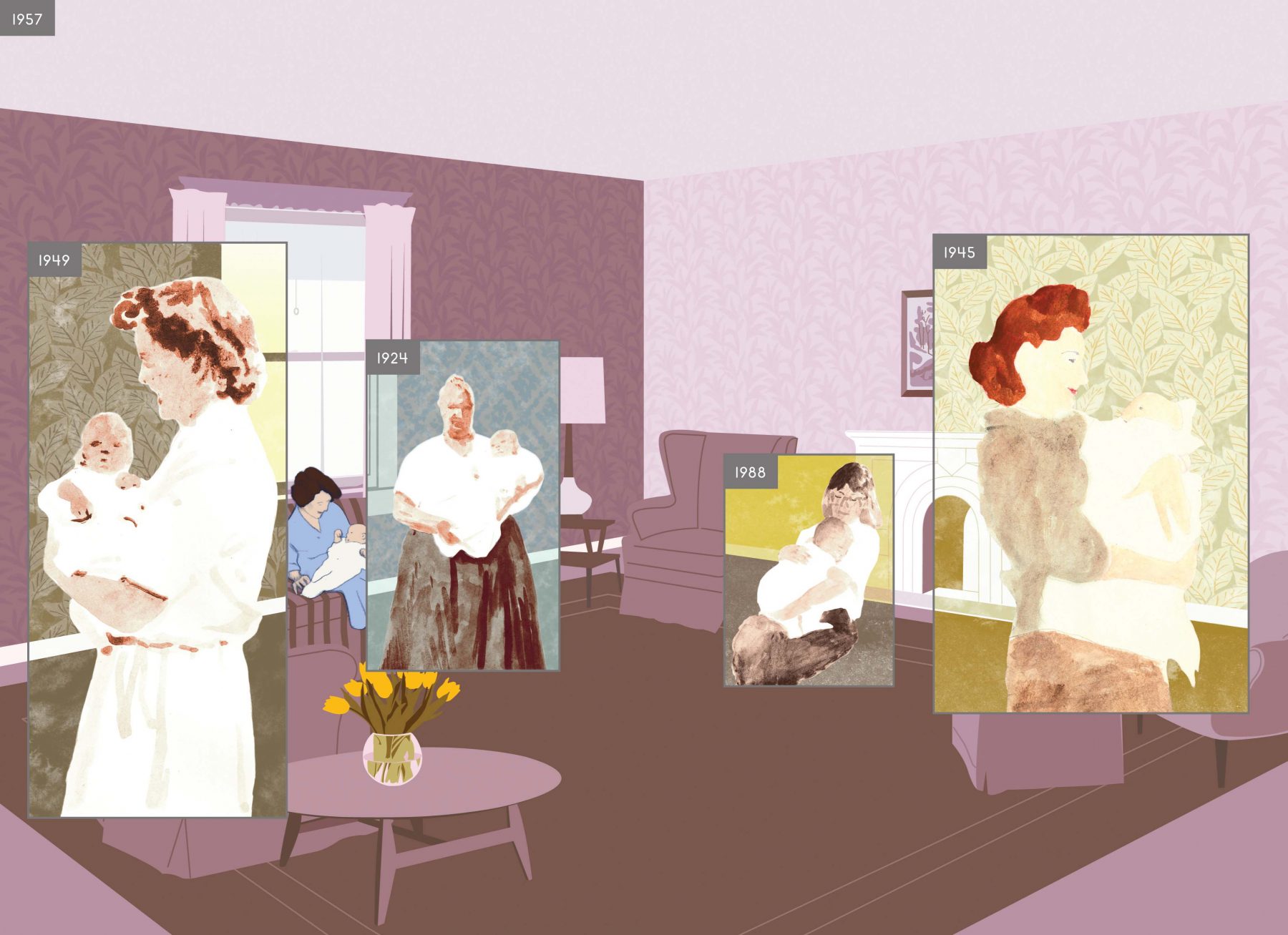
Spread from Here (Pantheon, 2014)
One of the formal aspects that contributed to the idea was Microsoft Windows. I started work on the story in 1988 when the Windows program had already been out for a few years, but I didn’t even own a computer at the time. It was when a friend came to visit and explained how he could open different “windows” simultaneously on his computer screen, that’s when it hit me. I could do the same thing and show many windows of time in my comic.
The result was a six-page story, where each panel of the comic showed the corner of the room moving through time. Each panel was made up of smaller panels interlaced with other glimpses of time moving both forward and backward. I sent the comic to Spiegelman and his wife, Françoise Mouly, who had been co-editing an experimental comic magazine called RAW, and they published it.
-
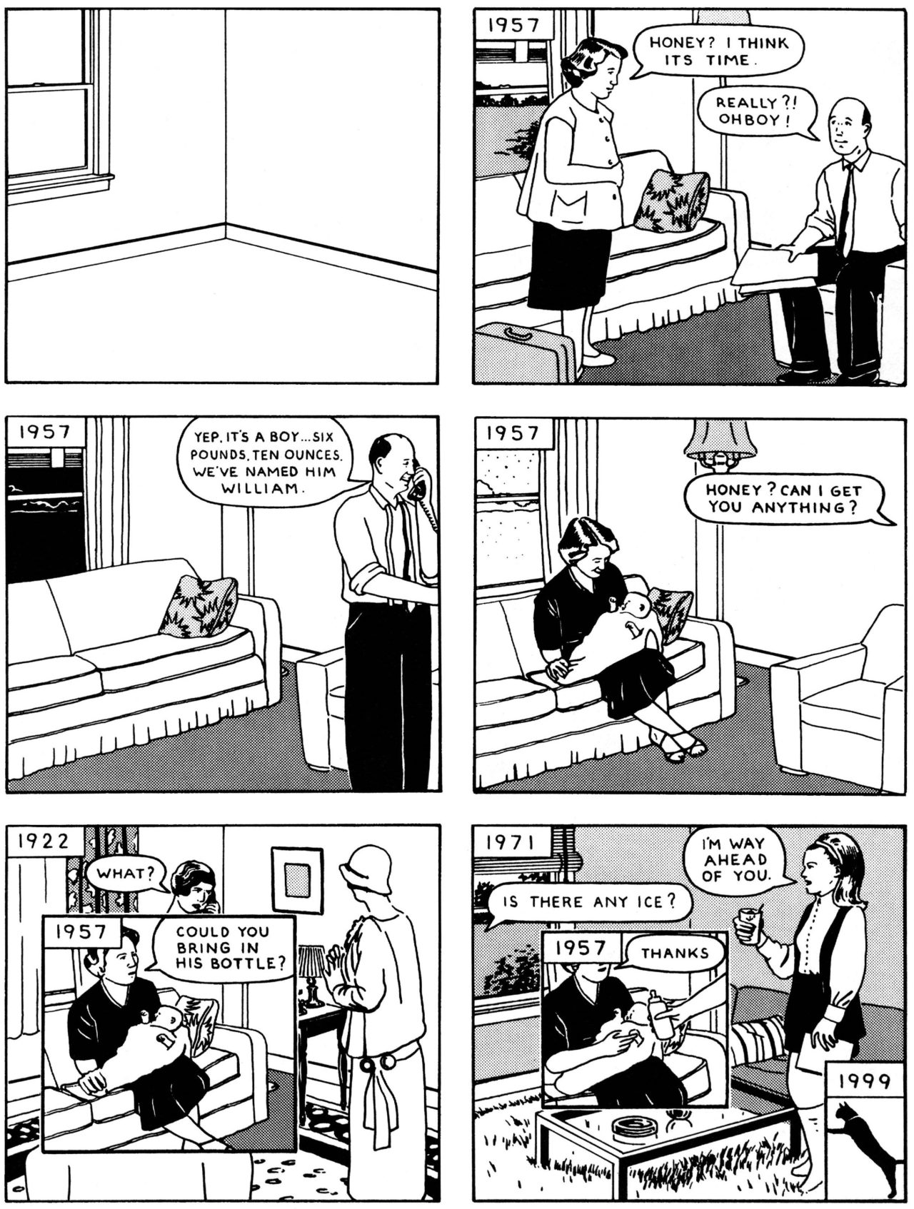
A six-page story from Here (RAW, 1989)
Years after the short story was published, I had the idea to develop it into a book. I struggled to find my way back into the project. I kept making attempts and then putting it away again in a drawer. I wasn’t convinced that I could just add pages to the original. That idea didn’t excite me much. I worked on it on and off for years.
At some point, I was assembling a dummy copy of the book and as soon as I put the two cardboard pieces together to form the cover it suggested the walls of the room. It was an exciting moment seeing the format of the book as the corner of the room. Suddenly it felt there was even more of a reason to expand the short comic into this book format. When the viewer/reader opens the book they are literally entering the space of the room.
I built a small model out of cardboard, primarily the reason was to photograph the light coming into space. It was important to get the shape of the light to look realistic as it entered through the window.
-
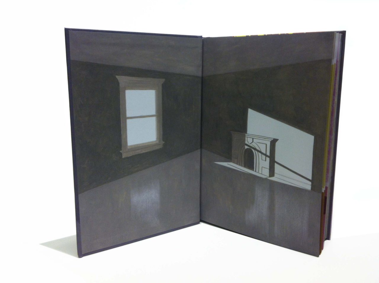
Inside front cover of Here (Pantheon, 2014)
What can you tell us about the window on the cover?
I thought an open window on the cover would be a nice way to enter the book. It acts as a portal, and it also echoes the comic panels inside, as they are all portals.
As simple as the cover looks, it did not come easily, I tried all sorts of things but wasn’t happy with any of them. I finally decided to get some advice from a book designer I had admired for a long time, Peter Mendelsund. I showed him a cover idea that I had mocked up, which was a collage of images from inside the book with the title in very large type. He said that in his opinion a book cover should be different from what is presented on the inside. This instinctually felt right to me.
-
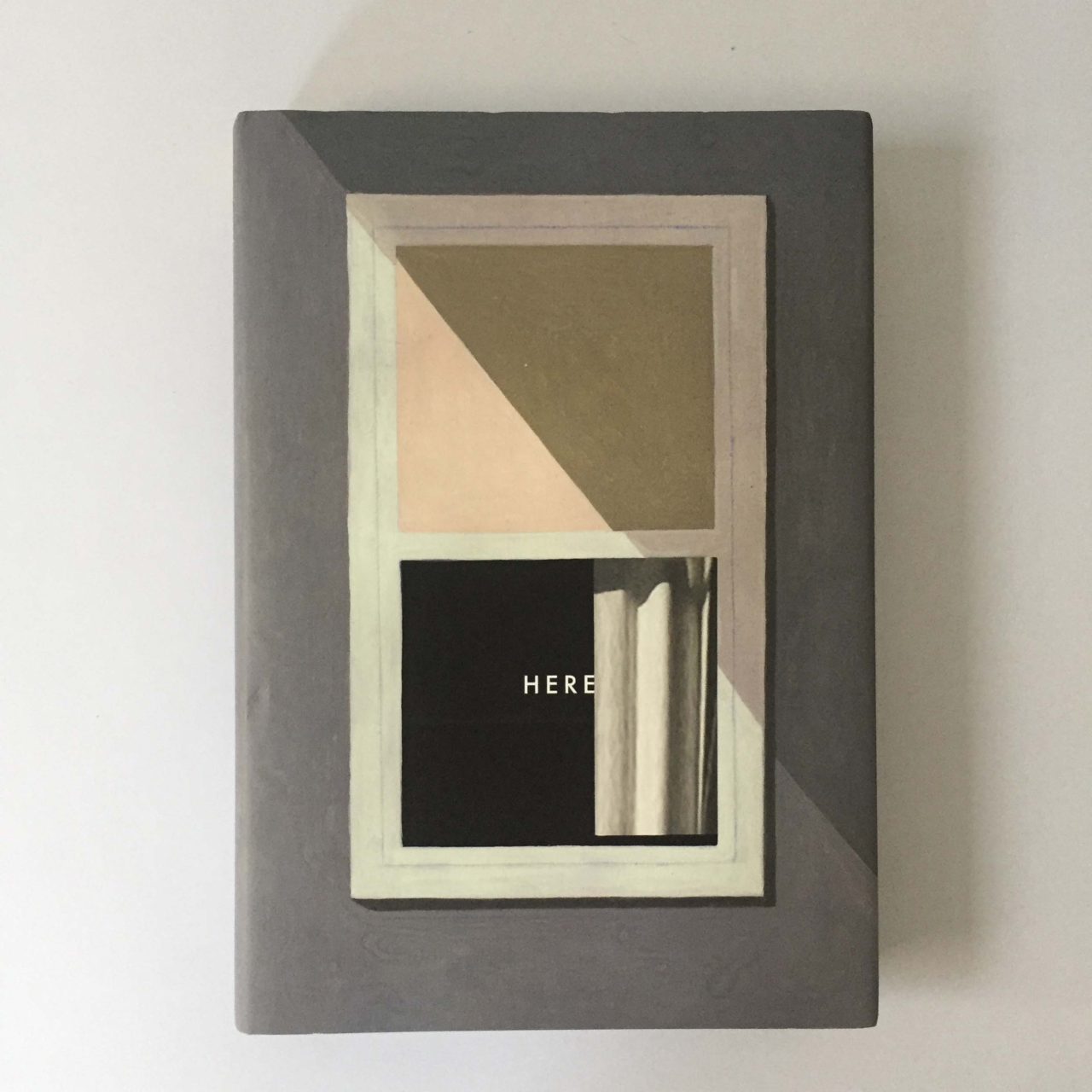
The front cover of Here (Pantheon, 2014)
The next thing he said was, “This book is about the inside of a house, so maybe the jacket should be the outside of the house”. This seemed so obvious to me that I was surprised I hadn’t thought of it myself, it felt completely right. I left his office with a feeling of direction but I still made many versions before I was satisfied. Focusing the cover entirely on the window felt right. I wanted the cover to have some mystery to it, something that would make you curious enough to open it up.
When I showed the final version to Peter, he only had one last bit of advice, saying that I should close the curtain a little bit over the text, so that the title would appear to be inside the room. I loved that suggestion, it’s a nice detail.
Were your personal experiences reflected in this work?
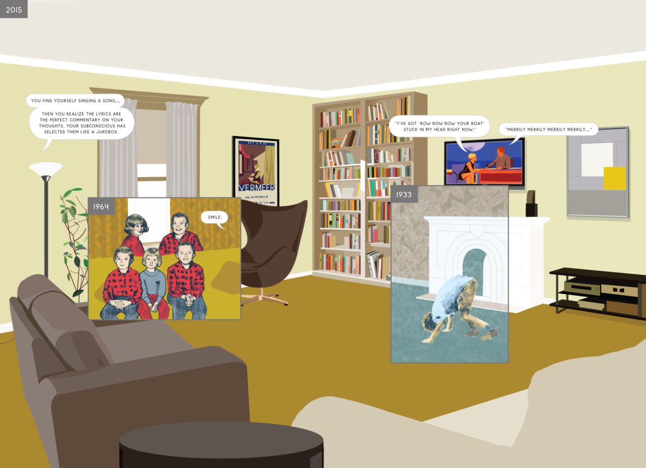
The room in the short story was never rooted to an actual place, but for the book, I felt that it had to be a real location in order to go deeper. The living room is based on the house where I grew up in New Jersey. My family is at the center of the book: it’s the heart of the story. I used a lot of family photos and some home movies as references. Every year at Christmas, my father would take photos of me and my siblings always sitting in the same place, in the same positions. I think this series of photos may be the real seed of this project. I included a few drawings of them in the book.
-
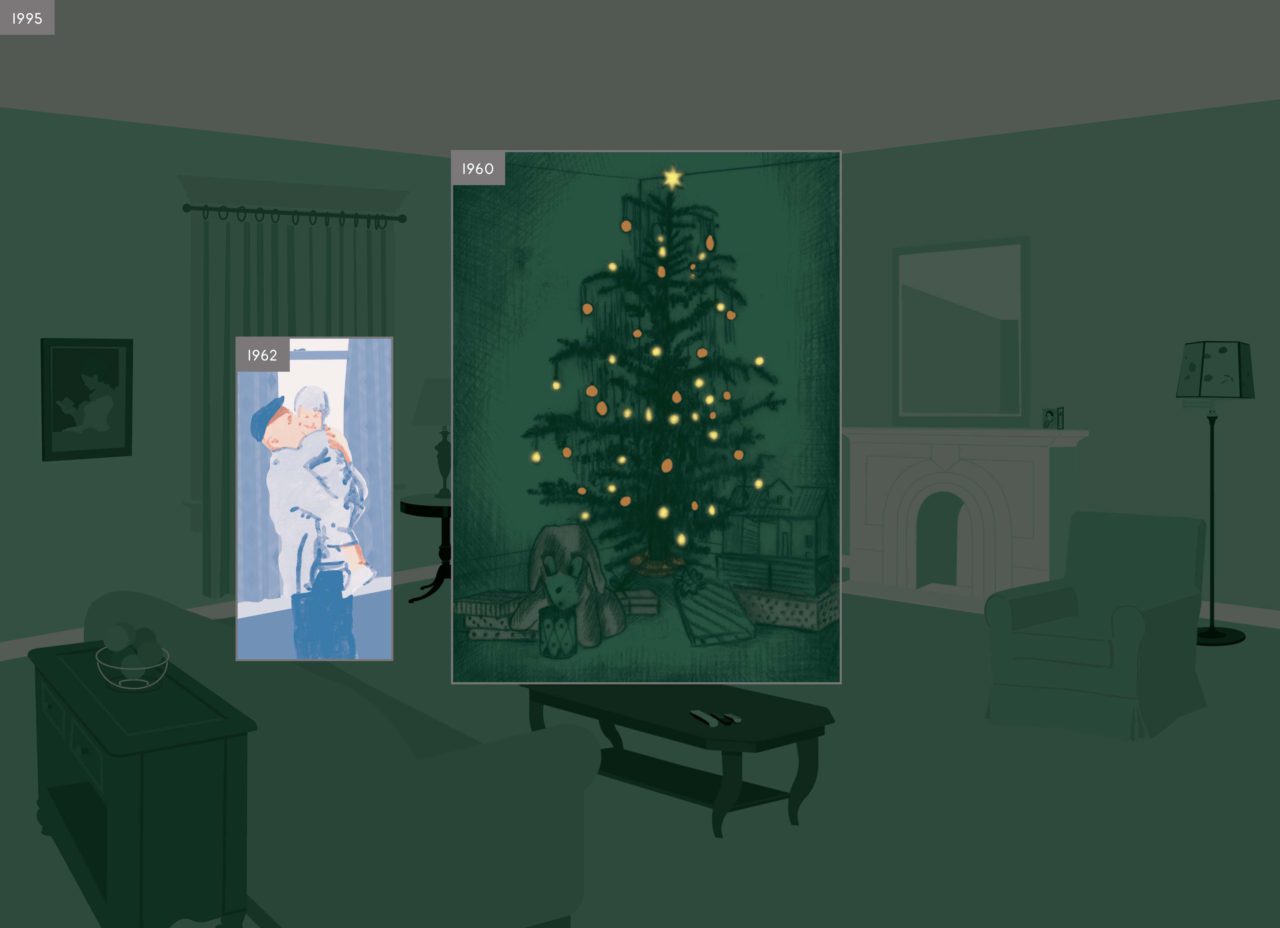
Spread from Here (Pantheon, 2014)
While I felt it was important to include these personal memories, I knew I wasn’t writing a memoir, either. My family lived there for a fifty-year period, which is nothing when we are looking at things in the long view. Native Americans lived on this spot for ten thousand years before European settlers arrived. I had to keep an eye on the bigger picture. I wanted the viewer to be aware that all of our lives are very tiny in the huge ocean of time. The story really is about how everything is transitory.
So in a way, could it also be read as American history?
I realized I wasn’t interested in making a book about American history. I was much more interested in the small personal events than the big ones. I came up with a motto early on in the project that I wrote on the wall of my studio as a reminder of where the focus should be: “Make the big things small and the small things big.” It was a way of avoiding the obvious lists of historic events. Life is more about the small things, the daily things.
I wonder if there might be a certain collective sensibility that American people share, or if the cultural or historical background of that country was reflected to create this work?
It’s true choosing this location locks it into American culture, but I wasn’t trying to describe the American experience as much as I was trying to describe a human experience. The book has already been translated into over twenty languages and I think that is testimony that it has a connection to a wider audience. This concept of one place over time could take place anywhere and have a similar feel.
-
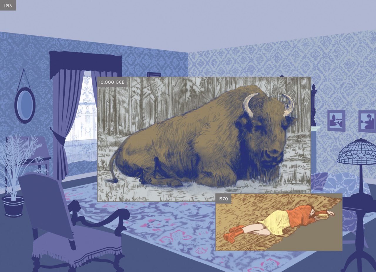
Spread from Here (Pantheon, 2014)
On the other hand, some parts of the story are set in the far future.
I was a little nervous about creating the parts for the future. I consulted a friend who is a climate scientist. He directed me to maps that had time projections of rising tides. It’s predicted that this location will be completely submerged at some point.
There is a scene where it’s suggested that some kind of nuclear disaster happens, which was based on the events of Fukushima and Chernobyl, and it seems likely that another similar event could possibly be in our future. I read that experts believe that after a nuclear accident the area will be habitable after twenty thousand years, so I showed that leap of time with life thriving again.
I’ve also read about the scientific predictions of the sun expanding and eventually swallowing Earth. I made a reference to this in a scene where you hear about it in the commentary of a documentary that is playing on the TV.
-
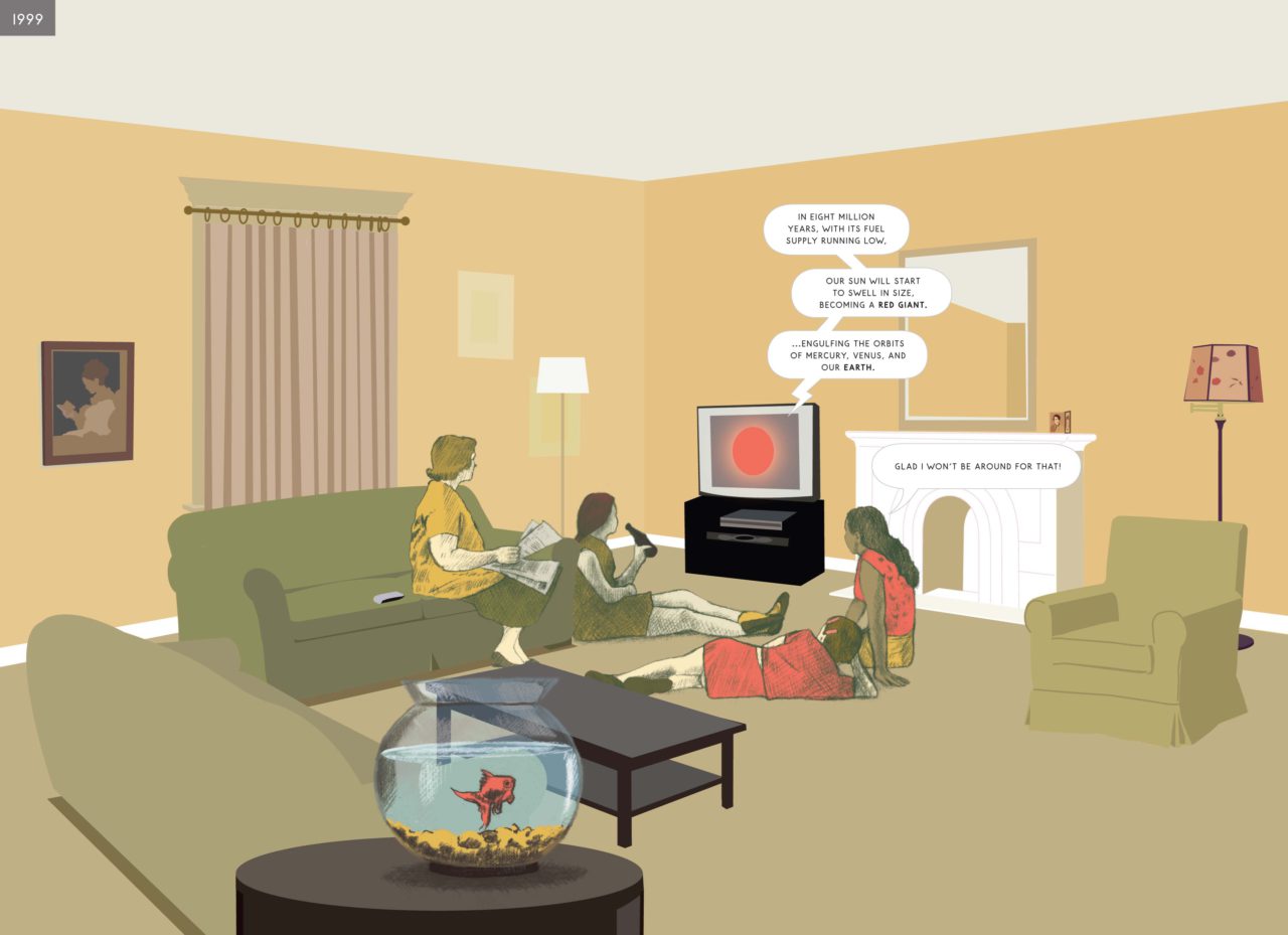
Spread from Here (Pantheon, 2014)
There is a very striking yet quiet scene with a woman alone in the room looking outside through the window, which makes a vivid contrast with the sort of behavior happening by the window, such as hearing something, a flying bird coming in, glass being broken and flooding, etc.
That is one of my favorites in the book, where the mood and the color came together nicely. I like that the room is empty. It’s emotionally charged because of this, and the woman is possibly leaving the house for the last time, or maybe she is just moving in.
The watercolor of the stream was one of the first images I made, I didn’t know where it would go in the book but this combination had a nice magic to it. The stream is like a metaphor for time moving.
-
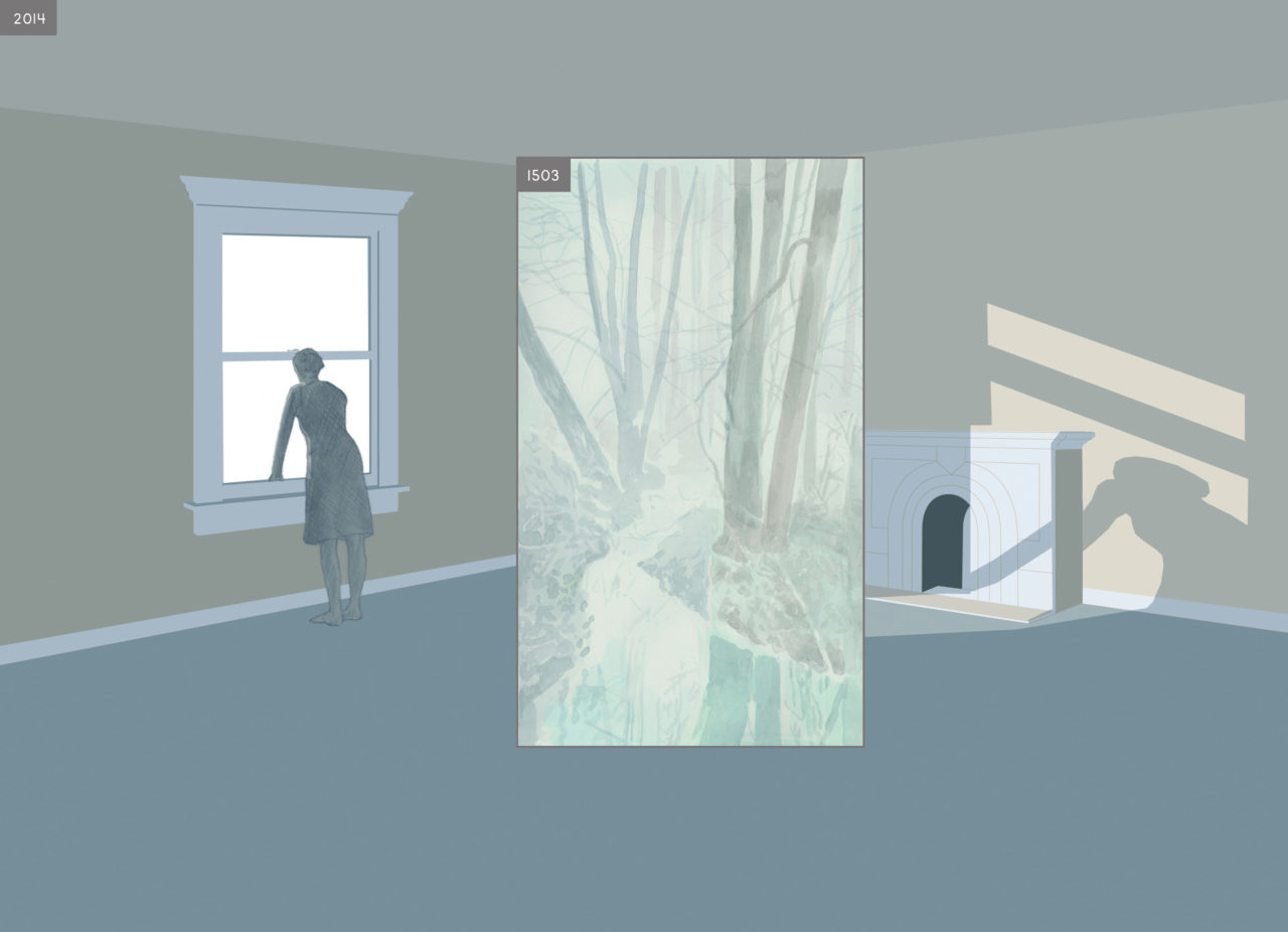
Spread from Here (Pantheon, 2014)
Reading Here, we sense the passage of time as something very dynamic and overwhelming: it is like re-experiencing our lives rather than simply reading something. The panels seem to restage the trivial, personal recollections buried in one’s subconscious.
I wanted the reader to feel that time was moving like a roaring river. One book that was an inspiration was Tadanori Yokoo’s Waterfall Rapture, Postcards of Falling Water. It’s a meditation on this particular subject. Whenever I open the book it’s as if you hear a roar, and this is the feeling I wanted to evoke.
Waterfall Rapture, Postcards of Falling Water is a magnificent book composed of 13,000 postcards of waterfalls that Yokoo collected in various ways as references for his painting.
Another inspiration for me was the archive of Peter Cohen, who is a collector of vernacular photography. I was lucky to have been introduced to him when I was doing research for the book, and he generously offered to let me use his archive as a reference. When you look through thousands of personal photographs you see the commonality of the things we hold important enough to document. It’s all the same: birthdays, weddings, holidays, sometimes just silly moments with friends.
I think the book strikes a chord with people because they recognize themselves in it. It feels a bit like a photo-album. If you take a long view of time our lives are small and transient, and these moments are all we have. This is what I want people to take away.
-
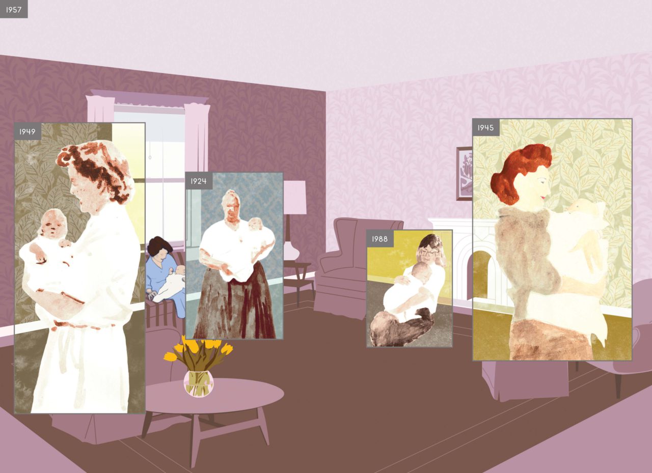
Spread from Here (Pantheon, 2014)
Do you do this kind of extensive reference work when you work on other projects?
This project is unique for me. I try not to repeat myself. Each project requires different ways of thinking, different research and skillsets.
Could you tell us about one of the other projects you have been working on recently?
For a while now I’ve been interested in quantum physics and the idea of the “Multiverse”. These concepts are impossible to completely understand but they inspire me. I have been experimenting with drawings and I’m not sure yet how this work will develop. Maybe it’s a book, maybe a series of sculptures.
Since COVID-19, I’ve been renting a place in a small town north of NYC. It’s nice having more room. I brought up instruments and started playing music. I think I would like to develop this more and when it becomes possible, play a concert and record a record.
All images: courtesy of Richard McGuire
Richard McGuire (Artist)
Richard McGuire is an American artist whose work is in the collection of the Museum of Modern Art and at the Morgan Library & Museum. His artistic output is multidisciplinary. He has made sound sculptures, toys, children’s books, animated films, and his illustrations have also appeared regularly in The New Yorker Magazine.
His early years were enmeshed in the performance and street art scene exhibiting work in museums and galleries alongside Jean-Michel Basquiat and Keith Haring with whom he became friends, and on the street alongside Jenny Holzer’s Truisms and SAMO© poetry. He was a founding member and bass player of the post-punk band Liquid Liquid for which he created all the graphics and videos.
He is the author of the award-winning graphic novel Here (2014), a non-linear story that shows one location over billions of years, which treats the book as a sculptural object. Most recently he exhibited a group of sixty sculptures, each named for a friend, mentor, or hero titled The Way There and Back (2018) at The Aldrich Museum in Ridgefield, Connecticut.
https://www.richard-mcguire.com/
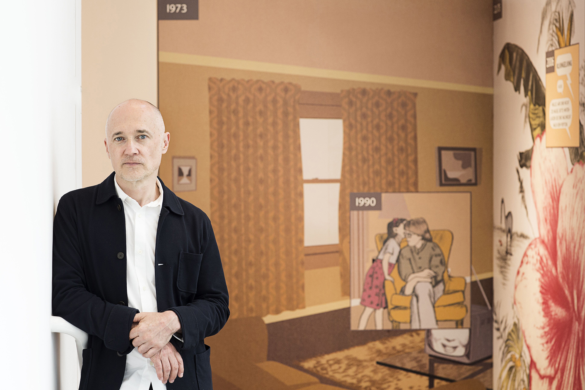
At The Museum Angewandte Kunst in Frankfurt in 2016. Photo: Anja Jahn
