Windows as Connectors between the Inside and Outside
06 Sep 2016
- Keywords
- Architecture
- Interviews
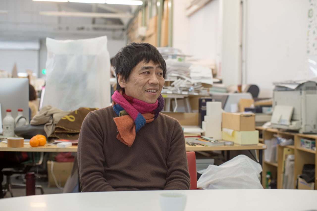
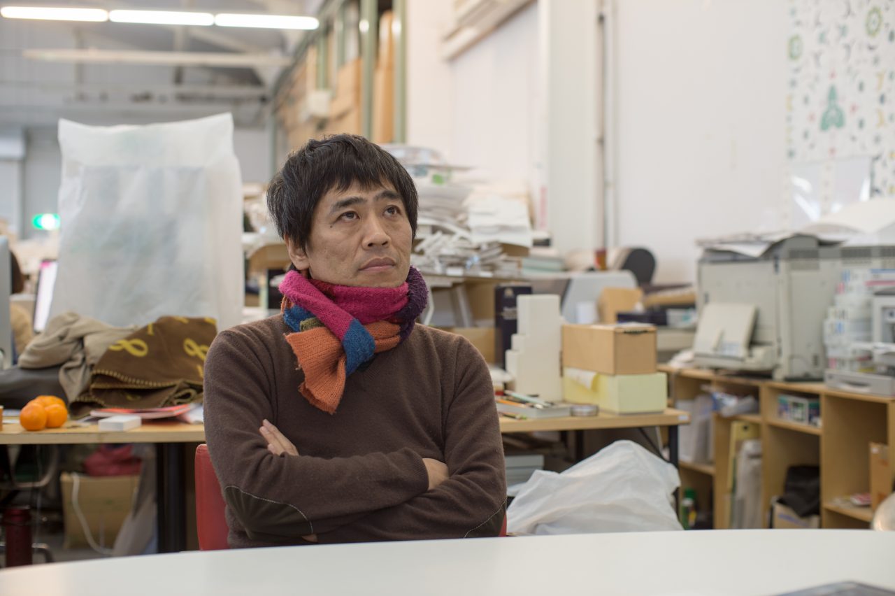
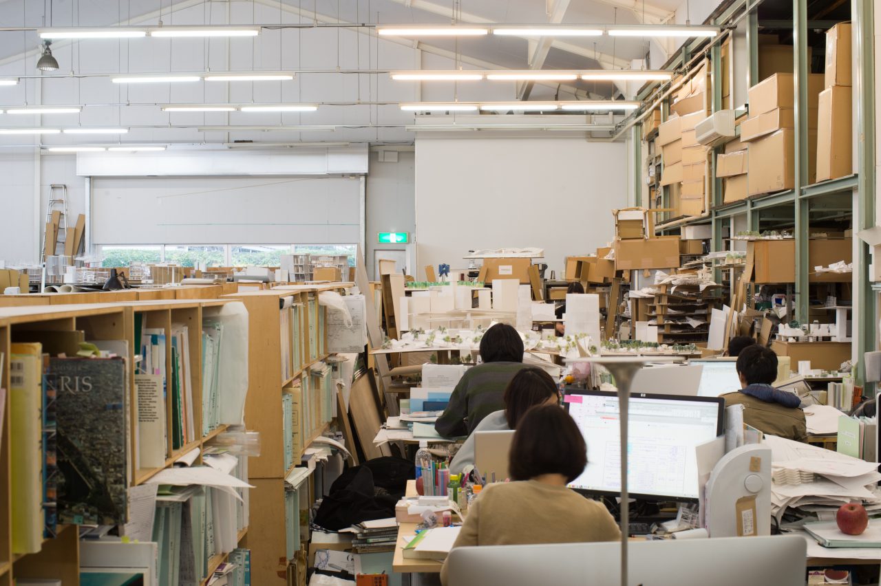
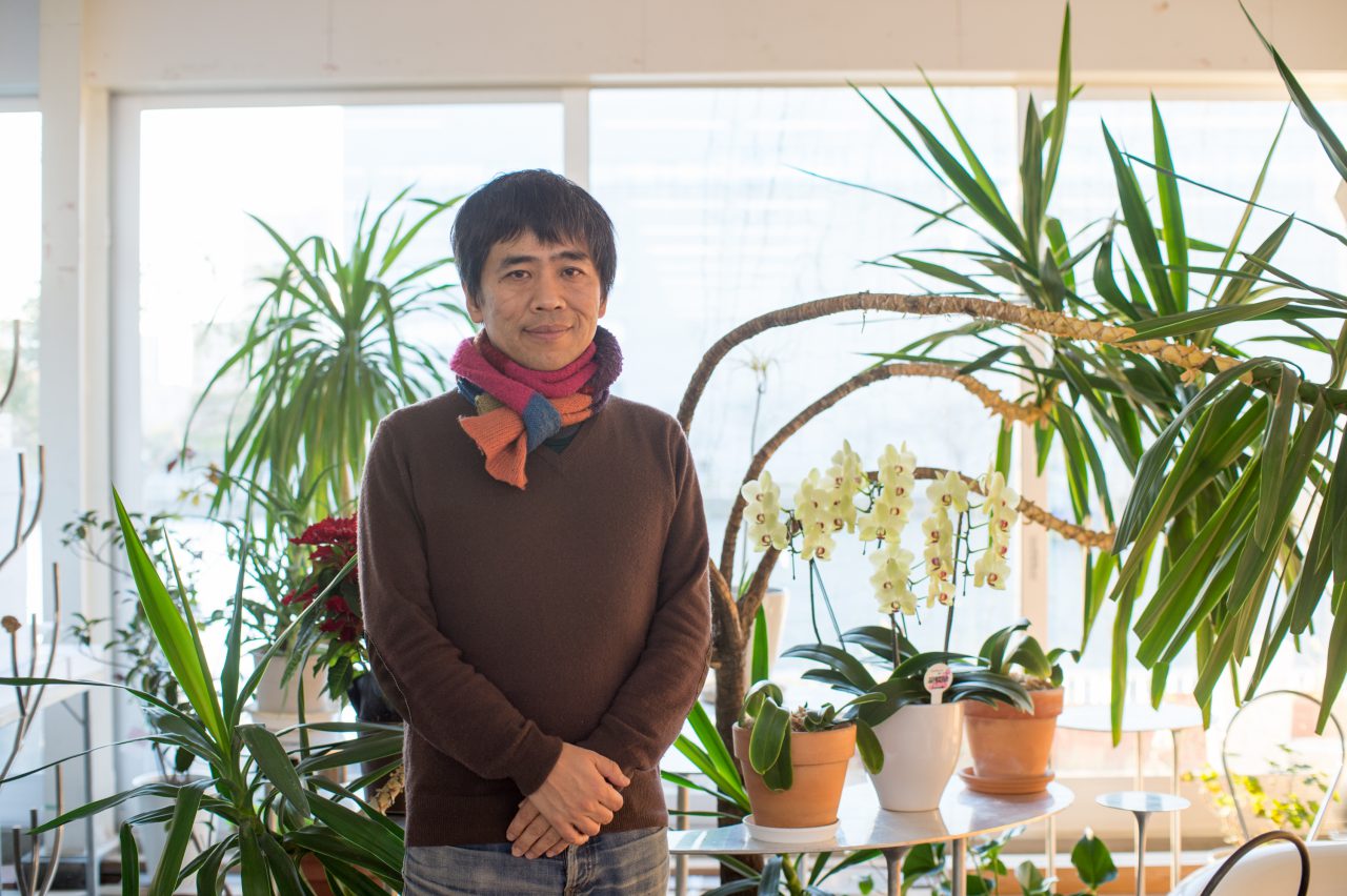
Architect Ryue Nishizawa has designed a wide variety of projects, including houses, a church, a station square, and art museums. He has also found international success through SANAA, a practice that he established together with architect Kazuyo Sejima. His notable works include the 21st Century Museum of Contemporary Art, Kanazawa; and the Louvre-Lens, a satellite facility of the Musée du Louvre. He has come to be recognized as one of the leaders of the contemporary architecture field after receiving the Pritzker Prize, a prestigious award often described as the “Nobel Prize for Architecture”, in 2010. We had the pleasure to visit him at his canal-side studio to ask him about windows.
What thoughts do you have in regard to making windows?
Ryue Nishizawa (hereinafter referred to as Nishizawa): The problem of how to make the windows was a major theme with the “Moriyama House” (2005), for example, because I designed the house as a cluster of box-like volumes made of steel plate, and I needed to prevent the buildings from becoming hermetic boxes. I don’t think the window becomes a theme on its own very often with the methods of timber frame construction commonly used for houses in Japan, because the buildings don’t have walls, and they are open to begin with. With wall-based architecture, however, the problem of how the windows should be made becomes very important.
-
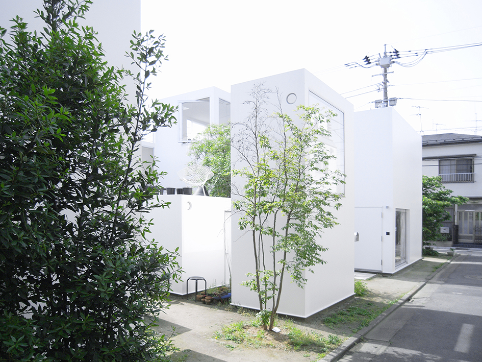
Moriyama House, Photo: Office of Ryue Nishizawa
For the Moriyama House, I was interested in making the windows in ways that would “break” the boxes. I tried to do this in various ways, such as by making unusually large windows, positioning a window to span the second and third floor levels, and opening windows at the corners of the boxes. But in hindsight, I feel that I wasn’t able to wipe away that hermetic, boxy feel of the buildings as much as I wanted.
The Teshima Art Museum, which I made on the island of Teshima in the Seto Inland Sea, has a shell structure. Shell structures are typically shaped like seashells, and you normally don’t open holes in them, so with the Teshima Art Museum I had to put thought into how to make the openings in its shell.
Do you consider the large holes of the Teshima Art Museum to be windows?
Nishizawa: They could be windows or holes. Actually, it doesn’t feel right to call them windows.
Do you have something like a definition for what a window is?
Nishizawa: No, not in particular. The openings of the Teshima Art Museum aren’t glazed, though, so I believe I usually refer to them as ana (holes) when I talk about them in my lectures. However, when translated into English, they’re referred to not as “windows” but as “openings”. I suppose the Japanese term with the closest nuance to that would be kaikō.
-
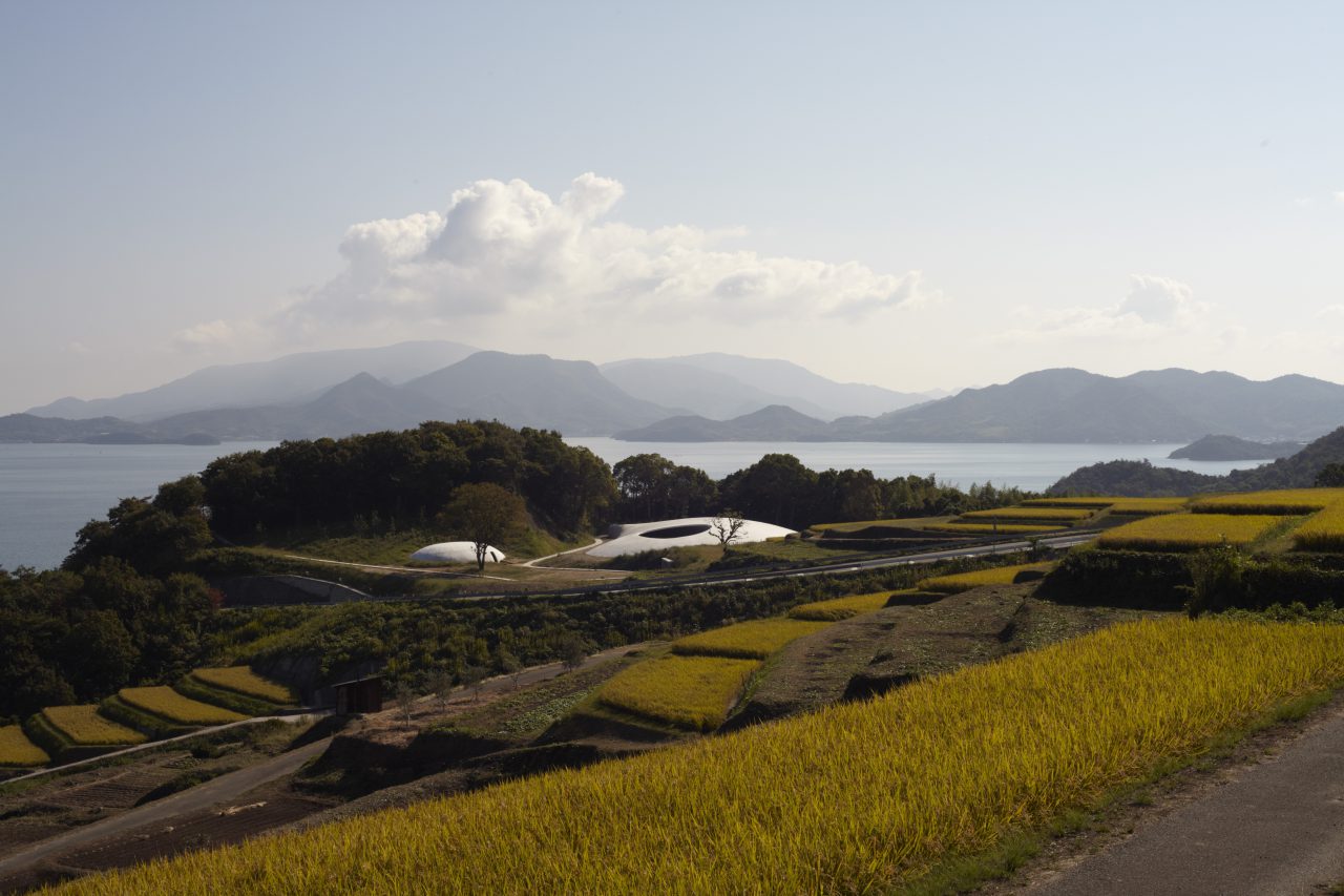
Teshima Art Museum, Photo: Noboru Morikawa.
Your Terasaki House also has a unique roof. It looks like you made it to be open to the outside from the start. Of course, parts of it would need to be closed off in order for it to be habitable, so you must have created boundaries between the inside and outside somewhere. I would assume that you took a different approach to this than using walls and opening windows in them. Could you share your thoughts on how you defined the boundaries of the Terasaki House?
Nishizawa: The boundaries of the Terasaki House are defined not by its walls but by its roof. The boundary that a wall creates is straightforward in that the outside and inside are separated along a single surface. This can be widely observed in European buildings. A roof, on the other hand, creates a layered boundary, and it makes a space under its eaves that can be described as a buffer zone between the inside and outside. The inside and outside are therefore separate as realms but continuous as spaces. This is a characteristic that you don’t see in Europe’s wall-based architecture.
-
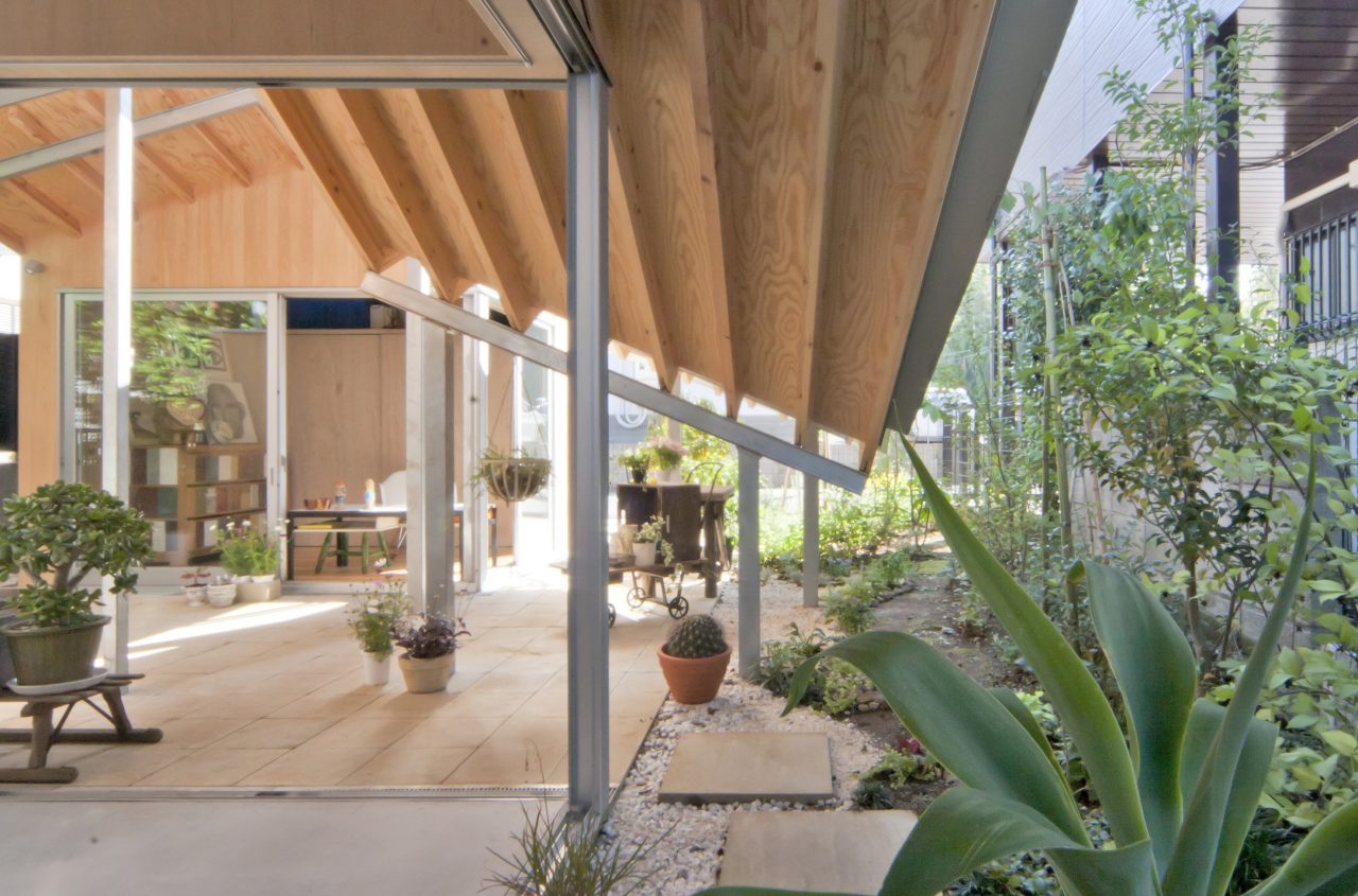
Terasaki House, Photo: Office of Ryue Nishizawa
These attributes peculiar to roof-based architecture like the Terasaki House can be commonly observed in traditional Japanese buildings. For example, if we approach the Toshodaiji in Nara, at first we can see its roof from a distance, but as we move closer to it, its roof falls out of sight at a certain point, and we instead begin to see the underside of its eaves. We’re still outside the building at this point, but this visual shift makes us aware that we have entered the realm of the architecture.
If we continue onwards and step into the space beneath the eaves, we gain a heightened sense of being inside the building even though we’re not inside its main hall yet. In this way, a roof can create a layered boundary and shape an approach sequence that enables us to gradually enter inside by passing through various intermediate realms as opposed to transitioning abruptly from the outside to the inside. This makes roof-based architecture interesting because it can merge the inside with the outside and connect a building to nature.
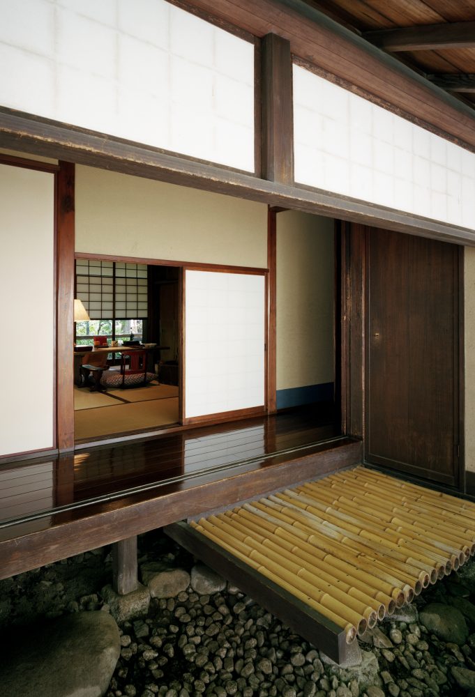
People from Europe will look at Japanese folk houses and say, “There aren’t any walls”. Technically speaking, there are walls, but to those used to making walls out of stone and brick, the walls made of paper and mud seem very frail and appear to be more like fixtures. And of course, Japanese folk houses are frame constructions, so it’s actually true that their walls aren’t structurally as important as their columns and beams.
In this sense, there were no such things as walls in traditional Japanese architecture to begin with, and there were also no windows. In contrast to this, I would think that windows must be very important elements for the wall-based architecture of Europe.
Do you mean that one needs to have walls that clearly separate the inside and outside like those of the buildings of the West in order to really be able to design windows?
Nishizawa: Think, for example, of the streetscapes of Paris. The windows play an extremely important role for the beauty of the urban space because of those façades of the different buildings that form the spaces of the streets together. While Paris is a remarkable city on many levels, the windows on the façades of its Haussmannian streets are particularly wonderful.
There seems to be something different about the way you and your partner at SANAA, Kazuyo Sejima, make windows compared to how other architects have made windows in the past. And your windows have really had an influence on the contemporary architectural field and architecture students. For instance, designs with “scattered windows”—that is, many small windows positioned randomly across walls—trended among thesis projects in the 2000s. What thoughts do you have with regard to this?
Nishizawa: I don’t clearly remember what we were thinking at the time when we made those windows, but we definitely were interested in windows. I recall I didn’t really like the windows that you commonly see on buildings in Japanese cities. I couldn’t see any beauty in them, unlike with the windows in Paris that contribute to the urban space.
The windows of buildings in Japan are made based wholly on the needs of the interior, so no consideration is given to how they look from the outside. This, I think, is what brought me to wonder if there couldn’t be windows that have meaning for both the spaces of the interior and the city. While I understood that they couldn’t be made in exactly the same way as in European cities, I believed that there should be ways to make windows and façades with a uniquely Asian appeal in Asia.
I think I was also interested in making big windows. You mentioned scattered windows, but I actually liked windows to be bigger than those. I still do. I also didn’t really like square windows.
Why is that?
Nishizawa: I felt they were tacky [laughing].
I see [laughing]. So, basically, you think windows should be considered not only from a functional standpoint but also from an aesthetic one. Is there anything that you are particularly careful about when designing windows?
Nishizawa: There are buildings that heighten the appeal of the space of a street, and there are buildings that don’t. The windows are just as important of a determining factor for this as the feel of a building’s volume and how its façade is made. The thing about windows, though, is that it takes time to develop their designs because they have a direct effect not only on the exterior but also on the beauty and comfort of the interior as well. Personally, I try to give every room at least three windows. This is not an issue of beauty but of comfort and ventilation. Three windows per room may sound simple enough, but it’s actually surprisingly difficult, and I always struggle with this.
Would you say that the depth of a window affects the way you shape it and the experiences and feelings that people have when they interact with it?
Nishizawa: Yes, the depth is a big factor. Take Le Corbusier’s chapel at Ronchamp, for instance. Those thick walls are very important for the windows.
The walls of Sejima’s Umebayashi House, in contrast, were very thin. You could really feel the thinness of the walls in a direct manner when the windows were open. Something I still remember about the house is how its windows protruded beyond its walls because the commercially produced 70-millimeter-thick aluminum window frames were thicker than the walls. That was quite amazing.
If you look at Saarinen’s TWA Terminal at the John F. Kennedy International Airport, its space as a whole is highly unique because he designed not just all of the architectural components, such as the mullions and columns, but also the furniture, air curtains, and belt conveyors. If you look at the buildings we’re making today, on the other hand, everything from the windows, columns, and doors are commercially produced. I feel that what we’re doing is closer to editing than to creating in the sense that we’re just gathering ready-made products and rearranging them. Because of this, if you take close-up photos of just the windows of recent architecture, you often can’t tell whose works they are. In that sense, I feel like the architecture being made today is a bit bland compared to the architecture of other periods in the past.
If you could freely design new windows, what would you change about the commercially made products currently available?
Nishizawa: I suppose there are many things that could be done. For one thing, I think it would be nice if there are windows that move in a more organic way better adapted to human movements as opposed to sliding or swinging in a mechanical manner. If you consider clothes, for example, when you slide open a zipper, your hand moves in a slightly curvilinear fashion, but the zipper has the flexibility to accommodate this movement. I want to see windows that move in a more ergonomic way like that.
Also, while I do like the light and crisp feel of aluminum windows, I want to try making windows for wooden buildings as well. It’s beautiful how everything from the structure to the finishes and fixtures is made of wood in old buildings in Japan. Japanese folk houses are quite lavish if you think about them this way. And they’re not just beautiful; they’re also strong and impressive. I would like to try making a wooden building someday if I have the chance.
Out of all the buildings you’ve seen around the world, are there any particular windows that have left a lasting impression on you?
Nishizawa: Again, I think the Parisian streetscapes are wonderful. The windows of the Masjed-e Sheikh and Masjed-e Emam in Isfahan and the Hagia Sophia in Istanbul have also left a lasting impression on me.
What about windows in Japan?
Nishizawa: Although they aren’t windows, the shoji screens along the engawa (perimeter walkways) of Kyoto’s temples. The way they open up is great.
In terms of contemporary architecture, the windows of Tadao Ando come to mind. I think they have originality.
If you had to describe windows in one word, what would it be?
Nishizawa: “Openings”, I suppose. By opening a window, you can bring in the wind and connect a room to the city. I think the appeal of windows lies in how they’re symbols of this kind of openness.
You mentioned wind. I think you would agree that the space around a window is something that’s important to experience firsthand. When I visited your Moriyama House, I was amazed by how its windows were entirely different from the impression I had of them from seeing photographs. I was really able to appreciate how much thought you put into making them.
Nishizawa: One major theme for our buildings is the idea of opening and closing. It may seem contradictory to attempt to achieve both at the same time, but it’s actually something that a lot of buildings do as a matter of course. Personally, I think it’s a very interesting architectural problem. I was very much thinking about the idea of opening and closing as a generative architectural problem when I did the Moriyama House, too. Perhaps it wasn’t just an issue about windows in the case of the Moriyama House, though, as I tried to address the problem through the architecture as a whole, such as by breaking it up into separate volumes and avoiding the use of boundary walls.
Buildings are made up of the two elements of an exterior and interior, but when drawing plans, you naturally tend to think more about the interior, such as the layout and functions of the rooms and the placement of the furniture. On the other hand, when working with models, you tend to think about the exterior of the building, such as its form, size, cladding, and relationship with its surroundings. Because of this, when you are developing a design through plans and models, you get a strange feeling that the inside and outside can be thought about separately. This is not something we strive for, though. I believe the models and plans that we use as design tools to think about architecture are actually limiting the imagination of architects.
I came to the realization at a certain point that the inside and outside can be connected more smoothly if we think about architecture from the viewpoint of human experience instead of through these design tools. Regardless of how closed or open a building is, when people come across the building in the city, they will go inside it, engage in various activities, and eventually exit from it. When you consider a building from the viewpoint of the people’s activities in this way, you can see that the inside and outside are actually continuous. Following this logic, I’ve now come to believe that if we regard architecture from the viewpoint of human experience, we can consider everything from streets to buildings and gardens as one without thinking about the inside and outside separately.
Ryue Nishizawa
Born 1966 in Tokyo, Japan. Received a master’s degree from the Yokohama National University in 1990. Joined Kazuyo Sejima & Associates in 1990. Established SANAA with Kazuyo Sejima in 1995. Established the Office of Ryue Nishizawa in 1997. Currently a professor at the Yokohama Graduate School of Architecture (Y-GSA) of the Yokohama National University. Notable works include the 21st Century Museum of Contemporary Art, Kanazawa* (2004), Moriyama House (2005), Teshima Art Museum (2010), Hiroshi Senju Museum Karuizawa (2011), and Louvre-Lens* (2012). Has received numerous awards including the Golden Lion at the 9th International Architecture Exhibition of the Venice Biennale in 2004*, Architectural Institute of Japan Prize in 2006*, Pritzker Architecture Prize in 2010*, and 25th Murano Togo Prize in 2012. (*designed/awarded together with SANAA partner Kazuyo Sejima)
www.ryuenishizawa.com
