Experimenting with Windows
14 Jan 2014
- Keywords
- Architecture
- Interviews
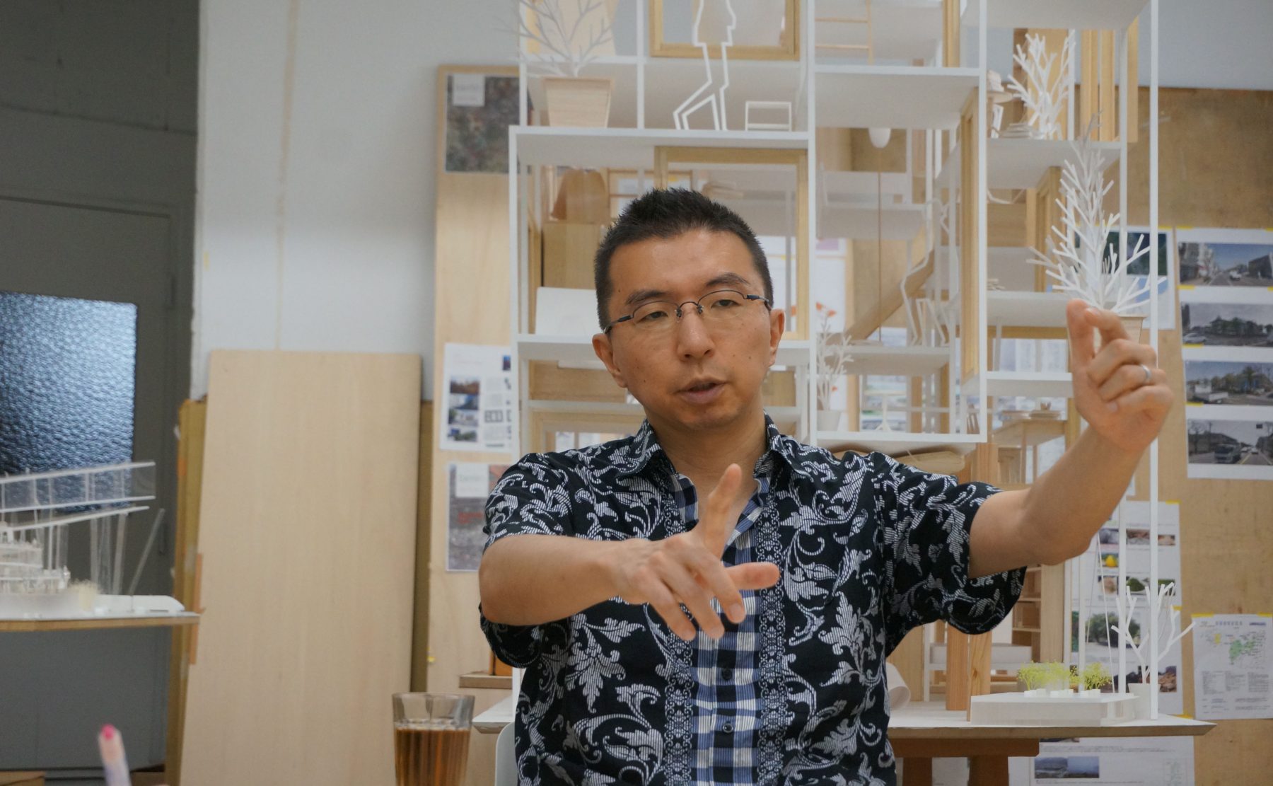
The following is an interview with architect Sou Fujimoto, who has designed many internationally recognized projects and continues to propose new possibilities for architecture. We asked him about the memorable experiences he has had with windows and how he has been experimenting with windows through his work.
A WINDOW BY LE CORBUSIER AND A HOLE IN A CARDBOARD BOX
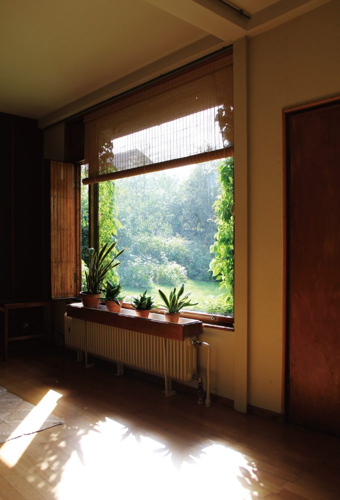
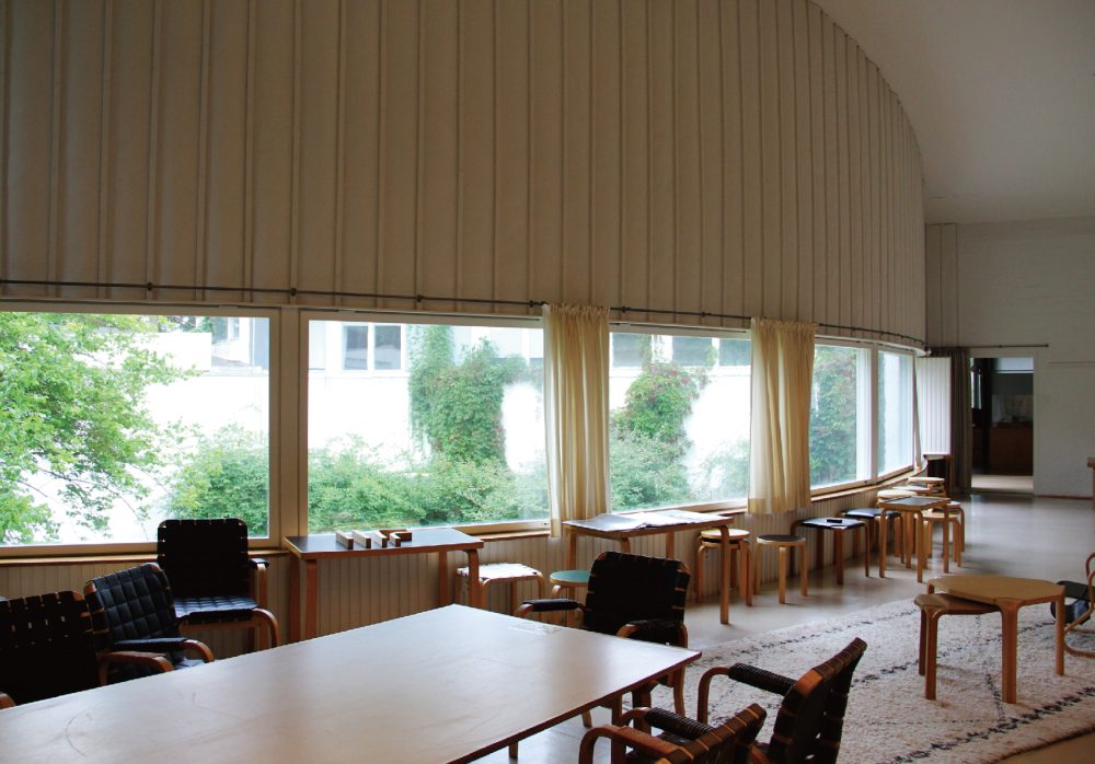
When I was a student in my fourth year of university, I once made my own drawings of Le Corbusier’s mother’s house (Villa Le Lac) at 1:50 scale by tracing its plans and taking various measurements from them. That house has a band of horizontal windows made to extend across all of the rooms. I can recall that I had liked how this single window ties together the entire scenery on the outside with the various activities of daily life on the inside. Also, when I went to places such as Europe where there are fortresses with thick walls that have had embrasures carved out of them to make spaces for shooting, I liked how the small window slits opened in their ends were filled with light. I felt that it was nice how these windows were not just objects but were accompanied by space.
Additionally, although this is a memory from a long time ago, when I was a child, I liked to play inside cardboard boxes. I would open holes in them so that I could see outside. I think that experience of looking out and enjoying the things happening outside while being in a protected place was my first memorable window experience. Because I lived in the countryside, I also used to play in the woods by parting my way through the bamboo grass and small trees. When doing so, I felt somewhat sheltered by these things around me, but I still also had good visibility and the freedom to clear out a path for myself. While the situation of being inside the cardboard box and the situation of playing in the forest are completely different from each other, I feel like they had both given me a similar feeling of a kind of fundamental pleasure or comfort.
THE FEELING OF SPATIAL EXPANSION CREATED BY LAYERED WINDOWS
In regard to my own work, House N has the most characteristic windows. Windows carry the important role of separating and connecting the inside and outside, so they are essentially at the front-line of where architecture is defined. I wanted to attempt to experiment with this most critical part of architecture. That house is composed of three boxes that have been nested in such a way that there are more windows beyond a window, and there are still more windows even farther beyond those windows.
I simply made an extensive number of windows. Although these windows exist as objects, I was more interested in how they could transcend being objects and generate a certain atmosphere of sorts from the layering of the spaces in between them. The whole building can thus be seen to have been made out of windows, and at the same time, the windows can be seen to have disappeared as objects and to have become the space itself.
Once the house was completed, I found that, depending on the light, you can gradually begin to lose your sense of how deep the in-between spaces are because of how there are more frames beyond a window. You have a good sense of distance when you can clearly see the texture of the walls, but it becomes difficult to grasp the distance from a window nearby to a window farther away when the light is a bit hazy. The feeling of spatial expansion in the architecture as a whole therefore seems to change with time. When I entered the space, I was really surprised by how the architecture felt like it was expanding beyond the sense that I had of its actual size. The entire space made of windows seemed, in a way, to be throbbing. I found this effect to be much more fascinating than I had imagined it to be.
Of all the windows in House N, only those of the middle box have glass in them. I thought that it would feel strange if the wall thicknesses of the differently sized boxes were all the same, so I have made the walls become thinner as the boxes get smaller. In doing so, I did not want the detailing of the glass in the windows to stand out in only the middle box, so I rather forcibly made the glass panes in such a way that they are held in place without any frames. As there also needed to be parts of the middle box that could be opened, we designed and built our own thick wooden-framed components that can be opened as one piece and have built-in screens. The parts that can be opened thus do not look like windows and instead appear to have wooden picture frames sitting in them.
-
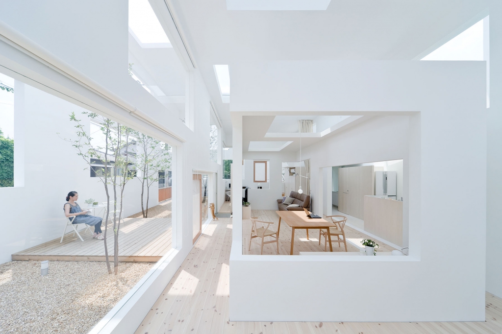
House N, 2008, Photo: Iwan Baan
A HOUSE WITH FLOATING WINDOWS
House NA is made with a very thin structure with columns that are only about 5 centimeters wide. The wooden sashes of the windows are about 10 centimeters thick, so the windows became more prominent than the structural frame when they were put into place. These windows are in a state in which by common judgment they would not be considered to have been properly detailed to fit, but I instead thought that it was an interesting way to detail them. The floating window frames, which have been positioned in every which way, loosely delineate the living spaces of the house. It could be said that, in one sense, I have treated the windows symbolically, or in another sense, that I have treated them crudely.
Normally, the profile of a space aligns cleanly with the position of the windows, but I thought that it would be interesting if they were shifted apart to create spaces in a more dynamic way. Also, because the individual floors are not really big enough to be called floors, an entire floor becomes like a window-side space wherever a floor meets a window. This turns into a window-side alcove if there is one more floor. I was interested in subtly changing the character of each of the spaces as seen independently from the character of the whole space bounded by the windows.
In House NA, I felt that the windows would relate better to the scale of the life in the house if they were made to be objects. The scale of a house’s windows usually reflects the scale of life inside it. When I introduced the windows that gave scale to the life in this house, they accentuated the fragmented floors further and created more contrast. The windows and floors were brought into a funny relationship that made me wonder why the windows look so big. This is why I intentionally used off-the-shelf windows with wooden sashes that look unmistakably like windows. These ready-made wooden sashes have fine irregularities in them that make them all the more window-like.
In the case of this building, I had thought that it would be better to use these windows that have “this is a window” written all over them instead of using clean frames that are like abstract sculptures. I detailed these windows so that they simply appear to be sandwiched in place, and I came up with appropriate ways to detail the complicated areas such as where they meet columns.
As you can tell from House N and House NA, I assume entirely different stances toward windows depending on the situation. I believe that the way I use windows, whether this means creating an appropriate balance or an intentional imbalance of them, is determined by how I want to shape the architectural experiences that take place in each project.
WINDOWS CREATE ANTICIPATION BY LIMITING RELATIONSHIPS
The bookshelves of the Musashino Art University Library form a spiraling shape in plan, and they have openings that are more like large holes than windows in the parts where they are in many layers. The world inside of the library contains a place in which you are surrounded by bookshelves but also have deep perspectives, and it offers a sense of expansion that makes you think to yourself, “I don’t know what’s happening there, but the space really opens up over that way”. My hope was to create a place where you develop a feeling of anticipation that makes you say, “Let’s try going over there, too,” because you cannot see the space in its entirety.
I wanted to do this because I had thought that the experience of arriving at a book after wandering through an unknown world would be interesting. So, in a way, I have made the library to have a somewhat inefficient arrangement by using the spiraling plan that is antithetical to functionality and efficiency.
The large openings are very important for this concept. Because you cannot see everything beyond them, they create a feeling of anticipation that makes you wonder how far the spaces continue on for and extends your perception of the building beyond how big it actually is. I think that this is an important part of the experience of architecture. The holes that have been opened into the walls create this feeling of anticipation which causes your experience of the physical architecture to transcend the physicality of the architecture. In this sense, I think that windows have a way of producing relationships that have greater depth to them because of the fact that they limit the relationships that you can establish with what is on the other side. I feel that this is where the difference lies between the case in which you have glass windows that you can clearly see everything through and the case in which there are things that you cannot see.
CONTINUALLY RE-ESTABLISHING THE APPEAL OF THE ARCHITECTURE
The way we make our buildings shifts this way and that depending on our ideas, so with each project, I find myself thinking, “Wait, what’s a window again?” Actually, I have always tried to make architecture by starting at the place where I am asking myself, “What’s architecture again?” It is as if I would enjoy having to re-think everything from step one if I woke up every morning having forgotten everything. [laughter] As I proceed further into the process of developing a project, the most important parts of it gradually surface to the top, and in a way, the process becomes about continually re-establishing the appeal of the project. This process will often put me in situations where I am thinking, “If I go with this idea, it will create architecture that will not be like what I have always considered to be architecture,” or where I realize, “I shouldn’t even be talking about these windows as ʻwindows’, should I?” I suppose I just like to think about things from scratch each time.
POSITIONING ONE’S WORK INTO THE COLLECTIVE BODY OF DIVERSE WINDOWS
Windows have both an inner side and an outer side. You look outside through a window when you are inside, and you are connected to the inside when you are outside. I find this two-sided quality of windows to be interesting as an architect. At the same time, I am interested by how windows have historically always been windows. There may be many types of windows, but anyone can recognize a window as a window. The appearances of windows can be very different, though, depending on the climatic and cultural contexts in which they exist. When I imagine how humans might have interacted with windows long ago, I feel like we still may be able to adapt them to the present in new ways. There may also be interesting ways to fuse together windows from different cultures. The fact that windows have these diverse historical, cultural, and geographical backgrounds is one aspect that makes them interesting. Also, I feel that windows are able to invoke certain reactions in us and make us notice when something is awry because we possess a certain amount of background knowledge about them.
For example, we would be fine if we saw a window made in an ordinary fashion, but we would feel that something is odd if we saw three windows layered against each other. I would be excited and would find it to be interesting, however, if a meaningful experience can be created from oddities like this.
I think that it is also really interesting to think about the collective body of diverse types of windows. When I make a window of my own design, I do not think to myself, “This is the coolest window of them all”. I instead prefer to think of it as having taken shape as a natural result of the architecture that I had imagined it for. Even if a window similar to it had already been made in the past, I like to just think that my project has given birth to another variety of it. As these various types of windows accumulate over time, someone in the future might say, “Gee, there was a fool who came up with this as a solution in that situation. Hmm, but it might be interesting to implement it here in this situation.” I think it would be great if little by little this collective body of windows gets used in richer ways by people like this.
THE IDEAL STATE OF A SPACE AND ITS WINDOWS
The Serpentine Gallery Pavilion that I made recently in London is almost completely a semi-outdoor space, so it practically does not have any windows or a roof. However, it in a way manifests the dream or ideal state of how I imagine the interaction between the outside and inside to be. Specifically, the pavilion has wall-like elements, but you can see partially through them because they are made with thin frames. You are able to see the surrounding greenery very well where the frames gradually become sparser.
These areas could be called windows, but you can also walk through them. The frames become like walls again where they get denser. You relate to your surroundings through the differences in what feels like the thickness or density of the air. This relationship between the outside and inside is created in a similar way to that from my experiences in the woods that I spoke about at the beginning.
-
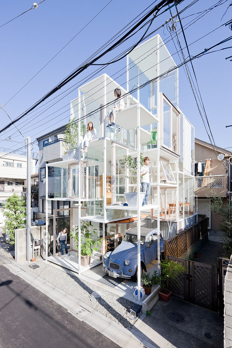
House NA, 2011, Photo: Iwan Baan
A HOUSE WITH FLOATING WINDOWS
House NA is made with a very thin structure with columns that are only about 5 centimeters wide. The wooden sashes of the windows are about 10 centimeters thick, so the windows became more prominent than the structural frame when they were put into place. These windows are in a state in which by common judgment they would not be considered to have been properly detailed to fit, but I instead thought that it was an interesting way to detail them. The floating window frames, which have been positioned in every which way, loosely delineate the living spaces of the house. It could be said that, in one sense, I have treated the windows symbolically, or in another sense, that I have treated them crudely.
Normally, the profile of a space aligns cleanly with the position of the windows, but I thought that it would be interesting if they were shifted apart to create spaces in a more dynamic way. Also, because the individual floors are not really big enough to be called floors, an entire floor becomes like a window-side space wherever a floor meets a window. This turns into a window-side alcove if there is one more floor. I was interested in subtly changing the character of each of the spaces as seen independently from the character of the whole space bounded by the windows.
In House NA, I felt that the windows would relate better to the scale of the life in the house if they were made to be objects. The scale of a house’s windows usually reflects the scale of life inside it. When I introduced the windows that gave scale to the life in this house, they accentuated the fragmented floors further and created more contrast. The windows and floors were brought into a funny relationship that made me wonder why the windows look so big. This is why I intentionally used off-the-shelf windows with wooden sashes that look unmistakably like windows. These ready-made wooden sashes have fine irregularities in them that make them all the more window-like.
In the case of this building, I had thought that it would be better to use these windows that have “this is a window” written all over them instead of using clean frames that are like abstract sculptures. I detailed these windows so that they simply appear to be sandwiched in place, and I came up with appropriate ways to detail the complicated areas such as where they meet columns.
As you can tell from House N and House NA, I assume entirely different stances toward windows depending on the situation. I believe that the way I use windows, whether this means creating an appropriate balance or an intentional imbalance of them, is determined by how I want to shape the architectural experiences that take place in each project.
-
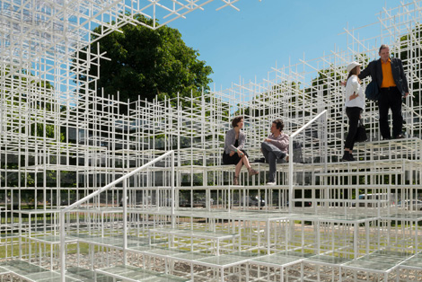
Serpentine Gallery Pavilion, 2013, photo: Jim Stephenson
However, it is not as if I am driving all of my ideas toward that ideal. Ordinary window-like windows are fine, too. Whenever I use off-the-shelf window sashes, I look for products that really have the feeling of off-the-shelf products, and I choose typical-looking window-like windows rather than windows that look cool. There are many manufacturers that have recently been putting an effort into making sashes that have thinner edges even while still maintaining their performance. I think that those windows have their uses, but personally, I want you manufacturers to also keep your old aluminum sashes that are a little more unrefined. [laughter]
For the medical facility projects in Hokkaido, I purposely ordered the kind of double-sliding sashes that are typically used in office buildings. I wanted to use sashes that did not look like custom-made products as much as possible, and I tried to make it seem like I had simply put in ordinary sashes that I had gathered from all over the place. In that regard, it would be a shame if this great diversity of windows, which are shaped by diverse historical and cultural values as I mentioned earlier, were made to converge to a single trend.
In regard to how boundaries between the inside and outside could be defined in the future, personally, I think that the spatial condition that I have created at the Serpentine Gallery, in which you are gently encompassed by different densities of matter, could be a good way to go. Similarly to House N, where I made the windows seem to disappear by making many windows, the pavilion creates a place where you are surrounded entirely by spaces that have a wide range of depths. House N is made of concrete walls, and it is basically just composed of ordinary boxes that have ordinary windows opened in them.
However, my experience of the space was incredibly soft and flexible, and it wondrously seemed to leap lightly over the material and form of the architecture. It was a pleasant surprise to realize that regardless of whether the windows retain their forms in the architecture or if the walls are square, the experience of the space is much freer than these things. In light of this, I believe that the answer to the question of what windows will be like in 10 or 100 years’ time will essentially be the same as the answer to the question of what architecture will be like in 10 or 100 years’ time.
SOU FUJIMOTO
Born in Hokkaido in 1971. Graduated from Tokyo University, School of Engineering, Department of Architecture. Established Sou Fujimoto Architects in 2000. Co-awarded the Golden Lion for the Japan Pavilion exhibition at the 13th Venice Architectural Biennale in 2012. Designed the 2013 Serpentine Gallery Summer Pavilion in London. Awarded the Marcus Prize in the same year.

