Series Window Behaviorology in Switzerland
A Conversation with Peter Märkli
17 May 2021
Peter Märkli, one of Switzerland’s leading architects, started his career after meeting his mentor, the architect Rudolf Olgiati. In 1978 he established his own studio, Studio Märkli, in Zurich. Since then, through architectural works such as La Congiunta – a museum for Hans Josephsohn’s sculptures, he has continued to contemplate and engage with the fundamental issues of architecture such as the city, history, and perception.
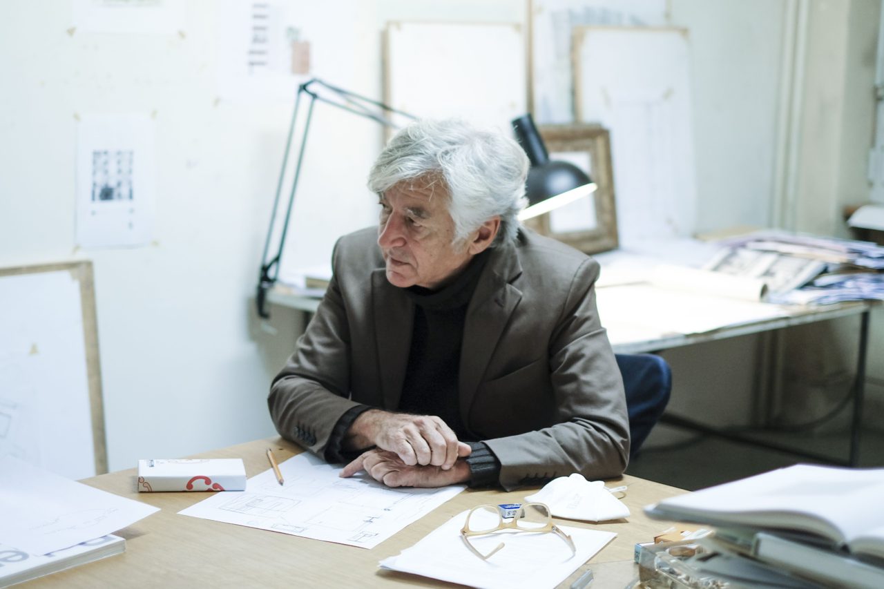
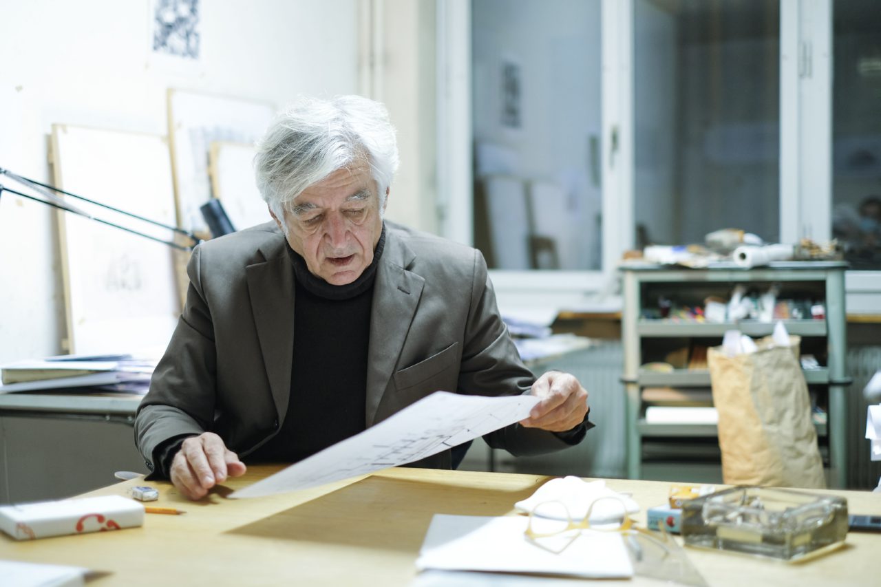
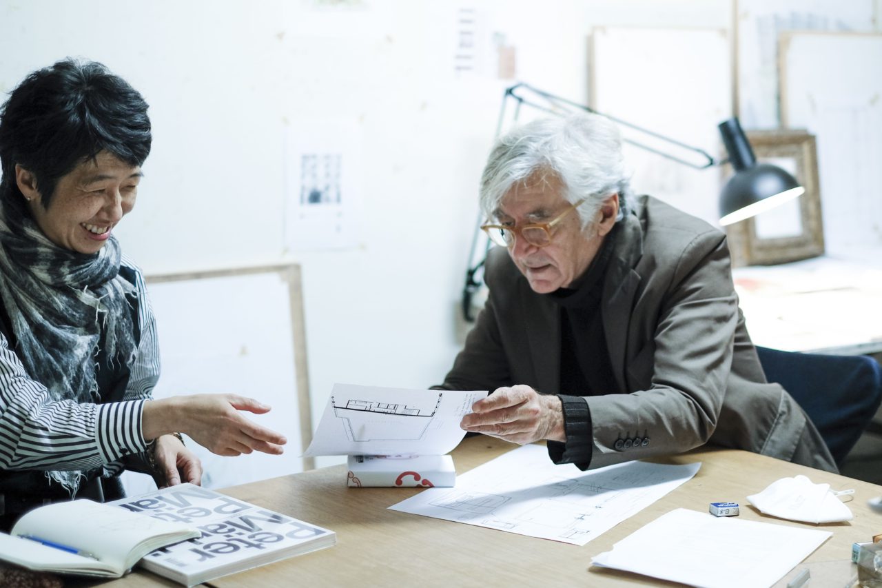
Architects Momoyo Kaijima, Grégoire Farquet and Simona Ferrari from the Chair of Architectural Behaviorology at ETH Zurich spoke with him at his studio in Zurich.
Chair of Architectural Behaviorology (CAB): In our research we are interested to reflect on the element of the window in Switzerland, on how the territory’s different geographical and cultural conditions determine its variety of forms. The diverse climatic conditions are a crucial factor too, especially nowadays, in relation to environmental issues – how thick does the glass need to be, how do we regulate the climate inside the building, etc. Every architect will have their own individual take on this theme.
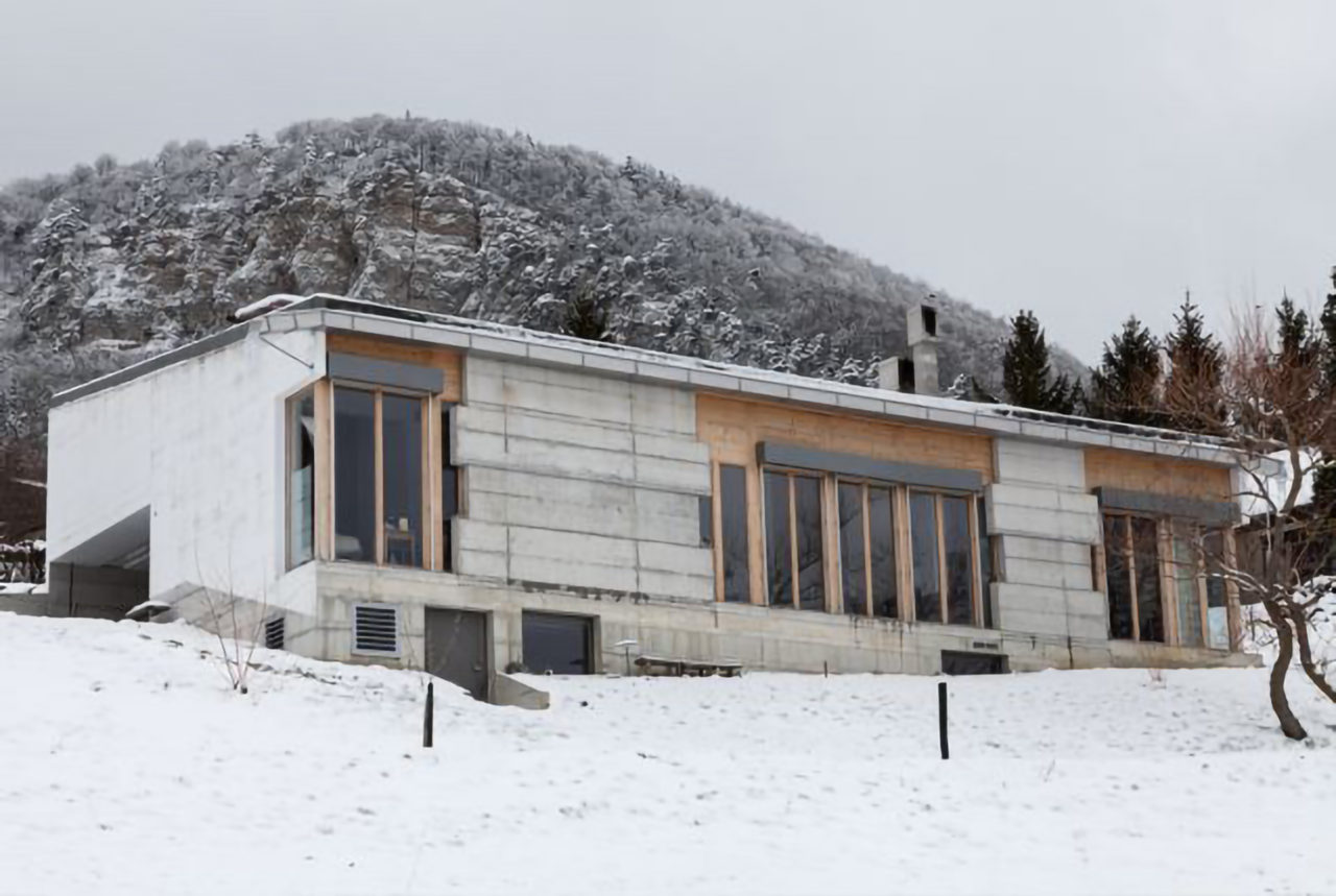
Alongside larger office buildings and schools, your more recent work includes new residential commissions, like the Weissacher atelier house in Rumisberg (Berne, 2013), which have perhaps made you address the topic of the window in a different way. So, we’d like to start by simply asking what the window means to you.
Peter Märkli (PM): I find that question practically impossible to answer, because the window has nothing to do with me as an individual. It has to do with the primary act of architecture: first you enclose an area for the given program and then, because people would be miserable sitting in the dark, you break open this enclosure to bring in the daylight and establish a relationship between the interior and the world outside. When the wall has a certain thickness or depth, it gives you endless possibilities to temper the degree of openness between the different areas.
And before we talk about the specific question of the ʻwindow in Switzerland’, we could have a real discussion about the environmental issue, because how does protecting the environment work in a consumer society? The two things are irreconcilable. What’s the use of making a window that’s ultra-thick just so that someone can stand in front of it in their bikini when it’s minus 10 outside? But that’s what the current regulations in Switzerland provide for.
I don’t think the solution is always to have thicker windows, thicker insulation. We’re deluged with regulations that seem driven more by some kind of moral imperative than common sense. In Switzerland the temperature dips below zero for only around one month – 30 days – of the year. What would be wrong with allowing people to decide for themselves to put on a pullover on those days? That’s what I’ve been trying to communicate to the city authorities, anyway.
CAB: Yes, it is very important to make these points.
PM: It’s a fact that we’ve lost our agency in this area. It’s apparently no longer enough to tell the architect ʻyou need this much insulation’. Building physics says ʻthis, this, this, this … needs to be inside. People have to be warm!’ But if you want to create architectural form, there are some elements that have to be on the outside. What Mies van der Rohe built was the bare minimum you can get away with, I think. You can’t do less than Mies – otherwise you’ll end up with those glass-wrapped boxes that I wouldn’t even call architecture; they’re just building physics taken to an absurd extreme.
For me, it’s not a simple question of increasing the thermal performance of a building. It’s something that comes within the whole remit of architecture. The fundamental thing to understand is that there is nothing but the wall that will be broken or cut into. The decision is then: where do I make the cut? And how can I guide the eye, because the eye can be directed? And how can I define the proportions so that something that is beautiful on the inside does not appear too small on the outside? All these things have to be consciously resolved – made to happen.
To do this there’s a whole palette of architectural tools that seem to have been largely forgotten. For example, who now works with the reveal? Farmhouses in the Engadin have reveals with angled surfaces that reduce the transfer of heat but still bring in daylight and sun – and they’re painted not red, but white, to bring in as much light as possible. It’s the traditional farmhouses that are the great architectural treasure of this country; they were the source, for example, of Le Corbusier’s figure of the ʻribbon window’.
How you break open the wall also depends on the system of construction. The Canal Grande in Venice is a fantastic example of this. You have Gothic buildings with solid walls but also loggias, so the facades appear very open – which is like contemporary housing. Then, alongside them, you have Renaissance palazzi with bundled columns that open up everything to view, but where the glass of the windows is set back, behind the structure. There’s a text by Max Raphael*1 on the historical development of the wall in which he talks about this kind of layering, which gives rise to a perception of depth. The wall is no longer monolithic but has a plan in depth (Tiefenplan).
CAB: I wonder how we can deal with these issues as architects – with the ʻart’ of architecture as a discipline.
PM: If you’re not limited to doing packaging for building physics – if you’re not just applying a finished envelope that can’t be opened up in any way – then nothing is ruled out. The more experience you have, the more you understand the elements of architecture, then the more freely you can work with them. It’s not such a bad thing if young people aren’t taught readymade solutions. If you have a finished product in your head, you’ll never learn anything new. Equally, not knowing something can be a great gift, because it frees you – allows you to work out things for yourself.
It was not a seminar at the ETH, for example, but a description in Goethe’s Italian Journey, that helped me understand that when you choose a post-and-beam system, you’re choosing a form that’s not naturally suited to domestic life. You’re infilling the perimeter defined by the columns to make an enclosure, and then breaking open these infills to bring in the light. The whole process is a contradiction, though that doesn’t stop you from doing wonderful things.
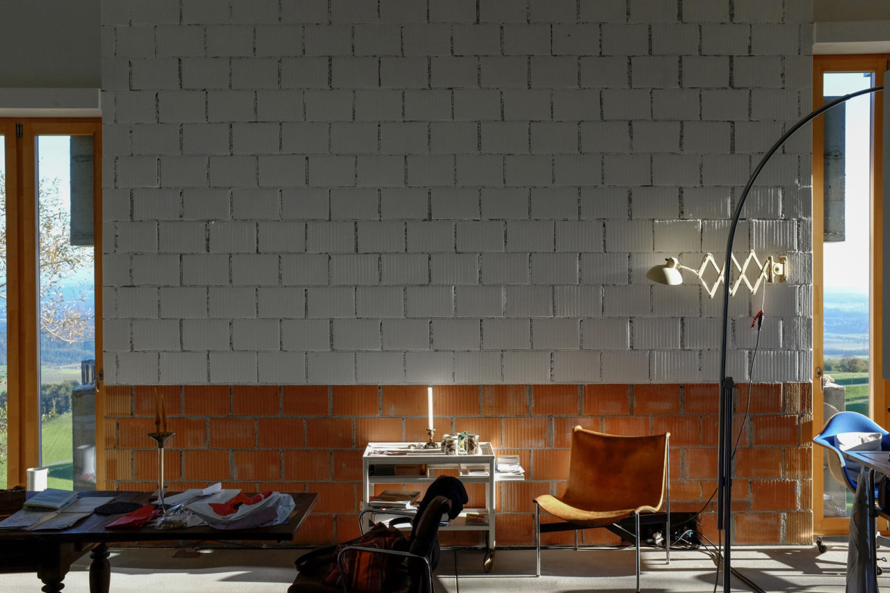
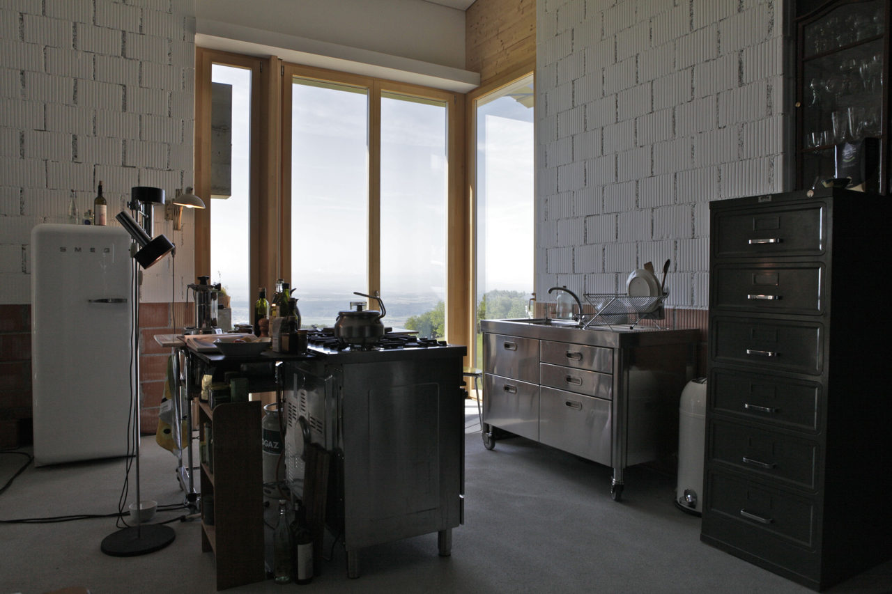
CAB: As you say, architecture is about the assembly of different elements, whose relationship we have to understand in order to work with them freely. In this regard, your atelier house might even be called ʻmannerist’. And I mean mannerist in a positive (rather than postmodern) sense, in that the various elements are arranged very freely, with a certain attitude of openness.
-
Weissacher atelierhouse, Rumisberg, Berne, 2013 : © Mats Eser
-
Weissacher atelierhouse, Rumisberg, Berne, 2013 : © Studio Märkli
-
Weissacher atelierhouse, Rumisberg, Berne, 2013 : © Mats Eser
PM: Exactly, you can have all these different elements, but they have to come together to make a whole. I think you need to have a lot of experience before you can become independent. History tells you how to use elements in a certain way. If you want to invent a new solution, use them in a different way, then you really have to grasp how they have evolved historically.
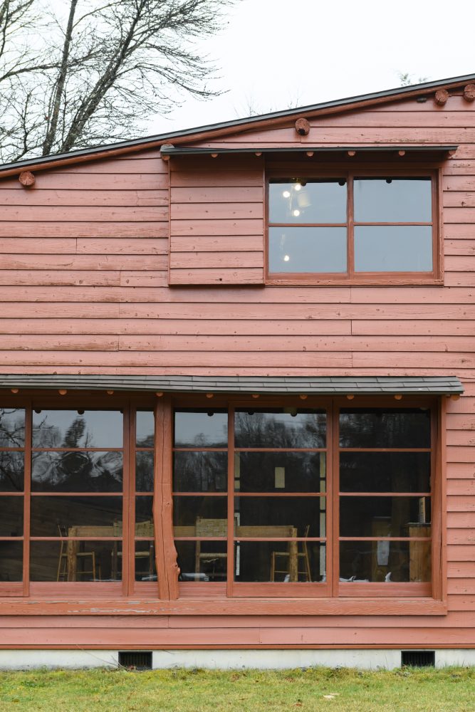
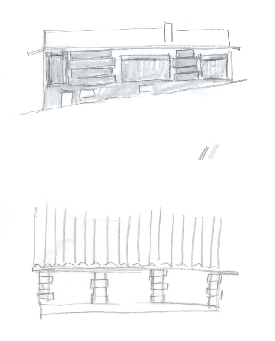
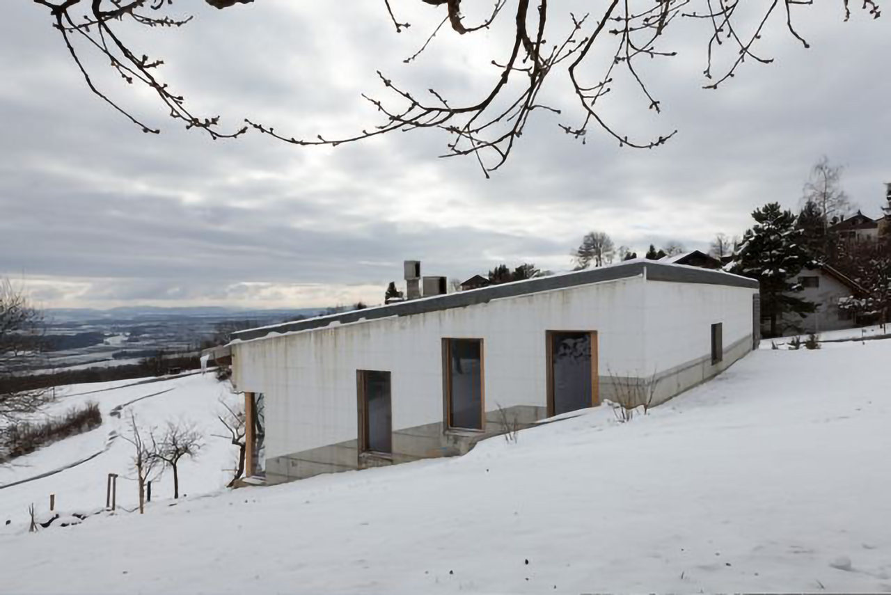
At an early stage of the design of the atelier house I tried defining the main facade with pillars, but these pillars eventually developed into piers. Similar to the Hürzeler house in Erlenbach (1997), the question was how to frame the openness of the main facade to the landscape. With a continuous glazed facade you are always presented with the same view, but I find it much more interesting to close off certain parts of the wall and to send the eye in different directions, so you’re viewing the scene from different angles and with different depths of perception – just like in the cinema.
The remaining three walls of the house enclose the programme. They have a dark plinth to mark the way they follow the line of the slope, becoming really low at certain points. This layering of the wall has not only a protective but also a visual function, contributing to a play of black and white, light and shade. The effect is even more pronounced in the main facade, with its projecting wall fragments where the light comes towards you and recessed parts go back into shadow. It’s like an optical dissolving of the architectural language of the wall – and something I tried out for the first time at Im Birch school, Zurich-Oerlikon (2004).
These tools are all part of the repertoire of the architect. How could it be bad to use them? Rather than being a smooth flush surface, the appearance of the wall becomes richer, and your eye can make out its different parts and the relations between them.
-
Sketches for Weissacher atelierhouse : © Studio Märkli
-
Weissacher atelierhouse, Rumisberg, Berne, 2013 : © Mats Eser
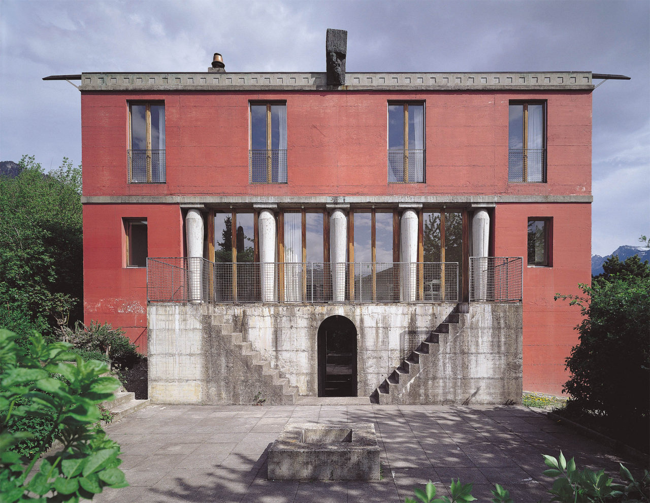
I feel I could be much freer here than I was with early works like the two houses in Trübbach-Azmoos (1982). It’s a question of temperament. I can’t attempt anything that I don’t understand. At Azmoos, because I hadn’t mastered all these refined things, I had to place the windows in the most regular position, the centre of the room, and not asymmetrically. Those early buildings were all quite different from each other. I was still learning the language of architecture, exploring everything. All I had was a feeling for the kind of space or atmosphere I wanted to achieve. But those little houses gave me the chance to experiment with materials, and with different forms of opening, in ways that would have been too risky with a larger commission.
-
Two houses, Trübbach-Azmoos, 1982 : photographer unknown, © Studio Märkli
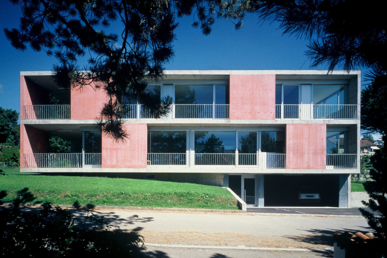
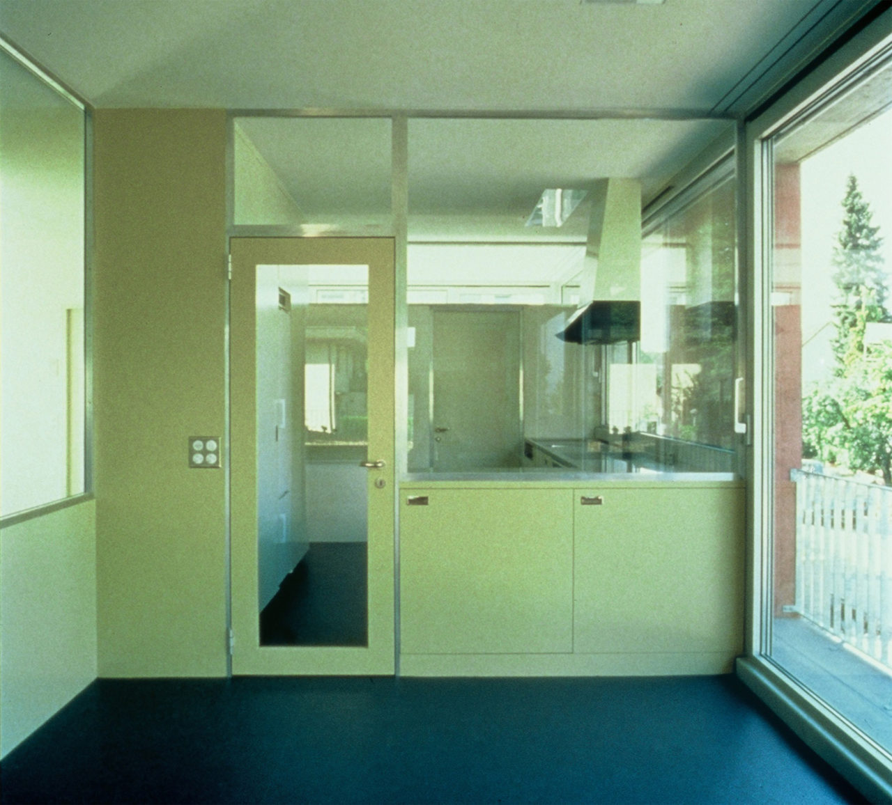
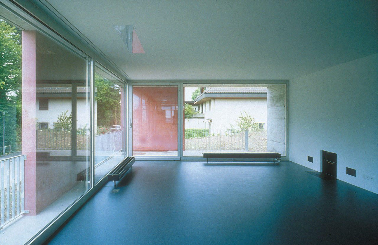
CAB: You mentioned the Hürzeler house in Erlenbach, which has a singular feature, a glazed box for the kitchen. Its perimeter is then separated from the exterior with another window. This layering creates a multi-layered boundary between interior and the exterior. How did you arrive at such a complex relationship?
PM: The kitchen is a small self-contained room almost like a shower, but you can choose where to bring in the light from. It can be flooded with light, or illuminated more subtly, by the light filtering through the narrow room next to it. It’s also really nice when there’s a shimmer of daylight from above. I find these kinds of spaces that are separated with something transparent – whether it’s glass or a moveable curtain or screen – quite beautiful. They can create such an incredible atmosphere.
The house in Erlenbach is in some respects a critique of classical modernism. At the back, the wall facing the rise of the slope is a kind of cold buffer, with the services and stairs. And at the front you have these asymmetrical slabs of concrete that only partly cover the facade. I’ve been attacked many times by people who say the house doesn’t fit into its surroundings, but it’s entirely consistent with urban planning norms. It’s east light that filters into the kitchen through the ribbon window in the adjacent room. The whole house is very clear and free. All the insulation and conduits are embedded in the concrete frame of the walls, ceiling and floor. And it’s this concrete frame, the sum of the assembly of all the different elements in the process of construction, that also defines the openings.
-
Hürzeler House, Erlenbach, 1997 : photographer unknown, © Studio Märkli
-
Hürzeler House, Erlenbach, 1997 : photographer unknown, © Studio Märkli
-
Hürzeler House, Erlenbach, 1997 : photographer unknown, © Studio Märkli
The facades have varying degrees of openness in response to the surrounding context. There are effectively three typologies in a single small house. Facing the street at the top, the appearance is mainly closed, with three small windows for the service spaces and two larger windows with reveals of different depths. Then there’s the east facade with the ribbon window, while the other two facades – oriented towards the northwest and the lake – are more open.
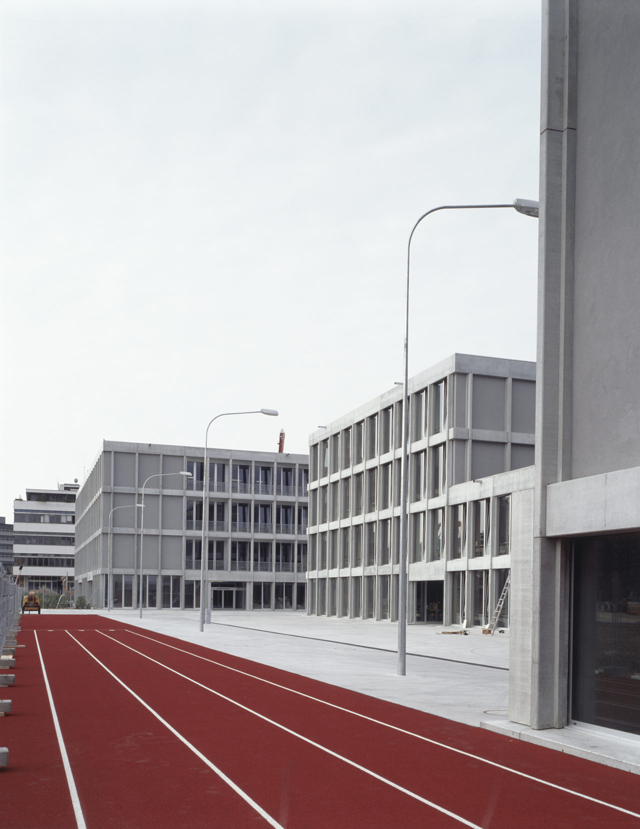
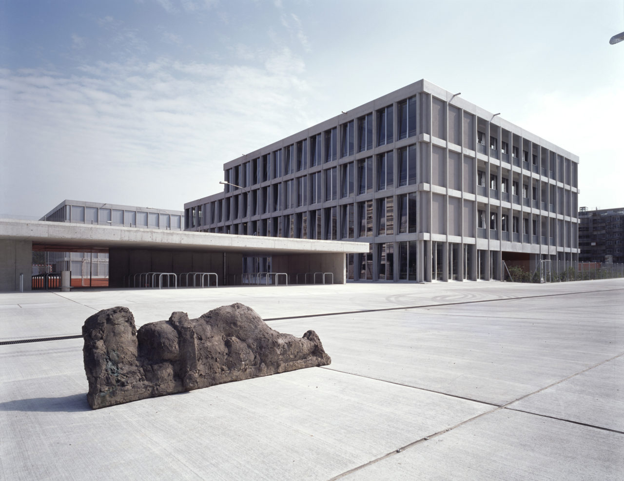
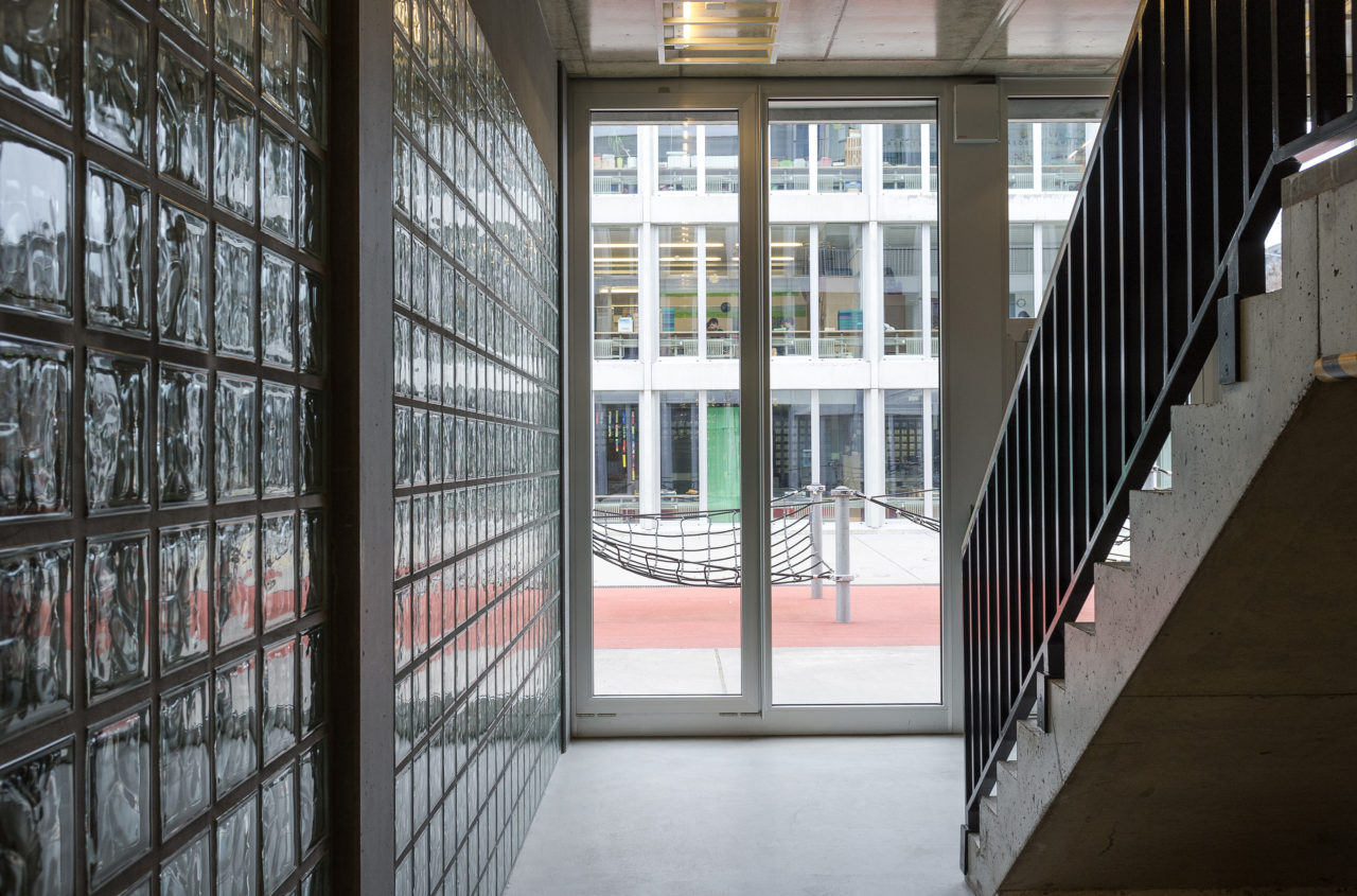
CAB: For long time you worked with the repertoire we’ve just talked about for the houses. But then you started to engage with projects like Im Birch school, where you have a more structural facade, a post-and-beam system, that does not allow for the same variety of expression. You can no longer have different windows for different uses or aspects. Buildings like Novartis and Synthes are also defined by this structural expression. Why did you make this step? Was it a question of the program or scale, or motivated more by financial considerations?
PM: Again, it was above all a response to the urban context. The school is in a new neighbourhood that otherwise has few shared facilities. It’s open on all sides to its surroundings – big, but calm. All the openings in the structure are filled with either glazing or a block wall. The differentiation in this building comes in the form of the open areas or squares that define its various parts or territories: kindergarten, school, canteen, sports hall. Of course, I could have used another system of construction that would have allowed for different openings in the different parts, but it would not have been good for the eye. I would not have been able to reconcile the proportions of those elements with the varying needs for light.
-
Im Birch school, Zurich-Oerlikon, 2004 : © Georg Gisel
-
Im Birch school, Zurich-Oerlikon, 2004 : © Georg Gisel
-
Im Birch school, Zurich-Oerlikon, 2004 : © Yuri Palmin
CAB: But this leap to a structural facade also comes down to a question of scale. Beyond a certain point, in the school and in office buildings like Synthes, for example, you need this regularity and you can no longer have the individual openings in the wall.
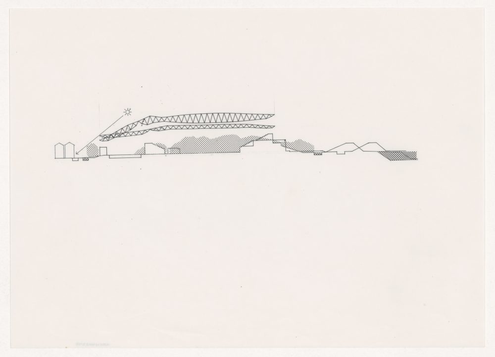
PM: The headquarters building for Synthes (Zuchwil, Solothurn, 2012) works at different scales through the two layers of its facade – the colossal colonnade of the outer facade can be seen as a direct continuation of the imposing natural landscape, while the inner layer forms an enclosure for the offices and workshops. The buildings you mention are all pretty deep – Synthes is on average 32m – and that naturally determines their large degree of openness.
If I’m able to work with different systems now it’s simply because I have more experience – I can respond to things in a different way. It’s never primarily a question of financial considerations! It’s not about the processes of production either – it’s something you have to feel in your heart. I find it quite wonderful to be in a profession that is rooted in art but still incredibly connected to these concrete questions of everyday life.
-
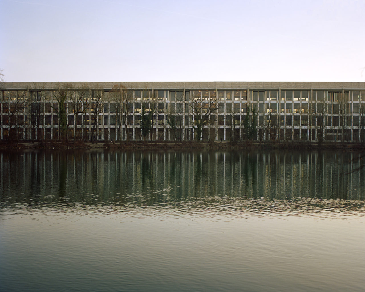
Headquarters building for Synthes, Zuchwil, Solothurn, 2012 : © Caroline Palla
-
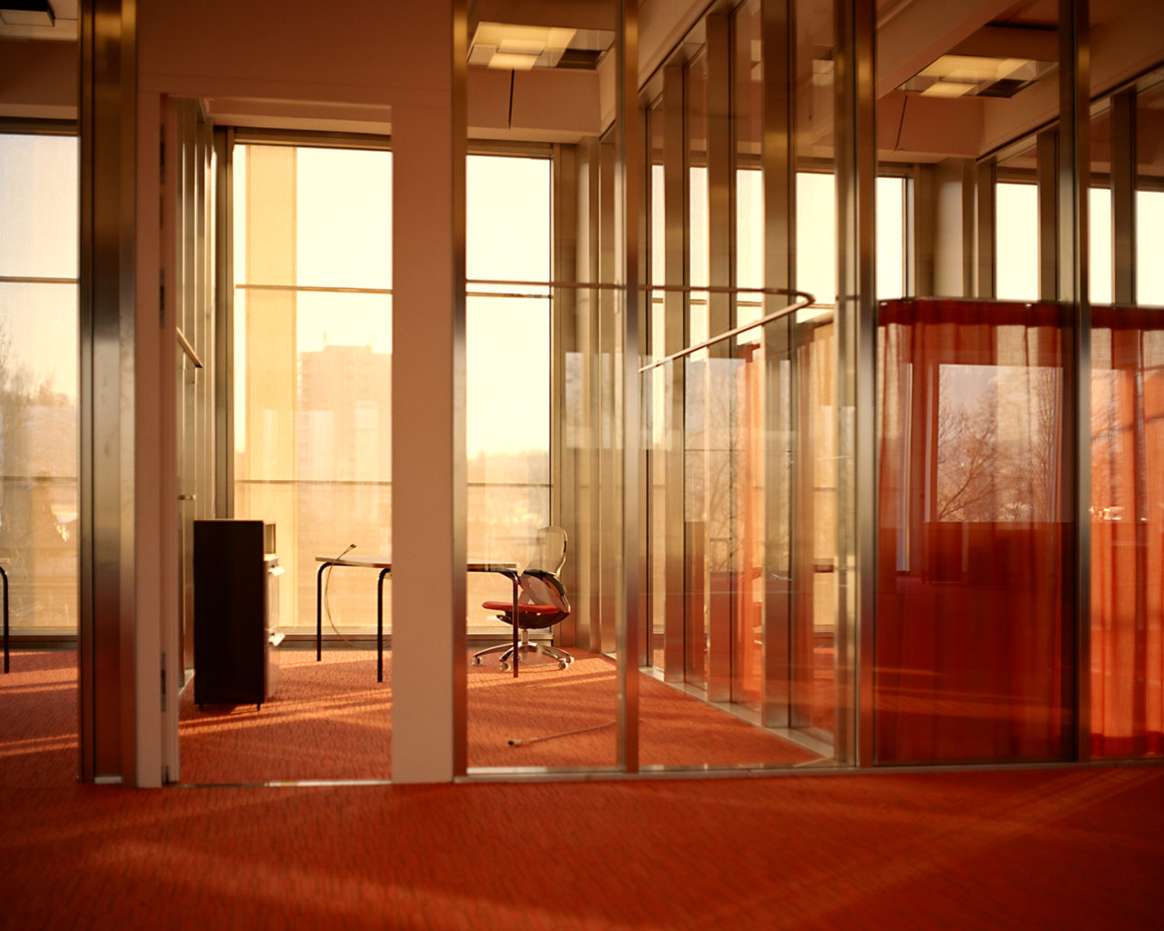
Headquarters building for Synthes, Zuchwil, Solothurn, 2012 : © Caroline Palla
-
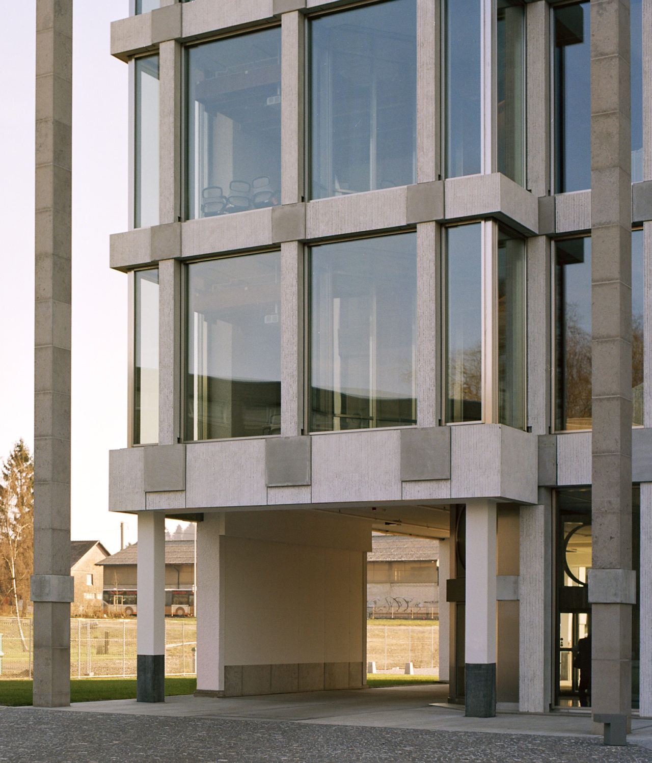
Headquarters building for Synthes, Zuchwil, Solothurn, 2012 : © Caroline Palla
CAB: Other influences too, such as your travels to Italy, will also have contributed to your learning process, your experience.
PM: Alongside travel, I would say that much of my education has come from visiting museums. As much as possible you should look to learn things from the other arts, such as painting and sculpture, because they suggest a lot of answers to these eternal questions of how we live our lives. Our profession is the art of building, right? And art does not depend on advances in technology or the latest fashions in kitchen design. The techniques that we use may be continually evolving, but art is always art. There’s no such thing as ʻprimitive’ art – it’s either art, or it’s not. That’s how it was a thousand years ago, and it’s still true today.
We may have to work within defined constraints, but that doesn’t mean we have to switch off our imagination. There’s a whole world of possibilities when it comes to the way these two lines – interior and exterior – can interpenetrate. You could write a thesis with hundreds of examples from Swiss farmhouses alone; every region has a different story to tell, of how the variation of basic geometric forms can give rise to completely different expressions.
-
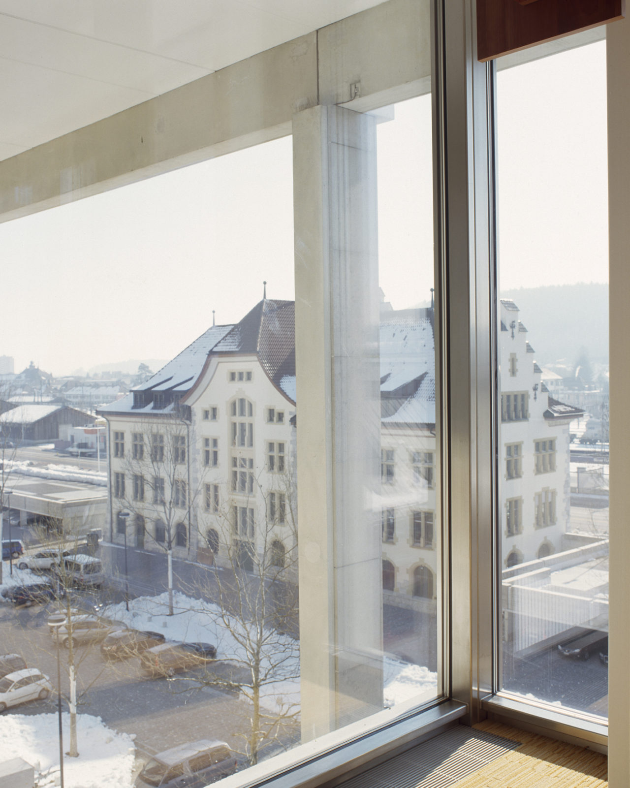
Headquarters building for Synthes, Zuchwil, Solothurn, 2012 : © Caroline Palla
CAB: I think that Rudolf Olgiati had a large collection of old windows from Graubünden, didn’t he?
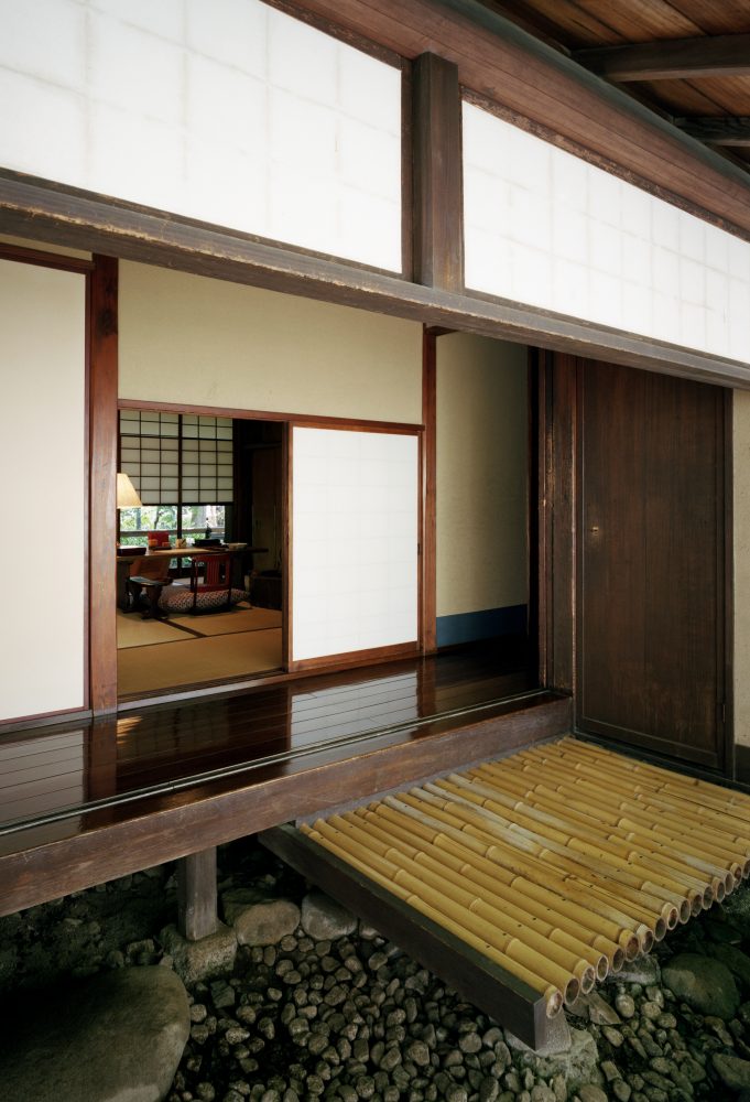
PM: Yes, and I also learned so much from him. You know how it is when you’re young and quite clueless and you find someone who is willing to talk things over with you and help you on your way. Olgiati built little houses that are like nests, in the best sense of the word. But he organised these nests by cutting the walls to make large openings with specific orientations, which he simply covered with glazing, saying that in winter it would warm you. He wasn’t coming from the ETH with a climate program and a pocket calculator. He was able to be free. But today’s regulations no longer allow this kind of freedom, which is our great misfortune.
Personally, I think it’s enough to guarantee 18 degrees or at most 20 degrees in a residential building. If we could do that, it would save a huge amount on the construction costs. There would also be a better indoor climate. All you would need is a sweater for those cooler days. That could be a starting point for a programme to offer the politicians: a certain maximum room temperature. Then the ETH could calculate how much that would save in terms of glazing, grey energy, and so on. Politics needs data. And that can only come from specialists, right? We are the specialists. And an institution like the ETH, a university, should be able to summarise all the individual questions and tell the politicians what the answer might be. That would be some research.
Note
1 : Das göttliche Auge im Menschen: Zur Ästhetik der romanischen Kirchen in Frankreich, 1935
Peter Märkli
Peter Märkli, born in Zurich in 1953, studied architecture at the ETH (Federal Institute of Technology) in Zurich. Associates from his student days include the architect Rudolf Olgiati and the sculptor Hans Josephsohn. Own studio in Zurich since 1978. Professor of Design at ETH Zurich from 2003 to 2015.
Momoyo Kaijima
Momoyo Kaijima has served as Professor of Architectural Behaviorology at ETH Zurich since 2017. She founded Atelier Bow-Wow with Yoshiharu Tsukamoto in 1992 after her initial studies at Japan’s Women’s University and completed her post-graduate program at the Tokyo Institute of Technology in 2000. An associate professor at the Art and Design School of the University of Tsukuba since 2009, she has also taught at Harvard GSD (2003, 2016), Rice University (2014–15), TU Delft (2015–16), and Columbia University (2017). While engaging in design projects for houses, public buildings, and station plazas, she has conducted numerous investigations of the city through publications such as Made in Tokyo and Pet Architecture. She was the curator of the Japan Pavilion at the 16th International Architecture Exhibition — La Biennale di Venezia.
Grégoire Farquet
Grégoire Farquet is an architect, researcher and architecture critic. He studied architecture first at EPF Lausanne and then at ETH Zurich, where he graduated in Peter Märkli’s 2014 diploma class. In 2015 he founded his own practice, Farquet Architectes Sàrl, which works on projects of different scales with a focus on specificity and complexity, and has wide experience in timber construction and dealing with the existing. Grégoire is a regular contributor to Swiss architectural reviews. Since February 2019 he has been part of a Future Learning Initiative project team, a collaboration between the Chair of Cognitive Science with Prof. Christoph Hölscher and the Chair of Architectural Behaviorology with Prof. Momoyo Kaijima.
Simona Ferrari
Simona Ferrari has been a teaching and research assistant at the Chair of Architecture Behaviorology (ETH Zurich) since 2017 and works independently as an architect and artist. She studied architecture at the Politecnico di Milano, TU Vienna, and the Tokyo Institute of Technology as Monbukagakusho Fellow. From 2014 to 2017 she worked with Atelier Bow-Wow in Tokyo, completing several international projects. She is currently pursuing an MA in Fine Arts at the Zurich University of the Arts. Ongoing projects include the winning proposal of Europan 15 for the former industrial site of Acetati in Verbania, IT (with Metaxia Markaki).
Top image: the Chair of Architectural Behaviorology (ETH Zurich)
MORE FROM THE SERIES
-

Window Behaviorology in Switzerland
Swiss Window Journeys: A Conversation between Andrea Deplazes, Laurent Stalder, and Momoyo Kaijima
17 Dec 2024
Window Behaviorology in Switzerland
A Conversation with Silke Langenberg
25 Jul 2024
Window Behaviorology in Switzerland
A Conversation with François Charbonnet (Made in)
25 Jan 2024
Window Behaviorology in Switzerland
A Conversation with Christine Binswanger, Raúl Mera (Herzog & de Meuron)
24 May 2023
