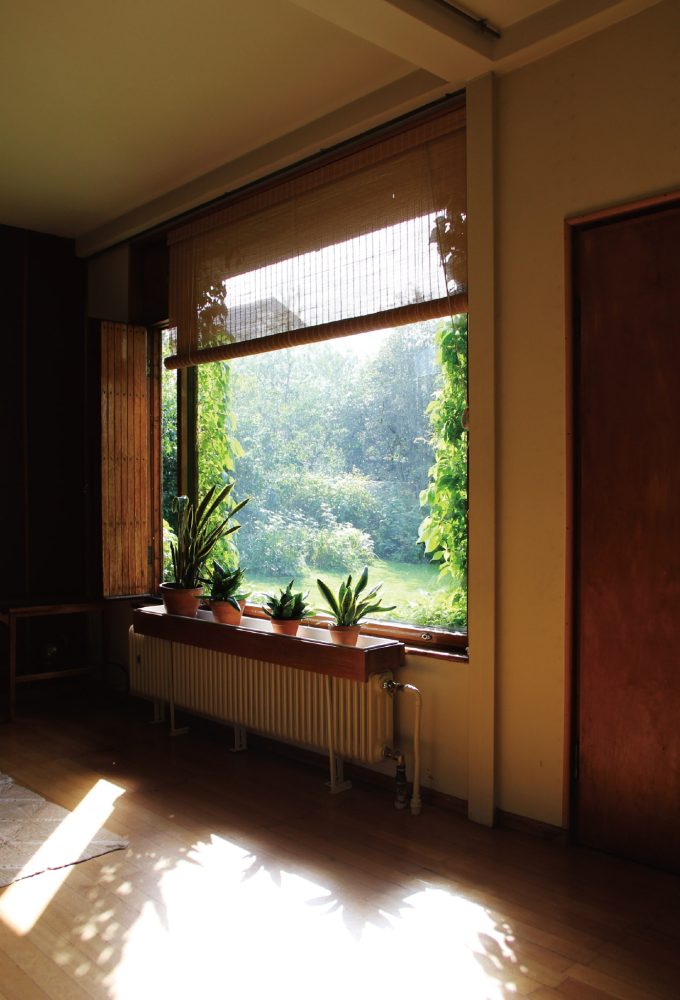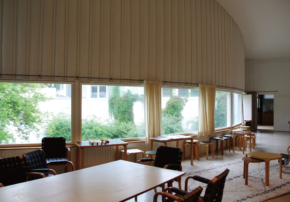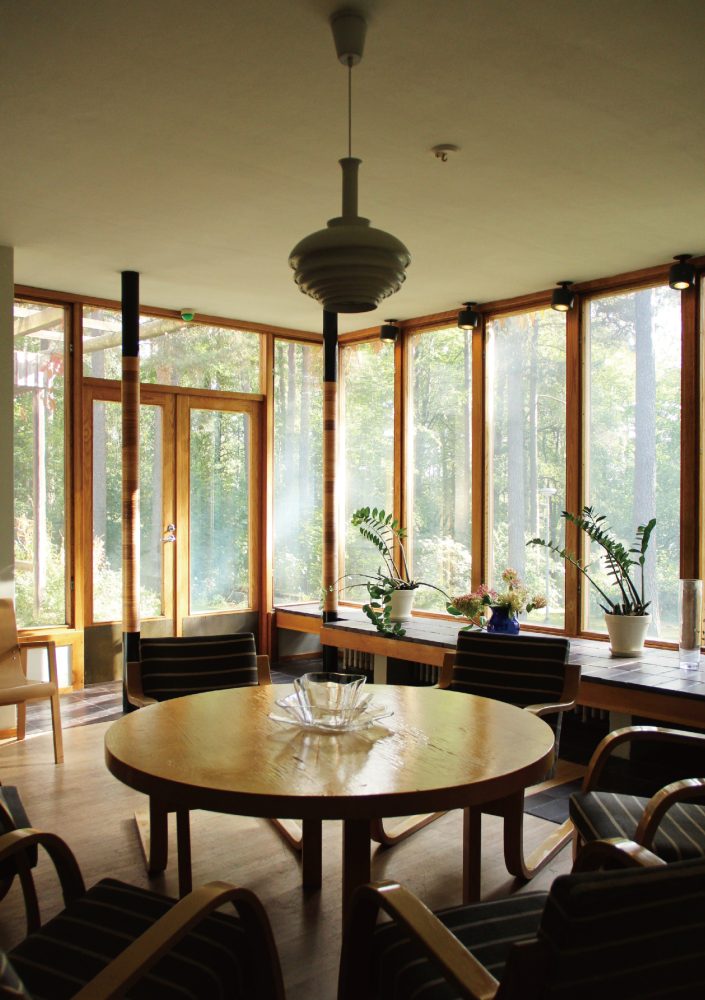
The Architecture of the Window
07 May 2020
In addition to his design practice, the architect Vittorio Magnago Lampugnani has also cultivated a unique philosophical approach to the fields of architectural theory and history through his writings and publications. Since the 1990s, he had served as director of the German Architecture Museum in Frankfurt, editor-in-chief of the architecture magazine Domus, and professor of the History of Urban Design at ETH Zurich. Lampugnani has also applied his knowledge and expertise to the fields of curation, media, and education.
In this essay, he expounds on his own “theory of windows” in an attempt to locate the essence of this particular structure in the context of architectural design, focusing on office and residential housing projects that he designed himself, including the Novartis Campus in Basel, Switzerland.
* This article has been adapted from a lecture given at the Windowology Symposium, held in Tokyo, 2017.
Vittorio Magnago Lampugnani: Allow me to show you three projects by my office, one in Basel and two in Zurich, where windows played a particularly important role for us.
Office building Fabrikstrasse 12
One of these buildings is located in Basel, on a pharmaceutical campus that you can see on the left hand side of the aerial view. We conceived the master plan, which attracted a number of very distinguished architects to build there, including Prof. Fumihiko Maki [pict_01]. We were also asked to build an office building in this context: this office building [pict_02].
-
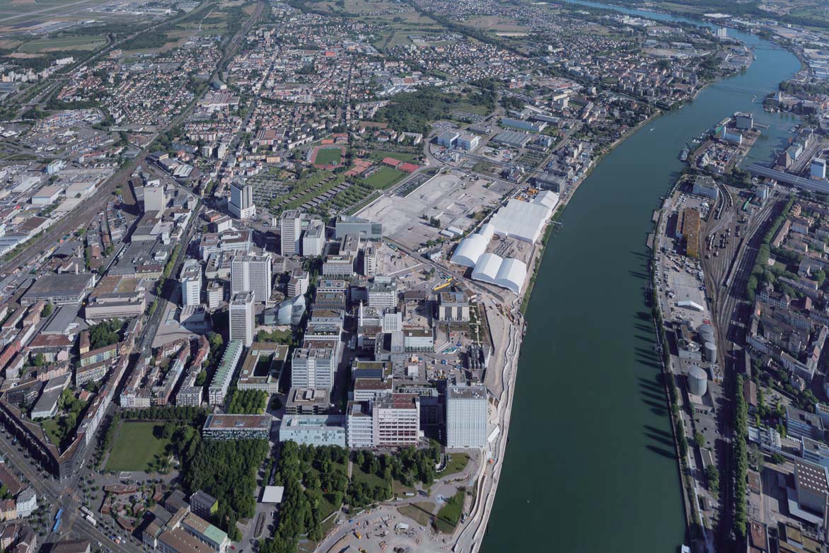
[pict_01] Aerial view of the Novartis Campus, Basel
-
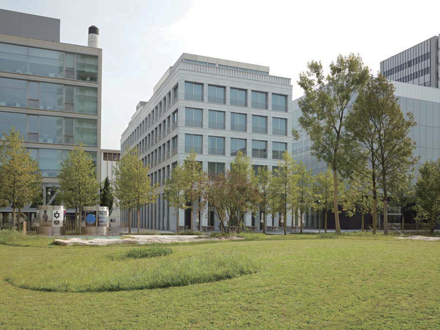
[pict_02] Office building Fabrikstrasse 12, Novartis Campus, Basel. Architect: Vittorio Magnago Lampugnani, Studio di Architettura, Milano.
The windows were a crucial point in the composition of the façade. These are many studies where we examined possible structures of the façade [pict_03].
Of course, the façade and the windows are the same. So these studies were a kind of geometrical investigation into the forms that a rhythmical façade could take, and the kind of harmony we could create between the façade, the windows, the arcade on the ground floor, and the full volume of the building — a harmony that is inserted into our fairly strict master plan.
-
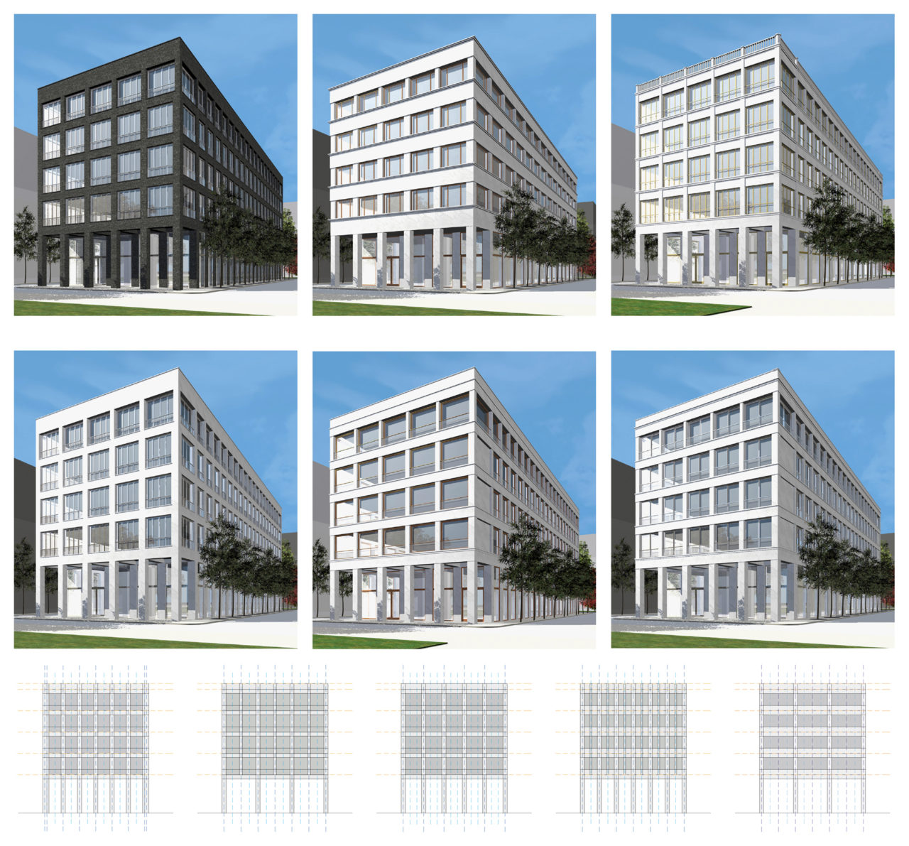
[pict_03] Studies on façade of Fabrikstrasse 12
We went so far as to create a mock-up, a life-size model [pict_04]. At first glance, it seems like just a small building. You could think that the two windows are the same, but they are not. We used the mock-up to investigate the small details. Personally, I am very interested in the little details of architecture and the refinement that becomes evident when you go deeper into the material aspects of architecture.
If you look carefully, you can see that there are small differences in the windows, such as the color of the aluminum windows with triple glazing. There is also a small difference in terms of the glass: one is solar glass, while the other is totally transparent. And of course, there are differences in the shading.
-
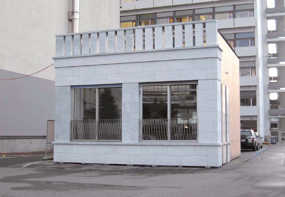
[pict_04] Mock-up of the façade of the building Fabrikstrasse 12.
We used this mock-up as a tool to refine this important architectural element of the windows. I must say this element here is particularly important, and not just in terms of the composition aspects of the window. We wanted to create a building without air-conditioning, where the windows should be opened by the people working there. So we tested how easy or how difficult it would be to open them as sliding windows, and found that they needed to be very, very light.
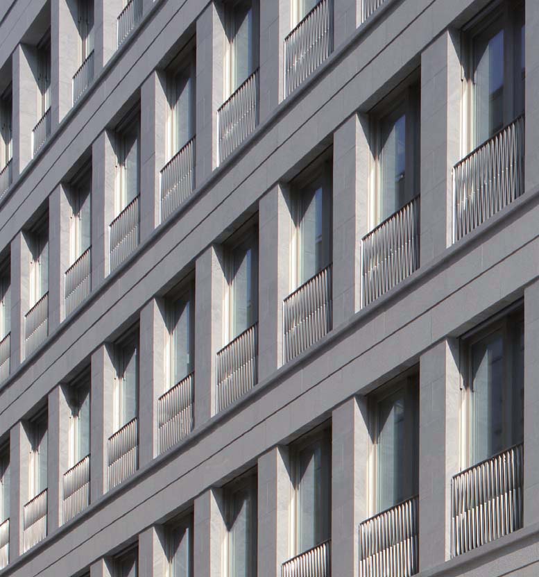
The result is a strongly rhythmical façade made of white marble from Carrara with the windows pretty recessed [pict_05]. As I said, they can all be opened. Of course, the windows are important in terms of both the exterior and the interior. The interior resembles a kind of city, the big staircase being akin to a street. The first range of openings is a kind of arcade looking into the offices. Now please look at the windows from the inside. We were very interested in the relationship between the interior and exterior space. And we were very sure that we wanted the windows to act as a filter.
-
[pict_05] Façade of the building Fabrikstrasse 12
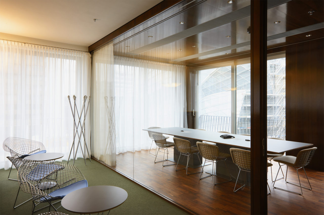
So we put in very light curtains, creating a kind of interplay between inside and outside, while of course also protecting the workspaces from the sun [pict_06]. This is a corner where you can see it pretty well. The windows are really pieces that you can use: you can open them, you can look outside, and of course there is the protection afforded by the railing. It was our intention to create an office building that clearly functions as an office building. Thanks to the windows, however, it has a new and unexpected domestic dimension, as it were: you can open the windows, just like you would do in your own house.
-
[pict_06] Viewing through window beyond interior of Fabrikstrasse 12
Residential Building Kontadhof, Wallisellen
The second project that I would like to show you was faced with a similar situation. We created a new neighborhood on an empty lot near Zurich. Half of it is residential and half is a mixed-use development: a combination of offices, shops, and housing. We planned all of this, designing the master plan, controlling the public spaces, and coordinating different architects. And we built one of the buildings, this big residential block.
In the former project, we did the smallest building, whereas here we decided to do the largest one, since we had won the competition. This is the building, and I was interested in creating a decidedly urban situation. We had this rather large lot for this residential building, arcades with shops on the ground floor, all the rest apartments.
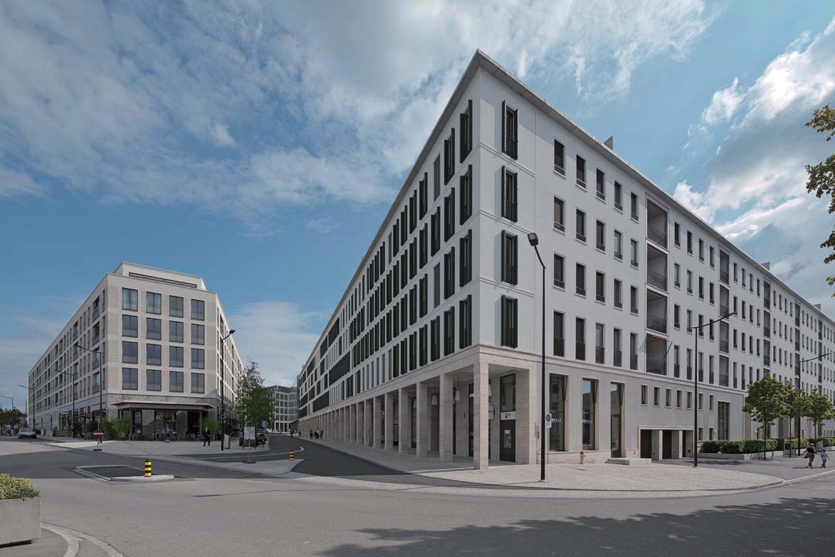
We had a long façade, a long urban façade along the main street cutting through the neighborhood. Once again, the windows became a crucial element for us. We decided to do French windows in order to get as much light into the apartments as possible, and also to have this beautiful feeling that you can lean out of the window and look outside onto the street. We wanted an urban architecture, so we decided to have a very homogeneous façade [pict_07].
-
[pict_07] Richti neighborhood, Wallisellen near Zürich.
Architect: Vittorio Magnago Lampugnani, Studio di Architettura and Baukontor Architekten, with other architects.
In fact it is deliberately repetitive and 130 meters long, so the shutters become extremely important: for practical reasons, security, sun shading. But they are also important because they bring a sense of life and variety to these strict geometrical rules. The developer had asked us to study the possibilities of creating diversity across this façade, so we tried small variations in color and railings.
Eventually, however, we decided not to do it. We decided to keep the façade totally homogeneous, because it is the lifestyles of the people that differ in terms of how they make use of the windows. Some shutters are opened, others are closed or half closed: this is more than sufficient to create a sense of the diversity of life that was required.
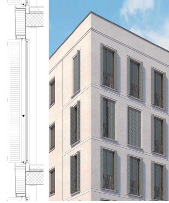
Here is just a brief look at the details [pict_08]. The details are very simple: triple-glazed windows with aluminum shutters that we designed and developed, and that you can comfortably open and close by hand. It is extremely simple, exceedingly efficient, and it creates a nice atmosphere.
-
[pict_08] Detail of the window (Residential building at Richti neighborhood)
The façade on the green courtyard is totally different: it opens up in a much more generous way. Here, we have windows that are different, too: larger windows and terraces [pict_09]. This is the view from one apartment into the courtyard.
-
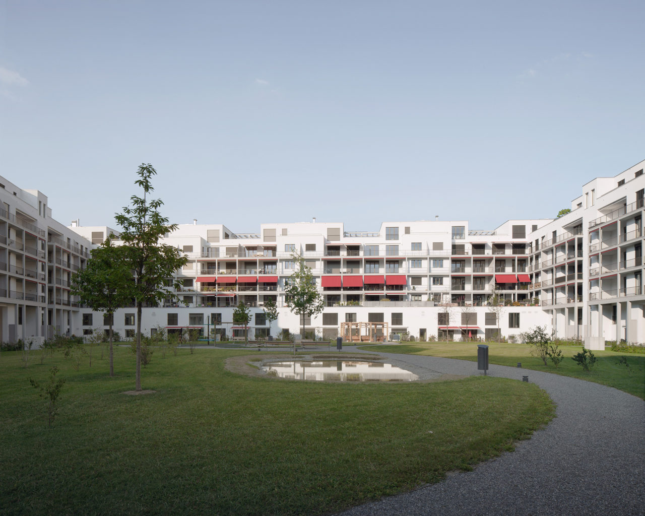
[pict_09] Courtyard of Kontadhof in the Richti neighborhood, Wallisellen near Zürich.
Architect: Vittorio Magnago Lampugnani, Baukontor Architekten.
Office building am Schiffbauplatz, Zürich
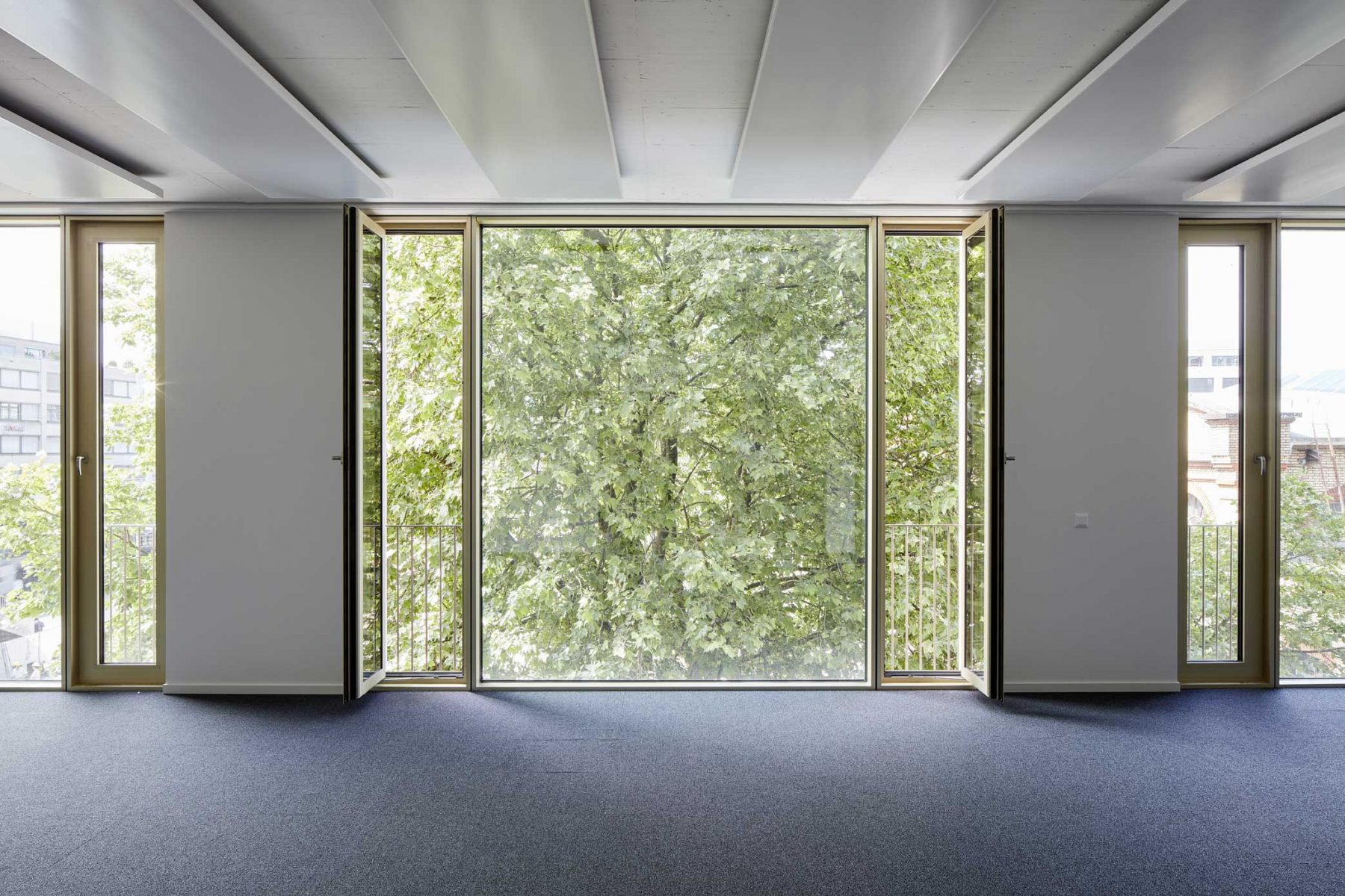
The last project I want to show you is our most recent one: an office building that we did in Zurich [pict_10]. Here again, the windows play a seminal role. Here again we were interested in the rhythm that I showed you in our other projects. We played with different kinds of openings: glazed openings, openings that create a filter with stone, modern Chicago — windows enlarged in a very special way, so that they become a part of the interior space.
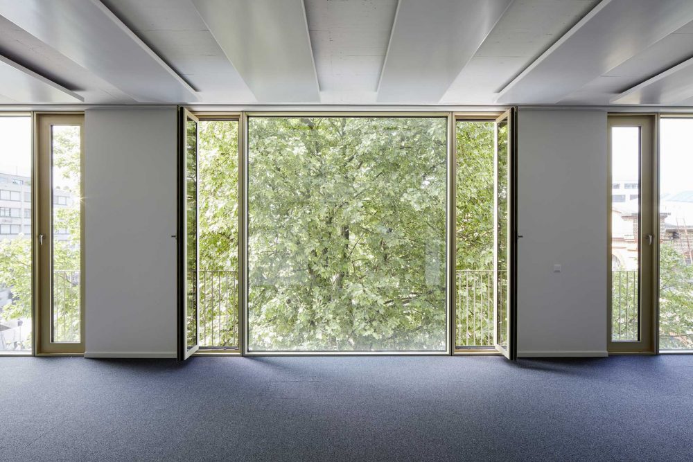
Here you can see the side windows that you can open quite normally. The middle panel is extremely large, and fixed [pict_11].
-
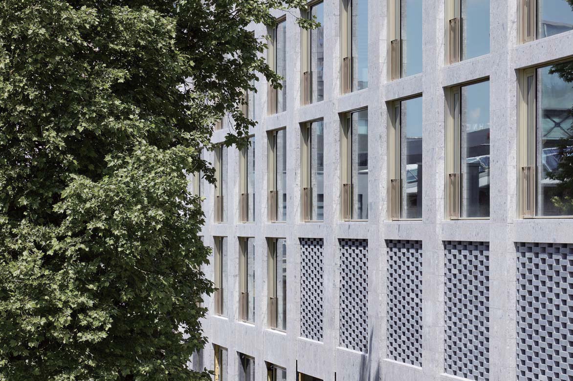
[pict_10] Façade of the office building with shops and restaurants on Schiffbauplatz, Zürich.
Arthitects: Vittorio Magnago Lampugnani and Jens Bohm, Baukontor Architekten.
-
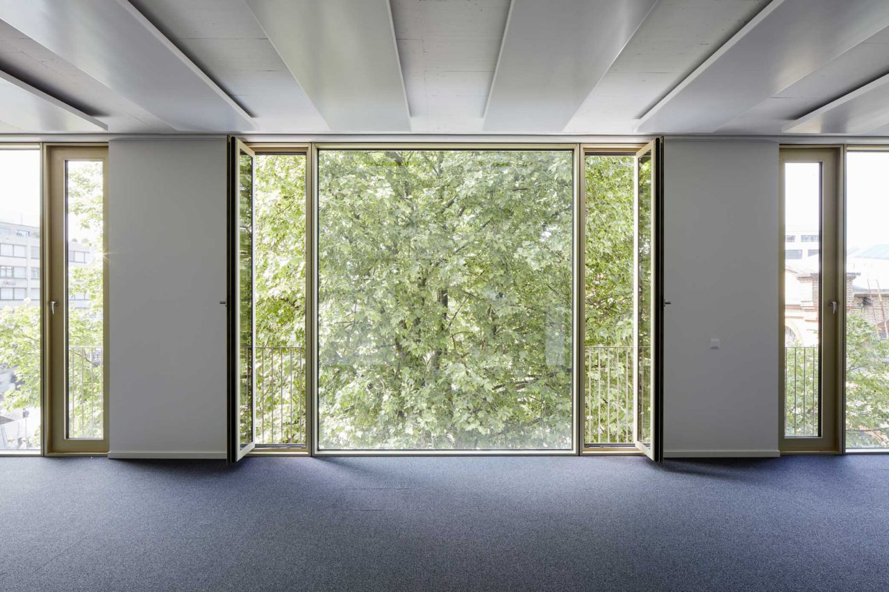
[pict_11] The fixed window in the center and openable side windows on both sides (The office building with shops and restaurants on Schiffbauplatz, Zürich)
What I tried to convey in this short presentation is the idea of the window as a commodity. Windows are very practical elements: they have to work, and be efficient and durable. But they also have a sense of poetry to them. What we tried to achieve in the architecture that I showed you is a little of this poetry that makes our lives richer and more beautiful.
Vittorio Magnago Lampugnani
Professor Emeritus, Swiss Federal Institute of Technology Zurich / Architect. Studied architecture in Rome and Stuttgart. Has been practicing architecture since 1980 from studios in Berlin, Milan, and Zurich. Director of the Deutsches Architekturmuseum in Frankfurt from 1990 to 1994. Editor of Domus from 1990 to 1995. Professor of urban design history at the Swiss Federal Institute of Technology Zurich (ETH Zurich) from 1994 to 2017. Has edited and curated numerous academic publications and seminal exhibitions. Architectural works include the Mergellina underground metro station in Naples and the Novartis Campus in Basel.
